Skip to content

When the user Encrypts or Decrypts an item, we clear out the password field(s) automatically for them.The length of a password is one of the most important criteria in preventing prevent brute-force attacks. For this reason, a minimum character length is mandated.
Additional technical info...
The states are:Encryption flow:Please enter a passwordValidation Error: Password too shortConfirm passwordValidation Error: Password mismatchReady to EncryptDecryption flow:Unlock with password
If the user leaves their item decrypted, it’s highlighted in RED in the card list, along with a notice. Decrypted items are visible to other users in the doc, so it’s important that the user is aware.Similarly, if they haven’t cleared out an item’s password fields, those passwords would also be visible to a user motivated enough to find it. This is another security risk (especially considering many users reuse passwords), so again the card is highlighted and a notice is prominently displayed.Additional technical info...
Typing directly into a table cellPressing [Enter] moves the user to the next row on the table, or adds a new row if they’re on the last onePasting multi-line text into a cell creates multiple rows in the table, one for each paragraphYou need to press [Shift] + [Enter]. Other apps use this key combo, but it’s rare and unintuitive.Typing into a text input (canvas control)Doesn’t support multi-line text at all.Custom Layouts (ie activating a row’s popup modal view, or using a layout in a DETAILS table view):Pressing [Enter] moves to the next column[Shift] + [Enter] works. Once again, unintuitive
The trigger button:This button is ridiculously discreet. The user has to click on the cell, then click a second time for the input to get keyboard focus. Only then is the button displayed. Also, it’s the same color as the page background :( In short, easy to miss.The “expand cell” keyboard shortcut. Ctrl + Shift + E. This shortcut is unique to Coda - no other software uses it, as far as I know. So it’s extremely unintuitive. It’s also fairly badly advertised. You first have to find the trigger button, then hover over it to see the shortcut.
User clicks on a CARD and it launches a popup modal with a custom layoutHere we display the text content as a read-only columnTo do this you just create a new text column, right-click on it and select “Add Formula”, then in the formula window just type thisRow.[Text Column] where [Text Column] is the name of the original text column.By making this read-only, the user never encounters the “pressing enter doesn’t add a line, it moves me to the next input” issue.Alongside the text is an Edit/View button. Because the text content is read-only, the user knows they must click this button to make changes to the text.This button takes them to the page where a “details” view is displayed on-page which is a DIRECT COPY of the popup window they were just working in.Within a moment, the text column’s “Big Cell” mode is automatically launched.Now, when the user closes “Big Cell”, instead of returning to a CARD LIST and getting lost, instead they see the DETAILS view of the row they were editing, and don’t lose their context.
If it’s TODAY, then we use the duration since created:eg. 6 mins ago If it’s YESTERDAY, then we just display:eg. Yesterday
If it’s THIS WEEK, but before yesterday, then we just display the day of the weekeg. Tuesday
If it’s BEFORE this week, but it’s still this year eg. Tue, Mar 15
If it’s BEFORE this week and the year is different to the current yeareg. Mar 15, 2021
Can you keep a secret?
- Pages
Share
Explore
 Builder Notes
Some notes for fellow Coda Doc Makers...
The purpose of building WikiVault was to explore how the UI of a doc could support the security goals that per-item encryption provided. I’ve documented some of the ideas I’ve implemented here. Would love to hear your feedback if you agree with these decisions or feel I’ve missed the mark.
I’ve also thrown in a few tips and tricks :)
Keeping passwords safe
Here are a couple of ways we assist the user in remaining secure
Step by step guides and live feedback using “dynamic headings”
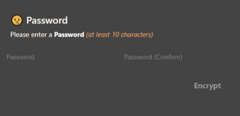
Instead of static headings for fields in the add/edit item layout, I used Formula columns to display dynamic headings based on the state of the field. At first glance, they appear to just as regular labels for the fields, but as the user fills the form in, they’re automatically updated to reflect the state of the row. This guides the user through the steps they need to perform, and provides validation feedback “in situation”.
Building these is pretty simple. First, I have a table which I use for storing text strings that I need to use dynamically. Each of these headings is a separate row on that table.
To display the appropriate heading, I just use a big SwitchIf() formula then display the appropriate heading by referencing its row in .
Although you could generate the text dynamically with Concatenate() or Format(), using the template table makes maintenance SO much easier.

An example of where I’ve used this is the “Password” section of Secure Items. The heading here guide the user through the steps they need to take, and alerts them of any validation issues immediately so they can solve them right away.
Warning notices
The best bank vault in the world is utterly useless if an employee leaves the combination numbers written on a post-it stuck to the vault door. It’s important that the user interface is supportive of the user.

These notices are also visible to the user in the popup window.

I really wanted the notices on the popup to be prominent, and love how they ended up turning out. The way I achieved the solid background with the rounded edges is using a lookup column. There’s a table specifically for this use called .
The “Display Column” should be set to the actual text you want to display (see the first column on the left of the screenshot below). Then to use the notices in the “add/edit item” layout, there’s a LOOKUP column which looks up to . That column has a formula which references the relevant notice depending on the state of the row.
🔍 click to zoom in


The risk of over-warning
An important thing to remember about user behavior is that if an error light is ALWAYS on, users become blind to it pretty quickly.
If the notice appeared every time the user entered their password before encrypting or decrypting an item, it’d quickly just become ignored. To help prevent this, we only display warning notices after a few seconds.
The specific duration can be changed on the page. I had planned on having multiple “threat levels”, so if the user ignored the notices long enough, we dramatically escalated the impact of the notice. I never got round to that, but the settings page still has a reference to that.
In most instances, the user won’t even see those notices. In typical use, the user will enter their password and we expect they will click the Encrypt/Decrypt button shortly thereafter. That button clears out the password fields automatically.
The (+- 20 seconds) delay is only really likely to kick in if the user gets distracted or if they realize they’re viewing the wrong item and close the window before clearing the password fields out.
For those cases, this warning will help jog their memory as intended.
What’s with the page?
Wow this was quite a tricky issue to troubleshoot. I’d love to hear how other people solve this, but (and correct me if I’m wrong), there really is no good, intuitive way to allow users to enter multi-line text into a Text column in Coda.
The best way to add multi-line text is opening the cell in “big cell”. This can be triggered by:

My Workaround
“Big Cell” mode is the best way to enter multi-line text, however it’s not intuitive for new users to find. A particularly nice way to get users to “big cell” mode is via an Enlarge button, which takes the user directly to the correct column’s “big cell” mode when clicked. I think the solution is from Paul D. Basically you take the row’s URL and append &columnId=xxxxxx&view=modal to the end of it. Then pass that url to an OpenWindow() formula within a button’s action.
👍
The button solution makes the UI for getting to “big cell” mode far more intuitive.
👎
The downside is that if you pass the user to “big cell” from within a popup window, then when they click Done or Cancel Changes, they are not returned to the popup window they were previously on :(
This means that you can only really use the “Big Cell” mode button click solution from a button directly on the page (ie in a table, or from a canvas control). You can’t use the button click from a “popup window”.
Unfortunately the popup window solution is the only way we can realistically show the user content from the card list view. Clicking a card ALWAYS results in a popup modal unless you add a button that performs a custom action when clicked. The caveat of using the button solution on a card is that the user must know to click it, and never click elsewhere on the card.
💡 The Solution
With all the caveats and workarounds, we are left with the final solution, which is the one implemented in this doc...
I think this is a really seamless and intuitive way to enable multi-line text input. It’s a pity it’s SUCH a workaround, but nonetheless it’s really nice for the user so it’s worth it.
Friendly dates
I love that Coda supports multiple ways of formatting dates, times and durations. That said, I think that real-live humans refer to moments in time completely differently based on how long ago it was.
I thought that’d be fun to code, and help people more accurately date items in their list. This code applies to the Date Created and the Last Modified timestamps.
The formula is quite long-winded, but I built it this way to make it easier to understand for future maintenance.
FYI: On there’s a canvas variable [VAR This Week] which calculates midnight on the current week’s Monday morning.
WithName(
SwitchIf(
thisRow.Created() < [VAR This Week],
If(
thisRow.Created().Year() != Today().Year(),
"BeforeThisWeekAndDifferentYear",
"BeforeCurrentWeekAndSameYear"
),
thisRow.Created() < Today()-Days(1),
"ThisWeekButBeforeYesterday",
thisRow.Created().DateTimeTruncate("day") = Today()-Days(1),
"Yesterday",
"Today"
),
HowToFormatDate,
Switch(
HowToFormatDate,
"BeforeThisWeekAndDifferentYear",
thisRow.Created().FormatDateTime(5, 0).ToText(),
"BeforeCurrentWeekAndSameYear",
thisRow.Created().FormatDateTime(9, 0).ToText(),
"ThisWeekButBeforeYesterday",
thisRow.Created().WeekdayName().ToText(),
"Yesterday",
"Yesterday",
"Today",
thisRow.[Date Created - Duration].ToText().Concatenate(" ago")
)
)
Test out the formatting
Select a Date and Time to preview how it would be formatted in the WikiVault card list:
📆
Here’s how that would be formatted:
👉
Mar 28, 2022
How dates are formatted
Here are the various ways we format the date in the PK. It makes sense to list them in order from MOST RECENT. In the formula, however, it made sense to list them in the reverse order.
or 2 hrs ago
thisRow.Created().Year() = Today().Year()
⏲
1388 days
Want to print your doc?
This is not the way.
This is not the way.

Try clicking the ··· in the right corner or using a keyboard shortcut (
CtrlP
) instead.