Skip to content
 Tips
Tips
Buttons and Scales work on cards, so you can make them interactive!
In addition to interacting with cards by clicking on them (to open) or dragging and dropping them (to re-order them or update their status, etc.), you can add buttons, sliders, scales, and checkboxes to make your cards even more interactive.
For example, you could add ratings to books you’ve read as shown in the example. Or, you could add buttons to Slack people are log discussion questions before a meeting or event.
Think about grouping on the top or whether to group at all
Ungrouped cards can present a smooth-looking “gallery” visualization of your information. In some cases , you might still want to apply sorting to add some clarity/ease of use to your cards. For example, the example provides an ungrouped view of new team members, sorted alphabetically by first name.
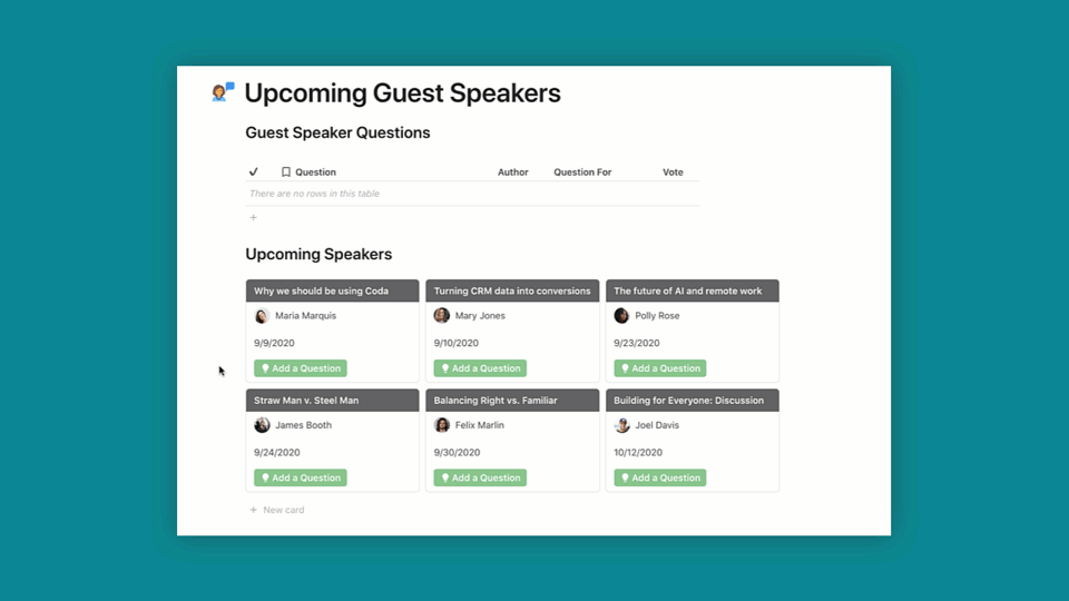
However, for projects or other data schema that are more likely to involve some change in status, condition, etc., you might want to consider applying grouping to your cards. A traditional project management board would typically allow you to move tasks from one status to the next; to set this up in Coda you can group your table by status with a “top” grouping as is displayed in the example.
You can also group with a “left” grouping for content meant to be read as a user scrolls vertically. You can see an example of this in the example.
Be judicious with conditional formatting
If you want the entirety of your cards to be one color/change color as they move between groupings, you can apply conditional formatting to “all columns.” However, some content doesn’t always look great against a color-changing background, so you may want to format only specific columns (if at all).
This can be especially true for cards that have images, or use scales. For example, a five-star scale shows “empty” stars as gray, and the rest as yellow. Putting this scale on a gray or yellow background could be difficult for some teammates to see.

Check out the example to see how we applied conditional formatting to the title column only to avoid such an issue.
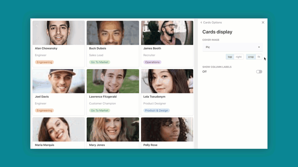
Experiment with image and column display options to get the look and feel that work best for you
From the Table Options menu, you can select “Cards display” to choose whether or not you want to show a cover image, and how you’d like to treat the image in terms of size and alignment on your card.
Want to print your doc?
This is not the way.
This is not the way.

Try clicking the ··· in the right corner or using a keyboard shortcut (
CtrlP
) instead.