Skip to content
More
Share
Explore
 3.1 Visual Identity
The first concept that comes to mind when opening this section is likely the logo. While the logo is a crucial component of your brand, your visual identity also includes typography, color palette, imagery style, and space design. As a crash course in visual design exceeds the scope of one chapter, this section is pared down to the essentials. In fact, the only sentence in this guide will have about logo design is this: like every other visual identity element, it should represent who you are as a brand. (If you want to do a deep dive into design, there are so many great online tutorials and Medium articles at your fingertips.)
Design has both a functional and an emotional purpose. Visual elements should convey your brand personality and reinforce brand attributes while pulling the audience in with compelling associations and imagery.
Visual identity also reflects positioning. Strong sans-serif fonts and primary colors - think supermarket chains - have become associated with lower-cost "value" brands. Mid-range brands utilize a broader spectrum of colors and more decorative typography and imagery. Luxury brands stand out with high-quality materials and tend to revert back to simplicity with distinct, stylized imagery (though, with changing design trends, this may no longer be as broad a generalization).
The one thing your visual identity must have, above all else, is intentionality. Justify your design decisions. Why did you choose a specific visual element? What does it say about your brand personality? Not having an answer to these questions undermines brand cohesion and consistency.
Images
Imagery subliminally influences perception through associations. The images you share should be discernable from other brands but cohesive to your identity.
🖼️ Start by creating a moodboard.
This exercise is exactly what it sounds like - collect images physically, on Pinterest, or with another platform that evokes what you think your brand looks like. A moodboard is an unintimidating way to start building your visual identity - maybe you've started one already.
You also don't have to stick to one board, unless you already have a firm idea of what you want your visual identity to be. Explore various visual themes, colors, and image types. If you prefer to collect and save inspiration on Instagram, you can sort images into different collections.
Do the images in your moodboard seem cohesive to you? What emotions do they evoke? Taken together, they should suggest a story. You can also take moodboards as inspiration for social media content later on.
If a sonic identity is important to you, you can start thinking about what kinds of sounds would enhance your imagery. Sounds and music can complement other brand elements to intensify the experience of a brand, by triggering emotional responses.
Typography, Colors, and Symbols
Typography subliminally communicates brand personality - a fun, experimental brand and a distinguished heritage brand won't use the same font combinations. The most important consideration when it comes to selecting typography is readability across different platforms. A general guideline is to choose one "body" font and one "header/title" font. Using more than three fonts runs the risk of appearing messy, and is rarely ever necessary.
In addition to type, designers use color to express brand personality and create differentiation. Colors are visual shortcuts to moods, emotions, and associations, influencing viewers through psychological affect - such as red inciting passion - or associations that are reinforced over time. For example, Roman emperors wore purple while Chinese emperors wore yellow, so purple is considered regal in the West while yellow is considered regal in China.
Symbols and iconography also carry meanings and associations; when used in a way that aligns with other aspects of the brand identity, they can positively reinforce brand attributes.


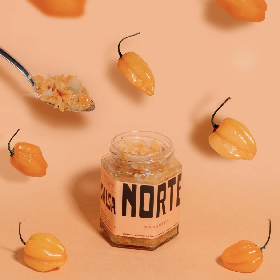
Images taken from brands' Instagram accounts. From top: @omsom, @flybyjing, @apostle_hs, @salsa_norte
📌 's and 's branding uses vibrant colors to reflect the potent, multi-layered flavors of traditional ingredients in Asian cuisine. Vibrant colors and punchy typography are also common with hot sauces around the world (eg. , ), as the product should pack flavor. Apostle is also a good example of how a brand uses updated iconography in service of their brand, visually represent transcendent hot sauce.
The Physical Space
Infuse your brand identity into the physical space while considering who your audience is and the message you want to portray. Again, remember that consistency across brand elements is key. If you ask a customer to say three things about after walking into your business, those traits should be an accurate reflection of your brand personality. Further detail on environment can be found in Section 4.3.
A great example of how brand elements reflect in physical space is with London-based Bao - design site It's Nice That profiled the and how they created .
“Bao is more than just a place to eat... when you sit in our restaurant you’re sitting in a story.” - Bao co-founder Erchen Chang
Creating Identity Guidelines
How do employees or partners know which types of images to share online and when or how the logo be used? Perhaps they'll make decisions based on their personal understanding of the brand, but having a style guide, or document of acceptable text styles, colors, and web design elements, makes it easier to reference which images or decisions are (and aren't) aligned with your visual identity. In short - yes, do compile identity guidelines.
Sharing Your Visual Identity Development - Building in Public?
Sharing the visual identity development process not only builds anticipation and interest but also conveys the intentionality of visual choices.
If you followed along as an empty space slowly become a bakery - watching architectural elements being chosen and delectable pastries being refined - you already have a bond with the bakery before you set foot in the door on opening day. After learning about your local deli or cafe's rationale in choosing furniture to craft a welcoming space, you might feel more connected to the space, and thus the business. Sharing these moments with your guests invites them to strengthen their understanding of and emotional connection with your business.


📌 London-based neighborhood cafe Nola shared the process of finalizing their physical space on Instagram (@drinkatnola). Explaining how the worktop and other items are is made from recyclable materials reinforces their commitment to sustainability and care for the neighborhood before the business welcomed its first guest. The caption also attracts value-aligned customers.
If you have a following, building out your identity in public enables potential customers to feel like they're joining you on the creation journey. Even if you don't have a following yet, you can still document your design processes and share snippets with your audience later on. For example, Omsom's allows their audience to feel closer to the brand as many core customers resonate with the brand's design justifications.
Want to print your doc?
This is not the way.
This is not the way.

Try clicking the ··· in the right corner or using a keyboard shortcut (
CtrlP
) instead.