Skip to content
320px — 480px: Mobile devices481px — 768px: iPads, Tablets769px — 1024px: Small screens, laptops1025px — 1200px: Desktops, large screens1201px and more — Extra large screens, TV

Flutter Class
How to Get Started
Basics Of Flutter 💻
import “package:flutter/material.dart”;
import ‘package:flutter/material.dart’; is what you always need to write when you start a new project or .dart file. This is because it basically imports everything you need to create a basic Flutter application. There are many other packages and extensions you can connect to your Flutter application, but these are just add ons that are only necessary if you are looking for specific functionality.
Did you like this explanation?


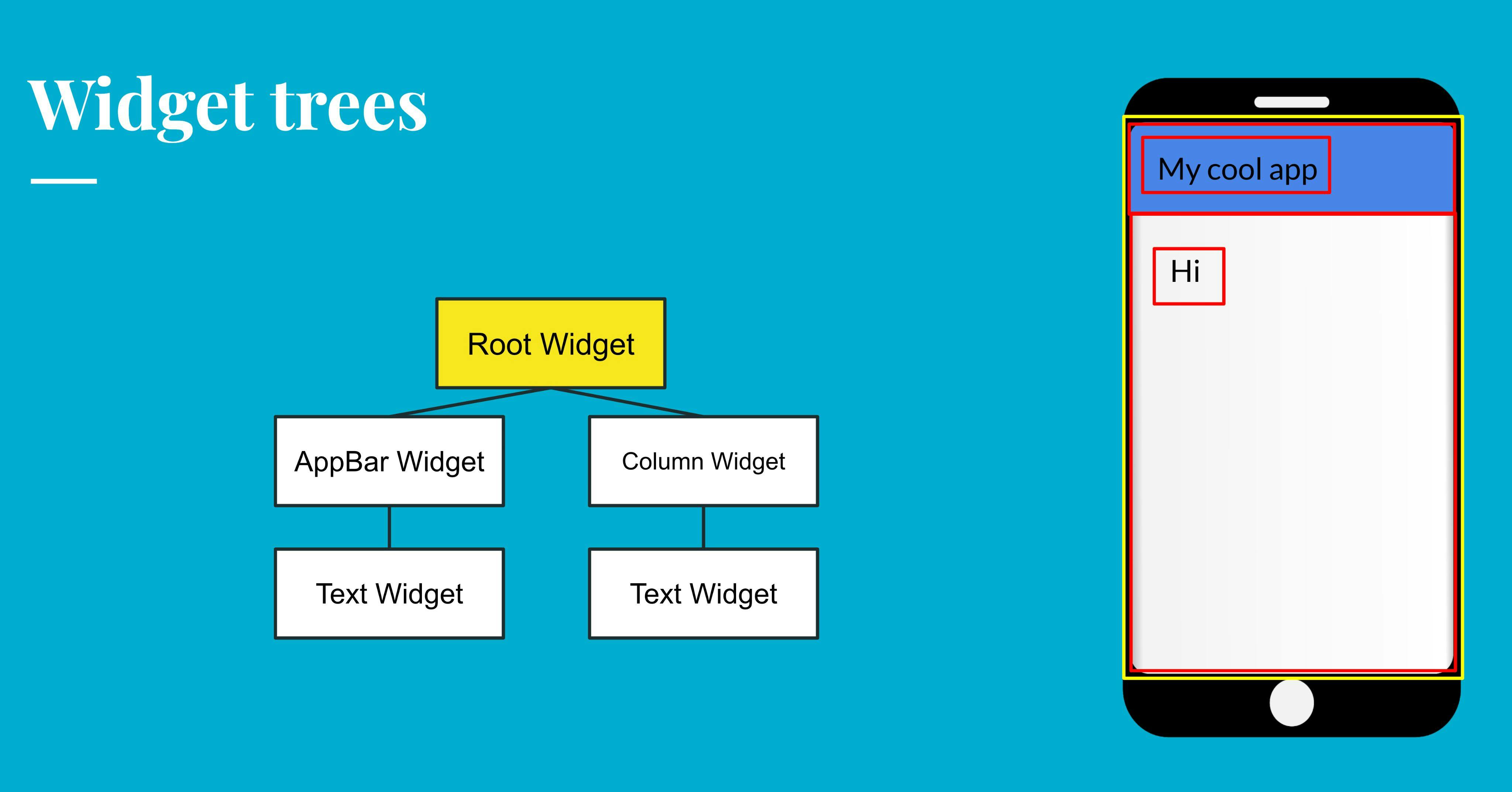
Widget Tree’s
Everything in flutter is an object. Objects are also known as widgets. Different widgets can be stacked and create something called a widget tree! Widget trees are important to understand so you can structure your code correctly to get the output that you want.
Here is an example of a widget tree beside the end product of what ti produces:
Did you like this explanation?
Stateless and Stateful Widgets
In flutter you can make something called a class, a class is where you can start off a new widget tree and make a new page. There are two different types of classes, Stateless widgets and Stateful widgets.
Stateless widgets are for when you are making a page that doesn’t change in real time. This is useful when you want a static UI and aren’t making real time changes such as communicating with a backend, retrieving data and displaying it, etc,
A Stateful widget is when you are making changes in real time.
If you are first starting out with Flutter you are most likely going to be working with Stateless widgets most of the time to create simple UI and functions that don’t require a setState function that is enabled through a Stateful widget.
Did you like this explanation?
Scaffolds
Scaffolds are very important when coding in flutter because it provides a lot of different things that you would usually need in apps and provides default settings for text widgets, button widgets, etc. It is most typically used every time you are creating a screen since it has certain key properties such as appBar, body, drawer, and other things you see frequently in apps.
Properties:
appBar: App bars are commonly used in most apps and can only be accessed using Scaffolds.
body: This is the widget where you input anything you want within the body of your page
drawer: This allows you to create a drawer on the side of the screen that can open up to display navigation, profiles, and pretty much whatever you want! You can learn more in the Widgets section of this document.
There are many more things you can do with Scaffold so feel free to check out the official Flutter documentation to get the full set of properties and possibilities.
Did you like this explanation?
Properties
Properties are the certain things you can do with a certain widget. For example the Scaffold widget has the some properties such as:
appBar and body
Did you like this explanation?
Columns, Rows, Stacks and ListViews
Columns, Rows, Stacks and ListViews are all widgets in Flutter that allow you to structure your widgets in a certain format. These widgets all have the property children: because they all take in multiple widgets.
Formatting:
Column: Structures widgets top to bottom of each other vertically
Row: Formats widget side by side horizontally
Stack: Puts widgets on top of each other
Here are some of the commonly used properties of the Stack widget:
ListView: Formats widgets top to bottom like a Column but can also scroll
Did you like this explanation?
Container
The container widget is one that you will use very often in your code. Oftentimes it is used for formatting like putting space around widgets, but can also be colored to add decoration to your app.
Properties:
child: The container widget only takes in one child so if you want to have multiple then you will have to put in a multi-child widget such as a column or row
width: You can manipulate the width of the container and the height as well
height:
padding: Padding is a very useful property that allows you to put a padding of pixels around the child of the Container. This helps with the UI of your app and creating nice UI designs with spaced out widgets. You use the EdgeInsets widget within this property.
decoration: Decoration is very useful if you are using the Container for decoration purposes instead of formatting. You can do multiple things in BoxDecoration including changing the color of the Container, adding a border, creating a shadow, and more!
There are several other properties you can use to customize your Container. Container is one of the widgets you’ll be using time and time again so feel free to look into the official Flutter documents to see everything you can do with them.
Did you like this explanation?
Widgets 📱
What are Buttons
Buttons are also commonly used in apps and it core function is something called onPressed. This is where you specify what you want to button to do when you press it. Learn about the different kinds of buttons in the next lesson 👇
Did you like this explanation?
Different Kinds of Buttons
While buttons seem like a pretty simple thing to have in an app they are very important. And in flutter, there are a lot of buttons you can use. So here’s a list of buttons with descriptions:
Flat Button
A button with not much decoration and no elevation. The two required fields are child and onPressed().
Raised Button
A raised button is pretty much the same as the FlatButton just with an elevation that increases when you press it.
Floating Action Button
A floating action button is a button that can have a child as an icon but can also have anything else as its child including a Text Widget. It is usually used in a Scaffold using the floatingActionButton function.
Icon Button
A icon button is a button that has an icon as its child.
InkWell
An InkWell is a button you can put anything in and then if you click it it will do whatever you say it should do. Instead of an onPressed() function is uses an onTap() function instead.
Gesture Doctor
Gesture Doctor is basically an InkWell except with a lot of other functions it can preform when pressed.
Activity Button
An activity button is another button you can use that allows you to put borders around your button directly. And you are able to put images inside your button along with some other functions.
Ghost Button
A ghost button cannot have images but you specify your border color, your fill color, your text color, etc. directly inside of the button.
These are just some buttons that you are able to use and there are probably more that you can use with different functions you can use inside of them.
Divider
A divider is a type of widget that displays a thin line to divide different parts of your app. An example of a divider is this:
persistentFooterButton
A persistentFooterButton is a button in the bottom right corner and is a property of the Scaffold. This allows you to put many buttons at the bottom of your screen. An example is this:
This created this at the bottom of my screen:

Navigator
Navigator is usually used with buttons to make it so when you press a button it goes to another screen. Here’s an example of it being used.
This is inside an onPressed function which means that it will be activated once a button is clicked. Then it is pushing another screen in front of another screen.
MainAxisAlignment
Rows and Columns both allow you to do something called MainAxisAlignment that allow you to change how the Widgets inside the Row and Column are positioned.
For example:
This would make it so that all the Widgets inside the Row would start at the beginning of where the Row started. There are many other formatting options as well such as:
MainAxisAlignment.center
mainAxisAlignment: MainAxisAlignment.end
mainAxisAlignment: MainAxisAlignment.spaceBetween
mainAxisAlignment: MainAxisAlignment.spaceEvenly
Did you like this explanation?
Formatting widgets
Formatting widgets are used for formatting. They are invisible but are still used for the UI. Let’s say you have five Text widgets that you want in a row. You can use the Row() widget to put them in a row. The row isn’t actually visible but the Text widgets are now in a row.
Columns and rows are commonly used but there are a lot of formatting widgets that you can use in flutter
Circle Avatar
Circle Avatars are a type of widget that takes either a photo or something else and makes it into a circle.
Here are the properties of the Circle Avatar widget:
backgroundColor
This allows you to change the background color if you are not putting an image in your circle avatar widget
backgroundImage
This is where you can add an image to make your image in a circular shape
child
This is in a lot of widgets such as Columns, Rows, and Containers. This is just for the next widget in the widget tree branching down from your Circle Avatar
foregroundColor
This is the default color for Text in the Circle Avatar.
radius
This is where you set the size of your Circle Avatar
maxRadius
This is where you can set the maximum radius you would like your Circle Avatar to be
minRadius
This is where you can set the minimum radius you would like your Circle Avatar to be
onBackgroundImageError
This is for when there is an error retrieving the image you would like to display in your Circle Avatar. Then you can tell it what to do in that scenario.
Did you like this explanation?
Drawers
Drawers are a type of Widget in flutter that is a flap that comes out. They are part of Scaffolds...here is an example of a Drawer:
That code creates this:

As you can see I added something called UserAccountsDrawerHeader. This is a built in Widget that created the setup we see above it come with the properties:
accountName
accountEmail
currentAccountPicture
Icons
Icons are a type of widget in flutter that allows you to make things like email icons and all different types like this one:

Some icons need to have a dependency in pubspec.yaml. But some of them can just be used like this:
ThemeData
ThemeData is a property within the MaterialApp widget you call when first creating your Flutter App. Essentially what ThemeData does is it allows you to create a uniform Theme throughout your entire app without changing the color, text style, and various other things all over your app!
ListTile
ListTile is a type of widget that can be a button. The two properties you’ll mainly be using is:
title
leading
These two creates two things in a row...for example:
This would create this:

You are also able to use the property onTap
TextFormFields
TextFormFields are things that you can write stuff in. TextFromFields are used very often in apps of all kind. There are lots of different functions you can use with text form fields.
This is what one could look like:

CupertinoActionSheet
CupertinoActionSheets are the things in iOS platforms that pops up from the bottom like this:

Here’s how you would usually make a CupertinoActionSheet:
One negative of the CupertinoActionSheet is that it only works with iOS so if you are trying to make an iOS and Android compatible app you probably shouldn’t use this.
CupertinoActivityIndicator
A CupertinoActivityIndicator is used to create a loading icon that spins around just like what you would see in many other apps. This is used for when retrieving data and it is taking a long time you can say go to this screen with a CupertinoActivityIndicator.
The widget is this CupertinoActivityIndicator and has a few perimeters including:
animating: this is a bool value (which means either true or false) that you put to say whether or not you want it to move
radius: this is for setting how big you want your CupertinoActivityIndicator to be
One negative of the CupertinoActivityIndicator is that it only works with iOS so if you are trying to make an iOS and Android compatible app you probably shouldn’t use this.
CupertinoAlertDialog
CupertinoAlertDialog is a widget that displays a popup message. The things about pop up messages is that you will need to put a button that shows the message or something to trigger it.
Here’s the code to make on:
One negative of the CupertinoAlertDialog is that it only works with iOS so if you are trying to make an iOS and Android compatible app you probably shouldn’t use this.
Did you like this explanation?
MediaQuery
MediaQuery is used to get data on the size of your screen, the positioning of your screen, etc. to help you better tailor your app to different phone variants.
The two main ones I’ll be talking about are the size and orientation function of MediaQuery that allows you to get the size and orientation of the phone. You can make a variable using MediaQuery and store the size of the screen in it like this:
Now, all you have to do is call size to get the size of the screen, like this!
This will make it so the container will take up the whole screen since I specified that it should take up the screen width and screen height. You can also do something like this!
I made it so that the Container would have a height and width of the shortestSide. You can also do this with longestSide and it will get the value of the longest side.
There is also another function you can use with MediaQuery which is orientation. Orientation essentially checks for whether or now your phone is in landscape view. This is because the UI will vary drastically depending on the orientation of the phone. You can check for this using MediaQuery:
Did you like this explanation?
GestureDetector
GestureDetector s a way to make anything a button that is able to carry out a function wen pressed. This becomes especially useful when you want a certain UI to your buttons but it would be extremely hard to do it with a RaisedButton for example.
All you have to do is wrap whatever you want to be a button in a GestureDetector and then use the onTap property to carry out whichever function you would like.
LayoutBuilder
Layout Builder is a widget in Flutter that gives you the width and height of the available space for your widget. This is very useful for creating responsive UI designs that can detect what user interface to display depending on the available space.
Extensions ➕
Pubspec.yaml and Images
Pubspec.yaml is where you can add extensions that can allow you to do more things with your code. Pubspec.yaml is where you can add the ability to add images to your app.
If you go into the pubspec.yaml file you will see this # assets this is where you can enable the ability to use images. Right now assets is commented out so remove the #. Then make a folder somewhere else that you want to store your images. Then you can put a dash and then put the name of your image folder and then a /.
Here’s an example:
Then you would use the image like this: Image.asset(””) in the quotations you would say the name of your folder (in this case, images) and then a / and then the name of your image along with .png, .jpeg, .gif, etc.
You may have to stop your simulator and then run it again in order to run the image in your app.
YouTube Videos
Importing YouTube videos is something that requires a package in pubspec.yaml called youtube_player_flutter that allows you to display YouTube videos in Flutter applications. It even includes some of the YouTube functionality like speeding up videos. So how can we do this?
Fist, go to pubspec.yaml, and go to the dependancies. Then import youtube_player_flutter: with the latest version:
Then you need to import the youtube_player_flutter in the .dart file you plan on using the extension in:
Afterwards you need to create a controller for the YouTube video that get the videoID out of the URL and therefore allows us to display the YouTube video:
Now that we have the controller, we need to display the YouTube video:
GetWidget
Functions ⌨️
Making Your Own Widgets
Sometimes you want to use something with the same design over and over again without anything changing. This will be a waste of code if you build it and specify all the UI properties multiple times. This doesn’t need a custom widget, what is needs is a new widget you build yourself.
The way you do this is by creating a new dart file and importing material.dart. Then, instead of saying Class, you would say widget. Or, let’s say you were customizing your own TextStyle, then you would say TextStyle. For example:
This is an example of a blank widget. Inside you would say return and then build out whatever widget you would like. Then you would call the widget by the name you set in order to build the widget you created. For example:
DebugShowCheckedModeBanner
In the corner of your simulator you may notice a red banner in the corner the says debug.

To get rid of it in your main.dart you can write debugShowCheckedModeBanner: false in order to get rid of it.
Run on the Web
In flutter you are able to put your app on ios, android, and the web. To get it on the web is very easy. All you need to do is go into your terminal and say flutter run -d chrome and it will run your code on the web. Your UI will probably look weird if you designed it for mobile but if you change the code it can look nice for both.
Variables
Variables are used in coding a lot in all different coding languages. Variables are basically just things you can store data in. Here’s the syntax you use in flutter.
In flutter you can specify which type of data you want to store in a variable. Strings, integers, booleans, lists, etc. In flutter the syntax is this:
What type of data you want to store the name of your variable = your data;
For example:
String name = “Samantha”;
If you were to put in a integer in the variable like this:
String name = 42;
It would give you an error because you specified that it would be String, but you put in an integer.
Dynamic
Dynamic is also a specification you can use that makes it so you can put in any type of data inside your variable.
For example:
dynamic var = 42;
dynamic var = "Hello World”;
dynamic var = [2, 3, 4, 5, 6];
dynamic var = true;
This would not give us any errors. But, it is usually better to specify which type of data you need because if you need a String stored in your variable you’ll remember that when you put in an integer because it’ll give you an error.
If and Else Statements
If and else statements are structured like this:
Maps
Maps are like dictionaries. There is a word, and then a definition. They are both linked together because you don’t want to ask for a word and get a definition to a different word, that wouldn’t make sense. Maps can be used to store usernames and passwords because you want your username and password to be linked just like in a dictionary.
Here’s an example of a Map:
The <String, String> part of the code above is specifying which type of data you want stored in your map. Afterwards I say database. That is me naming the Map. And then I put in the data. The : is to link the data together.
Custom Widgets
Custom Widgets are used when you are making things multiple times. Why Re-write the same code over and over again when you can just make a custom widget?
Custom widgets can also be made to have certain parts of it changed based on your needs. For example, a menu. Every item on the menu is going to have a title, a picture, a price, a calorie count, and a list on ingredients. The formatting is the same, but all the different components will change. You can use a custom widget for this as well!
Void
A void is a function that doesn’t return anything. So, if you were making a function that validates whether or not you put in the right username and password, it doesn’t return anything, so you would use a void for that.
kIsWeb
kIsWeb is a function that you can use to detect whether or not your code is running on a mobile or on the web. Here’s an example:
You can create an if and else statement to build out you app depending on whether it’s on a mobile or on the web to build out different UI’s that work with the interface.
With the if and else statement you can also use !kIsWeb to say if it isn’t on the web aka on a mobile, then do this.
Lessons 📖
Basic Database
Sign Up
What are _ used for?
Underscores are often used before variables. This is because adding an underscore makes it so that the variable can only be modified or used in that .dart file. And becomes particularly useful when you are using database. For example, let’s say you’re trying to create a new user and you accidentally modify another users username. That could be prevented with an underscore before the variable you use.
Want to print your doc?
This is not the way.
This is not the way.
Try clicking the ··· in the right corner or using a keyboard shortcut (
CtrlP
) instead.