Skip to content
YouTubeInstagramFacebookNetflixTwitterSpotifyTikTok
Instagram - Instagram has an entire section of the app dedicated to discovery. Additionally, community-based recommendations come in the form of being able to post other users Instagram stories on one’s own story. All functionality of the mobile app is available on the desktop browser version of the platform, but based on the desktop app still having everything in-line on a vertical feed to scroll through it would seem that Instagram is primarily designed with mobile usage in mind.Twitter - Suggested tweets are placed in-line with the user’s tweet feed - usually selected from a topic that the algorithm thinks the user is interested in. Community-based recommendations are from the built-in retweet feature and Twitter also occasionally shows content that followed users have liked. Similar to Instagram, it would seem that Twitter is mostly built for its mobile usage due to the nature of scrolling through the feed and usage of the resolutions for any given device.Netflix - Rows of content types are listed on the app’s homepage. , the most recommended content will be placed in the uppermost row, with the rest in descending order of content recommendation. This is true also in the mobile app, which mirrors the rows of recommended content and even the video player when viewing content.
Even products that people love to use don’t have the greatest algorithms.
This entails a full redesign of how the platform looks, where different elements of the platform are placed, and how individual streamers show up on the UI. A platform redesign is most in-line with the previous market research that was done with other platforms, therefore many areas of inspiration and prior examples are available for Twitch to take after and learn from.By far the most costly in price and time since it requires a lot of validation and rethinking of the UI, and will also have a big impact. This presents its own opportunity cost as well, since there is likely to be user dropoff as a result of the newly imposed learning curve to figure out how to use the platform again. This can be mitigated with an onboarding flow for users to introduce them to the new platform UI and walk them through how to best interact with the new redesign. Another method to mitigate user dropoff is to slowly roll out the redesign on different parts of the platform instead of fully redesigning and releasing a redesign overhaul all at once.The largest benefit for a full redesign of the platform is that it would bring about the best outcomes for the recommendations to become a strength of Twitch. The redesign also creates opportunity to reexamine other areas of the platform that might be due for an update and redesign as well.Twitch already has a Squad view feature, where creators can all register themselves as part of the same squad and users can simultaneously watch all the creators on the same squad in a browser with multiple streams embedded (referred to as multiview). The proposition for this solution is to make use of the squad stream feature in order to serve users multiple recommended streams at once - potentially best left for after a streamer has ended their stream.Measurement of impact is a big assumption given that users engage with the feature, which may be difficult since it has to be integrated with the regular usage of the platform. Of course, there are many tradeoffs in disrupting the existing experience to make users engage with this new feature. If the feature isn’t pushed enough then it would have been a time and investment lost into a feature that wasn’t engaged with, but if it’s too dissimilar and detracting from the normal viewing experience then it would be disruptive and cause user dropoff.This feature would simply expand upon the existing feature of hosting other streamers on Twitch. Automatic hosting based on streamer selection is already possible, but if no other streamers are online to autohost, this feature would come into play to start autohosting onto another streamer that’s decided algorithmically.Since the hosting feature is already implemented, this feature would be fairly quick and easy to implement. by nature of being an expansion upon an existing feature, the impact of this feature update probably would have marginal impact past the existing impact of stream hosting. A potential side-effect of integrating the recommendations with the automated hosting would be potential good will with users, instilling confidence in the recommendations that Twitch pushes.This is yet another solution that expands upon an existing feature, although this one may be deceptively more involved than the initial proposition. At its face, this suggestion would be to have required tags for streamers to begin their streams that way the information can be further used to create algorithmic suggestions and additional stream filtering criteria when searching for streams.Since this in and of itself doesn’t really create a new way to experience recommendations for content, this is likely to be used in tandem with other solutions to make the system as a whole work better. In effect, this solution mostly focuses on quality of recommendations rather than effecting more usage of recommendations. A result of having high-quality recommendations users need
All the streams that they see on the homepage are recommended based on streamers that they follow and watch. Where to find the content that they are used to viewing before. Many people only engage with the sidebar on the homepage to view streams that they already follow but they will need to click on the Following page to be able to access that same content as of the redesign.Users that are used to looking at recommended categories or clicking the browse button to look around the different categories will now need to click on the categories button to access that same content.
Project Repository
- Pages
Share
Explore
 Twitch Recommendations Case Study
Twitch is a B2C live streaming platform primarily focused around gaming content. In this exercise, I act as a Product Manager at Twitch with a goal of solving a given problem.
Problem Statement
It is difficult for users to discover new content or people to watch that aligns with their interests on Twitch.
Understanding Twitch’s Audience
Demographics
In order to even begin approaching solutions to the problem, we need to understand what kind of audience we are solving for. By and far, the largest demographic that actively uses Twitch is who clock in at 65% of the audience. Additionally, 75% of the demographic lands between the ages of . Based on this, we can do a bit of market research to understand what drives content discovery for these users and if see if they have experiences with other apps and platforms that help them discover new media.
Another important consideration is the kind of devices that are used to access Twitch and its content. Twitch has apps for video game consoles, televisions, and mobile devices so it’s important to know which device to design for. Available information indicates that access Twitch via mobile device so we will have to make some assumptions. For the sake of this case study, we will simply consider the remaining 65% of the user base to be accessing Twitch via desktop browser and so we will move forward keeping in mind that the solution that we land upon will be for the desktop browser experience.
Culture
When Twitch was initially created, it was expressly design to cater towards live streams of video games. Since then, Twitch has expanded its horizon a bit but primarily (with the main demographic in mind) most of the community culture is based around overall gaming culture. This is another consideration for how Twitch may be able to deliver suggested content to their audience, since we can examine what drives these users to view or purchase the games that they do. Integrating the language of gaming into the content discovery process will make our solution very targeted and tailored specifically for the demographic that we’re trying to reach.
How Users Currently Find New Content Creators
Most commonly, users are brought on to Twitch via reference from other platforms that creators have grown their presence on. A hypothetical of this phenomenon would be a user seeing a video on YouTube of a Twitch streamer and deciding to visit that creator’s Twitch channel after seeing that initial content. In terms of finding other content creators directly on Twitch, creator referrals tend to be a way that users are cross pollinated with other creators. Creators also collaborate with each other on their streams and develop a shared audience - this is also a very popular way that users find new content creators.

Twitch homepage for new users
Ways that Twitch try to encourage viewers to find new content creators is via their homepage (pictured above). There is a carousel of highlighted content with algorithmic suggestions on creators and categories that are based on creators the user is already following. This isn’t necessarily the way that most users find content though, since the Twitch homepage isn’t a page that is visited often by existing users and even if it is, most users are simply trying to navigate to streamers that they already follow.
Additionally, streamers are able to “raid” other users at the end of their own streams. The raiding feature allows streamers that are ending their streams to push all of their remaining audience to another streamer’s page. This is another community-driven way that users are guided into finding other streamers.
Aligning With Business Goals
Twitch has a lion’s share of the livestreaming market with and 90% of content streamed. While this is great for understanding Twitch’s current position in the market, it’s also of note that competitors such as Facebook and YouTube are pushing their own livestream platforms and they are slowly growing their share of the market.
Twitch’s revenue comes primarily from rather than ad revenue. This means that for all of the watching that people do, if their view time isn’t spread between different channels then those viewers aren’t providing much value to Twitch. Implementing a system for discovery has a strong potential of increasing subscription revenue by introducing viewers to other content creators and cross-pollinating viewership.
User Interviews
To get an understanding of how people discover creators on any platform, our interview targets would be both Twitch and non-Twitch users. This way, we can tease out the differences between how users find new content versus how platforms find new content for users. After getting that information, we can start to think about what form our solution would take place (whether it’s a new feature, redesign of existing features, etc.).
Quantitative information from non-Twitch users could easily be obtained via surveys with short answer questions and polls. With non-Twitch users we are trying to understand their pain points for other platforms. Getting insight on what people do and don’t like about other platforms can elucidate areas of opportunity for Twitch to create a unique experience with content discovery. Since surveys would be more difficult to complete with too many open-ended short answer questions, we will set the surveys to ask about only a certain number of different content and social media platforms that also have suggested content for their users.
For the survey, I picked Twitch along with 7 other content platforms as follows:
Of course, all of these platforms are valid targets for market research but given that some platforms will have more favorable responses about their content recommendations, those may be stronger candidates to look at for inspiration on solutions for Twitch. Additionally, some may be worth looking at more than others due to the nature of the content being closer to that of what Twitch offers.
User Survey/Interview Plan
User-Survey_suMwt
User-Survey_suMwt
User-Interview-Plan_suUc5
User-Interview-Plan_suUc5
User Survey Results - Button Prompt Choices
Demographic Questions


Age demographics (left) and Gender demographics (right)
Most of the correspondents fell within the age range of 25-34 with the next largest cohort being younger from age 18-24 for a total of 79.2% of the total users who have taken the survey. A majority of these people identified as male, with the next largest group being female.
The demographic information that I was able to collect mostly lined up with the Twitch demographics, give or take a few percentage points.
Overall opinion of platforms
YouTube pulled ahead with the most favorable in this category, while Twitch had the most neutral responses of all. Facebook had the most responses for “Not favorable at all” of all the platforms. This question in particular was to understand what kind of biases that users are going into the survey with. I wanted to get any initial suspicion on whether or not peoples’ overall view of a platform affects what their opinion on functionality may be.
How easy it is to find new content on the platform?
YouTube again pulled ahead of the pack with 80% of the responses marked above neutral. Instagram, Spotify, and TikTok also had a high number of responses above neutral. Twitch and Facebook had a high number of responses directly in the neutral category, while Facebook had the most responses in the “Not easy at all” category of the survey.
YouTube seems to be the overall model of how most platforms should be serving catered content. I was somewhat surprised at the results for TikTok not being overwhelmingly on the side of being very easy to find new content, but that may be because many of the survey correspondents don’t necessarily have personal experience using the platform.
Relevance of new content
YouTube seems to be far ahead of all of the platforms, with no responses putting them below neutral. Instagram, Netflix, and Spotify come out as the next highest in rating of relevant content. Twitch comes out with the most neutral responses of all of the platforms yet again, presumably because most users do not necessarily have experience with the platform.
User Survey Findings - Short Answer Responses
Favorite platform from the survey and reasoning for why
Following the results of the of the choices, by far the most responses came in with YouTube being the favorite platform. Many responses like the variety of content that’s available on YouTube with a good portion of it being for educational or informative purposes. Spotify came in with the second most responses. A single user responded with Twitch being their favorite community because of their interest in gaming and wanting to participate in the gaming community.
How users find new content on their preferred platform
The vast majority of users elaborating on their YouTube preferences find new videos via their YouTube homepage. Spotify users find their additional content via Spotify-generated playlists, recommended playlists, and “discover weekly” playlists. TikTok users are defaulted onto the “For You” section of the app which feeds algorithmically suggested content as the users swipe to each new video. The Twitch user said they find content via creator collaborations as well as being brought to the platform from user content from other platforms (for example, YouTube videos referring people over to their Twitch channels).
Improvements that users would make to their preferred platform
This was a fairly open-ended question to identify if there were any potential opportunities for Twitch to fill in gaps left by these other platforms. For YouTube, many suggestions for quality of life improvements such as having more items for suggested content, not showing already watched videos in the suggested content, and algorithmic improvements. The most consistent response across all of the different platforms was most related to the overall community experience such as application of copyright or inconsistency of rule enforcement.
User Interview Findings
I was able to get three users within the 25-34 age demographic to sit down with me to do a 1:1 interview. I confirmed with both of them that they were Twitch users prior to the interview to get an understanding of why they use Twitch and what other kinds of platforms that they use.
User 1 Interview Insights
User 1 primarily found new content creators to watch via their immediate network and other communities that they participate in. Reddit and Discord seemed to be the primary areas where they tend to participate in communities and what makes them more likely to catch on to new creators is when other people from those communities start talking about a new trending creator. Their rationale for engaging with the community-pushed content is that if there’s already a shared interest amongst the community, it’s more likely that the content other users suggest is aligned with their own interest as well. Other content that they had been suggested via algorithmic means tended not to stick with them because there wasn’t a community or other means to continue engagement outside of watching the content itself.
Like other users that took the user survey, User 1 regularly used YouTube. After asking about how they use YouTube and what their thoughts were for YouTube’s suggested content I learned that they don’t use their subscription feed whatsoever. They almost exclusively access content via the YouTube homepage that gives recommended content, with an occasional search for particular content.
“Youtube’s homepage does a pretty good job of giving me content that I would see in my subscription box anyway. On top of that, it lets me find new content although the suggested content is 50/50 on whether or not it’s relevant to my interests”
Whenever User 1 wanted to look for any content in particular they would simply search up the content on the YouTube search bar. All other content would be through the recommended content on the YouTube homepage. Although not all of the content would be relevant, they did appreciate that the algorithm seemed to by trying to push content that’s somewhat related since it helps expand the boundaries of the kind of content that they watch.
Twitch content that User 1 watched was primarily content that they initially discovered elsewhere that had specialized content on Twitch. For example, they would play a video game and later find out that there was an official Twitch channel with streamed tournaments. Only after hearing about this additional content would they start engaging with Twitch.
User 2 Interview Insights
The interview with User 2 was a bit more brief, but we were able to touch upon Spotify, YouTube, and Twitch. User 2’s platform of choice was also YouTube and they used it as a means of finding content on both Spotify and Twitch. Most YouTube content that they find was either by searching for it directly or via the YouTube homepage for recommended content. Additionally, they allow YouTube to autoplay new videos after finishing previous videos and will find new content that way as well. Often times they leave YouTube running in the background while they are working on doing something else, so the algorithm and “autoplay next video” feature will push them newer content. As for whether or not that content is something that User 2 is interested in, it tends to stray on the path of content that is somewhat related to the initial content but misses the mark enough to make them click off of those autoplayed videos. They find this to be a bit annoying because if they get too far into a video on content that they don’t necessarily care for, they find that the suggested content in their recommendation algorithm ends up being skewed towards the content that they don’t care for.
When using Spotify, they would initially search up music that they are already familiar with from watching other playlists on YouTube. From there, they will occasionally check recommendations from Spotify’s homepage as well as a feature Spotify has for a “Discover Weekly” playlist to find anything new. User 2 does note that for the most part, they don’t tend to use these discovery tools because they estimate it only really hits the mark around 30% of the time. Instead, they opt to create playlists of songs that they already know from artists that they specifically have searched up and will only listen to those playlists.
Twitch was the least used platform of the 3 that User 2 put forth, and they said that they only tend to watch streams of friends that he has personal connection to. Occasionally he will browse categories of games that he plays to see if there’s anything interesting but for the most part only learns about peoples’ stream via word of mouth or from recommendations of game communities.
User 3 Interview Insights
The final interview with User 3 gave the most insight as the heaviest Twitch consumer of the 3 users that were interviewed. We also talked about YouTube, Instagram, and how they got their music. The consistent theme for this user was that they want to be the prime curator of their content. Whenever they watch content on Twitch, they will only ever watch channels that they have followed. Finding new channels to follow isn’t really a consideration for them, it tends to happen organically via the channels they are already familiar with. For example, if they watch a stream of a video game tournament and hear that one of the players or casters for that tournament stream on their own time, User 3 may take it upon themselves to check out that person’s channel and give them a follow. This is also how User 3 finds Twitch channels from content elsewhere - namely YouTube. They will see a YouTube video that’s related to their interests and then perhaps that content creator collaborates with another content creator, then User 3 will go to that other person’s channel and follow them. Creator collaborations and content from other platforms is the primary way that User 3 gets new recommendations for creators to follow on Twitch. Their primary way of using Twitch is to have something passively playing on the side while they do other things because they find that even though they may not be actively engaging with the content, being able to take a quick mental break from something that may be monotonous at work to see something interesting on another monitor for a quick moment. Passive engagement with content is something that wasn’t mentioned before by the other interviewees and given that User 3 spends the most time of the three on Twitch, their use case may be worth considering.
When it comes to using YouTube, User 3 was the first to tell me that they consistently check their subscription feed and only check recommendations if they are looking for something after they’ve already exhausted their subscription feed. When asked why, they said they only really care about the content that they’ve self-selected for as if they’ve created their own curated recommendations feed. User 3 felt that the homepage was decent at giving recommendations for content but more often than not, they’d rather watch something from channels they already know that they will like rather than give new content a try.
Offhandedly, they did mention that they are similar when it comes to music. User 3 mentioned that they do tend to access their music in a similar way. They will only get recommendations from their friends or musical content creators, and does not use any streaming services to listen to their music. Based on their content consuming habits for both music and video, it seems that User 3 doesn’t tend to use any platforms for the express purpose of looking for new content but does find new content via creators they already enjoy.
Market Research
To get an understanding of what makes the platforms that people love to use tick, I conducted market research on a YouTube and Spotify to look at the way that recommendations work for each platform and how it integrates into the overall experience of using the products. This will help to understand what are the flaws of Twitch’s experience and give some possible solutions to emulate or build upon. YouTube and Spotify were chosen as the candidates since they came out as clear leaders ahead of the other platforms from the user survey that was conducted earlier. A smaller section for the other platforms will follow the YouTube and Spotify market research as well as some thoughts and takeaways from the market research that may inform the solution.
One thing of note for the platforms that we conduct this market research with is that we will look at both mobile and desktop experiences to see if there is congruence. Even though we are solving for the desktop experience of Twitch discovery, we can also still drive insights that may inform our solution from mobile experiences. This may also open up opportunities for future changes on the Twitch mobile app as well.
YouTube
Desktop Experience

YouTube homepage for new users
Any user that doesn’t have an account will still automatically have a portion of their homepage dedicated to algorithmic recommendations, but will also see a split element for Trending videos as well. My assumption here is that because YouTube isn’t sure what kind of content the new user will like, they simply populate the fields with general content that it seems like most users enjoy watching in general.
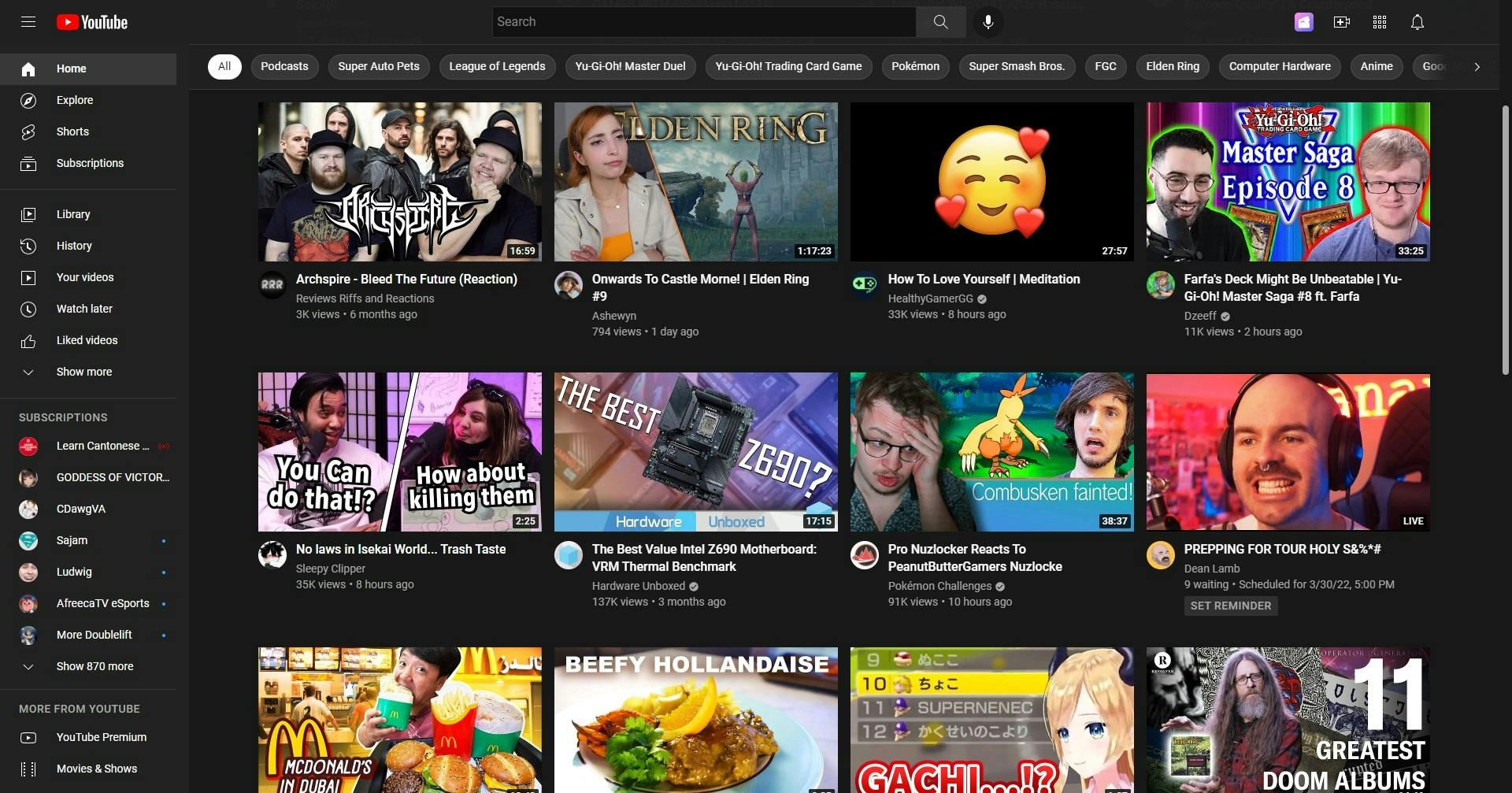
Personalized YouTube homepage for existing users
On the other hand, if you have an account and are subscribed to channels or actively watch content then the entire homepage is full of only recommended content. The recommendations are a combination of content from channels that the user is subscribed to as well as algorithmically related content. Users can scroll down to continue loading more and more recommended content if they aren’t interested in what shows up initially. It also has filters for different content topics along the top of the homepage.
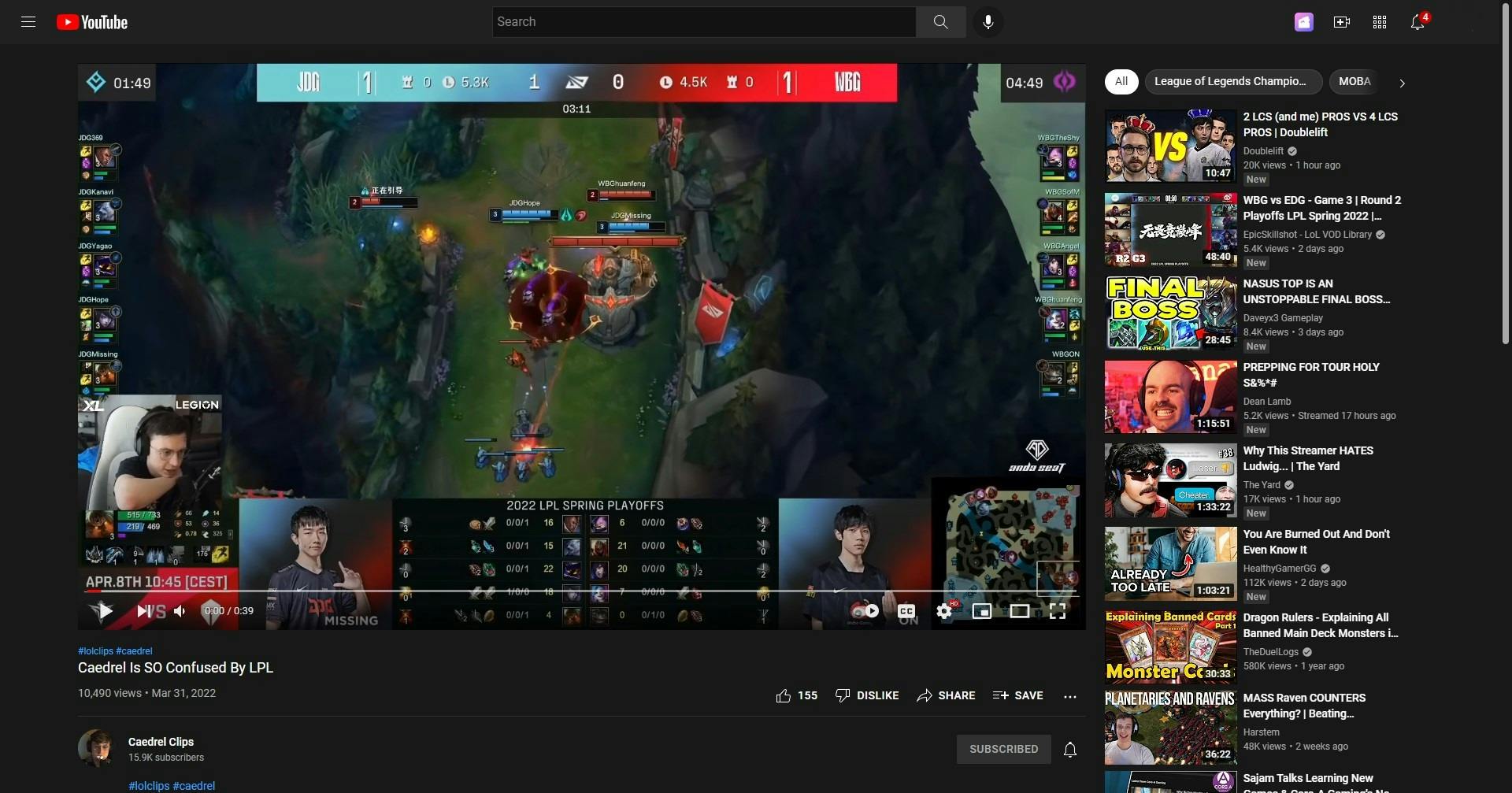
YouTube video player with video recommendations in the column on the right
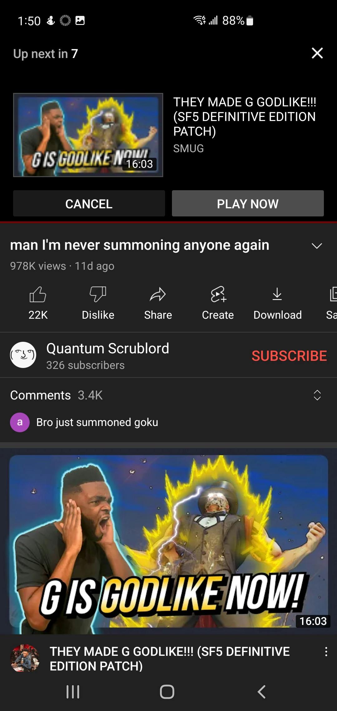
Another method of recommended content delivery is inline with the video player. When using the video player in the non-theater view mode, recommended videos will show up in a column on the right side of the screen. If the video player is in theater mode, the user will have to scroll down on the page in order to see the right column full of recommended videos.


Post-roll video recommendation (left); video player autoplay button (right, blue square)
Video post-roll (meaning after a video has fully completed) will show a preview of the next item on the recommendation column. If the user has the autoplay button enabled, then YouTube will continue to play through that next recommended item automatically.

An in-video endcard recommendation
Video endcard recommendations are another way that videos are recommended to users. If the user so chooses, they can click on the endcard that is generated within the video to watch the recommended video. These endcard recommendations are automatically populated via YouTube’s algorithm rather than using the next available video on the recommendations column.
Mobile Experience
The home section of the YouTube mobile app
Video player interface and recommendations
Post-roll & autoplay recommendations
In-video recommendations
The mobile app experience is very similar to the desktop experience in the way that each individual feature behaves. Something that I couldn’t capture that was in an earlier version of the mobile app was that they had a limited amount of video recommendations that they displayed (something between 3 and 5 videos) below the played video and then it cut off to the comments section. Now the comments section is hidden in its own section that users will need to tap in order to access, with an infinite scroll of video recommendations being what is displayed normally.
Spotify
Desktop Experience
Rather than a purely browser-based platform, Spotify is a program that needs to be downloaded and installed. Similar to YouTube, when first using Spotify the user is immediately put onto the “Home” section of the app. Conversely to how YouTube operates, Spotify will still populate different areas of the app with content labels such as “Episodes for you” and “Try something else” before a user has listened to anything rather than hiding the personalized fields and showing trending content to get a user started.
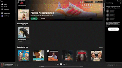
A slow scroll through the Spotify homepage
Once the user starts listening to content on Spotify, then more related fields will pop up and more tailored content will be suggested on the homepage. Unlike YouTube, Spotify also highlights content that has already been listened to. This is probably because of the nature of audio content being re-listenable more so than videos being re-watchable.

Spotify’s auto-generated music queue
Once a user picks a song to listen to, Spotify will automatically create a queue of music with algorithmic suggestions for music that should be related to the selected song.
Via an integration with Facebook, users are able to follow their friends on Spotify. This is how Spotify creates community-based recommendations by showing what any user’s friends may be listening to. They are also able to save other user’s playlists to listen to on their own independently.
Spotify has also that let users know how they can interact with the app to influence the algorithm to feed them more of a specific kind of content. Of note is that this tutorial is content that isn’t built into the in-app experience. It is also of note that YouTube has a to teach users how to influence their algorithm for recommended content.
Mobile Experience
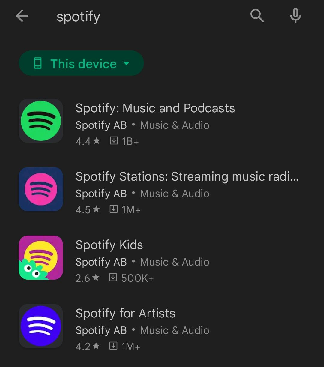
Play Store search results for Spotify
Out of the gate, the mobile experience of even accessing the Spotify app is very different than how it was on the desktop. Upon searching for Spotify on Google, it was easy enough to find the top link for it to get to Spotify’s main website which pushed me to download the app. When looking for Spotify on the Play Store, I was greeted with a few different options and it was confusing to know which app would be the correct one to download to simply listen to music or podcasts.
Spotify’s mobile app onboarding
After selecting a few artists
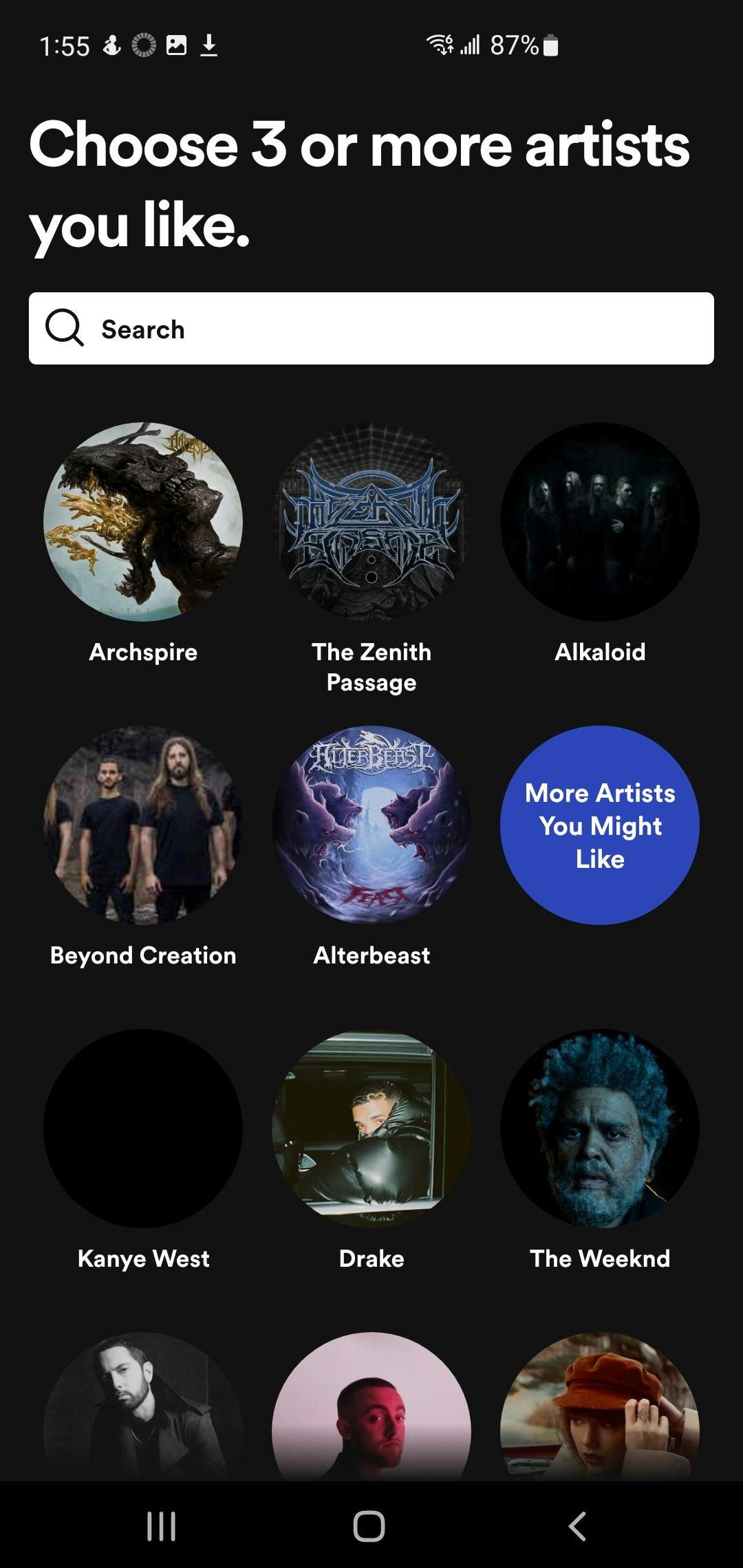
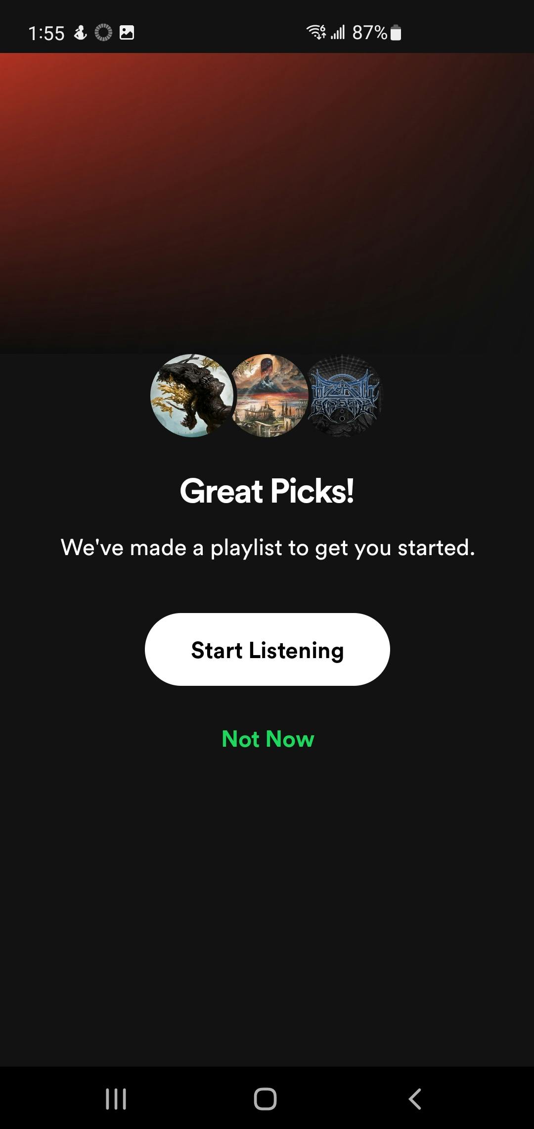
Contrasting the desktop app, Spotify’s mobile app puts the user into an onboarding process the moment a user finishes signing in or creating an account. The user is prompted to select a few artists (or search a few artists to select them manually) in order to tailor the automatically generated playlist for the user’s interests.
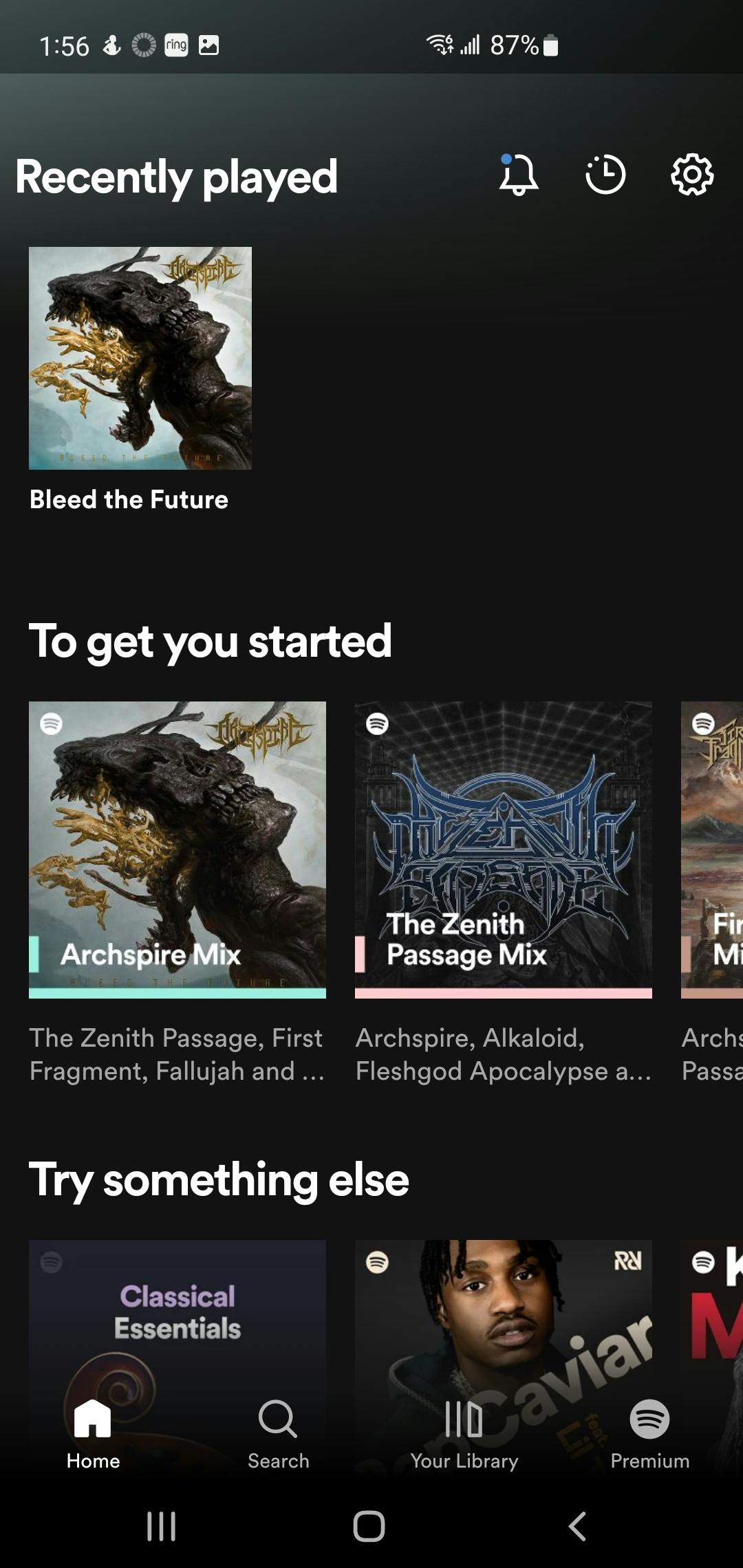
The Spotify mobile app homepage
Spotify’s mobile homepage mirrors that of the desktop’s homepage as a very long page that users can scroll down to view recommended content. Since the resolution of phones is much more narrow than that of most desktops, the rows of recommendation require horizontal scrolling to see all of the content that is suggested. Similar to the desktop app, only 3 rows of content are viewable at a time (based on my devices and those resolutions, it may differ for devices with higher resolutions).

“Now Playing” screen of the mobile app
In a large divergence from what the desktop app does, the mobile app has a full screen to display the currently playing content where the desktop app simply has a tiny corner of the app that shows what is playing with a chin of controls (play/pause, next, previous, volume control, etc.). To speak a bit more to how I got to this screen, I tapped on the first album art that I saw under “to get you started” but it started playing music from a band that differed from the one associated with the album art. Once on this screen I searched around for ways to view the auto-generated playlist queue, but I couldn’t find any controls for that. After searching around on the internet I saw screenshots of other users that pointed out how to view the play queue via a button on the “Now Playing” screen, but I wasn’t able to access the player queue on my own end.
Quick Research for Other Platforms
Takeaways & Findings of Market Research
I mention this because it doesn’t seem that algorithms have to be absolutely perfect to get people to use recommendations on a product. Making sure that the user experience is top-notch takes precedence over algorithmic implementation and improvements. That doesn’t mean that there is no value to having a good algorithm, it is more to say that algorithms are not core to the user experience.
2. Let communities be algorithms.
Many of these platforms allow users to interact with or create their own communities so that users can get ideas of what content to check out based on other users. Whether it’s having friends on Spotify or reposting/retweeting a la Twitter and Instagram - users love to suggest content to each other and getting content recommended by like-minded individuals. To hearken back to the user interviews, people are more likely to engage with content recommended to them from others with similar interests so having a non-algorithmic method for users to get content to each other is a great way to keep users on a platform. If a platform doesn’t have a way for users to share content built into it, users will simply hop off and find a different platform where they can do so.
3. The power of scrolling.
Every platform that I looked at for market research makes use of scrolling for content discovery. Some of these platforms are built with scrolling in mind as the base mode of interaction (Twitter, Instagram, TikTok) so in those cases, content discovery was simply slotted in to the existing experience. All platforms understand that scrolling has less friction than tapping or clicking (see articles about this phenomenon
,
,
, and
) so they make sure to have content that users haven’t seen before be tied to scrolling to increase user retention on their apps. YouTube has infinite scrolling to see video recommendations, Spotify’s home screen has loads of content that’s a mix between content that a user has already listened to and recommended content that users can scroll through to view. 4. Recommended content should be just as easy, if not easier, to access than content that users already know that they will like.
On every product with product recommendations, it is built to make them front and center for users. YouTube’s homepage is populated with only recommended videos that populate infinitely when scrolling, while accessing subscriptions requires a click on a small element on a column on the left side of the screen. Spotify will put users directly on the homepage where they can place recommendations and suggested content front & center, while accessing libraries and playlists users have already saved requires a click or a tap. Instagram and Twitter have a single focused experience based on scrolling so they just add suggested content directly into users’ feeds.
Platforms are designed to push recommendations to get users to stay on the platform longer therefore increasing the chance of conversion or to getting additional ad revenue from engagement. Increasing the friction between users and content that they already like plays into the psychology of scrolling versus clicking. Since scrolling is more of a continuation of what users are already doing while clicks are seen as more of an intentional action, users aren’t put off by an additional click to accomplish something that they set out to do upon opening the app. If users don’t know exactly what they’re looking for, making use of scrolling to load more suggested content is a great way of increasing use time of the platform.
User Personas and Journey Maps
Based on the previous user interviews and survey data I created two user personas to segment the user base into two categories: existing Twitch users and first time Twitch viewers. Doing this for the user personas gives insight on the differences between the ways new and existing users find new content on Twitch. This will also inform what forms the solution may take to solve for the new and existing users’ pain points.
User Personas

John is the persona for an existing Twitch viewer who is looking for content to fill in gaps of time while streamers that he already follows aren’t live.

Kelly is the persona of a new user that only heard of Twitch recently and is looking to explore content on Twitch that she can’t find anywhere else.
User Journey Maps

John’s User Journey Map

Kelly’s User Journey Map
Solution
Now that the bulk of the groundwork is laid out, I’ve come up with a few potential solutions to solve for the issue of discoverability and recommendations on Twitch.
Matrix
I created a matrix of a few solutions for the recommendations in order to lay out the tradeoffs for implementation of any particular solution.

I will put further thoughts that expand upon each proposed solution and how I arrived at the estimations for impact, cost, and time below in the next section. One thing of note is that much of this is via the conjecture of a singular perspective and in a team setting would be collaboratively estimated, potentially with quantifiable metrics from existing data on previous projects that were similar.
Platform Redesign
Multiview (Squad) Recommendations
Automated Hosting
Required Tags
Decision
The solution that most directly targets the initial problem would be to go for a full Platform Redesign. Of course the biggest drawback is monetary and temporal costs in a real-world setting, but for the sake of this exercise these will be non-factors. Additionally, in actual business settings any inkling about going forward with a full platform redesign would have many cycles of validation and research before any actual work would be done on the project. Since this is an exercise and there aren’t multiple teams that I can collaborate with to create a platform redesign, I will move forward assuming that approval for the project was obtained and all the steps of validation have been fulfilled.
Formulating Epics and Stories
Since our initiative is to improve the recommendations portion of the platform, we can start creating epics and stories based around the initiative. This will operationalize the different action items that will need to be worked on to complete the project.

To break down the epics and stories I created a chart to act as a visual guide to easily understand them at a glance. Our solution, in this case completing a platform redesign, will act as the epic that informs the individual stories for what might be involved in a platform redesign.
The first story for the epic are to create an onboarding flow for new and existing users to get them familiarized with the platform. Since the platform redesign will alienate some users and confuse them about how to navigate the site, offsetting this phenomenon by creating an onboarding flow is crucial to reduce user dropoff. Something to keep in mind when creating the onboarding flow is that the platform redesign will be rolling out piece by piece rather than a complete overhaul dropped all at once. To solve for this issue, the onboarding flow can be segmented into the individual changes made for each page. Dividing up the changes to be individually understandable makes it so that the onboarding for different pages can be fed to users as the changes are rolled out while also creating a comprehensive flow for any users that are joining Twitch sometime during the redesign.
UI work is divided into the other 3 user stories, each for a different section of Twitch’s platform experience that will be redesigned to accommodate for the recommendations feature to be pushed harder. Areas for the redesign would be the homepage, the navigation bar, and the view while watching streams. Since so many of these different areas would be redesigned, there could potentially be another project for other areas of the site (e.g. Following, Browse) to be changed for consistency with the new designs. These are additional considerations for more user stories, but outside of the current scope.
Wireframes
Current Layout
First, I created wireframes for the existing layout of the two pages that we created stories for: the Twitch homepage and the stream view. This is done so that the changes to the site layout will be easier to understand at a glance.
Homepage

Stream View

Redesign Layout
Much of the market research informs how the homepage should change, so that will be the first section that I make changes to. Changes to the navigation bar will be wrapped up into the homepage change since the navigation bar is an element of all pages.
Homepage

This layout is what I came up with for the Twitch homepage redesign. It populates fully with only recommendations for streamers to watch and check out, all who are algorithmically chosen based on metadata of what creators that the user follows and watches. There’s a half cutoff of the suggested streams at the bottom to indicate to the user that they can continue to scroll down to see more different recommendations. I have also changed the way that the stream thumbnails are displayed from the way that they were displayed on the homepage previously.
The sidebar was removed entirely so that users can more readily engage with recommended content rather than going to content that is familiar to them. This change was inspired by the market research that was done earlier and is intended to make users engage with streamers that are recommended to them rather than only giving their viewership to streamers they already follow. Users don’t necessarily lose functionality this way, it is simply an extra click to get to the streamers that they follow.
Of note is that the Twitch selected featured streamer reel has been removed entirely from this design. To offset this loss, featured streamers can be marked differently on this page. Some ideas for a solution here would be to add an icon to the thumbnails that shows that the streamers are selected to be featured by Twitch. Highlighting the streamer’s avatar in a different color could potentially be another avenue to explore for denoting featured streamers. This mitigation effort is something that would need a bit more research before going forward with any additional changes.
Thumbnail Changes

Two main elements were removed - the current viewer count, and stream tags. Since the goal is to increase engagement with more different kinds of streamers, I decided to get rid of the live view count from the thumbnail so that users aren’t sucked into the orbit of streamers that already have a large amount of viewers. This should deter users from visiting streams that don’t necessarily need the help in gaining viewers and spread the viewership more evenly to creators that may not have the engagement that they would without the change in discovery.
Stream tags were removed to improve clarity and make room for more rows of streamers on the homepage. Utility of the tags is somewhat limited as well, since at a glance it doesn’t necessarily help a user decide on whether or not the content that they’re about to click on is going to be much more different than anything else that they watch. If anything, tags are best for gathering metadata to further improve the recommendation algorithm. Users always have the option to search or filter via particular tags as well, so removing them for clarity shouldn’t impact users ability to navigate through the list of streams.
One small change that may make a large impact is giving the streamer an extra line of text for a stream title preview. Similar to removing the live view count, giving streamers a bit more space to create an enticing stream title to attract viewers should allow those users to compete for attention on the recommendations page. The bolded “Stream Title” on the design was to denote that users should have the ability to use alternative formatting to express themselves more freely with the stream titles.
Navbar Changes

The most striking change to the navbar that I made was to add in the text Twitch logo alongside the icon. Without the text logo, the usual button that brings users to the Twitch homepage has a lot less weight than the elements next to it. Since the goal is to get users to engage with more recommended content, increasing the size of the button that takes users to the homepage may help to increase the engagement for the new design.
“Browse” was relabeled as “Categories” to more aptly describe the page users will be taken to, and changing the name allows for more additional features in the future that might allow users to browse for different kinds of content. “Categories” and “Following” were then switched in their placement to promote users to first engage with the homepage and check categories before accessing the users that they already follow. Similar to the changes with the homepage, this will hopefully get users to engage with the recommended content or search out new content before defaulting to the streamers that they already enjoy. Of note is that this is coming from a western perspective on how users scan through a webpage since most English-speaking countries read from left to right. This may not necessarily have the intended impact given a country and language that reads from right to left.
Homepage Onboarding
Since elements were moved around and the homepage has a totally new look, users will need to be refamiliarized with where all the elements are. To cover everything that users need to know about the redesign, the onboarding has a few points that it needs to cover:
Stream View

Due to the stream viewing experience being Twitch’s main area of excellence, I didn’t want to make too many changes to the layout of the streaming page. Instead I only made changes to the sidebar to only show recommended channels. Users may not immediately check out the recommended streamers, but the exposure via the usernames may produce an uptick in traffic towards those streamers. One feature of the sidebar that was removed was the ability to collapse/expand the sidebar. The stream player already has a built-in button to be able to view the stream in what’s known as “Theater Mode” that will expand the stream player and the chat to fit the entire size of the browser which somewhat mimics the effect of collapsing the sidebar. Since this feature is redundant and the goal is to increase engagement with channel recommendations, making the sidebar static shouldn’t hurt the viewing experience very much.
Next Steps
Now that the lo-fi wireframes have been created, the changes are going to need to be tested. This can be done with usability interviews internally or by getting a random sample of users and doing A/B testing for the changes. Once the testing has been completed then high fidelity wireframes can be completed and down the line go into full implementation. With something as sensitive as redesigning an entire platform that already has so many dedicated users, getting as much testing done as possible before shipping out the changes is critical to making sure that the redesign doesn’t flop.
Success Metrics
Since the goal of the redesign was to increase the viewer engagement with more different streamers the metric there might be to track the average number of streamers that users follow and see if that shifts after the redesign. More importantly, the number of streamers that are subscribed to, Twitch Turbo subscribers, and number of bits being sent to streamers would be strong metrics to track since these features are directly tied with monetization of the platform. Total watch time with the platform is another metric of consideration, since that may be correlated with how many different streamers users tend to watch. It might be the case that viewers tend to watch the same streamers but have found other streamers that they can hop over to when their original streamers aren’t live.
User sentiment is also important to keep an eye out on any changes that might need to be made to the new design. This falls a bit more under the realm of community management and the difficulty there is trying to distill the useful criticism from what might simply be people who are upset that the layout changed at all. Communication between the product team and community management team to make sure that both teams are in lockstep with how to talk with the users to set expectations as well as understand what kinds of changes should be made given that there will be many areas of improvement.
Future Considerations and Opportunities
As was stated previously, many other areas of the site have the opportunity to be redesigned. For example, the thumbnail and stream title previews on the homepage aren’t displayed the same way on the currently existing “Browse” section of the site. Redesigning the “Following” page can be another undertaking as well to make the experience of that page more cohesive and intuitive, especially if users interact with the “Following” page more now that they have to visit that page rather than only using the sidebar.
More features can also be pushed forward to increase the discoverability of channels, a few of which were identified in the user journey maps. One example of something that might be worth creating is an additional “Clips” page. Twitch already has the ability to create clips of streams and communities online compile and share these clips with each other. The popular page on Reddit “Livestreamfails” is one of these communities and many of these users discover up and coming streamers to watch from the clips that are shared. Twitch has the opportunity to create a page directly on the site that shows clips and be able to convert the Livestreamfails users to engage with the content on Twitch instead of externally.
Twitch might also benefit from a page that shows non-algorithmic recommendations. Similar to YouTube’s “Explore” page, this new page might show the top trending streamers or clips of any category to expose users to more different kinds of content that they might not normally watch on their own. This runs a higher risk of being a feature that lacks engagement than any of the other previous two features, but may be worth looking into to further expand upon the kinds recommended content Twitch can push to users.
Thank You!
I appreciate the time that you’ve taken to read the case study! Feel free to check out any of the other projects that I’ve done by revisiting the main repository page. Let’s connect! You can find me via the links below.
Want to print your doc?
This is not the way.
This is not the way.

Try clicking the ··· in the right corner or using a keyboard shortcut (
CtrlP
) instead.