Skip to content
Information moves so quickly that it was difficult to keep up as a regular layperson. This is true both for policy surrounding COVID-19 as well as scientific developments about the capabilities of the virus as well as suggestions on how to best combat its spread.Terminology and jargon can be intimidating and difficult for people to understand.People like to engage with their network and trust insights from their community.Trying to find multiple sources relating to a particular information source to validate it can be difficult and time-consuming.Many people have difficulty discerning what information is fact as opposed to narrative driven.People fall too hard into an echo chamber effect where the only voices and opinions that are heard tend to be from sources and other users that have the same opinions
Users like having a community to engage with around the news that they consume.Users like being able to view multiple sources to validate information about their news stories.
The world has moved on from the “debossed” card view on to full-bleed list items. This makes use of more screen real estate while maintaining the distinction between the individual items on the screen (be they Tweets a la Twitter, or image posts from both Reddit and Instagram).Forehead/chin navigation for each separate feature is universal. Sometimes these areas are also used for different categories of items like subreddits on Reddit or categories of news on both Google News and SmartNews. Twitter and Instagram handle the categorization via #hashtags that users have to fill in on their own for each individual post. Later when users want to sort out any particular category of posts, they can navigate to the search function and type in the hashtag to filter for posts containing that particular hashtag.Settings for the apps tends to be hidden from immediate access. If the app requires an account, the settings menu is often placed under the account section of the app. This is of note because this wouldn’t necessarily be an intuitive design since app settings seem to be a very separate category from a user’s profile.
Screen 1 Screen 2The “Snackables” feature of the app was put on screen 3, as well as the previously mentioned government updates section.Screen 4 is the comment interactions section of an article, with the upper part of the screen being the article of the discussion. Screen 5 was an iteration on the idea we had for “verified articles”. We wanted to get an idea of what it might look like if an article was marked as verified by 3rd party sources.The list of favorited articles went to screen 6. This is primarily so that users can go back and reference apps that they have saved in the past.Screen 7 was an idea of how we would have community interactions. We already knew that we wanted to have interactions in the form of comments on any news post, but we were playing around with creating a forums section so users could have more meta-level discussions.
Project Repository
- Pages
Share
Explore
 Product Splash
Introduction to Product Splash
Product Splash ‘21 was a 5-week event hosted in collaboration by both Design Buddies and Product Buds for a pool of applicants to form teams and design a product from scratch to prototype. These online communities help young professionals looking to transition or learn about product management and design. They provide mentorship sessions, webinars, and networking events connect people with industry leaders within product. For the Product Splash ‘21, these resources were made available on a tight timeline to loosely guide participants through the product process. Our team’s composition ended up being along the recommended guidelines: two product managers and two product designers.
Product Spash’21 Prompt
Your challenge is to integrate the lessons and friendships gained from a life dependent on URL into a reimagined world IRL (in real life). Using your product sense and design thinking skills, explore and find innovative ways to support the transition from pandemic life to a more hopeful & inclusive future - with a new mobile or desktop app.
A slogan used for brevity’s sake to refer to the prompt was “Healing from COVID”.
Additionally, our team was composed of two product designers and two product managers.
Deliverables
Adobe XD prototype, 10-15 slide Pitch Deck, Case Study
Our Approach
Since the prompt given was so broad, my team came together and started by listing out general app ideas keeping in mind what concerns that people have most transitioning from an at-home lifestyle during the pandemic to a lifestyle that involves more in-person interaction. We had a brainstorming session where we proposed our general app ideas for problems that we’ve learned about and experienced over the past few years with COVID-19. One of the group members worked in the education sector so their app idea was an app that helps students between at-home study and in-person courses to make their educational experience more seamless. Another group member was living in India and at the time, they were suffering through a large outbreak of the delta variant. Due to this, their idea was to create an app with a strong network effect to create safe routes to work based on self-reported contact tracing. In the end, we all collectively decided to design for a news app.
Team Background
Firstly, it is important to recognize the biases of our group due to our demographic - we’re all young Millenials/Gen Z and we live in fairly densely populated metropolitan areas. What may be important problems for us may not necessarily be things that are of concern for users of the app outside of our demographic. Keeping this in mind, during our brainstorm we identified a globally pressing issue: information regarding COVID-19.
Explorations
We had many considerations and potential roadblocks that came up as a result of picking a news app for our solution. One of the first things that we had to figure out was what the target demographic would be for our app. Making a news-based app already creates a segmentation of audience based on their views about news media. These users are also further divided, or even excluded, from the potential user base due to the main topic of the news app being COVID-19 information. Understanding this, we knew that the audience for our app would likely be users of similar environments and background to us.
Now knowing what the userbase would be, we bounced ideas about what common issues people experience because of information and stories around COVID-19. Among the concerns that we postulated were:
Problem Statement
To condense the issues that we are solving for in a concise manner, we created this problem statement that would be our compass to point us in the right direction for the rest of the project.
People have difficulties returning to in-person activity because of difficulty understanding the rapidly developing stories regarding COVID-19. There’s a gap with the average layman’s understanding of COVID-19 compared to the studies that are reported on, with many resorting to take their entire understanding of the virus from their local networks. This further exacerbates anxieties related to the pandemic and future in-person activity.
User Interviews and Surveys
To take advantage of the fact that we were participating in an event with multiple teams, we created a survey that we pasted to the Product Splash Discord server for other participants to to fill in. The multiple choice portion of the survey was designed to mainly get demographic information for the quantitative data about our users. Another portion of the survey had short answer prompts created to get a better picture of how news is integrated into the lifestyle of our users. Using information from the short answer responses we can identify pain points that they have with news in their day-to-day.
Separately, one of the designers and I came up with user interview plans for longform interviews to get qualitative information from long-form conversation with our peers. Being able to ask follow up questions and dive deeper into areas of interest is helpful to inform our future design and feature ideas. I created a user interview plan to get the most important top-line items that I wanted to cover and I asked follow-up questions where appropriate. Below is a link to the user interview plan as well as a transcript of an interview.
Takeaways
As we foreshadowed with the biases of the group, most of the users surveyed and interviewed were from a similar demographic - especially in terms of age. Answers from the survey indicated that most of them were either concurrent students or young professional starting on their professional journey. A majority of the users check the news relatively frequently (at least 1-2 times a week), while 22.8% of the correspondents do not check news whatsoever. Of those that do frequent the news, a majority of them check via the internet.
For short answer questions of the survey, we asked users why they like using the sources they use (whether it’s a physical medium or if they check news via a particular source/app). This question was for the purpose of getting useful information about crucial features that keep people on their particular news source. Two common key reasons why people use the news apps and sources that they do are as follows:
When asked for the reason why people check the news, responses were split between those who simply like to keep updated on what happens globally and in their communities and people who want to keep updated on the latest information about COVID-19. This information is a bit tricky potentially due to the sampling bias present in the users that we took the surveys from, but to confirm questions that we had about how news about COVID-19 affects people we asked more in-depth questions with the users that we interviewed. The response that was most interesting to our group was that people feel more safe when they are armed with knowledge about COVID-19.
User Personas


Features & UI Research and Ideation
Potential Features
Carrying over the insights that we gained from the user interviews and surveys, I got together with the team to figure out some solutions that we might have for some of the required features as well as to solve any lingering issues that were brought to attention from the interviews and surveys. Based on the earlier insights, we knew we needed features to be able to create some sort of community engagement and another feature that allows users to tie multiple sources to any particular story. The other project manager and I got to work doing market research to see what kinds of existing solutions for these issues were present on existing news applications.
Market Research - Google News
Many users responded that they used the Google News app on our survey so I decided to open the app myself and see why so many of the respondents use it for their daily news searches.


The big standout feature that Google News has as an app is that under the “Headlines” section of their app, they present new breaking stories that have multiple sources reporting on it. They intuitively indicate that the story has multiple sources by having cards for each source and placing the subsequent cards toward the right side of the screen. This gives the user a sense that the different sources for the particular story are on a carousel that can be swiped over to see how other outlets are reporting on a given issue. Upon clicking “Full Coverage of this story” a new view is presented where users can scroll down to see the headlines and name of all of the sources for the story.
Some things that I felt could have been done better is the “For You” page as the top recommended stories were never necessarily relevant to my interests even after checking the app over the course of a few days. This may simply be an issue with their algorithm but it doesn’t seem to function quite the way it should. I also felt that the associated image with the stories was way too large, which means only one story can be present at a time on the screen. I think that the spacing and size of each story could be smaller to make room for at least two or three stories on the screen at a time without making the app cluttered and making it easier to see upcoming stories.
Market Research - SmartNews
The top rated news app on the Google Play Store was SmartNews, so I downloaded it to learn more about why this app is particularly successful. 


SmartNews’ approach to showing personalized content is to first show news that is local to the user (in my case, news from my state, California). Options are also abundant in terms of customizing the experience of the app if a user wishes to do so. This goes for anything from changing the order of the different categories of news (referred to as “Channels” within the app) to having a more customized theme to manage the appearance for the app. The default theme of the app pulls on the theme of the device - in my case the app opened up using a dark theme since my device theme is set to dark as well.
Market Research - InShorts
My partner product manager wanted to take a look at a news app that was popular in his home country of India. He explained that the main draw to this app is that they create bite-sized news snippets to give context to and summarize the article and from there, users are able to view the full article.
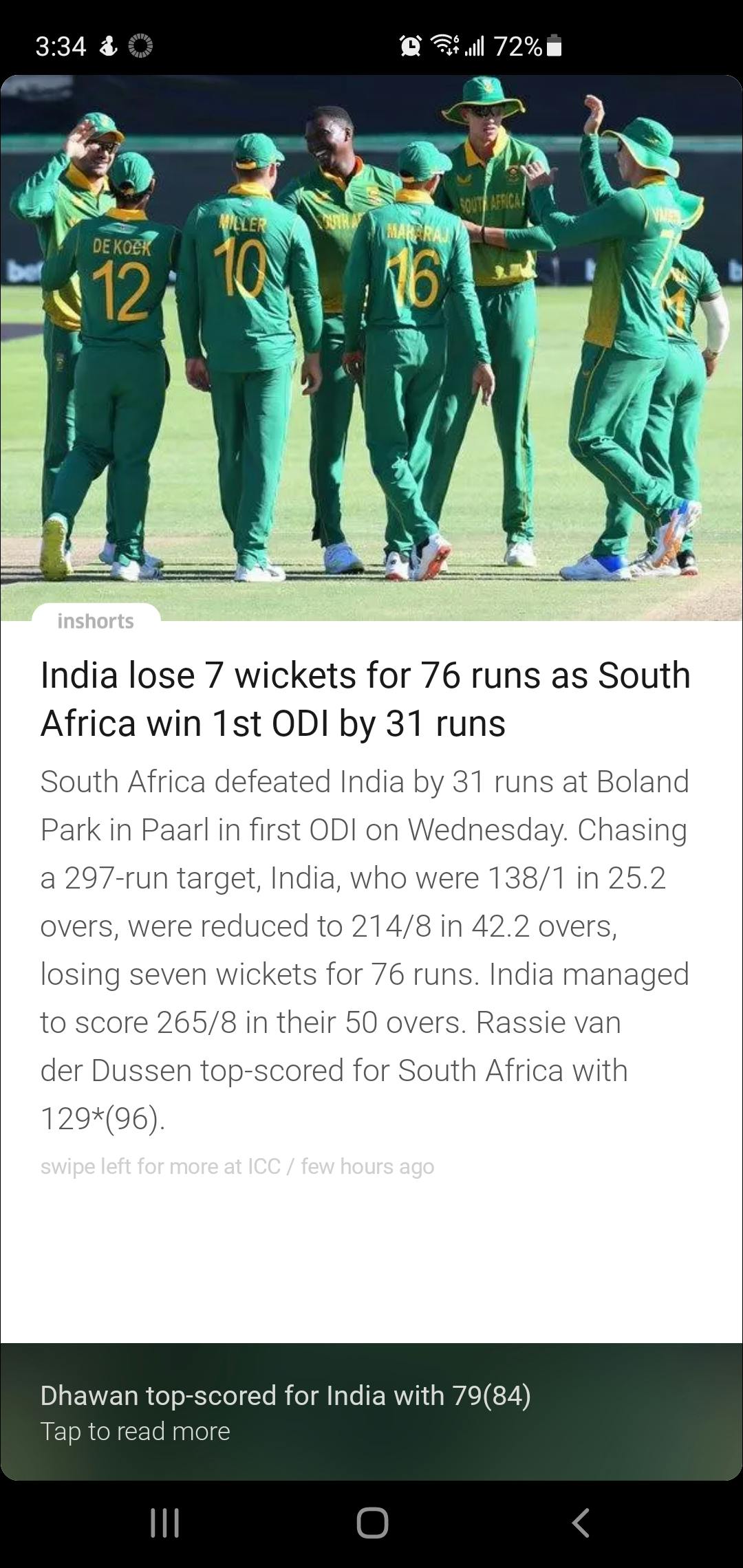
Much of the news is specific to India, so we mostly looked at it for feature ideas and ideas for our UI. Since the user demographic came out to be mostly young professionals, we felt that there would be value for the users to have a bite-sized (what we will refer to as “snackable”) versions of stories to make content consumption quicker as many young professionals have difficulty finding the time to be able to do deep research on complex topics that come up in the news.
Aside from the highlight feature of the app, I didn’t find a whole lot that I loved about the experience of using it. The stories are only displayed one at a time with a small prompt to tap for the full article. This uses the entire screen space for the condensed version of a single article which could very easily be the full article instead of just the snackable version. Another issue that I took with the experience of the app is that navigation isn’t intuitive. Upon first installing the app it will give a bit of a tutorial on how to navigate through the app, such as swiping upward to get to the next story or swiping left to read the full article. As the app teaches the user how to navigate it simply gives the direction to swipe and doesn’t exactly explain what the action is supposed to be teaching the user. It also integrates their ad placement into these actions which creates a disconnect between what the user expects to happen and what may actually happen when using the app normally.
Additional Features
Other features that we figured would be vital to overall usability of the app were searching, sorting & filtering, and saving articles for later use. Another idea that we had was to have posts be “verified” (in actual execution it would probably be a 3rd party fact-checking agency), but that wasn’t something we pursued because that feature would be quite difficult to execute for the small prototype that we were dealing with. We also toyed with the idea of having a section of the app dedicated to recent government updates that are of relevance to COVID.
These are features that we were not necessarily going to design out fully due to the time constraints, but we wanted to keep elements in place as they would be important for any future iteration on the app. It also gives us a better idea of what the direction is for the overall feel and look of the app, so we decided that we’d have a few screens designed for these features even though the functionality wouldn’t necessarily be in place for the final prototype.
UI Inspirations
To create an intuitive experience for our target audience, I took a look at different apps from their user personas. This meant looking at the UI for many popular social media apps such as Twitter, Reddit, and YouTube. Additionally, I looked at the previously mentioned news apps to see how apps within the same market create their experiences.
Upon examining these apps, a few commonalities came to attention:
UI Decisions
The three points outlined in the previous section informed the general layout of our UI. This was also kept in mind when designing for the features that we wanted to add in as well - namely a way to place multiple sources to a single story as well as a way for users to interact with and create their own communities.
Low Fidelity Mockups
UI Ideations
Quick Mockups
With this in mind, I created a few super low fidelity mockups that I passed on to my designers to get their opinions.

This was my first UI concept. I placed a placeholder avatar of the user in the upper left corner which upon being clicked would open up the “My Account” section of the app. The bottom navigation bar has the Home screen which would be the user’s regular news feed, a Search button where users would search for any particular headline, a Heart button that would be for articles that the user has favorited, and the Sort button.
Upon further thought, I decided that the sort button was superfluous as a navbar item so I replaced the menu item to be access for the “My Account” section. Since that mostly settled the bottom navbar I updated the navbar and I put forth my idea of what the news items should look like.

I sent these two images to my designers to give a visual metaphor for the difference between card view and the full bleed, 0 margin view that most modern apps adopt. While I was giving these basic ideas to the designers, they came up with a few designs of their own.
Designer Low Fidelity


These screens will be referred to in numerical order from 1-7, left to right, top to bottom.
The designers came back with these ideas for how they envisioned each page to look. Many elements are rudimentary, such as having 5 menu items on the bottom navbar as well as leaving a search function in the upper left of the main UI even though there’s already other ways to access the search function. The upper right hamburger menu is for quick app settings access - yet another UI element that we weren’t sure if we would keep going forward.
A brief explanation of each screen:
We had a bit more discussion around the elements that we wanted to change after creating these lo-fi screens. Since the deadline was approaching fast and we had a better idea of what we wanted the final prototype to look like, we decided to move on to the next step.
High Fidelity
Onboarding Flow
One discussion that we had was how we would customize the content to the individual users as well as whether or not we wanted to have the app locked behind account creation. Since we decided that community interaction would be a core feature of the app, we went forward creating an onboarding flow that both sets up a user’s account and starts the customization process to tailor content to their particular interests.


One concern due to customized news is that users can fall into echo chambers that only validate their own opinions. This combined with the earlier verified post feature were ideas of the app that would need much more exploration before adding them into the app as full-fledged features.
Home Page
This was the final iteration we had for the home page. All of the general elements from top news to trending to the snackable news are accessible by scrolling down the page.


Forums
We created the forums section of the app to allow for user communities to be created. The forum topics would show up as individual items and users can tap a topic to reveal the full post as well as the replies.

Post & Comments
This is the area of the app that we expected most users to be spending the bulk of their time on: viewing articles and interacting with other users via the comments.


Search
Search ended up looking quite a bit better than the impression we had from the original low fidelity mockup. The elements are distinct and easy to understand at a glance and enough information is presented to be able to navigate to the features that the user wants to access.

Favorites
For saved posts, we had the screen separated into two separate elements: individual saved articles and snackable articles. Users can revisit the different snackable snippets and articles that they’ve favorited from this page.

Prototype
The final prototype was a single experience from creating an account through to posting a comment on a post. This included navigating to a post, scrolling to view comments, and posting a reply to other comments on the article post.
Next Steps
Other features of the app need to have a prototype designed for them to flesh out what the interactions look like. Once all of the existing features have been developed out into prototypes, the next step would be to conduct user testing to get feedback on what about the experience can be improved.
Additionally, there are features that aren’t fully implemented that require a lot more research and consideration before implementation. This includes features like having verified articles and newsfeed customization. Features like this can go any number of different ways depending on the goal of the app and execution of implementation. For example, should the goal of the app be to offer varied news from multiple different sources to give the perspective from many sides of an article, then there may be conflict with this goal when marking articles as verified. Algorithmic implementation for news feeds would have to account for providing a balance of news articles for any particular story. On the other hand, if the goal was to stick purely to anything that can be factually verified the execution of the features would change a lot.
Monetization of the app is another consideration for future steps. More research and testing for implementation of monetization would need to be done, with user surveys on different iterations of monetization methods. If the app goes for the free-to-use model, then advertisements will have to be placed in the app but the method of delivery needs to be considered. The app can also be monetized via a subscription model, or some combination of free and subscription-based. The kinds of ads shown on the app also needs to be carefully considered in order to align with the goals of the app and features that are implemented.
These are just a few considerations of an infinite amount of possible ideas since the prototype is a very small MVP that doesn’t fully capture the potential scope of the product. Much discovery work and research would need to be done for future development of the app.
Improvements/Retrospective
Taking the app from nothing to having a working prototype that I could interact with was a great experience. The narrow time limitation spurred a lot of fast growth and also made it easier to learn hard lessons that would otherwise be more costly in a professional environment.
One of these takeaways was that establishing processes early. Getting down how the team will communicate, what tools will be used, and how often the team should sync was a conversation that we needed to have much sooner than we did. Additionally figuring out peoples’ schedules based on their time zones was another issue that hurt productivity at times. Learning what the best way to communicate with team members synchronously and asynchronously was a challenge to do as the We also didn’t establish a central repository early for the work that we were doing and thus couldn’t cross-reference information with other teammates in real-time. A lot of these small processes on how a team should operate definitely needed to be established early on and while we did touch upon these issues, we didn’t get enough people on the same page as to what exactly we were going to settle on.
Another hard lesson learnt was to come up with a loose product roadmap early that would be revisited and updated throughout the duration of the project. Doing this early acts as a bit of a “north star” for the project that team members can look towards if they’re ever in need of guidance on next steps. What ended up happening was that the product roadmap was figured out in the middle of the project and because of scheduling conflicts, some parts of the project were put on a much slower timeline than they should have been, resulting in a bit of panic when due dates approached.
All in all, the project did well for being a short sprint that we had to create from scratch especially given the experience level of the team members on design projects. I learned a lot from the experience and will definitely be taking these lessons to heart when working on future projects.
Want to print your doc?
This is not the way.
This is not the way.

Try clicking the ··· in the right corner or using a keyboard shortcut (
CtrlP
) instead.