Skip to content
Product designer (me) - Competitor Analysis, wireframes, UI Design, prototyping, testing, and co-organizing stakeholder workshopsUX lead (managing design sprint and stakeholder workshops, and cowriting user stories)Me: prototyping, cowriting user stories with the UX lead, making the first UX concept in sprint day 4, making and testing the final prototype Product owner (managing deliverables, writing user stories and communicating with the Dev agency)Design system lead: (UI consulting)
People found it good with the nutrion circular labels and the info buttonPeople knew how to scan a customer card and edit the cart Users liked the allergy details and noticed the combo benefits and liked that all products are displayed with large images most users managed to make an order
Recruiting 5 internal users from our colleagues but we made sure they had nothing to do with the IT team (age between 35 and 55)Define key scenarios we want to test scenario 1: your wife doesn’t want to cook and told you to pick up for a Fried chicken meal for herSenario 2: your partner sent you this coucher for a free cuppocino how would you redeem it Scenario 3: you saw this redbull stand beside the order terminal and you want to add this redbull to your orderWrite user test guidelines Prepare test material We used a touch frame on a 27 inch screen to mimic the order terminal experience We used a fake scanner built from cupboard and a small flashlight We used a phone stand to record the interview
less is more (focus on the most bought dishes), we had a lot of dishes to offer pay attention to the surrounding, place the terminal close the entrance and free the area around it to give the customer the space and comfort to order. And remove and distractions from the background such as posters and offers We need to prompt the user to scan their customer cards at first or give them a button to scan it in the checkout page because they usually forget it customers forget to pick up the receipts so we need to remind them to pick it upCash payment is very important and should be placed 2nd after the card paymentpeople ignore the upper part of the screen the menu needs to be updated everyday to reflect what is actually offered in the kitchen. Focus on freshness and local ingredients, people click on images, the more appealing it is, the more they will click
Share
Explore
 Billa Self Service Terminal 2022/2023
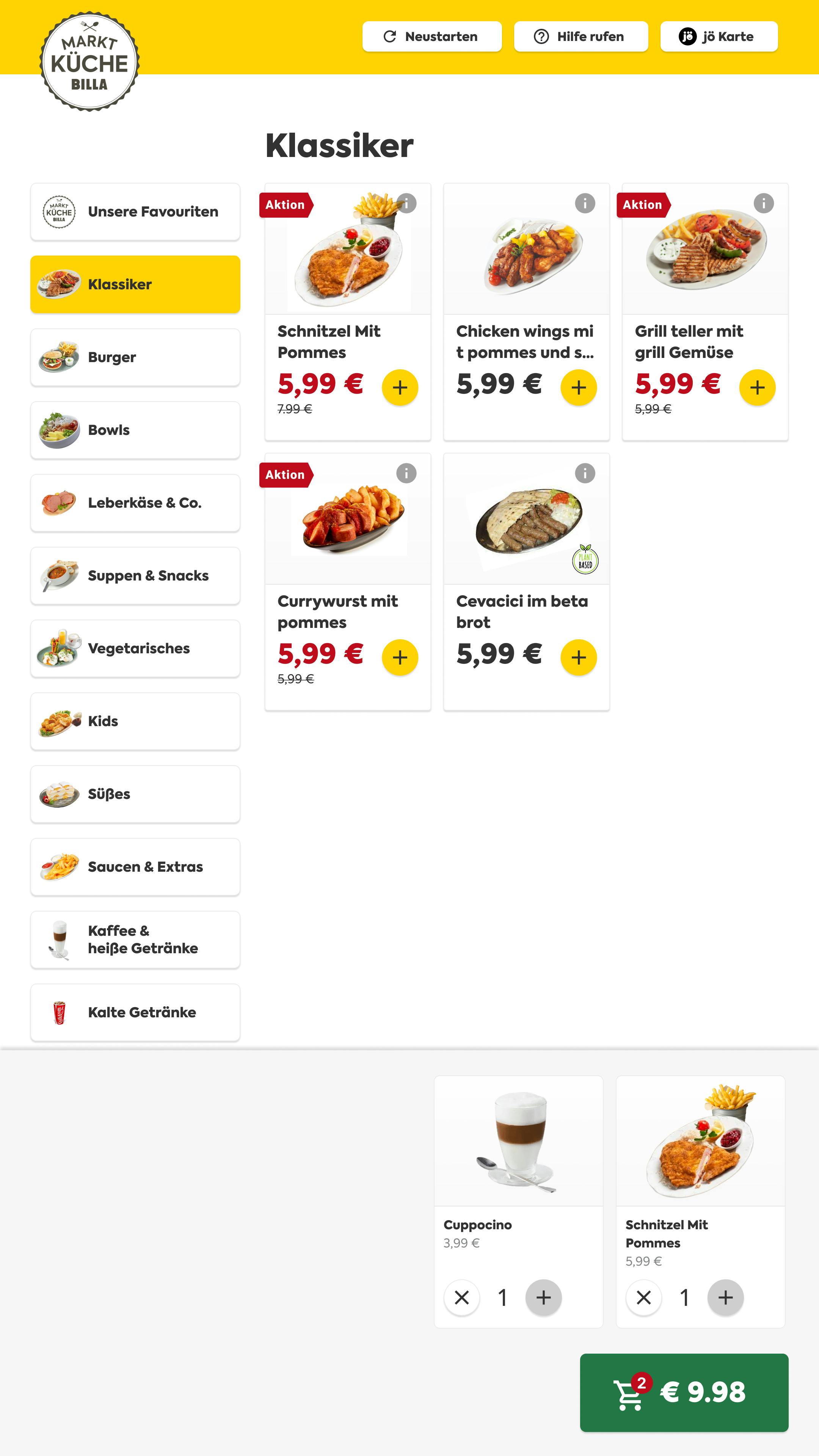
Billa has a sub restaurant brand, which is Billa Market kitchen, they wanted to offer a self checkout experience for their customers who visited the restaurants in Billa Branches in Austria. It took 5 months from the first kick off meeting to the go live date.
Company
REWE Group
Duration
4 months
Role
UX/UI Designer & Researcher
Watch the video prototype 👀
Project Team & tasks
The process


1. Design Briefing
In this step me, the PO & the UX lead gathered the stakeholders to find answers about, goal of the project, target group, which features would the minimum acceptable go to market product include and which resources and timeline we’re constrained by.


2. Competitor Analsis
In the design briefing we decided to do a design sprint with all stake holders. Before this we wanted to give the stakeholder a frame on the competetive landscape to be a basis for the ideation excercides we gonna have in the design sprint. I took over this part and it took me 2 days to watch videos on Youtube from other self service terminals, and summarize the findings of 11 competitors.


3. Design sprint
We planned 4 days for the design sprint with 8 stakeholders.
The goal of the first day of the desing sprint was finding what problem are we trying to solve, how might we solve the ((The problem)) so that we can (( a business outcome)).


In the second day I presented the outcome of the competitor analysis, after this we did some ideation excercises (crazy 8) to come up with as much ideas as we can and sketch them, then vote on which ideas to persue, mapped the user journey, and finally collectively sketch a very low fidelity wireframe.


On the 3rd day, I was working on the 1st prototype in Figma, while the rest of the stakeholders were thinking about the scenarios and the questions we are going to ask to 5 users in the 4th day.


The 4th day was the testing day. In which we tested the 1st prototype that was derived from the sketches we collectively draw on Miro in the 2nd day.


Day 4 interview results
What went well
Things to improve


4. Iterating on the prototype
Based on the user feedback it took us 1 month to write user stories out of them and deliver high fedilty design for each story. Before we handed over the final design to the dev agency we decided to do another round of user testing.
For the final prototype it took 1 week from first doing wireframes for each user story, and then transforming these wireframes to a high fedility UI.
User story


Wireframe


High fedilty design


Final designs


5. User test setup & results
It took 2 weeks in total to plan and do the user testing. And we planned it as follows.


Test results
What went well
✅ User started scanning their customer cards on the start page
✅ Users liked the product overview page and clicked right away on the product image
✅ Users liked the cart overview page and managed to go back and forth between the cart and the menu
✅ Users manged to edit their cart and delete items smoothly
✅ All users managed to at least search, add product to cart and pay with card
What needs to be imroved
💡2/5 users didnt notice that they can scan customer cards by clicking on the button in the top yellow nav bar
💡2/5 users didnt realize that they can scan convenience products on the terminal to add them to their order
💡Users were missing a visual or a haptic(sound feedback from the scanner) after scanning their customer card
💡Users were missing more information about the dishes (where does the meat come from, is it local? .. etc)
💡Users were missing information in the order summary about the loyalty points they collected
💡In the payment page users did not understand some payment options such as (papier compouns & jÖ and go).
One last thing! What about quantitive research.
Before the handover to the devs we wanted to make sure that we offer the right products and the right payment methods to the right customer. We didnt manage to do this survey externally because it will cost more money, so we launched it internally to all our 2000 employees and we got 390 responses.
It took 1 week to plan and lunch the suvey and 1 week for data collection. Me and the UX lead made the questions, and here is a sneak peak of the results.
Which menu categories we should show first?


Which dish infomration customers care about


Which payment methods customers like to use the most?


What should we avoid from other order terminals


Lessons learned after release and next steps
Unfortunately I can not disclose any information about usage numbers here, but what we learned is the following
Thanks for reading! 😃
If you have further questions on this project, do not hesitate to contact me :)
📞 +4366565601610
Copy Contact Data
Want to print your doc?
This is not the way.
This is not the way.

Try clicking the ··· in the right corner or using a keyboard shortcut (
CtrlP
) instead.