Skip to content
 Scattered Letters
Overview

For applications where Pobrecito would like to and has enough visual room to be more bold and playful, the orientation of Pobrecito’s letters can be scattered on a space. Whereas the letters themselves look like they’re about to explode, this would express how it might look if the letters actually went off! It functions both as a brand signature and a unique visual element for the
Arrangement

The letters are encouraged to be arranged in a playful yet readable manner. Always consider that people read from left to right, and up to down.
Cropping

Parts of the letters can be cropped out of the frame as long as they are still readable.
Misuse

Do not use colors or color combinations that are off brand.

Do not rearrange the letters of the logo.

Do not make the letters overlap with each other to the point where the logo becomes illegible.

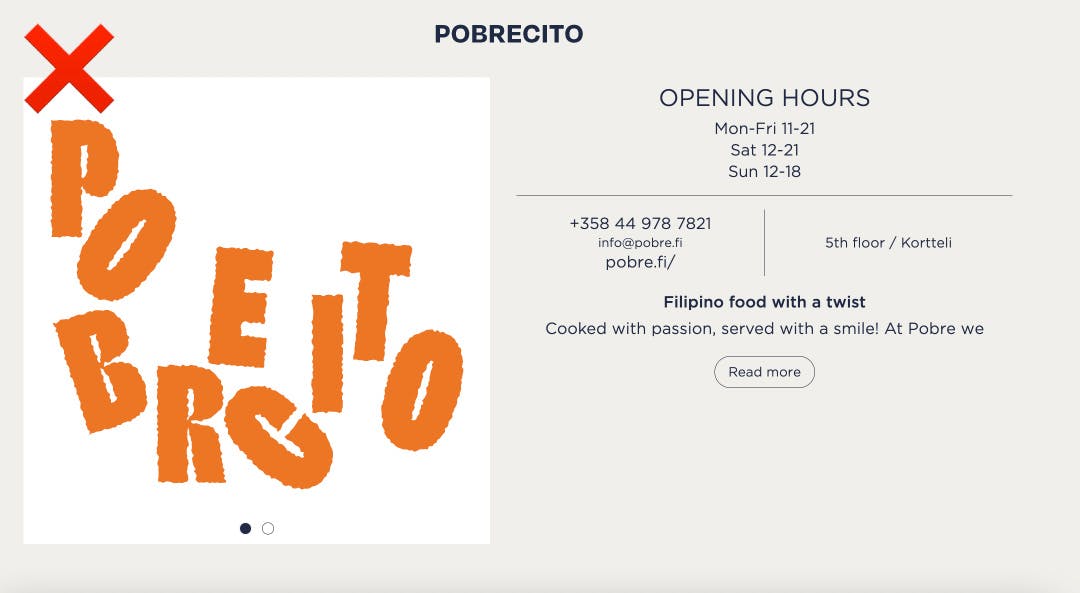
Do not crop out whole letters of the logo.
Since its use and function is very specific, do not treat this iteration as that of a standard lock-up. For situations that need more visibility & clarity for the Pobrecito brand name, use the Main or Stacked Lock-ups.
Want to print your doc?
This is not the way.
This is not the way.

Try clicking the ··· in the right corner or using a keyboard shortcut (
CtrlP
) instead.