Skip to content
For a lot of companies, the new user experience is an accident or afterthought, but expecting users to simply “get it” from the beginning is a recipe for churn. We should craft an onboarding process that moves them toward the benefit of the product as quickly and simply as possible.Product tours should not feel like work, and intelligent defaults are a great way to balance choice vs. ease—give users the freedom to customize while preserving their ability to move quickly through the process.Never stop testing and optimizing your onboarding process. Even those with “good” conversions could be better, and small improvements add up over time.
Mixpanel argues that it’s not good enough to merely meet the benchmarks in your industry. To succeed, you must beat them by consistently retaining more than the average percentage of customers.Just as numbers vary from one industry to another, what constitutes “customization” will look different for every app. Still, it’s important to balance instant gratification with customization in a way that works for your customers in order to have an experience that keeps them logging back in.
How Patrick McKenzie Reduces Churn Through User Onboarding

Software developer aka (easily one of my favorite marketers to follow and learn from) asserts that 40-60% of users who sign up for a free trial of almost every software or SaaS application will . Sometimes they forget they even signed up for the application, or they realize it simply wasn’t a good fit.
Often, however, they’re unable to see the benefit of using the software. Patrick claims that abandonment of this kind can be decreased by both making the software better and by better communication with users.
The Research
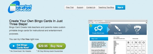
Patrick’s is designed to allow elementary school teachers to use a list of words to create classroom learning aids. Here are funnel analytics for the Bingo Card Creator new user experience:
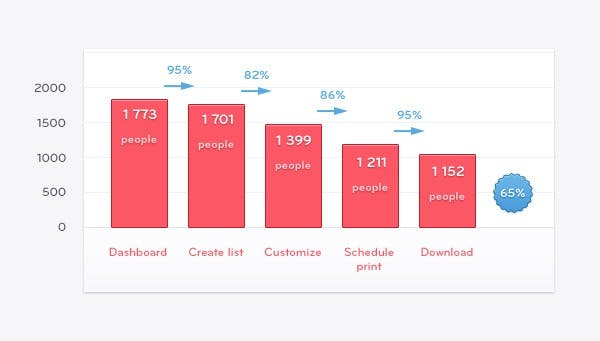

Though it’s not possible to track when cards are actually printed, downloading the PDF file for printing is used as a proxy for tracking printing, since that’s the last observable step of the process.
There is a drop-off of around 5% between teachers visiting the dashboard and actually creating a list of words, with more substantial declines between “Create List,” “Customize,” and “Schedule Print.”
Though the application is designed to take seconds, Patrick hypothesizes that many users are unaware of this fact and assuming the process will be too drawn out or complicated, they quit.
The Execution
In an attempt to increase the number of teachers who complete the Customize step, Patrick added a visible progress indicator (pictured below). Furthermore, teachers were given the option of moving forward without making changes to the default settings, further speeding up the process.
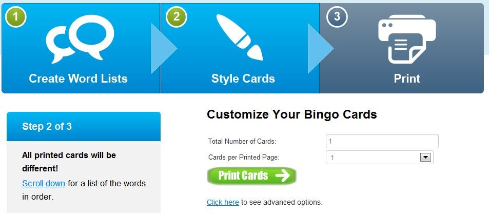

These small changes had a big impact. Whereas before only 82% of users completed the customize step, close to 90% made it through the test version.
Why Did This Happen?
When using a product for the first time, users have no idea what to expect. A good onboarding process walks them through it, demonstrating the benefit and teaching them what to expect along the way.
According to Patrick, the goal of Bingo Card Creator’s new user experience is getting the teacher through the funnel—and to the point at which she walks to her printer, sees the cards, and thinks, “Wow, my class will love these”— as quickly and painlessly as possible.
Bingo Card Creator’s progress bar helped get more teachers to this point by making it clear just how close they were to printing their cards.
Actionable Advice
How to Improve Mobile App Retention Through Customization


In 2011, cited the 30/10/10 ratio as a “law of web/mobile physics,” generally true regardless of business or industry—that is, 30% of customers will use a service each month, 10% will use it each day, and as many as 10% of daily users will be using it at any given time.
The Research
felt that this ratio no longer held true. To establish some new benchmarks for retention, they decided to look at the percentage of people who first used a given mobile app and then used it at least once more in the 30 days after their first use.
Using an aggregated set of over 15 billion actions analyzed by Mixpanel each month during August, September, and October 2013, they were able to establish new, industry specific benchmarks for retention.
The Execution
In the chart below, it’s clear that retention varies quite a bit from one industry to the next.
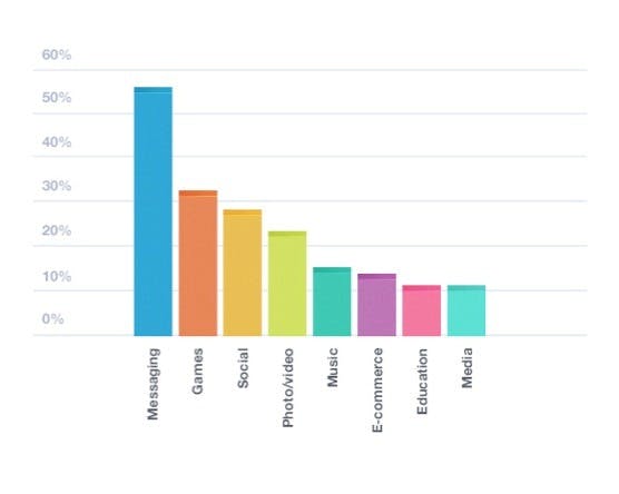

When looking closely at the verticals above, they found that two forces were at play—instant gratification and customization. Though the natural assumption is that instant gratification apps have a higher retention rates, the following chart shows that to be untrue:
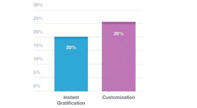

Actions that went beyond instant gratification, allowing users to more fully engage with the product, proved to be more sticky. While providing value quickly is important, it’s important that that value is more than superficial.
Why Did This Happen?
Mixpanel posits that the incredible stickiness of messaging and social apps is due to their increased level of customization. In the case of Facebook Login, for example, users can instantly access a network they’ve been customizing for months or years—the perfect marriage of instant gratification and customization.
Actionable Advice
Want to print your doc?
This is not the way.
This is not the way.
Try clicking the ··· in the right corner or using a keyboard shortcut (
CtrlP
) instead.