Skip to content

Share
Explore
Designing a new way to navigate your workspaces in Coda
For a cleaner and better-organized home for teams


Published on 9/29/2021
When a team grows, so do its rituals — the knowledge and the ways of working that are shared across a team. As we adapt to the new hybrid-remote world, we realized that enabling these is more important than ever. This has led the team to work on making that shared knowledge and giving makers the ability to during the past year. Now, we are introducing a few more changes to make Coda a better home to organize every team’s rituals.
A home for every workspace
Previously, landed you into a list of all the docs and templates that you have access to. While the comprehensive view was handy, it also became difficult to distinguish where everything was coming from if you were a member of multiple workspaces. To address this, we’ve added a new home for each workspace. This will be a dedicated space for the docs and templates in each team.
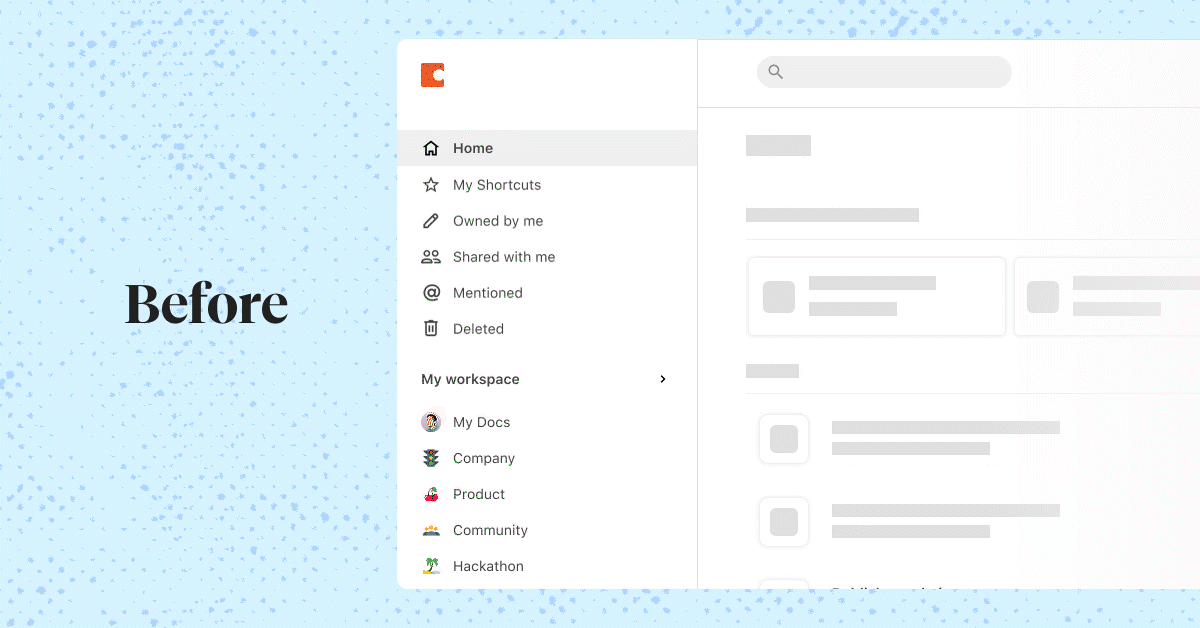
As part of this update, the doc filters (My Shortcuts, Owned by me, Shared by me, Mentioned) have moved to a new place so that you can access them both in All Docs as well as in a workspace home. And if you belong to multiple workspaces, opening will take you back to the last workspace you were in (or All Docs) so that you can pick up where you left off easily.

Navigation between workspaces
In the past, workspaces and their folders have been structured into a flat hierarchy so that everything is easily discoverable in a single scroll. However as more folders and workspaces are created, it can get overwhelming quickly to navigate and find what you are looking for.
Defining the navigation between workspaces was one of the designs that we’ve labored over the most in this update. How do we provide a bird’s eye view of all the workspaces you can access, allow for quick switching, while giving enough focus to the current workspace you are in? Here’s a small glimpse at our Figma file.

Some of the interaction models we’ve considered include completely immersing user into the context of a single workspace, design variations of a persistent sidebar that make it easy to switch between homes like an app switcher, and new placements of workspace navigation. After wrestling with the pros & cons of the possible interactions, we iterated towards a model that our users will find familiar and can scale best as workspaces grow.
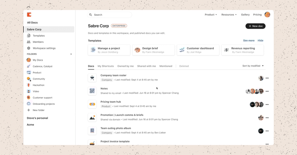
The left sidebar will now show the full list of workspaces you are a part of, with the current workspace fully expanded for richer context. In order to switch to another workspace, simply click on its name — it will then expand, while collapsing the workspace that was open previously. Through this change, we hope to surface the most relevant context while giving you the controls to quickly navigate.
Things that make up your workspace

Building on the new navigation model, workspace specific context such as Templates page and the Members list have been up-leveled to become more visible and accessible. This was intended to create a more comprehensive view of what makes up a workspace and better awareness for how the team is growing and what the team is building in Coda. With additional information to consider in the navigation design, this was also a timely opportunity to dive into the pixels and fine-tune the visual hierarchy across the different elements.

Your feedback
We hope that this set of changes will improve how your team organizes your workspace and its docs. Have any feedback about the new experience or other ideas that can better enable your team? .
This was written on behalf of everyone who worked on making this experience possible.
Want to print your doc?
This is not the way.
This is not the way.

Try clicking the ··· in the right corner or using a keyboard shortcut (
CtrlP
) instead.