Skip to content

We might have the feature! Instead of assuming the product misses the feature, ClickFunnels assumes the user might have not discovered it. Double friction to cancel (give email again + write the missing feature) so we can cancelA very compelling chart to showcase everything you get (value for less price). Incase there’s a competitor users are switching to, it would be a good time to compare. When users cancel stating “missing features” but your product is feature-rich, perhaps assume users haven’t discovered that feature yet. And work to educate. If they’re missing a feature but are on a cheaper tier, have them upgrade to a tier that might have it.


ClickFunnels
Clarity over design
ClickFunnels has their subscription details linked under “Account Settings”. They even show that users would have to go through 3 steps in order to cancel, so people aren’t negatively surprised by a longer cancel flow.

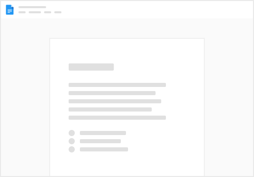
Idea:
Show people that the cancel flow has a few steps.
That can be done by using progress bars while users are in the flow or by calling out the upcoming steps before they start it.
Videos in the flow. Arrows to show where people should focus on. ClickFunnel’s UI definitely feels a bit dated but they make up for it in terms of clarity. One interesting reason is “Shutting Down Business”.

Idea:
Add a video to re-motivate users, address their pain points. Have it higher in the visual hierarchy than the feedback collection process if you’re optimizing for retention over feedback.
Missing Features —
ClickFunnels has a longer sales-page when users mention the product is missing features. It’s got a few things

Idea:
Switching Provider —
When a user states they are moving to a competitor, ClickFunnels doesn’t offer to do a live chat with them since motivation to stick around is lower. Instead, they layer on a video (all their videos come from a person, not a brand). They also have the same table that compares with others. It might make users question if they’re making the right choice switching to a competitor. They offer live training (exclusivity play) and weekly workshops (anchor effect). At the bottom of the page, the loss aversion is clear “losing subdomain” if you cancel.

Idea:
When users switch providers, assume they might not know the shortcomings of the competitor as well as you know. Disclose competitor names assuming knowledge symmetry (where customers know competitors exist and their names).
Not Using Enough —
A video and three different options for people to choose from. Cancel button is lower on the page. Live demo and weekly q&a webinars as a support option if they aren’t using the product because a lack of understanding on features. While the affiliate webinar exists to raise motivation that they initially started with.

Idea:
If people aren’t using the product enough, why aren’t they? Is it because of low intrinsic motivation or low ability to use the product or something else entirely? You can make more offers!
Too Expensive —
A video and three offers. This isn’t as customized as it could be (eg, offer hidden plans) tailored to their existing tier but it does take away the live small-batch size classes as we’ve seen in the other offers by ClickFunnels. Lower on the page, they reiterate that ClickFunnels is actually cheaper. And even offer a 6-month free period.

Idea:
When people share that you’re expensive, it happens when perceived value is less than perceived price. You can increase perceived value by explicitly comparing with an alternative solution and sharing all the stuff users get.
Instead of saying “Your account is cancelled”, ClickFunnels says “deleted”. That’s a much stronger word. The make yet another offer that is time-boxed with urgency “Special One Time Offer — Won’t be available if you close the page”. There’s illustrations and in this case, pausing is not free.

Idea:
Pause might not be free. It can be done at a lower cost. While the downside to cancellation can be losing all your data.
Churn Down for What
Stay in the loop with a monthly email featuring the most effective customer retention strategies you can implement immediately.
Get Notified →
Create Your Own
Retain more customers with personalized cancel flows, recover more failed payments, and expand customer-driven product development. It’s fast, intuitive, and effective.
Submit and Earn Cash
Do you or your company subscribe to software? Send us screenshots of their cancellation process, and we'll reward you with $10 for each unique brand submitted.
Want to print your doc?
This is not the way.
This is not the way.
Try clicking the ··· in the right corner or using a keyboard shortcut (
CtrlP
) instead.