Skip to content
Meesho is the first player in India to launch a returns unbundling project. Hence, there is no outside-in benchmarking available in India. Outside India, Taobao is the player who makes customers separately pay the return shipping fee. However, we did not get any access to the Taobao seller panel, so there is no outside-in data available.
For this we decided to do user calling to understand which information helps in decision making
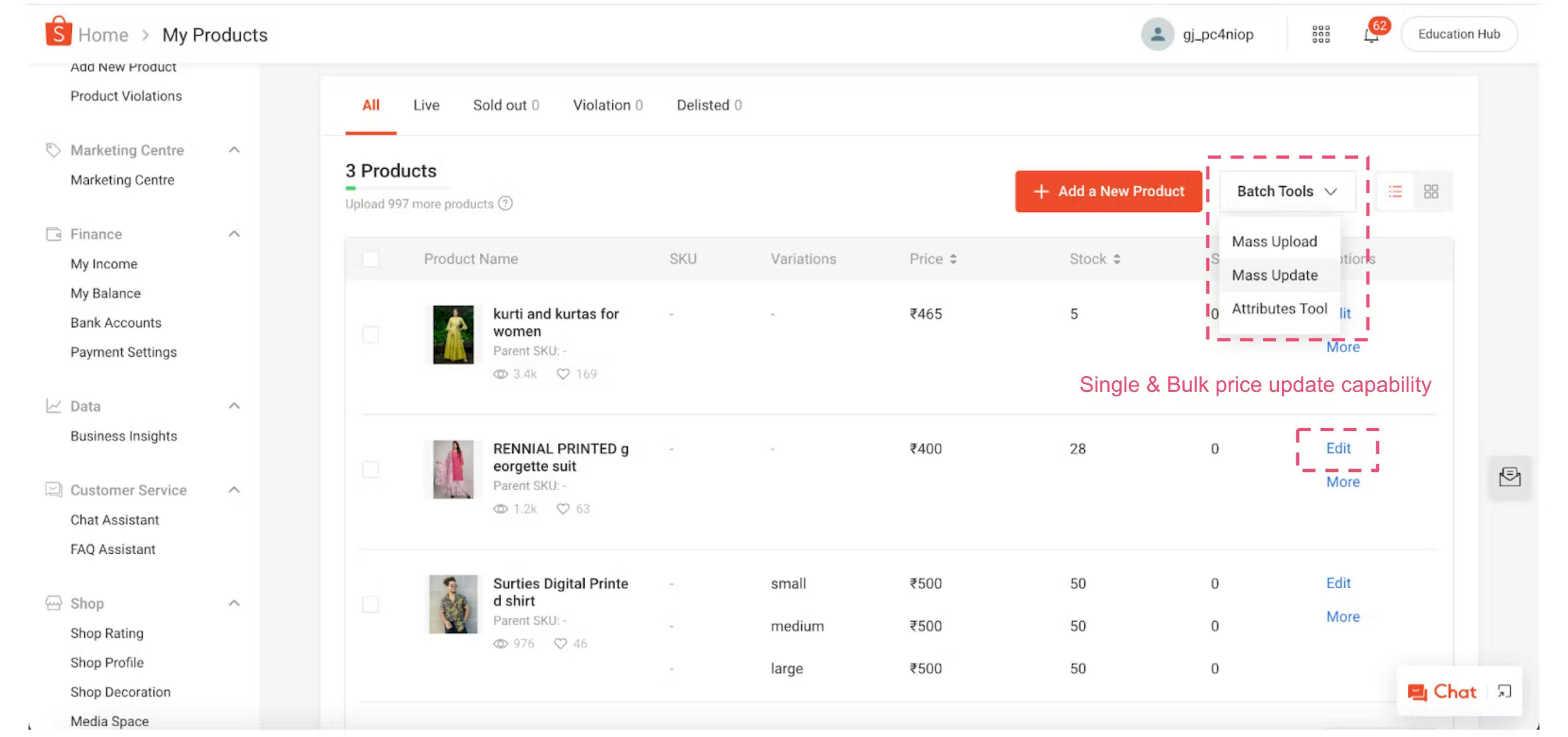
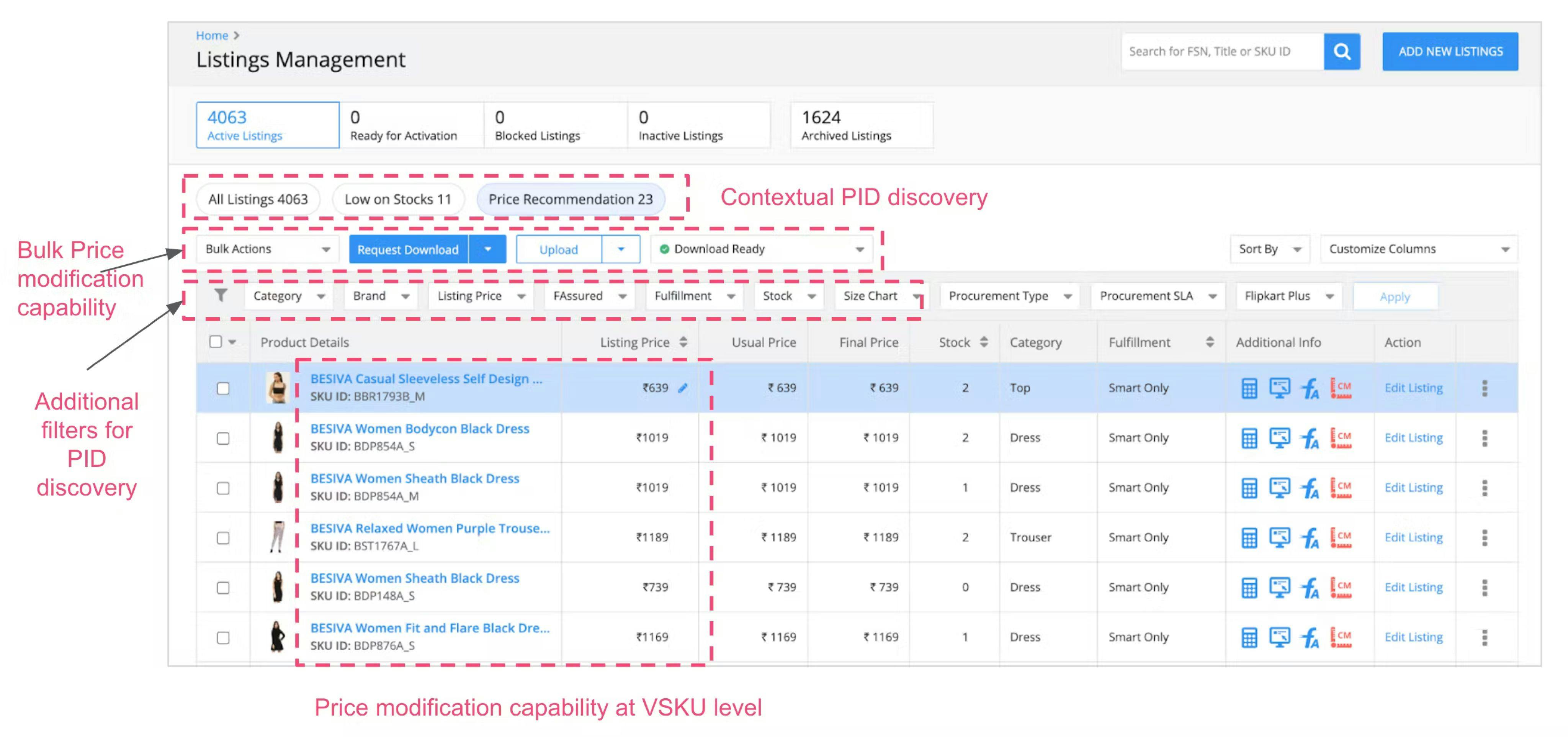
Amazon, Flipkart and Shopee all have product listing available at variant (size) level
Showing Average price of all variantsShowing Maximum/Min PriceShowing all variant prices comma seperatedShowing a price range from min-max.
Ideating Solutions
Design Approach
Considering our sellers are not digitally native, we decided to keep a short learning curve and maintain minimal design elements.


For Showing WDRP
How to show WDRP price in the list, without making it more cluttered and building information overload.
Which is good to have vs must to have
Took Deeper understanding around all information currently present
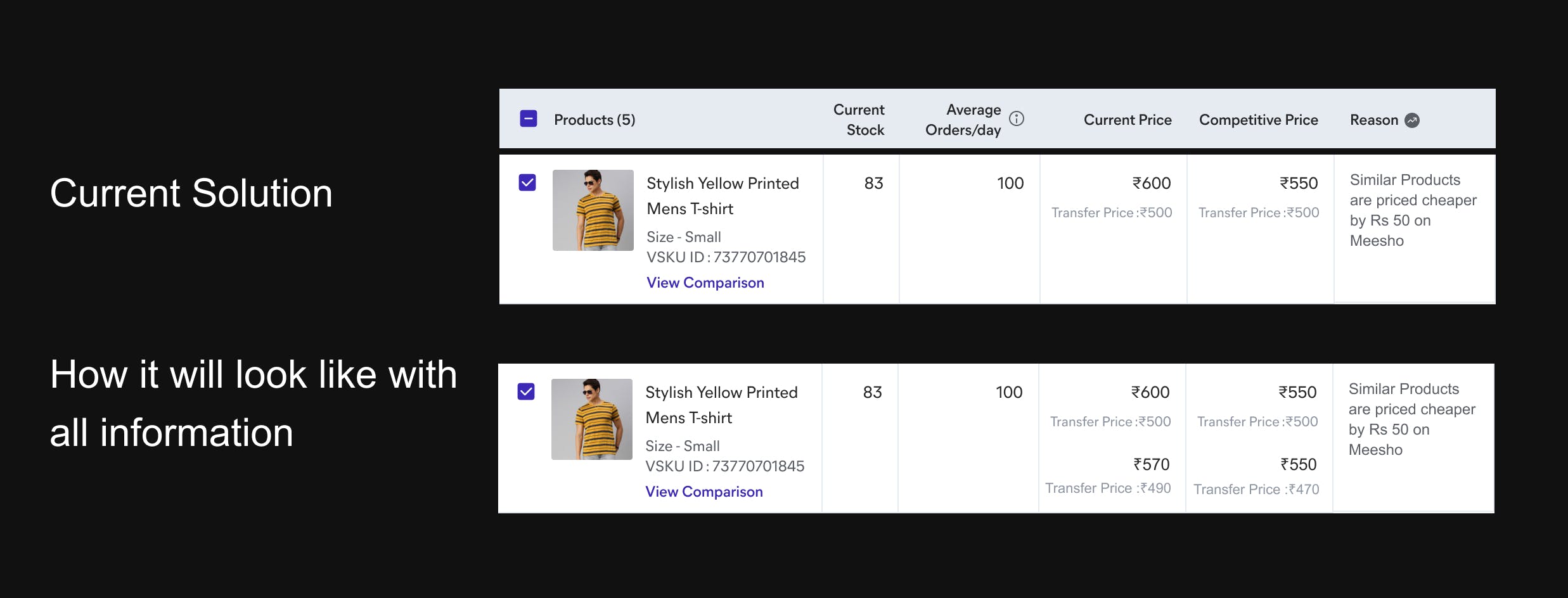

To avoid showing so much information on one level, we tried to think if we can take some information out of this listing and may be shift to next level.
Our Hypothesis


Identified Transfer price is a grey area which we can use
User Calling
To understand importance of Transfer price on listing, we connected with 6 suppliers, in which we kept 3 small scale and 3 large scale suppliers


Final takeaway
Transfer price is not contributing alot in decision making, so from listing we can remove it. But will keep it on further levels.


Previous Ideations


For showing VSKU
Competitor Analysis
To understand how other platform solved this problem, we decided to do competitive analysis of our top competitors, in which we picked Amazon, Flipkart, Shopee.
Shopee

Flipkart

Amazon
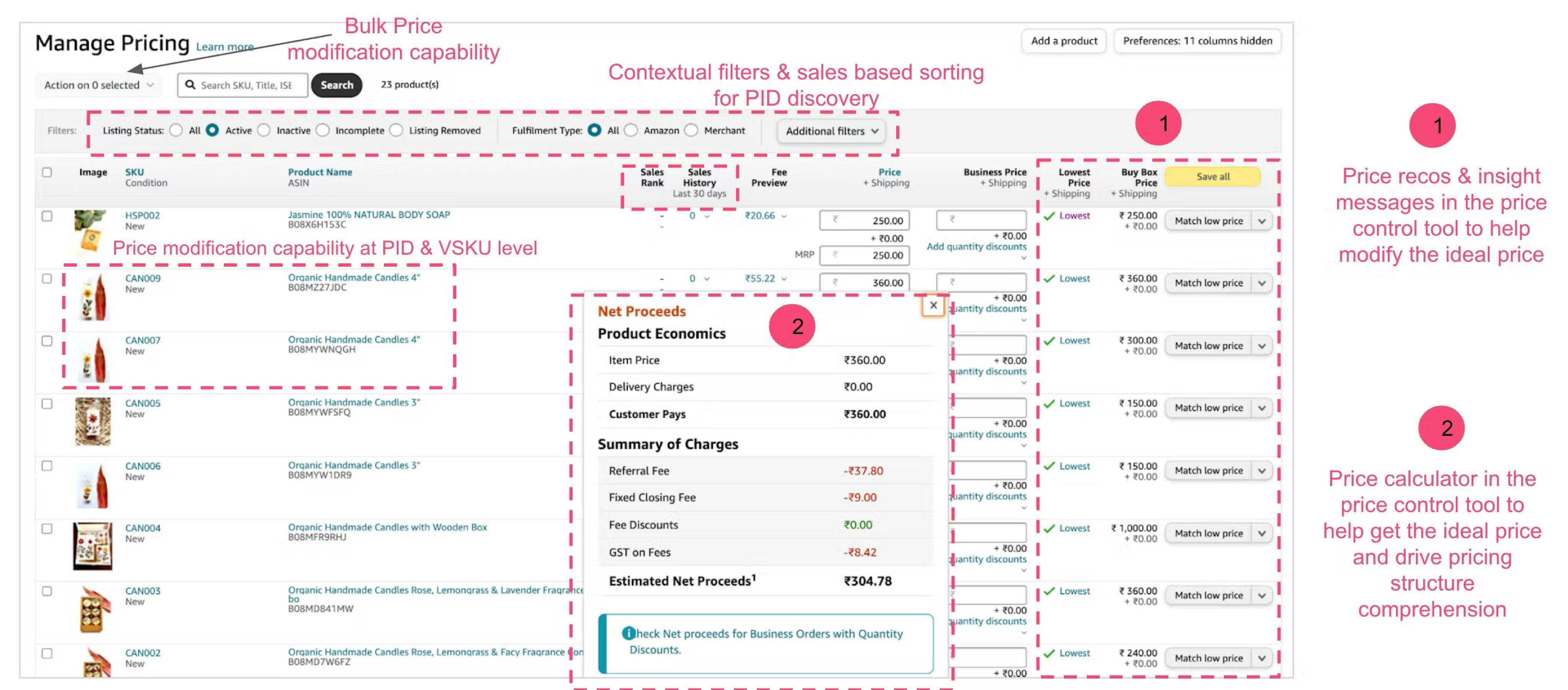

Insights we got by going through our competitors


Problem encountered with the above idea
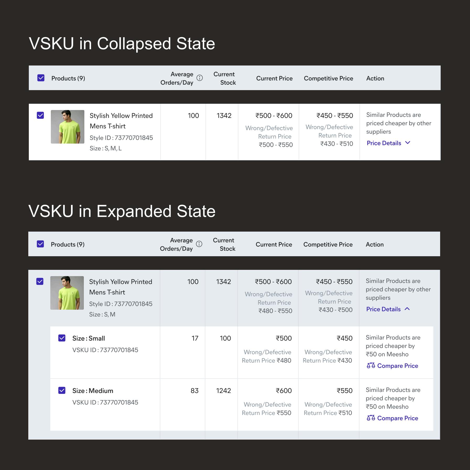
As we will be going to show all variants in collapsed state, then how prices will be shown on parent product level.
After building multiple iteration and over discussion with stakeholder, we decided to use price range option.
Final Designs
After trying 10+ version, we decided to go with this.

Final Visuals
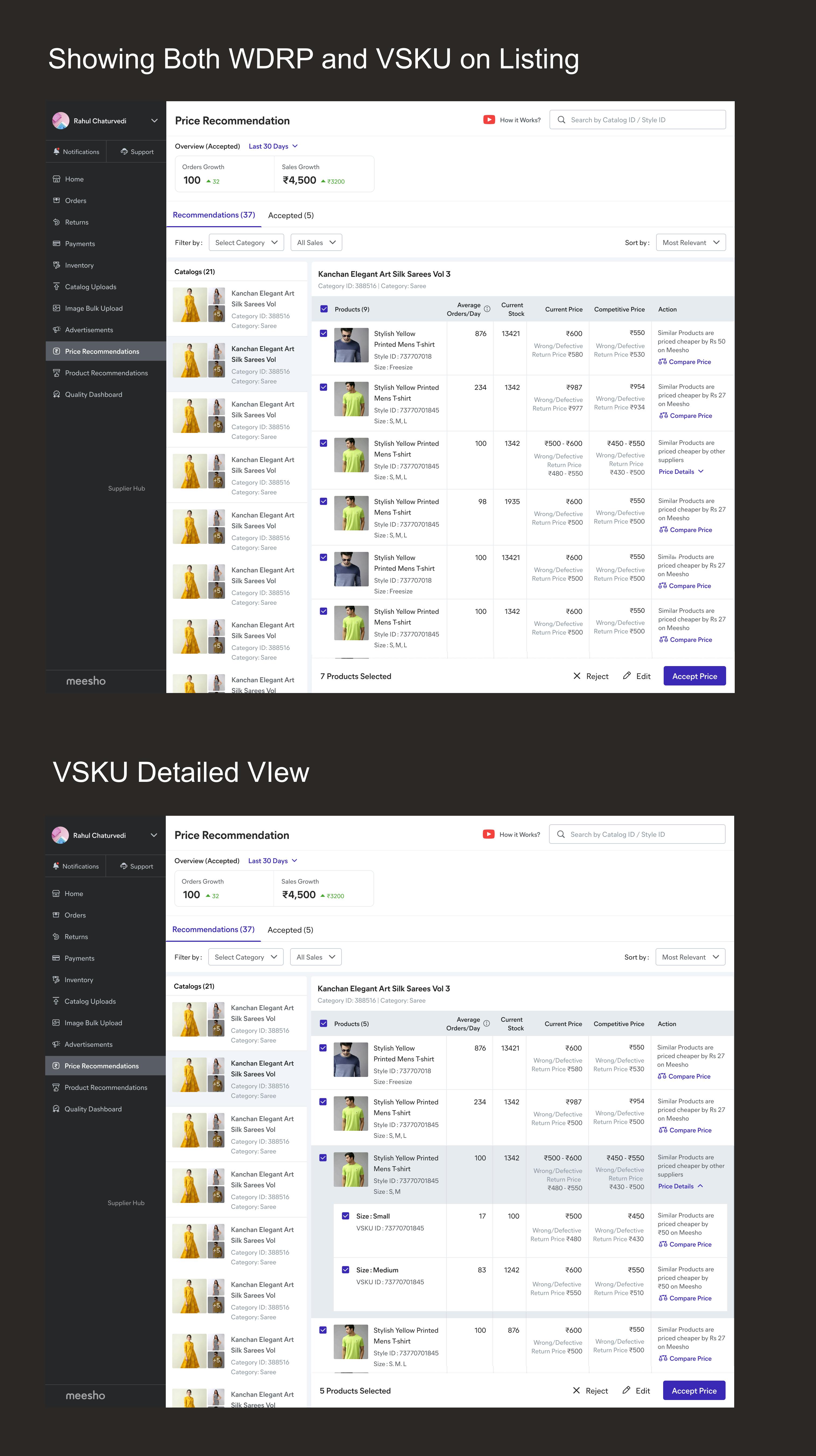
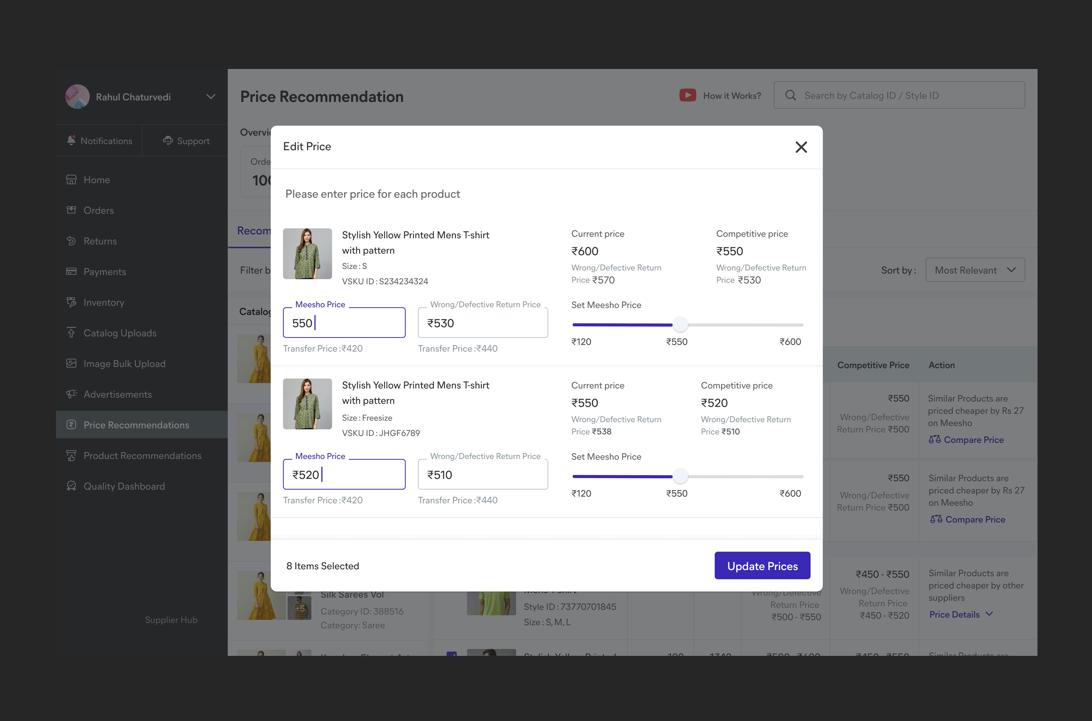
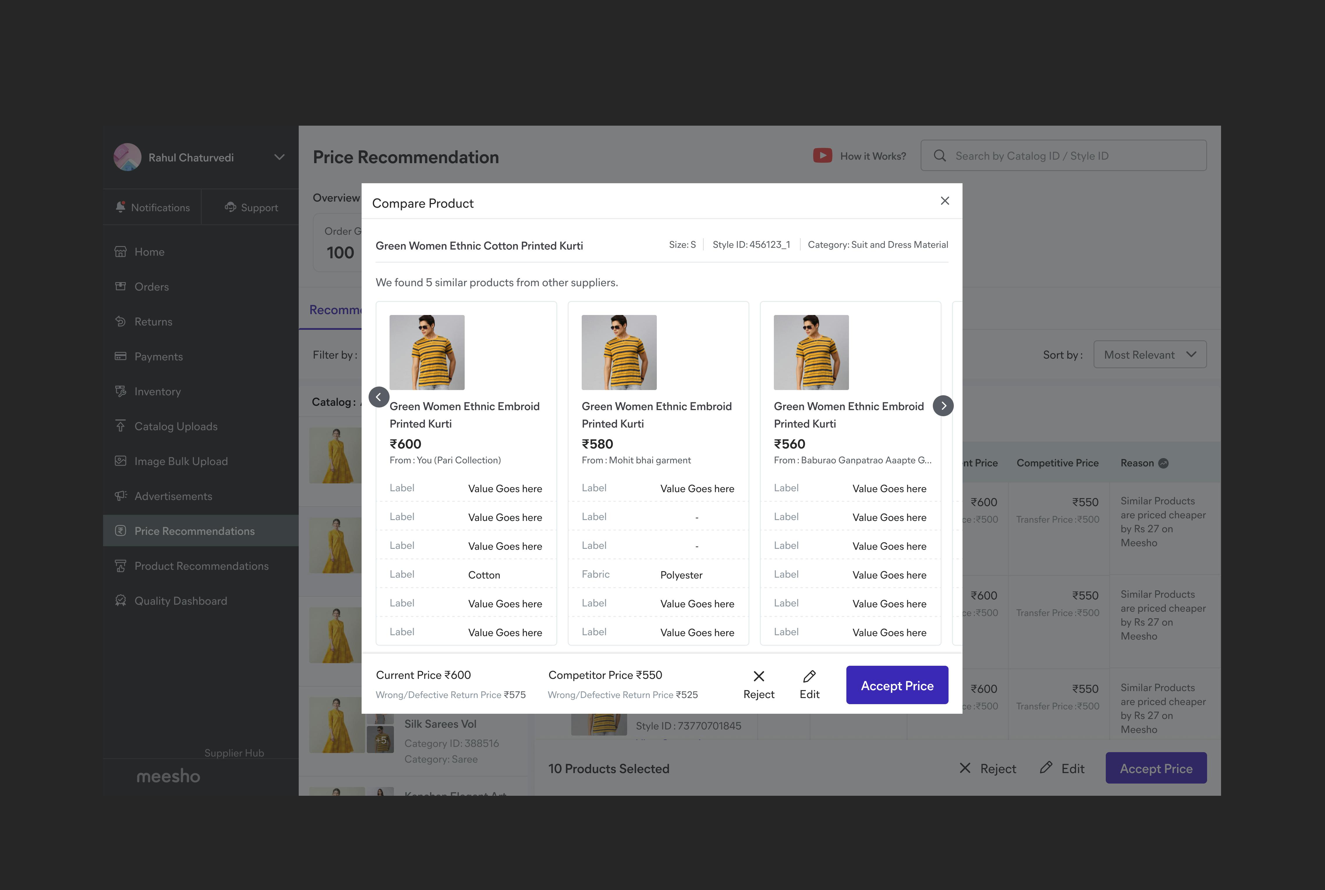
After identifying 5+ approach and building 30+ iterations we identified one minimal and intuitive way to solve this.

Edit Flow

Compare Flow

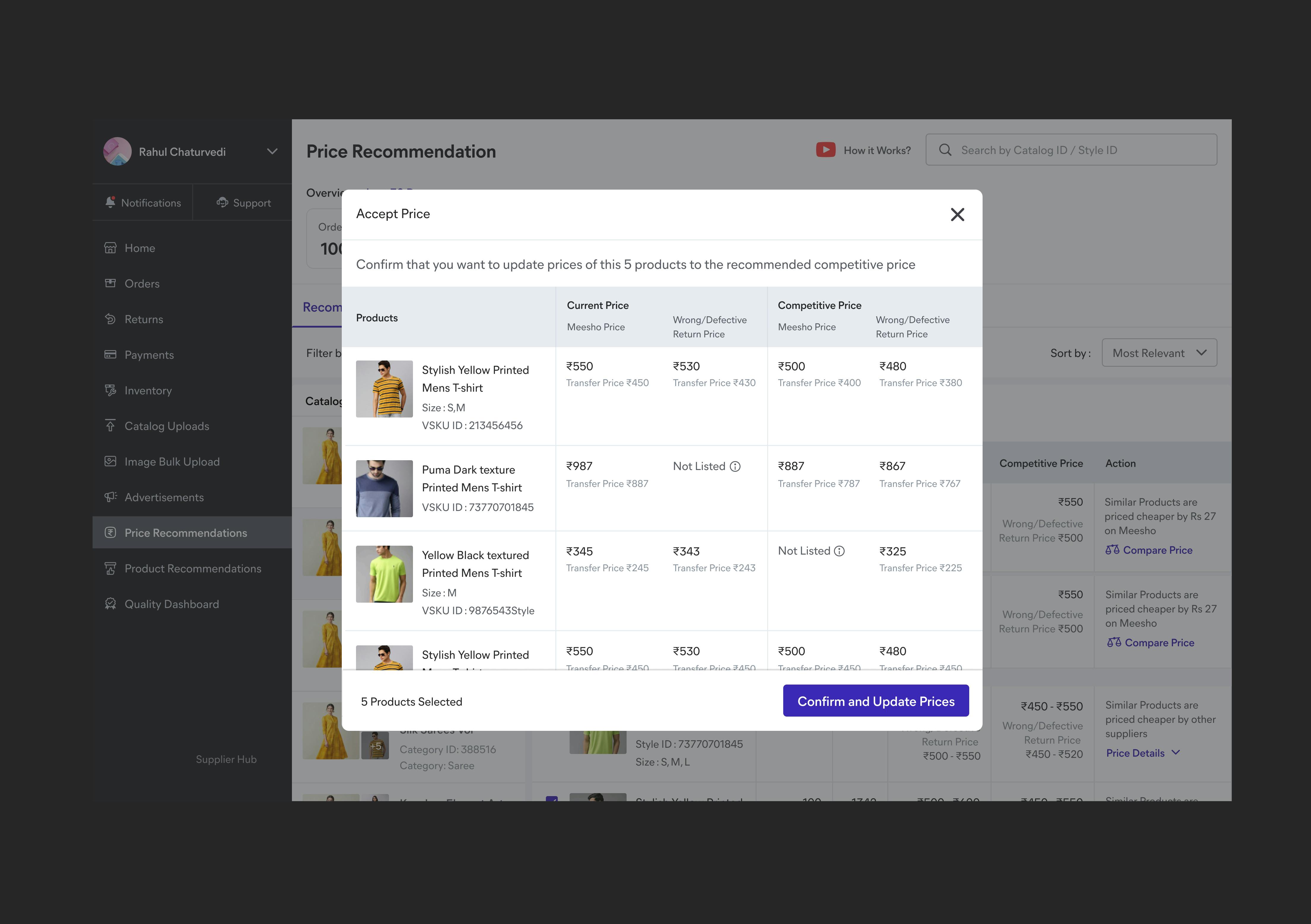
Accept Flow

Usability testing here
We tested our designs with around 15 supplier in the batch of 3-4 people in one session.
Want to print your doc?
This is not the way.
This is not the way.
Try clicking the ··· in the right corner or using a keyboard shortcut (
CtrlP
) instead.