Skip to content
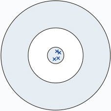 1. High accuracy with high precision. When results have both a high degree of accuracy and precision they will be clustered together around the target area (true value). In this example there is no bias.
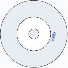 2. Low accuracy with high precision.Results that are precise will be clustered together, but because they are inaccurate they will not be near the target area (true value). This is an example of bias, the measured value deviates from the target value.
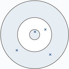 3. Low accuracy with low precision.Results with both low precision and low accuracy will be scattered about, and may not be near each other or the target area. Due to the poor quality of results we can’t say if there is bias present in this case.
Statistik i prediktion och fel-värden
Normal Distribution
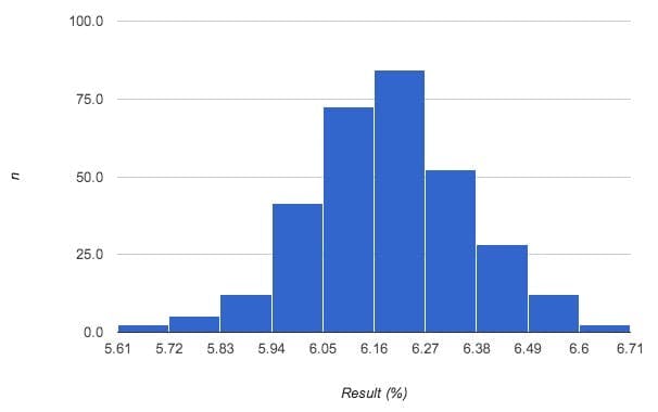

Figure 1: Normal distribution of HbA1c results obtained after repeatedly measuring a sample.
The best way to understand what a ‘normal distribution’ of results looks like is with a real example. Consider using the Afinion analyser to measure a HbA1c QC sample repeatedly. In a perfect world all of the results would be an exact match, but in reality there is always going to be some degree of variation, illustrated by the 10 results below:
6.6, 6.3, 6.2, 6.6, 6.2, 6.4, 6.1, 6.3, 6.2, 6.5 (%)
If this measurement was repeated a further 100 times, we’d have a lot of data and a graph could be plotted to show the result along the horizontal axis and the number of times the result was measured on the vertical axis. Typically, for normally distributed sets of data, the graph would look like the one shown in Figure 1.
Using this graph it’s possible to visually determine what the most common (i.e. average) result was (6.2 %) and how spread out the results were (e.g. 5.16 – 6.71 %). When data is analysed in this way and the graph evenly forms the shape of a bell around the average result, it is said to be ‘normally distributed’.
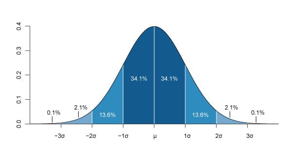

Figure 2: A normally distributed data set showing standard deviation intervals.
Standard Deviation
Consider the example above where the data was spread out in the range 5.16 – 6.71 %. Calculating the Standard Deviation (SD, represented by the Greek letter sigma, σ) is a common way to represent how widely this data is spread. The standard deviation is defined as the range in which 34 % of all the results fall and this is best illustrated using a normally distributed bell curve, show in Figure 2.
As you can see, by calculating the standard deviation (σ) for a set of data, it is possible to estimate the range in which 68 % of results are located (± 1 σ), 95 % or results are located (± 2 σ) and 99.7 % of results are located (± 3 σ).
Precision (CV)
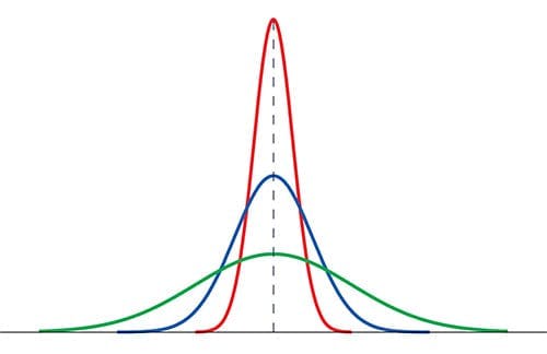

Figure 3: An example of how precision effects the shape of a normally distributed bell curve.
The magnitude of the standard deviation measured above also gives us an idea of how well the Afinion can measure HbA1c. This is because the smaller the standard deviation, the more likely the result is to match the target value. By normalising the standard deviation (i.e. removing it’s dependance on the magnitude of the results), it can then be compared it to other data sets, which is a useful thing to be able to do. The normalised standard deviation is known as the coefficient of variation (CV) and is simply calculated as follows:
CV = (σ ÷ Average) × 100
Precision refers to how closely individual measurements agree to each other, the lower the CV, the more precise the values. For example, in the image shown in Figure 3 the red curve represents the most precise data set (lowest CV) whilst the green curve is the more imprecise.
Precision is the degree to which future measurements or calculations yield the same or similar results — it is a measure of the spread of repeated measurement results and depends only on the distribution of random errors – it gives no indication of how close those results are to the true value.
Accuracy & Bias
Accuracy refers to the degree of conformity of a measured or calculated quantity to an actual (true) value. Accuracy is closely related to precision, but it’s not the same thing. A result is said to be accurate when it matches to a particular target. Let’s look at a common analogy to illustrate the difference between accuracy and precision.


Determining Accuracy
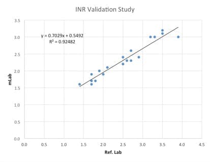

Figure 4: Example of an INR comparison study conducted between an mLab and a reference lab.
The primary method for determining accuracy is to compare test results from one method, to the values achieved from a method that is accepted as accurate, commonly from another accredited laboratory. To clarify this point, consider the example graph from an mLabs evaluation report show in Figure 4.
The coefficient of determination (R2) is a statistical measure of how well a model approximates real data points. In other words, R2 shows what is generally referred to as the ‘closeness of fit’ of a model.
In cases with a single variable it is the square of the correlation coefficient (r), which shows the tendency of two variables to move together. R2 can range from 0 – 1; the closer to 1 the better the model fits the data.
When comparing two methods, if a reasonably good value for R2 is obtained (that is to say the points match the line of best fit), then attention can be drawn to the equation for the line. For 2 systems that had no bias between one another the equation would be y = x. Therefore, by taking into consideration the slope and intercept of the line it is possible to determine the magnitude of any bias (i.e. the difference between the 2 methods).
Total Analytical Error
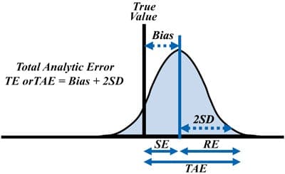

Illustration of how Total Analytical Error (TAE) is related to bias and the standard deviation.
Laboratories typically make only a single measurement on each patient specimen. Therefore, the analytical quality of a test result depends on the overall or total effect of a method’s precision and accuracy. The acceptability of method performance can therefore be judged on the sizes of the observed errors relative to a defined total allowable error (TAE). To put this into practice labs can estimate TAE by combining the estimate of bias from a method comparison study and the estimate of precision from a replication study. Accordingly, using a multiple of the standard deviation (SD) or coefficient of variation (CV),
TAE = Bias + 2 SD
for a 95 % confidence interval or limit of the possible analytic error. The best way to understand how accuracy and bias can be combined to estimate TAE is by studying the figure below.
Want to print your doc?
This is not the way.
This is not the way.

Try clicking the ··· in the right corner or using a keyboard shortcut (
CtrlP
) instead.