Skip to content

From user testing, there was no observed difference in familiarity - users in the inline toolbar variant labeled Coda as simple or similar to other tools just as often as users in the baseline variant.Consistent with our “right over familiar” value.From user testing, we did not find this to be a concern. Even when users had the toolbar, they still used / commands and Explore far more often to find things.We will watch specific metrics to ensure this doesn’t get affected.We will continue iterating to promote the toolbar in the UI at the appropriate moments (placeholder text, right click menu, / menu etc).Hold down Command key - tell users this reactively and find ways to teach this in the product proactively.Use / commands e.g. /bold, /link, /red, /emoji, /list.We’re adding quick paragraph style switching in the 3-dot menu.We’ll add an option in the right-click menu on a cell/row/column.We have tried to strike a balance but would love feedback to fine-tune the heuristicFind ways to make the toolbar unobstructive - e.g. make it smaller, transparent etc.Add a delay between when you select and the toolbar shows up.


Continue learning: We are still working on many ‘P1’ issues and feedback and refining a lot of the details. As part of that, we would love to collect more feedback internally and so please help us out by adding feedback. We would also love for the Go-to-Market teams to suggest makers who might have valuable input on this feature, and we plan to run additional user tests for other scenarios like coming into a collaborative doc, published doc, etc. Finally, we are considering doing an opt-in beta ahead of launching this in order to collect more feedback from existing users and ease people into the upcoming change.Ease the transition: On the day we release the inline toolbar, users will need to switch to a slightly different way of doing things. We plan to help them by providing in-product callouts that educate them about the feature as well as holding the Command key to show the toolbar. We would also love to partner with Go-to-Market teams to produce an instructional video we can link to and be ready to provide support as necessary.Tell the story: We plan to write a thoughtful blogpost that shares the “why” of the feature with users, similar to the . This is an important part of being transparent and clear with our makers, as we change a product that they know and love.Monitor data: We want to make sure that this feature does not regress any metrics around discoverability of key features or even activation of new makers. We will build a dashboard to review these metrics so that we can investigate and address any issues we find.


 Joel Davis
 Lola Tseudonym
 Buck Dubois
 Alan Chowansky
Share
Explore
 Product proposal (long-form)
Come to a complex decision.
Feel confident when making a large, strategic decision. Share the doc in advance of the meeting to collect early feedback, or carve out time at the beginning for everyone to read. Assigning roles such as “decider” or “informed” encourages accountability and a clear understanding of when a decision will be made.
After you’ve reviewed, then replace the sample text in the canvas.
Clear this page's sample data
Exploring the inline toolbar
Author:
@Polly Rose
Status:
Researching
Date:
6/30/2026
Stakeholders who reviewed: of
1
4
Background
As Coda transitions toward honing the simple cases, things like the visual design and emotional feeling of the product become more important. In the past, we saw evidence of this with the launch of features like centered content and cover photos, and especially with the . While we knew those features would be impactful ahead of time, we were still pleasantly surprised at the reception from makers and the continued enthusiasm for the dozens of small improvements we’ve done as a follow-up.
Since Coda’s inception, we’ve debated whether the toolbar should be fixed or inline. More recently, the inline toolbar was one of the features that we scoped out of the original visual refresh project. Our guiding principle behind the visual refresh was to minimize Coda UI and make more space for the user content to shine. In the same vein, the top toolbar is a piece of UI that permanently takes up real estate on the screen, even though it is not actually used that often. A majority of people who write and edit docs in a given week don’t use the toolbar. More importantly, the toolbar makes Coda docs feel more cluttered and “work in progress” for viewers and contributors. For that reason, we believe that switching to the inline toolbar will make Coda docs feel more lightweight for simple cases and more presentable for sharing with others.
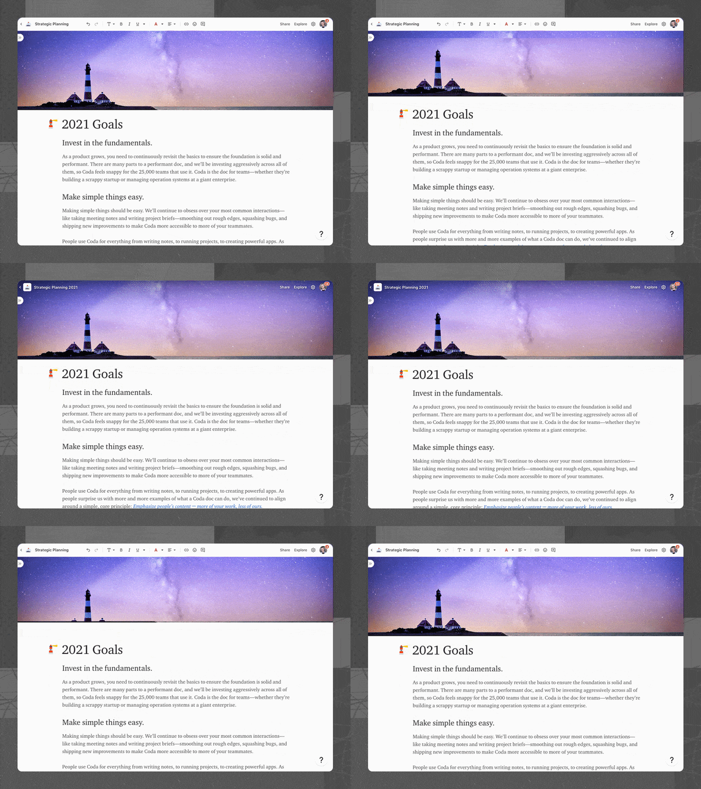

While we have always believed this change is the right direction to go, we had scoped it out in the past because we wanted to make sure to manage the transition well when we do. We decided to make this change now because it also blocks our ability to support key upcoming launches.
Who moved my cheese?
As with many other products, design changes in the UI can be controversial and draw backlash from makers. The inline toolbar is an especially sharp case of this change because it requires some adjustment to a new way of taking key actions. Moreover, there are some small scenarios that may have more friction with the inline toolbar, such as formatting the text on a blank line or in a single cell.
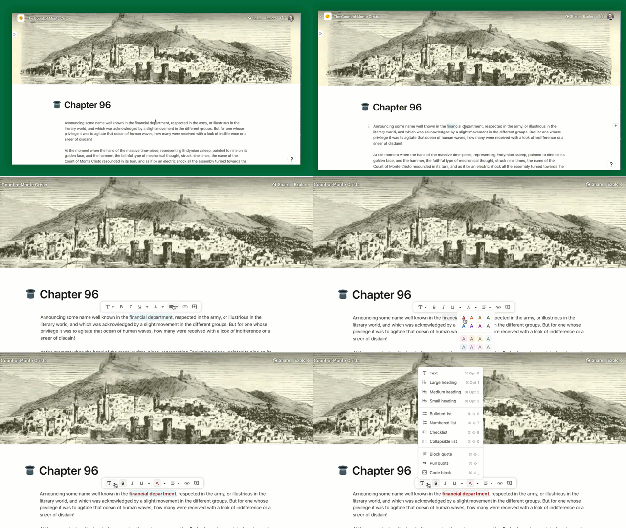

Given these constraints, we want to take a careful and considered approach to designing and launching this feature. Through our internal testing over the last 2+ weeks, we have received a lot of great feedback from Codans who are power users of Coda. We have run many user tests with new users across the baseline and inline toolbar variants. We plan to do additional testing and monitoring, but would love to share out what we have learned so far to collect input.
I’ve read this far 


 +6
+6


+6
Concerns
Besides the transition, here are the key buckets of concerns that we have heard so far with the inline toolbar, along with our current thinking on how to mitigate them.
Concern
Description
Mitigation
Concern
Description
Mitigation
Familiarity
Coda feels less familiar as a doc surface to those coming from Word, Google Docs as well as existing Coda users.
Discoverability
It might be harder to find how to do specific things like adding a hyperlink, emoji, comment etc before selecting.
Convenience
The toolbar doesn’t always show when I need to use it. I have to select something first e.g. blank line, single cell/column etc.
Noisiness
The toolbar sometimes shows up when I don’t need it, for example if I select text to read or select multiple rows/columns to move.
There are no rows in this table
Should we launch the inline toolbar in H1?
While we are cognizant of the concerns and want to do our best to address them, we believe there are still a number of important reasons to ship the inline toolbar. We’d love to hear some of your reasons for or against the idea. When all options have been submitted, let’s take a vote!
Pros
Hiding the toolbar would make Coda feel more lightweight for simple cases.
6
Since the inline toolbar shows up right next to your selection, it saves time compared to taking your mouse all the way up.
2
There are no rows in this table
Cons
Having to select something first before the inline toolbar shows up could be confusing, especially to existing users.
4
There are no rows in this table
Next steps
As a story team, we believe this feature does not lend well to running an A/B test because it could cause maker content to look different for different collaborators. And, running an A/B test also makes it harder for us to effectively tell the story of this launch and ensure that our essential help articles are up to date. We also believe that there are longer term benefits to making this change (outlined at the top), and are comfortable launching if we do not regress metrics we’ll outline in another writeup and dashboard. However, we are still open to revisiting this decision and would love your input on this.
I’ve read this far  9
9
9
How do you feel about this plan?
submitted. Avg of out of 5
7
4.29
Only show me
Search
Pulse check
Reflection
Added by
Pulse check
Reflection
Added by
No results from filter
Dory: questions & discussion topics
Add and upvote questions or discussion topics below.
Idea
Author
Upvote
Downvote
Idea
Author
Upvote
Downvote
Since there were some dependencies on the Go-to-Market team, can you speak to the timing of your next phase of testing and eventual launch?

9
Re: experimentation ー I’m confused by the wording, I understand that we’re aiming to understand impact through other methods, so is there a need for an experiment writeup?

8
2
Thoughts on setting up a few one-liner canned responses to the potential “who moved my cheese” questions? Even if we don’t use them, it’s worth the exercise.

6
Is it worth setting up a form/doc/community post/something else where users can submit anonymous feedback? (post-beta)

4
1
There are no rows in this table
Stakeholder reviews
Name
Title
Decision Role
Reviewed
Name
Title
Decision Role
Reviewed

Project manager
Decider

Engineer
Accept

Writer
Consulted

UX
Informed
There are no rows in this table
Want to print your doc?
This is not the way.
This is not the way.
Try clicking the ··· in the right corner or using a keyboard shortcut (
CtrlP
) instead.