Skip to content

Browser-friendly: Considering Coda works on the web, it was important to reference a browser’s dark mode behavior and make sure Coda played nicely with the surrounding chrome.Document-friendly: No surprise here, but considering Coda is an all-in-one doc, having an interface that is easy to read for long periods of time is crucial. We considered contrast ratios and evaluated other document tools.UI elevation: We understood the importance of finding a background light enough to offer the ability to use drop-shadows, overlays, and other use-cases without looking inverted.
On: Will turn on dark mode. Dark mode must be turned off manually.Off: Will turn dark mode off until turned back on.System: Will auto turn on based on your system-level setting. On a Mac, your device will use the surrounding light to determine which mode is appropriate.
Share
Explore
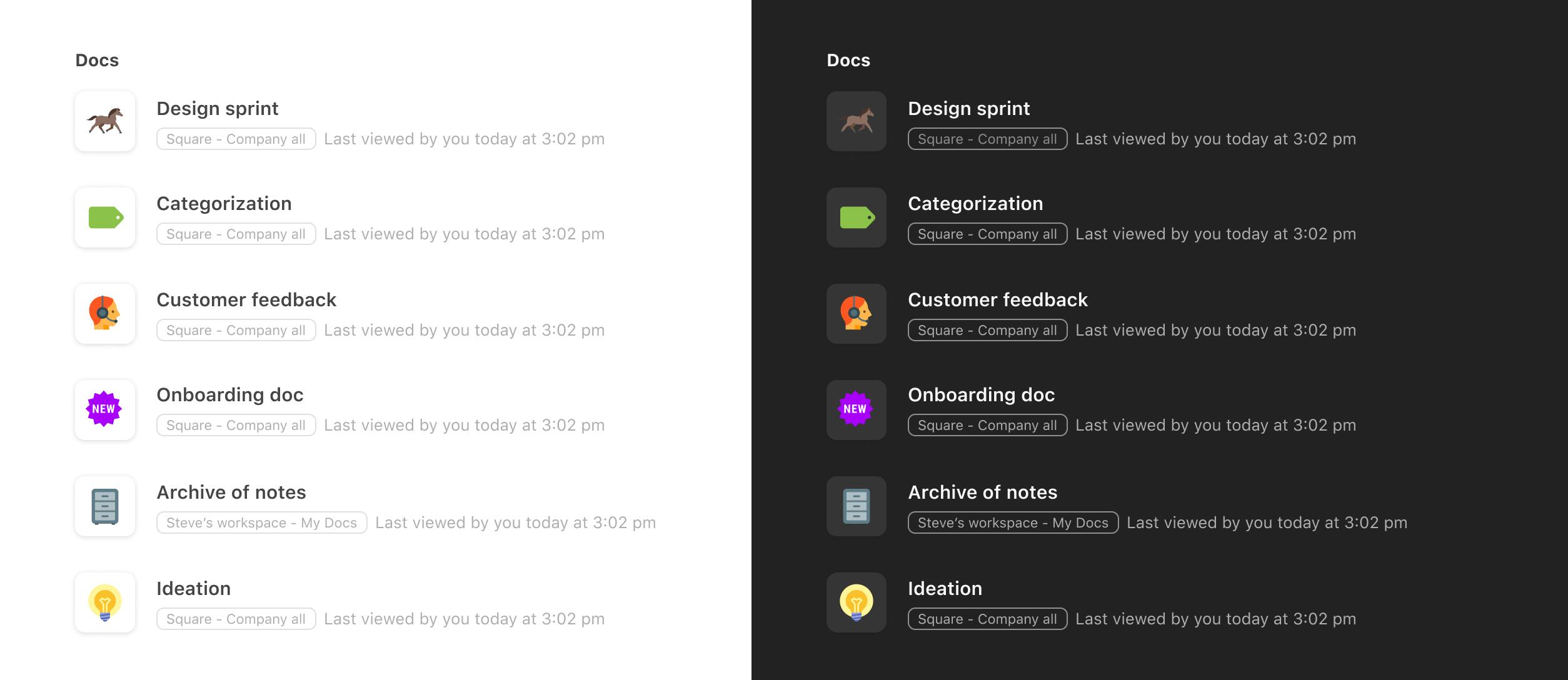
Designing Coda's dark mode
A look into the design process of one of Coda's top requested features.

From community posts to customer support requests to hacky extension solutions, heard all of your requests for dark mode—and we felt the need to prioritize the feature in our latest ship-a-thon.

After all, we want to give people docs they enjoy reading and using, day or night. 🌒
Not a simple switch—things got dark.
Because this was a heavily requested feature, the engineering team spent time away from primary work to start inverting colors from white to black. The result helped kick off the project on a code level, but the design was a painfully high-contrast interface that strained the eye and, in many cases, was illegible.

The design team set out to reconstruct and introduce a new color palette (not just an invert). Let's just say things got dark.
Balancing the background color.
The background color sets the tone for the entire interface. Going too dark strains the eye and also limits the ability to use overlays or drop shadows that focus UI, like in a pop-up. In exploration, we set a spectrum of system-level dark themes, like Apple and Google, and looked at grey tones that offer more flexibility.
Our decisions were based on a few guiding principles:

💡The end value is closely connected to browser preferences, but a little lighter to offer more depth perception and set a neutral tone for maker content.
There are no rows in this table
Elevation: Translating greys.
Achieving noticeable elevation proved to be the most important aspect of designing dark mode and, unfortunately, was also the hardest code-wise. This is primarily because elevation is achieved very differently in dark mode and light mode. For example, using a drop-shadow and adjusting its opacity and blur effect gives sufficient elevation in light mode and is a conveniently simple CSS value.

When you apply the same treatment on a dark background, some of the effects are lost because the drop shadow color value is closer to the background. There is some effect considering the lighter grey background.

But when you combine this with different variations of grey we start to see a stacking effect of elevation more clearly.

The challenge was that the main CSS class converted everything with a white background in light mode to the new primary dark mode background. Grey would only show up in dark mode if it was already grey in light mode. In other words, it was a grey:grey translation instead of white:grey. I had to create a new CSS class that mapped to a different token in the dark mode file to start dynamic coloring.
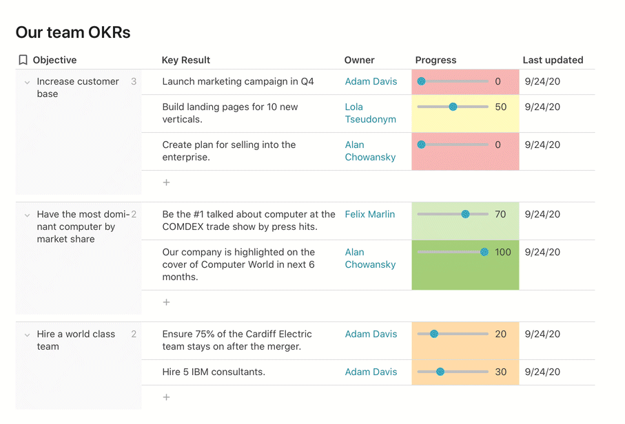
Communicate better, with new table colors and formatting.
The last big challenge was translating table colors and formatting to dark color values.
Colors can be used in a variety of ways to help communicate and organize different data and tasks. Some makers use colors for decoration in their workflows. We felt it was important to maintain the integrity of the colors while still finding a balance for contrast, saturation, and accessibility.

Example of Figma teams project tracker in dark mode.
When you click options in a row or table, you can choose conditional formatting and pick from a great preset of options to choose from. If you click custom, a 90-palette color set can be used for a cell's background color or text color. Many makers use the darkest values as text colors and the lightest value for background colors. This insight was taken into consideration—whatever was legible in light mode should also be when you switch to dark mode. Looking at the common scenarios of how table formatting was used helped flag all of these cases and develop the full set.


Not all of the colors are perfect. We continue to evaluate and evolve the colors to best suit creative and informative docs without major disruption.

💡 A look into the light and dark version of blue at its lightest option. The dark mode option is closer to black and not as saturated to reduce eye strain against a dark background.
There are no rows in this table
Go ahead—Flip the switch.
Now the background colors of cells are closer to black, highlighting and elevating instead of consuming data or distracting. And the darkest value will stand out and demand attention for those highly sensitive pieces of information.
To make the switch, click your avatar in the top right hand corner of your doc and click on the appearance options.
We hope that when you work into the night or flip the switch to dark mode you find your table's integrity is maintained while experiencing a new emotional connection to your docs in a different light.

Feedback?
If you have feedback on these changes or other potential changes that can help you,
This was written on behalf of all the teams who worked on making these features possible.
Want to print your doc?
This is not the way.
This is not the way.

Try clicking the ··· in the right corner or using a keyboard shortcut (
CtrlP
) instead.