Skip to content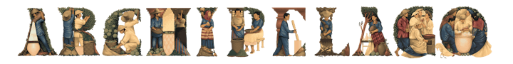
The Archipelago Letras can be used to spell out words and names as shown in the example below. This application should be used for added impact, for exampler in give-aways spelling the recipients nickname, in title cards, in signages, etc. It can also function like a typographic headline.They can also be used like where the first letter of a paragraph comes from the letras y figuras library.
Make sure that spacing between the letters is consistent.Make sure to have consistent proportion for each letter.Do not use the Archipelago Letras when there are no other brand elements present like the brand signatures and other key visual elements.Do not overuse the Archipelago Letras. Do not use it in place of the headline font in the typography library.
Take cues from vintage storybooks, illuminated manuscripts, archival prints, scientific illustrations, journals and the like.As much as possible, reflect the true colors of the ingredients when making new illustrations but colors used must be muted, earthy and with a sepia tone reminiscent of storybook illustrations and archival prints.Etching, hatching, cross-hatching, paintings, and ink and pencil sketches are some art styles Archipelago draws inspiration from. These styles are used as inspiration when making new illustrations while also making them fit for contemporary use.
Archipelago is premium, meaning illustrations should be kept classy and refined to match the overall tone of the brand.
Do not use multiple copies of an illustration in a single layout. If it can’t be helped, rotate the image of flip the orientation so it won’t be too obvious.Do not scale up the illustrations to the point where individual pixels are already visible.Do not manipulate the color or add effects like drop shadow, bevel, emboss, outer glow, to the illustrations.Do not warp or distort the illustrations
 Illustrations
Overview
Archipelago visually showcases pride of place through the use of illustrations, whether it be in the letras y figuras or the botanical illustrations. Archipelago uses the best ingredients sourced from all over the Philippines which is what the illustrations try to communicate.
Archipelago Letras Y Figuras Alphabet
Letras y figuras is a genre of painting from the Spanish colonial period in the Philippines. Popularized by , Archipelago draws from this rich tradition of illustrative letters showcasing Filipino slices of life during that time period.


Usage
To push pride of place as Archipelago’s core, the custom-made letras y figuras can be used for decorative purposes alongside other brand elements.


Misuse


Botanical Illustrations
Below are illustrations of botanicals based on Fr. Blanco’s works. These may be used in print and digital applications. The style emulates early scientific illustrations rendered in graphite and watercolor.

Lava Rock

Mango

Orange

Sampaguita

Wheat

Pine

Calamansi Flower

Oak Leaf

Oak Leaf

Calamansi

Pomelo
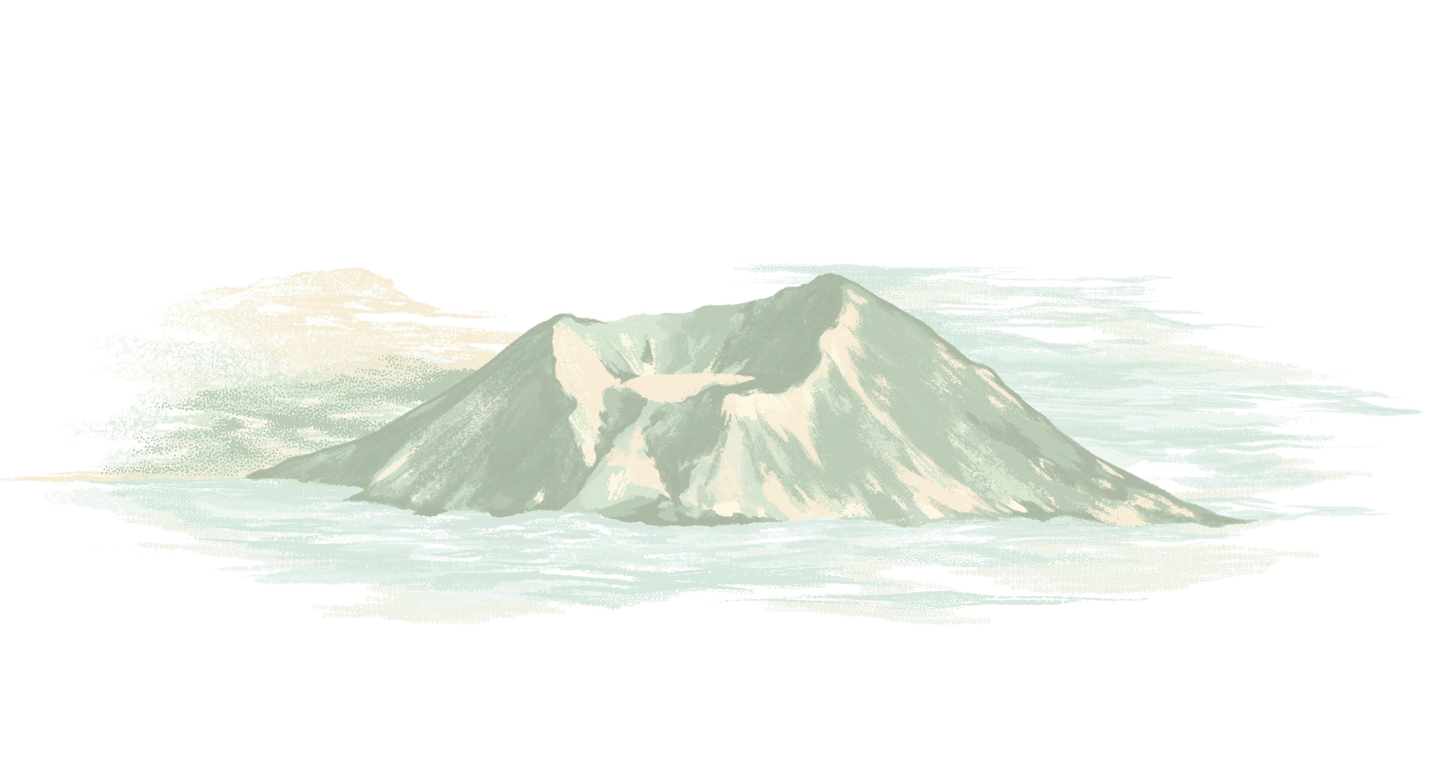
Taal Volcano
New Label Illustrations
Below are illustrations of botanicals as seen on the new labels. These may be used in print and digital applications. The style emulates letterpress prints commonly used in premium spirit labels.

Florals

Florals Left

Florals Right

Mountains Center

Mountains Left

Mountains Right
Additional Illustrations
Below are some illustrations of drink recipes produced for Archipelago. These may be used in print and digital applications. The style is reminiscent of ink sketches with watercolor. This style can be followed when making new drink illustrations.

ARC & Tonic

ARC Collins

Cloudrunner

Negroni

Summer as a Verb

ARC 75

Causeway

Full Circle Martini

Ramos Gin Fizz

The Dewey Gimlet
Creating other illustrations
Some applications may need specific illustrations aside from the Archipelago Letras and botanical illustrations mentioned above. Here are some rules to guide future illustration expansion projects:
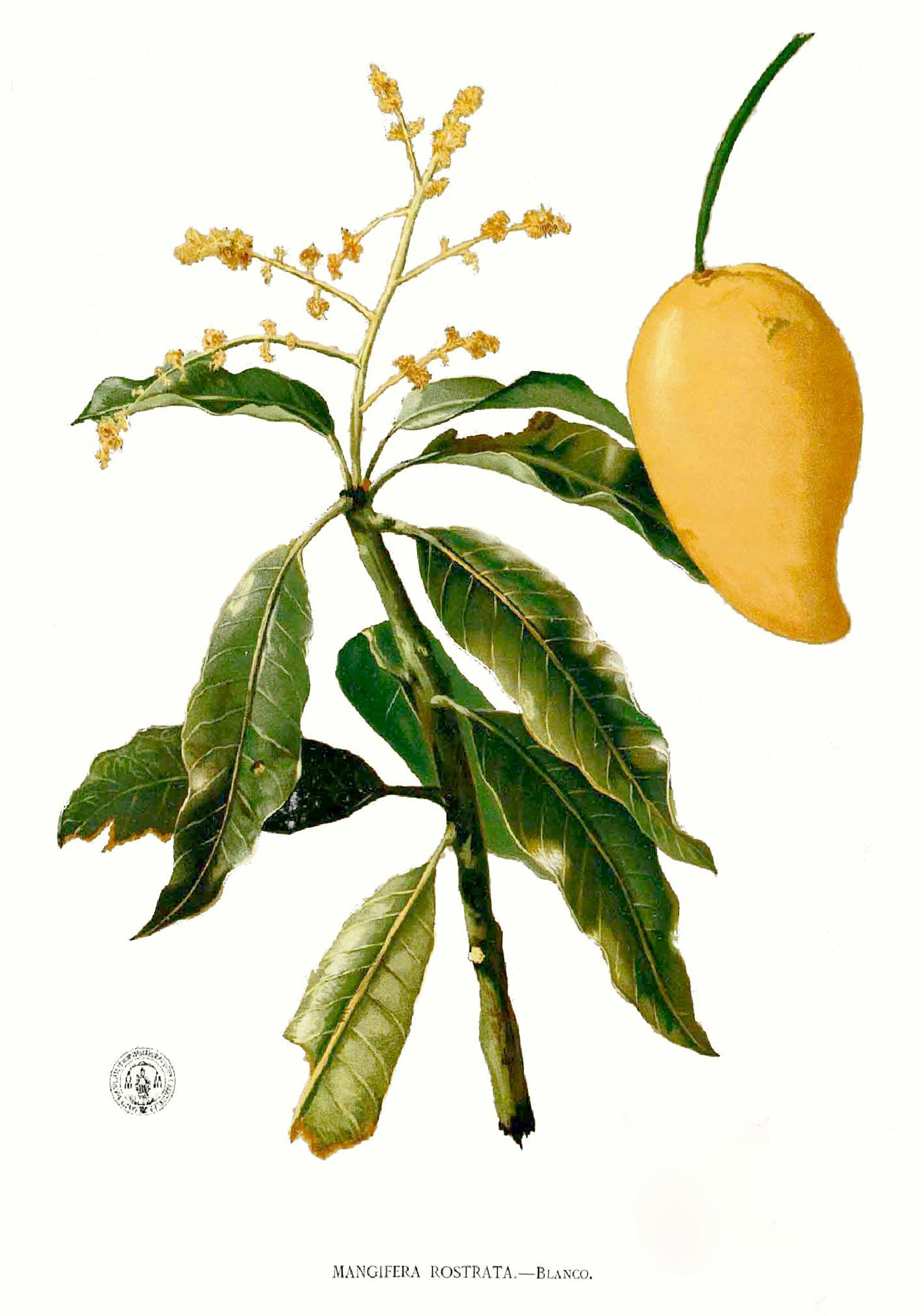
(Right) Magnifera Rostrata illustrated by Manuel Blanco.
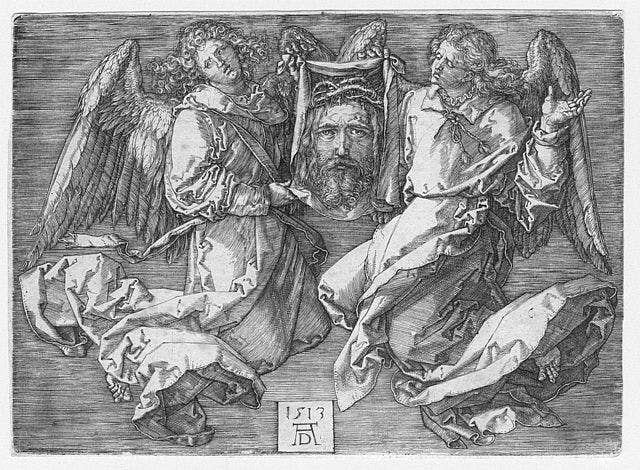
Veronica, , 1513. Example of hatching (e.g., background) and cross-hatching in many darker areas by .
Misuse


Want to print your doc?
This is not the way.
This is not the way.

Try clicking the ··· in the right corner or using a keyboard shortcut (
CtrlP
) instead.