Skip to content
😦 A text field designed for ants.
And with no ability to expand it. If you’re drafting a lengthy publication note, you’re in for a bad time. Scrolling, squinting, 😞 No formatting tools.
There is no way to make longer publications easier to consume. Line breaks, all caps, and emojis are all you’ve got. And remember the first point ☝️ this space is not at all friendly for drafting.😭 No structured data, no templates, no guidance.
A cold and empty text field that leaves you wondering “What should I write? What makes for a good publication note?”
How big (or small) are publications? Are designers publishing big batches of components, or lots of small ones? Why?Are there any patterns in when people publish? Does it happen evenly throughout a quarter, or year? Maybe in concentrated bursts? Why? What external factors cause this?What kinds of changes are being published? Smaller corrections and fixes, or big overhauls and large enhancements?What do individuals’ contribution stats look like? Who publishes the most? The least? And why? What does the history of component-X look like? When was it introduced to the library, and who authored it? Who has contributed the most to it? Has it changed drastically over time, or mostly stayed the same?
Encourages contributions by making contributing easy, and keeps a detailed record of everyone’s individual contribution histories. Writing in Coda’s tables is a much more inviting experience than Figma’s publication note text field. This doc takes the guesswork out of writing by asking guiding questions to help designers write the best note possible for the type of material they’re publishing.Enriches your library’s historical timeline by leveraging . This allows you to capture the “size” or “risk level” of each publication, in addition to the “who” and “when.” No more nodes on a timeline; you can actually tell a library’s life-story. You will see this story take shape on the bubble chart found on .Captures context about design decisions at the component-level. Understanding the history of a library is one thing, but imagine getting that rich timeline view at the component level. Pick any component, and view every change its experienced, who made that change, when, why, and what other components were affected alongside it.
Share
Explore

Get a copy of this doc
Figma is an incredible tool. But...
it’s like Figma wants you to write
bad publication notes 😰
Not only does Figma’s component publication experience make it hard to write good publication notes, it’s so uninviting that it seems to discourage writing anything! I suspect this is a big part of what makes folks scared to accept updates in their local files: if they can’t expect good publication notes, they can’t know what changes they’re accepting, so it’s easier to just... not. Let’s first examine the writing experience 👇
click to expand ☝️
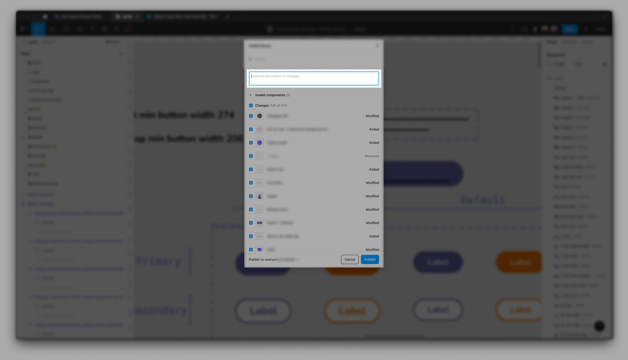
Nothing about this experience encourages designers to produce well-crafted, thoughtful, contextually-rich publication notes for their teammates.
And even if Figma did offer a space that encourages thoughtful note writing... the experience for viewing past publication notes is equally bad. The only real utility that a library’s publication history offers is the ability to restore a past version. If you’re curious about the file’s actual history, you’re out of luck. All you’re given a piddly little timeline. And for each publication in the timeline, you only get the first few words of its notes (that is, if the author bothered to write any. And I wouldn’t blame them if they didn’t!)
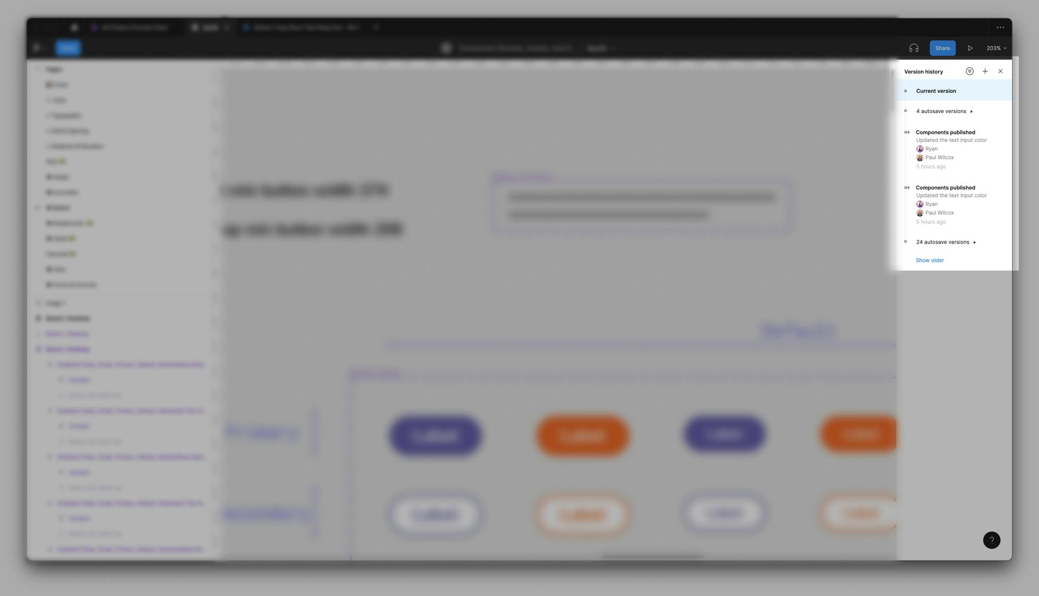
click to expand ☝️
Looking for historical context about a library in Figma will leave you wanting. There’s tons of great questions you may have, such as:
Well, in Figma, you can’t answer any of that 😔
... but with a doc like this one, you can ✨
Welcome to the UI Library buddy doc 🤝
Get a copy of this doc
Who should use this doc?
UX Designers tend to be the primary audience and users of this doc. They are creating mockups and prototypes using components from that this doc is related to, and also the ones who are writing and referencing publication notes.
Secondary audience is anyone else from Product who needs to keep abreast of what work is being done in . They do not contribute to the file, but benefit greatly from having access to the design decisions that have shaped the library and individual component into what they are today.
Jobs that these doc user’s perform
These jobs keep running, as well as this accompanying buddy doc. These jobs are grouped by where the work happens.
Table that this table is a view of has been deleted. Click to delete the table.
What information powers this doc?
Components data
Components are a critical object to track as they are the things that get impacted with every Publication made to . In addition to related Publication data, we offer two columns so designers can stay aligned on the state of each component’s documentation, and its status in Figma.
status
publication data
Publication data is generated here in Coda. When designers are ready to publish something in , in Figma, they should also come here to record that act of publishing. And since it’s here that we can offer them templates and guidance on writing good publication notes, this behavior should be easy to encourage and adopt.
Types of publications
Not every publication is the same. Some are tiny corrections to existing components, others are huge overhauls, and others are simply the addition of new material. This buddy doc uses to categorize different publications by their size or risk to override loss:
⚙️ Defect fix
While mostly relevant to code (like an IE11 bug), this also extends to an erroneous Sketch library symbol label or doc site’s guideline. ()
🌱 Small enhancement
A small enhancement where an architecture otherwise remains stable, such as adding an alert color (orange for “new”) to an existing set (red for “error,” green for “success,” and so on). ()
🌳 Large enhancement
A large enhancement extends an existing feature, such as an alert’s dismissibility, description, and position (inline, block, or viewport-locked). ()
🆕 New material
❓ Unknown
There are no rows in this table
A buddy doc also provides designers with a menu of tangible changes they might make in Figma. These each map to a publication type (listed above), and denote how risky any change may be in terms of override loss (⚠️ vs ⚠️⚠️)
⚙️ Defect fix
8
Correcting style or variable usage
Correcting auto layout settings (resizing rules, alignment, space between, padding)
Correcting stroke, fills, or effects
Correcting variant or property names
Correcting corner radii
Updating a component’s description
Adding missing interactive states
Adding component properties
🌱 Small enhancement
7
⚠️ Changing names of internal layers
⚠️ Changing name of component
Adding a new variant to existing component property
Moving component to new page, frame, or section
Adjusting or reordering a component’s properties and/or variants (either on the canvas or in the design panel)
Enhancing visual design
Exposing nested instances’ properties (or updating which ones are exposed)
🌳 Large enhancement
4
⚠️⚠️ Changing layer structure (any of the following):
Adding nested layers/instances
Renaming layers
Removing layers
Reordering layers
⚠️ Moving component or style to new file
Adding a new property (and variant(s)) to an existing component
Deprecating a component, style, or variable collection
🆕 New material
1
Creating new components, styles, or variable collections
❓ Unknown
1
⚠️⚠️ Clearing out the publication panel
Get a copy of this doc
Want to print your doc?
This is not the way.
This is not the way.

Try clicking the ··· in the right corner or using a keyboard shortcut (
CtrlP
) instead.