Skip to content
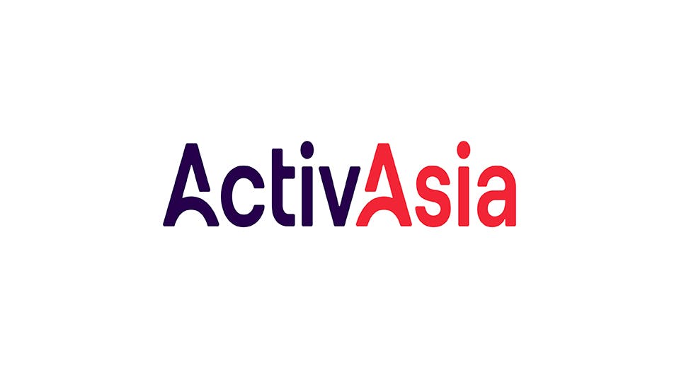
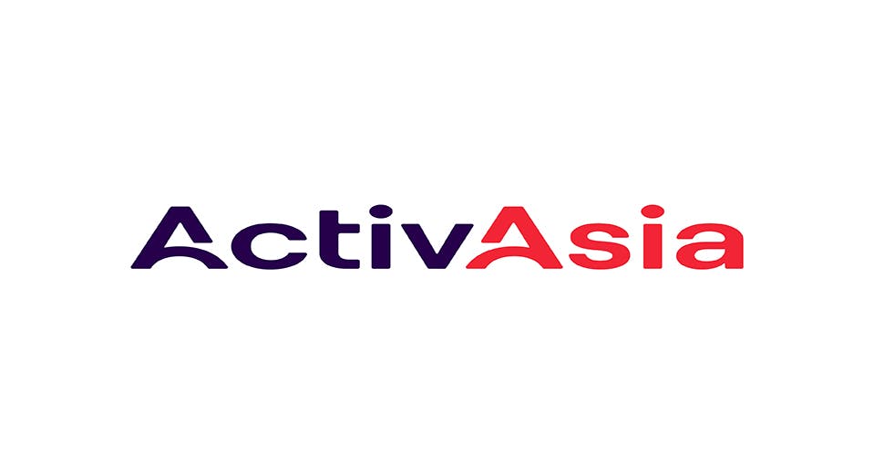
 Main Logo
As the Main Logo of ActivAsia, it is the highest in terms of usage hierarchy. It is the most flexible lockup and the mark that best and most concisely captures the core of the brand.
Overview
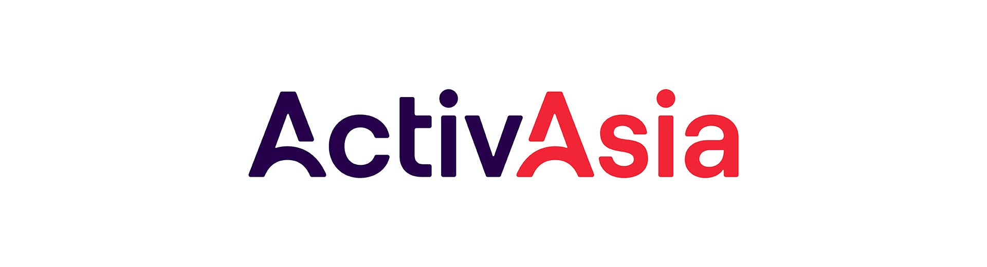
The ActivAsia logo shares the warmth and humanness of the brand. It shows what makes their team strong: the people behind the A+ team culture that has built lasting relationships.
Inspired by Rube Goldberg machines, its two A's illustrate a bounce that connects from the first A to the next, alluding to ActivAsia's work ethic and the strength of their end-to-end service.
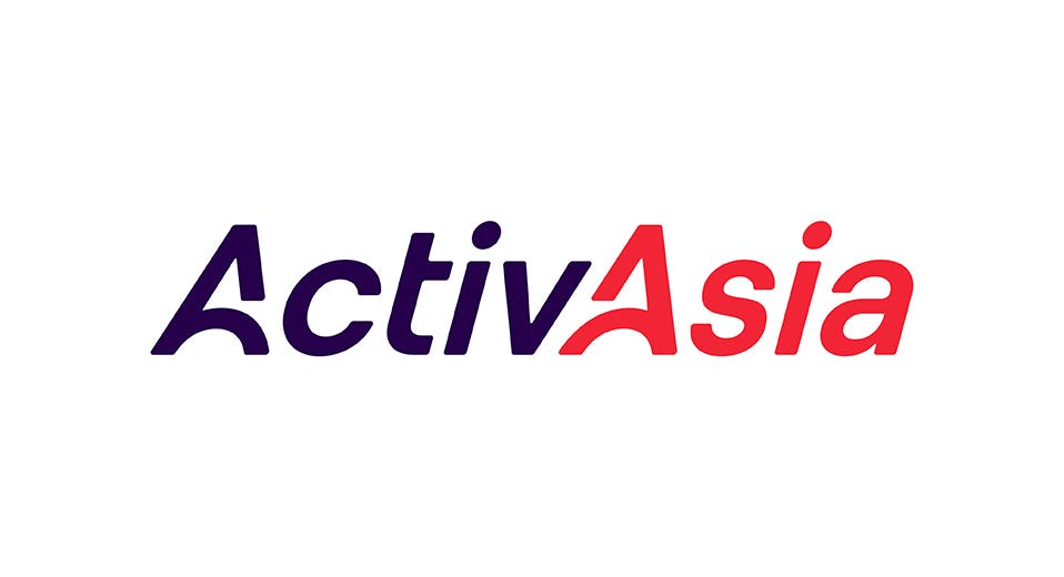
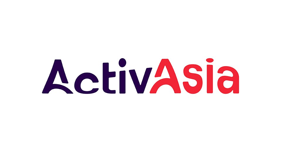
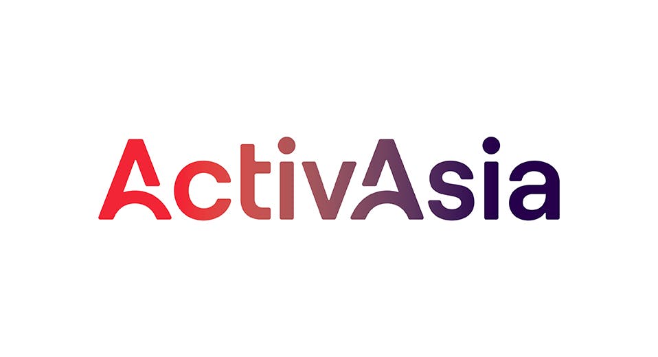
Color Variations
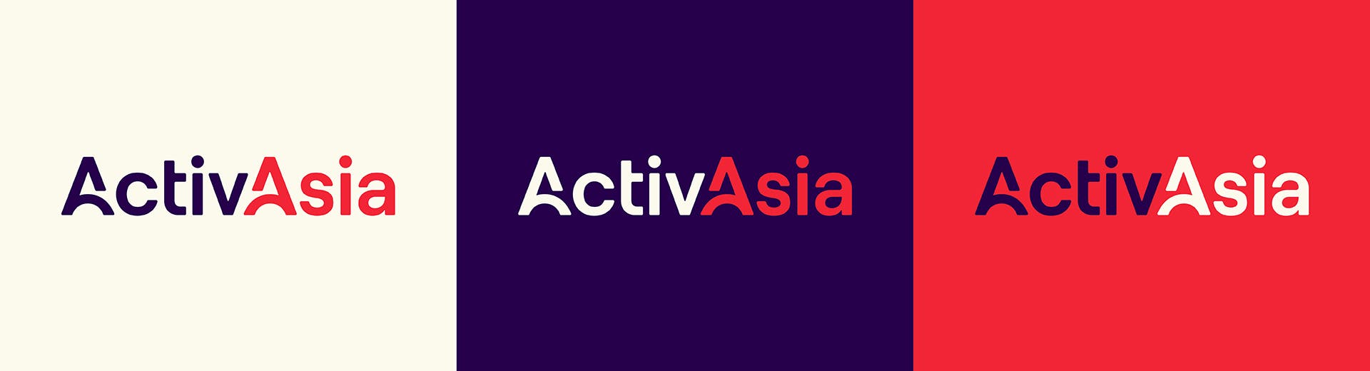
Primary Color Combinations
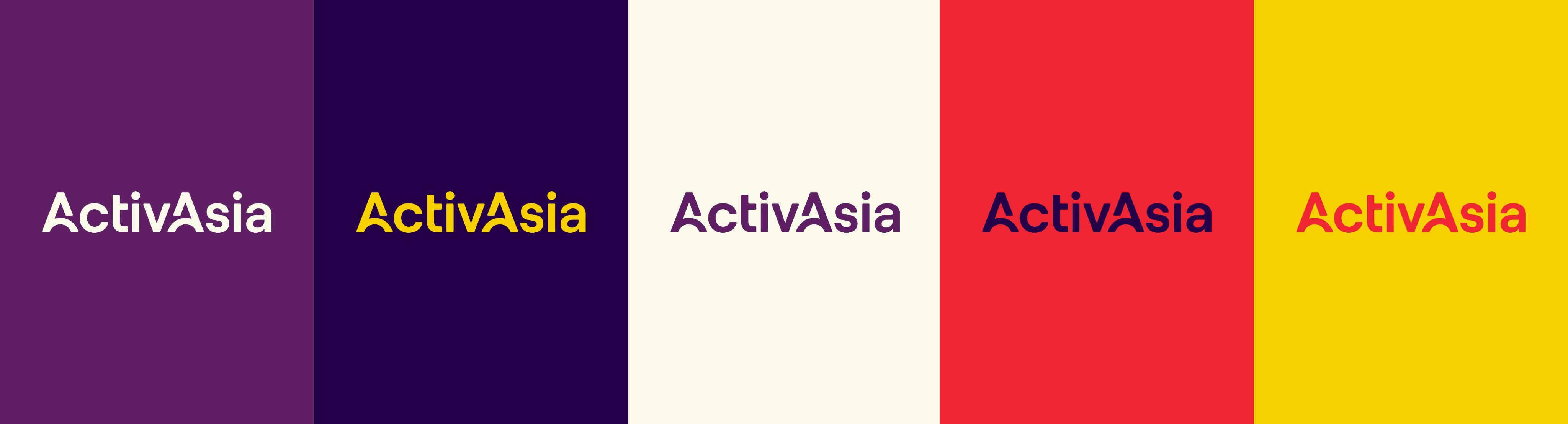
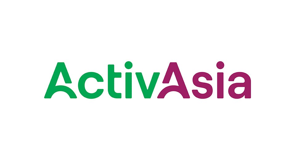
Alternate Color Versions
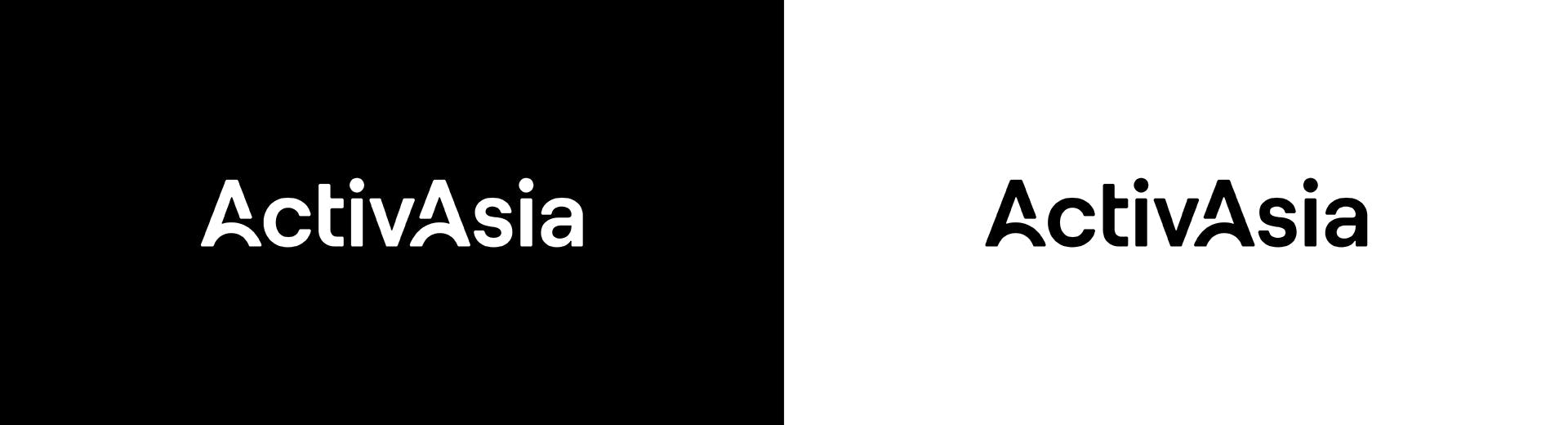
Black & White
Clear Space & Minimum Size
Clear space is a space surrounding the logo set to ensure elements surrounding the logo will not overlap or obscure it. The clear space of the Main Logo is equal to the height of the stem of i.


The minimum size of the Main Logo is at a width of 0.5 inches. This is the smallest possible size that you can use this mark.
Misuse
Do not compress the logo when scaling.
Do not shear the logo.
Do not add any effects that skew the logos form or geometry.
Do not add any gradients to the logo. Even if the colors are on brand
Do not stretch the logo when scaling.
Do not slant the logo.
Do not use colors or color combinations that are off brand.
Do not add any embellishments to the logo such as drop shadows, bevels, glows, etc.
Want to print your doc?
This is not the way.
This is not the way.

Try clicking the ··· in the right corner or using a keyboard shortcut (
CtrlP
) instead.