Skip to content

Share
Explore

The writeup below is a real proposal shared internally at Coda for the feature that shipped in April 2021. It’s been slightly edited to remove confidential information and add clarity for non-Coda audiences. The writeup was originally done by and from our Product and Design team.
This template has been adapted from Coda Head of Product & Design Lane Shackleton’s doc, , using page layouts. Replace the sample text, data, and images with your own. Learn more about how you can customize new and existing docs to highlight and synthesize data more effectively
on the Coda Community page.
Customize your own project overview
Background
As Coda transitions toward honing the simple cases, things like the visual design and emotional feeling of the product become more important. In the past, we saw evidence of this with the launch of features like centered content and cover photos, and especially with the . While we knew those features would be impactful ahead of time, we were still pleasantly surprised at the reception from makers and the continued enthusiasm for the dozens of small improvements we’ve done as a follow-up.
Project rationale
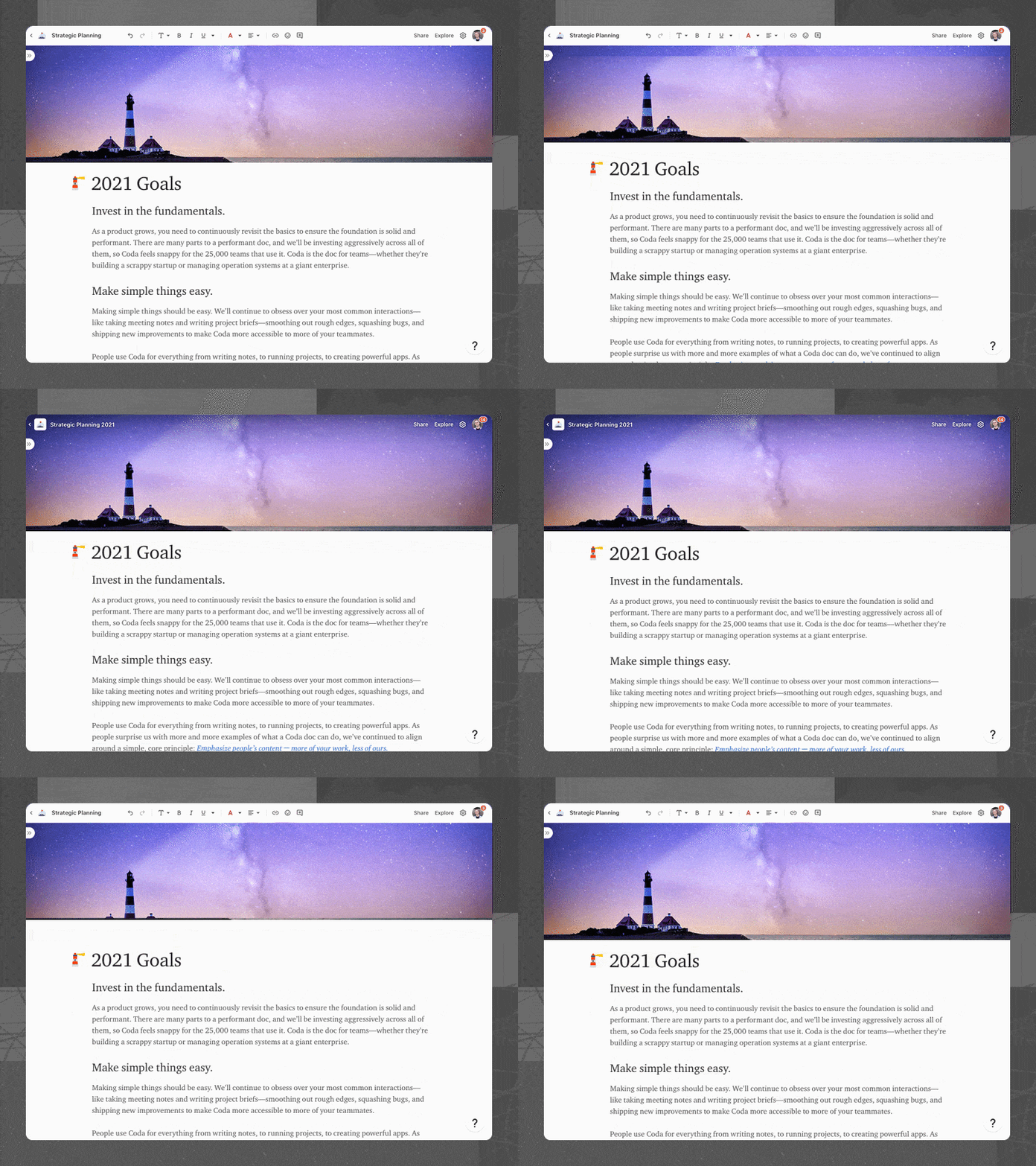
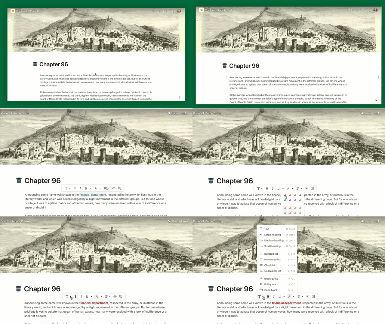
Should the toolbar should be fixed or inline? Our guiding principle is to minimize our UI and let user content to shine. This top toolbar is an element of UI that permanently takes up screen space. Switching to the inline toolbar will make docs feel more lightweight.
Proposed plan for testing this quarter
Through our internal testing over the last five days, we have received a lot of awesome feedback. We have run many user tests with new users across the base and inline toolbar variants. We plan to do additional testing and monitoring — but would love to share out what we have learned so far to collect input.
Inspiration
Continue learning: We are still working on many ‘P1’ issues and feedback and refining a lot of the details. As part of that, we would love to collect more feedback internally and so please help us out by adding feedback and concerns. We would also love for the Go-to-Market teams to suggest makers who might have valuable input on this feature, and we plan to run additional user tests for other scenarios like coming into a collaborative doc, published doc, etc.


Ease the transition: On the day we release the inline toolbar, users will need to switch to a slightly different way of doing things.
Tell the story: We plan to write a thoughtful blogpost that shares the “why” of the feature with users, similar to the .
Monitor data: We want to make sure that this feature does not regress any metrics around discoverability of key features or even activation of new makers. We will build a dashboard to review these metrics.
Expected reception
UI changes can be surprising—especially in features that are heavily used. There are some small scenarios that may have more friction with the in-line toolbar, such as formatting the text on a blank line or in a single cell. Here’s a look at how that might impact our current social media engagement:
To replace images, delete them, then use /Image to add your own images, GIFs, or videos, or drag and drop in local files directly from your computer.
Concerns
Besides the transition, here are the key buckets of concerns that we have heard so far with the inline toolbar, along with our current thinking on how to mitigate them.
Concern
Description
Mitigation
Concern
Description
Mitigation
Familiarity
Coda feels less familiar as a doc surface to those coming from Word, Google Docs as well as existing Coda users.
From user testing, there was no observed difference in familiarity - users in the inline toolbar variant labeled Coda as simple or similar to other tools just as often as users in the baseline variant.
Consistent with our “right over familiar” value.
Discoverability
It might be harder to find how to do specific things like adding a hyperlink, emoji, comment etc before selecting.
From user testing, we did not find this to be a concern. Even when users had the toolbar, they still used / commands and Explore far more often to find things.
We will watch specific metrics to ensure this doesn’t get affected.
We will continue iterating to promote the toolbar in the UI at the appropriate moments (placeholder text, right click menu, / menu etc).
Convenience
The toolbar doesn’t always show when I need to use it. I have to select something first e.g. blank line, single cell/column etc.
Hold down Command key - tell users this reactively and find ways to teach this in the product proactively.
Use / commands e.g. /bold, /link, /red, /emoji, /list.
We’re adding quick paragraph style switching in the 3-dot menu.
We’ll add an option in the right-click menu on a cell/row/column.
Noisiness
The toolbar sometimes shows up when I don’t need it, for example if I select text to read or select multiple rows/columns to move.
We have tried to strike a balance but would love feedback to fine-tune the heuristic
Find ways to make the toolbar unobstructive - e.g. make it smaller, transparent etc.
Add a delay between when you select and the toolbar shows up.
There are no rows in this table
Motivations
While we are cognizant of the concerns and want to do our best to address them, we believe there are still a number of important reasons to ship the inline toolbar. Here are the key reasons we’ve identified and please add comments to share your thoughts on them:
Reason
Description
Expected impact
Reason
Description
Expected impact
More beautiful & presentable
The lack of an ever-present toolbar means that docs look more ready to share or present, with or without cover photos.
People may be more likely to share Coda docs with their team or publish them to make their ideas shine.
Cleaner & simpler
A majority of weekly active editors never use the toolbar at all, so hiding the toolbar would make Coda feel more lightweight for simple cases.
People may be more likely to use and promote Coda for simpler cases like jotting down notes or a project brief.
Highlight what’s unique
Go from having ~15 buttons at the top of the page to just 5, making key actions like Share and Explore more prominent.
Increase in users clicking Share and Explore, especially Gen 1 users coming into a doc where Explore is not open.
Closer at hand
Since the inline toolbar shows up right next to your selection, it saves time compared to taking your mouse all the way up.
Applying a format using the toolbar takes less time and mouse travel than before.
Available in more surfaces
Users can now see the inline toolbar in places they couldn’t before, including row modal, comments, and also planned new features.
Increase in users applying formatting in row modal & comments, and unblocking future capabilities.
Contextual buttons
Since the toolbar is not always visible, we can show a different set of items based on your selection e.g. folding for headings.
Increase in discoverability of features like folding (and other things in the future like creating a view of a table).
There are no rows in this table
I've read this far. 
To resize columns, slide column dividers. To add new 2-, 3-, or 4-column layout sections, type /column on the page!
Want to print your doc?
This is not the way.
This is not the way.
Try clicking the ··· in the right corner or using a keyboard shortcut (
CtrlP
) instead.