Skip to content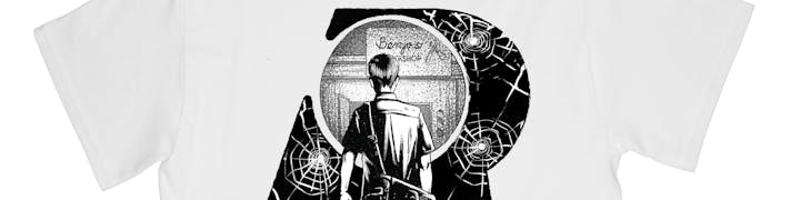
 Key Visual
The key visual is a graphic theme that appears consistently throughout the visual identity of a brand. It is something unique to every brand and should distinguish a company from its competitors.
The key visual (KV) of the brand is the negative space created by the counter* of the letter R (the Lens). This circular space acts as a vessel for different brand elements, able to adapt to the needs of Rein and its various applications.

*In typography, a counter is the area of a letter that is entirely or partially enclosed by a letter form or a symbol.
Rendering the letter R
The letter R can be rendered in the following ways when used in a flat image. It can also use any color from the brand palette.
(a) Using a solid color; or
(b) Using a colored outline.

As see in the sample below, parts of the KV can overlap with the subject of the canvas. Half of it can also become the foreground and/or background, creating an illusion of depth as seen in the sample on the right.


It can also adopt other effects (such as 3d) in future applications.
KV Treatments
There are several ways in which the Lens can be used as KV. This allows the visual identity to continuously evolve with every interpretation and application.
As Container of Ideas
The most distinctive feature of the lens is its flexibility to be used across different films, business units, & mediums. The Lens becomes a container of infinite concepts.

Below is a sample of how the flexibility of the KV can be utilized in practical applications like a pin button applied to the logo on the hoodie.
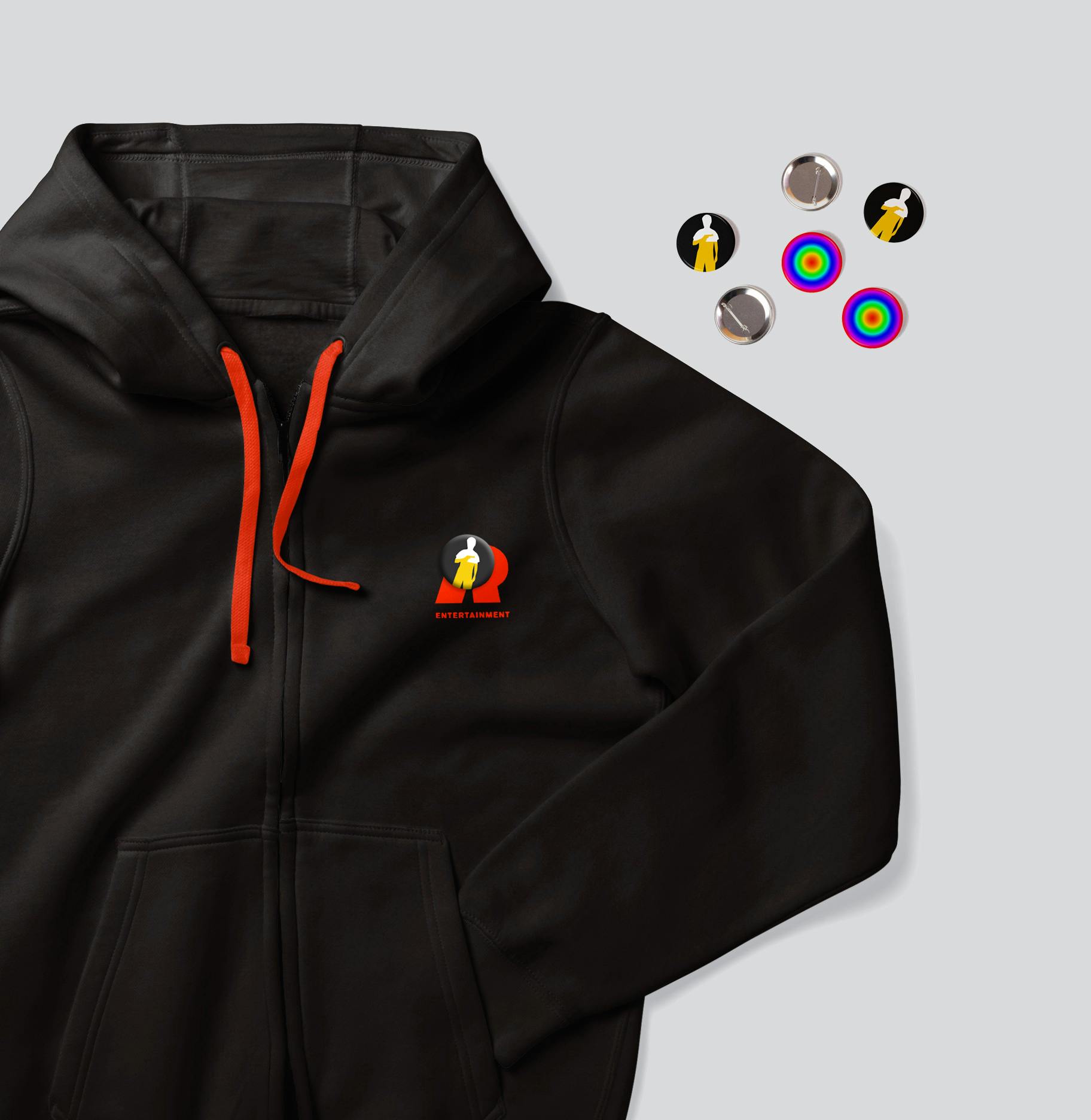

A sample merchandise for BetCin with a subtle application of the lens
Placement Inside the Lens

When placing subjects and/or objects inside the Lens, place them in the center or off-center of the counter.
As a Framing Device
The Lens can be zoomed and cropped to put focus on certain subjects or areas of the canvas. This framing technique can be applied on square or rectangular canvases, and can be flushed center, left or right. Follow these loose guides below when cropping the Lens:
On a square canvas


On a horizontal canvas


On a vertical canvas


As Typography
The brand can make use of unique typographic executions following the circular shape of the Lens. This illustrates how Rein entertainment “reins in the vision” and puts “reality into focus”.

A half circle can also be a way of laying out the text and can be used as accents to select graphics.

As Circles
The Lens can also manifest as circular shapes that are able to adapt to internal needs and to different projects of Rein Entertainment.
In the sample below, the rugged circular shapes are used to direct attention in conjunction with other brand elements.

The circles can also be used as containers in certain compositions as seen in the sample below.

Below are samples of graphics for different Rein Entertainment projects rendered as simple circular graphics.

As Patterns
Patterns can be made from concentric circles. Below are just a few samples of how these circles can manifest as patterns. The designer is free to explore other circular patterns akin to the samples below. They can also use any of the brand colors.


The patterns should only be used sparingly as a way to extend the visuals. The primary usage of the KV should still be as a container, a framing device and as typographic treatments.

Combining the Different Treatments of KV

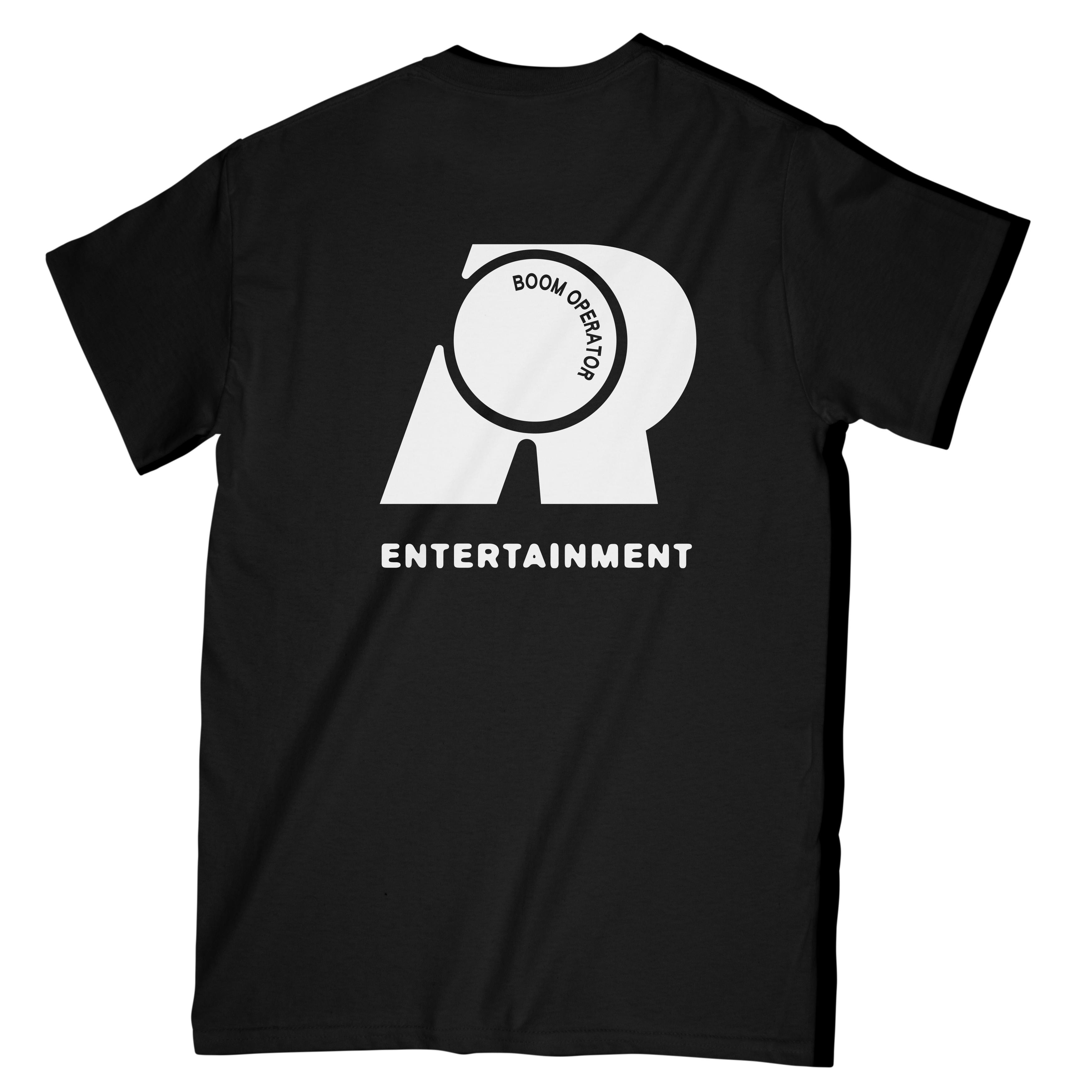
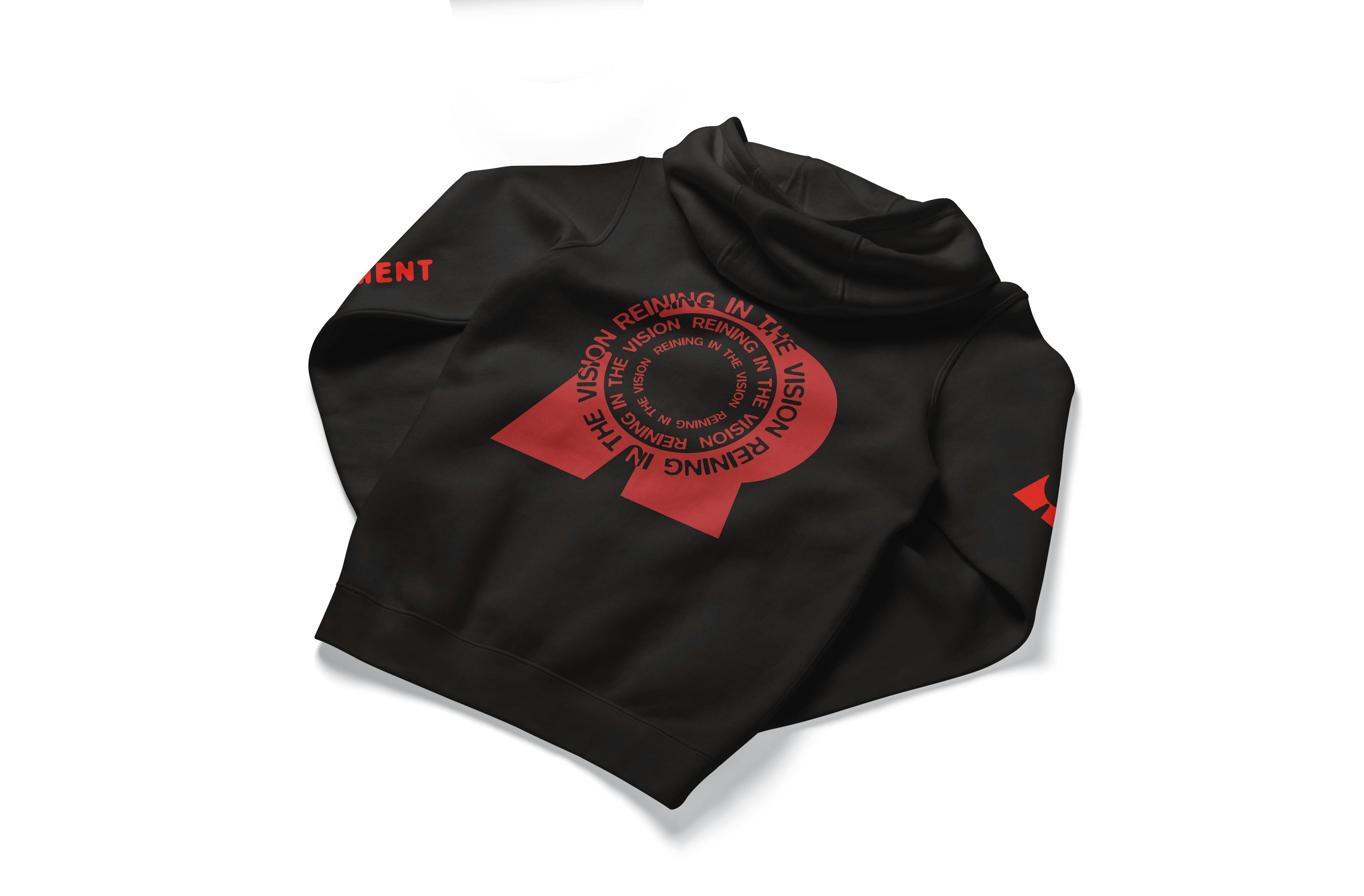
A sample KV treatment combination of type and container can be as simple as the graphic on the left. Below is another sample that gives this hoodie a little extra boldness.

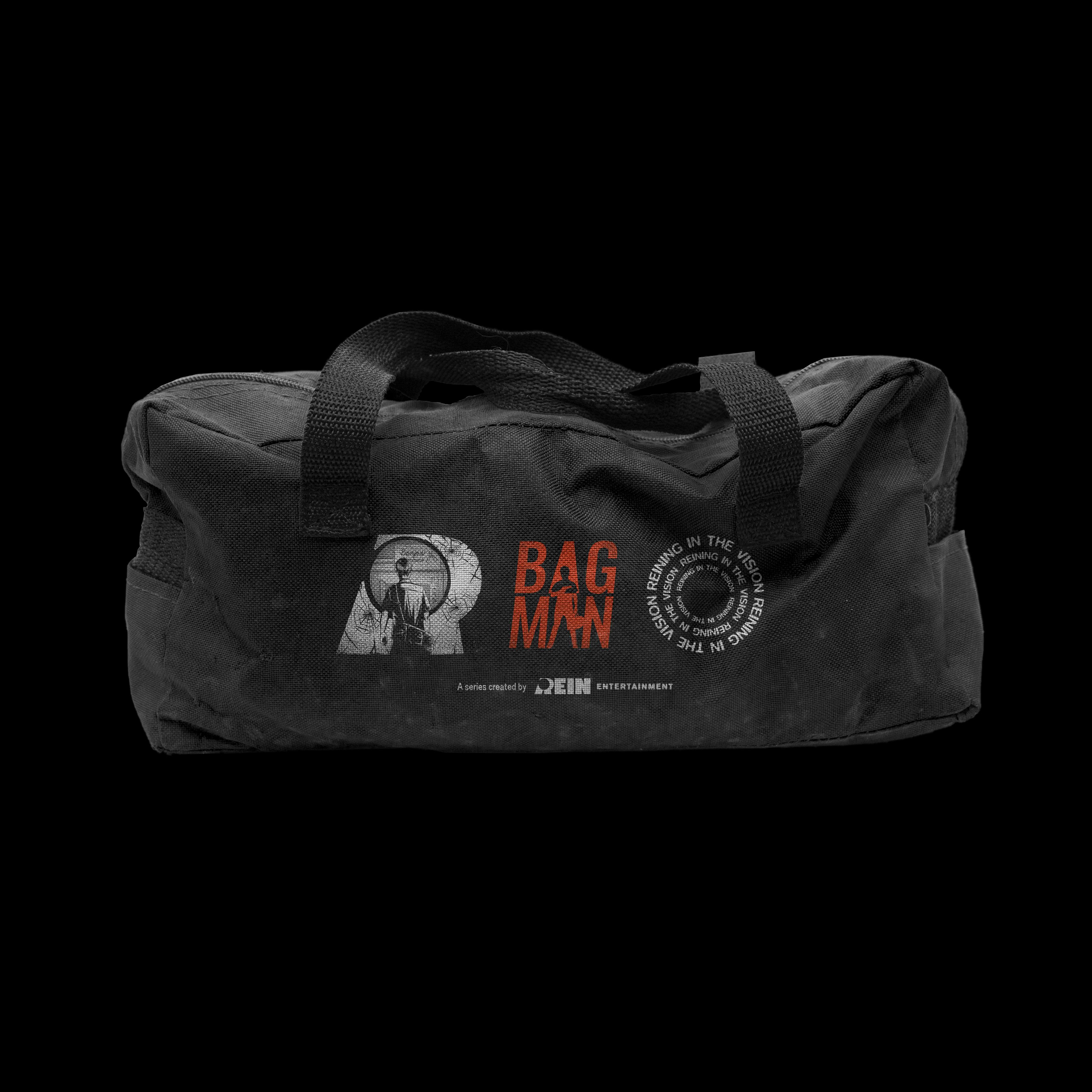
Sample applied on Bagman combines the framing device and the circular graphic.

A circle with a photo and a type treatment are combined to produce a strong, mysterious graphic.
Application on Projects
IMPORTANT NOTE: The KV should not take away from the individual visual identities of each film or project. Their identities should always take precedence over the mother brand.
When creating materials using the KV in combination with a project’s visual identity, make practical use of the KV as container and as circles. Below is a sample of what an illustration can look like featuring Bagman.
This treatment can be used not only on print but on digital materials such as videos and motion graphics as well.

Use such treatments when building the brand identity and recall of Rein Entertainment.
Press kits are a good way to not only promote a project but also to showcase Rein Entertainment. The application can be as subtle as the application below.

A sample merchandise for BetCin featuring concentric circles in the same color as the movie title.

Want to print your doc?
This is not the way.
This is not the way.
Try clicking the ··· in the right corner or using a keyboard shortcut (
CtrlP
) instead.