Skip to content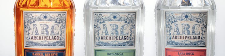
 Primary Logo
Overview
The primary logo is the main brand signature. It should be used primarily on but not limited to products, print materials and digital applications. Below are the versions of the primary logo and their recommended usage.
Composition
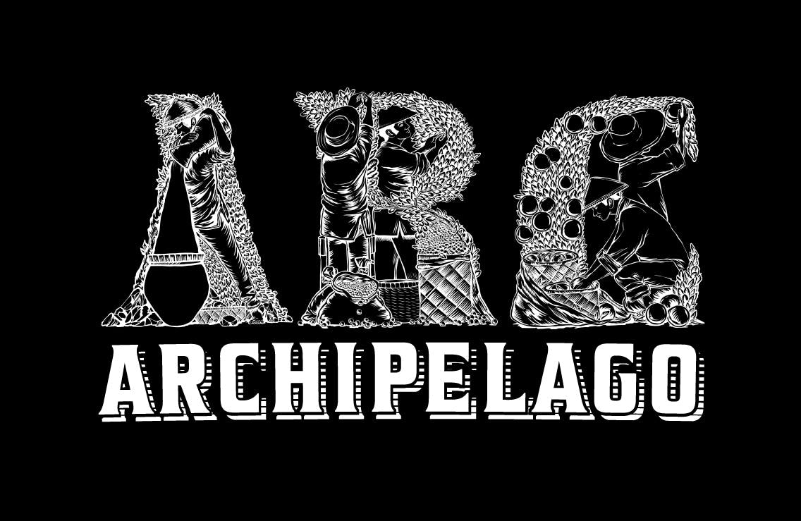
The primary logo is composed of the 3-letter mark and the wordmark stacked on top of each other as seen below.

Versions
Full Color
The full color version of the primary logo uses the fully illustrated 3-letter mark and the two-color wordmark. This must be used on full-color print and digital materials whenever possible.
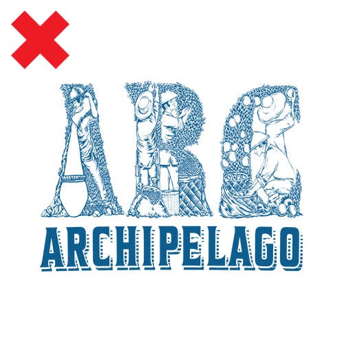
Colored Outline
The colored outline version of the primary logo uses the one-color 3-letter mark in Archipelago Blue and the two-color wordmark. This must be used for applications where color use is limited. For example on bottle labels, packaging, silk screen printing, etc.

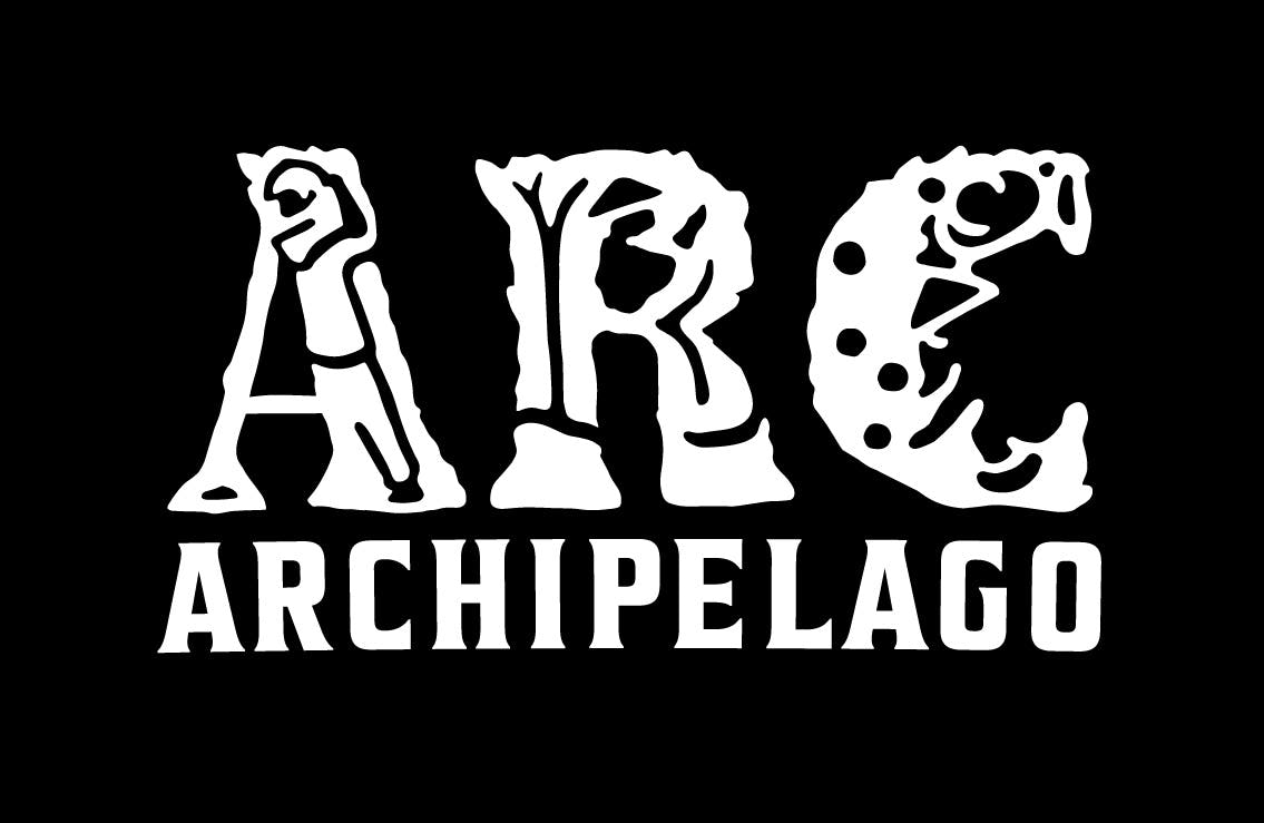
One-color Outline
The one-color outline version of the primary logo has three color variations: Archipelago Blue and Archipelago Dense Black. and white. They can be used on materials where application is limited to one (1) color. For example, stamps, decals, signage, laser engraving, etc.


Simplified Version
The simplified version of the primary logo must only be used for small applications where (a) the supplier requires a simple mark to accommodate production limitations and (b) where color use is limited to one (1) color. For example, stamps, stationery, and small print and digital applications.


Color Use
The primary logo versions must be used mostly against a background colored in Archipelago cream or white, or any light colored background that allows the logo to pop.


If the background is dark, use the white versions of the primary logo.

Clear Space & Minimum Size
Clear space is a space surrounding the logo set to ensure elements surrounding the logo will not overlap or obscure it.

The recommended clear space of the primary logo is equal to the distance between the baseline of the 3-letter mark and the baselines of the wordmark.
**IMPORTANT**
The only exception to this rule is when the primary logo is used on the label of the bottle to achieve more impactful compositions.

The minimum size of the primary logo is at a width of 2 inches. This is the smallest possible size that you can use this mark.
Misuse
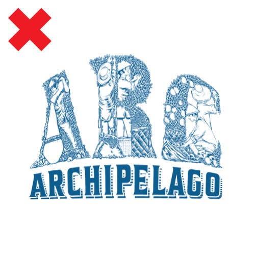
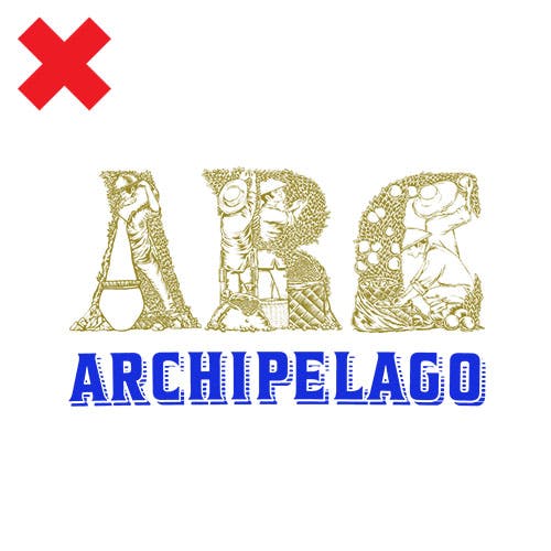
Do not compress the logo when scaling.
Do not rotate the logo.
Never apply gradients to the logo.
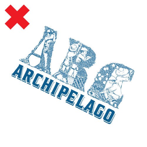
Do not alter the composition of the logo.
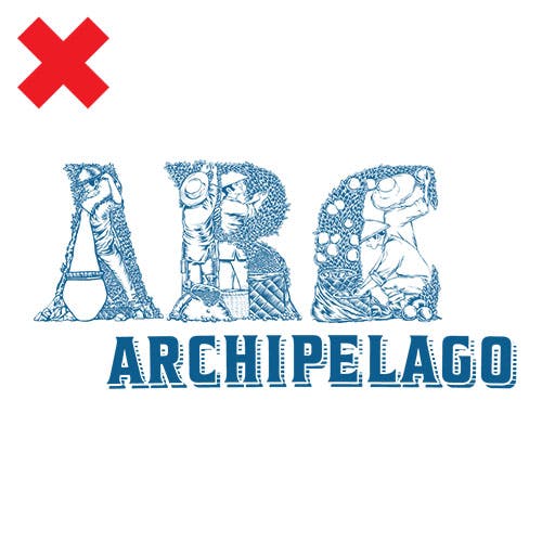
Do not distort the logo’s form in any way.
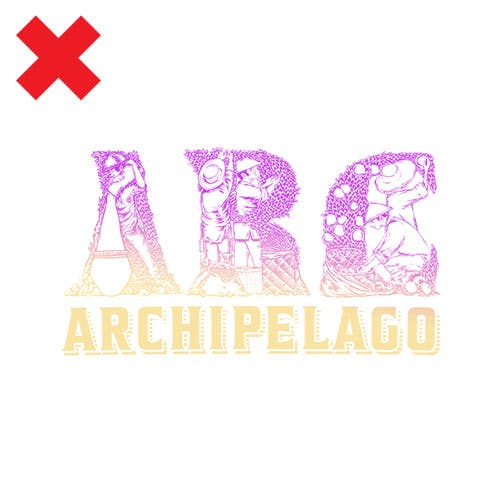
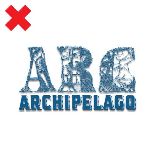
Do not alter the color of the logo.
Never apply effects such as shadows and glows.
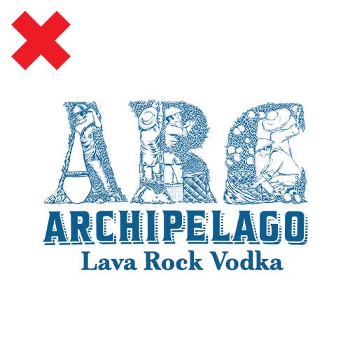
Never place anything close to, beside, or under the logo.
Want to print your doc?
This is not the way.
This is not the way.

Try clicking the ··· in the right corner or using a keyboard shortcut (
CtrlP
) instead.