Skip to content


 Widely used (familiarity, less learning curve)Express buttonsSo many buttonsNever bothered to read the long instructions
 Touch screenPrettier appearanceExpensiveUnique interface interactions
 Simple interactionsFew buttons, little cognitive loadLess functions
 Super unique characteristicsFun interactionsHigh costHuge learning curveBig tradeoffs
Kids — Still learning about using microwaves. “What does this button do?” “How long should I microwave this?” “Can I put this in? (hope it doesn’t explode ^^)” General adults — Use microwaves regularly, but only for heating up lunchboxes. “Never bothered to read the instructions” “Only knows express cook button 1, 2, 3” House chefs — Use microwaves on a daily basis, more functions mean easier work. “Takes forever to use — I need to press on that button for 4 times to set it up” “Have to enter everything manually” Elders — Use microwaves, but might be having some troubles with them. “What does this button do?”“Technology is hard” “The words are too small, can’t see”
Easy to use interface and simple interactionsAccessible design — readable, clickable, understandableInstructions & help if needed

Missions & GoalsEasy to use interface and simple interactionsAccessible design — readable, clickable, understandableInstructions & help if needed


Test & refine interface designCosts & stakeholdersCrazier ideas?
Share
Explore

In a few screens or less, redesign the interface of a microwave. We are interested in your creativity and problem solving, not your process. Include callouts of how it works, explanation of any tough tradeoffs you made, and a list of things you’d explore more with additional time.
How do microwaves look like?
Title
Photos
Comments
Online Retails
Best selling microwaves on Amazon, Target
My Own
At school’s common room kitchen


Other Interesting Ones I saw Online
There are no rows in this table
Microwave categories
Category
Appearance
Pros
Cons
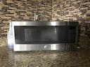
Traditional microwaves (by 2021)
Innovative microwaves (by 2021)
Retro/portable microwaves
Futuristic microwaves
There are no rows in this table
Who am I designing for?
Main Takeaways & Missions
Basic Interface Layout
Vertical Layout
Horizontal View
The microwave interface usually looks like a “bar” on the side or bottom of the microwave. From my understanding, this is due to technology restrictions that the interface should be protected from microwavable content.
As for my redesign, I would prefer to go with the vertical layout since it’s more common for all (less learning curve for people) and allows more space for interaction. Here’re some tradeoffs:
✔️ Common for all, less learning curve for people
✔️ Allows more space for interaction
✔️ Less cost, few technology restrictions
❌ Less space for heating food
❌ (Potentially) bigger in size
A closer look at the Interfaces

This is a typical microwave from LG — it has 31 buttons on that small interface area!
✔️ Number pad allows more functionality & flexibility
❌ Tiny words, flat buttons, 0 tactile feedback ... Please make it better.

Wow! So neat! This Samsung microwave only has 2 knobs to adjust time and heat level. The designer sacrificed many functional buttons to allow the simplest interaction — heating food.
✔️ Knobs — easy interaction
❌ Less functionality, 0 instruction
❌ Wired order — the knob on top should be the first interaction, which should be setting up temperature instead of time
My Design

Functions
Name
Design
Details
Bar Code Scanner
✔️ Scan the bar code from food packaging to enter food data (shortcut)
✔️ Quick & automated input (less cognitive load)
✔️ Easy to use, no need for instructions.
✔️ Designed for children, workers, and elders. Simple user flow.
❌. Additional cost for hardware & database
Knobs
✔️ Knobs with information displayed on the front — based on users’ adjustments.
✔️ Quick & easy input (less cognitive load)
✔️ Fun interaction
✔️ Accessible for all
✔️ Aligned the knobs separately to avoid mis-clicks
❌. Additional cost for hardware & interface
Top-to-bottom order
✔️ People generally take in information in the order or top → bottom, left → right
✔️ Information input order matches with people’s preference, easy interaction
❌. Slightly different from people’s general interaction with microwaves
There are no rows in this table
More about the Knobs

Inspiration from the smart knob-like thermostat
Moving Forward
This was a fun exercise and I took a while to look into many microwave products. However, I didn’t spend enough time tweaking the visual details or testing the interface. If given more time, I’ll make more screens & prototypes to test the idea out with people & gather more feedback
For my design, I focused more on the user experience so did not pay a lot of attention at the cost. However, as a technology product that every common household owns, the cost is fairly important and need to be taken into consideration.
As for this redesign, I stayed in the scope of a traditional microwave to design for all. However, I’m curious to learn & see if I can implement more innovative thoughts on designing the microwave interface.
Want to print your doc?
This is not the way.
This is not the way.

Try clicking the ··· in the right corner or using a keyboard shortcut (
CtrlP
) instead.