Skip to content

Share
Explore
Remodeling the Coda user experience
How Coda's user experience became fragmented and what we did to fix it.

When building a house, you finalize the plans and then build it in horizontal phases. You pour the foundation for the entire house, raise the frame, add the electrical, plumbing, and so on—one stage at a time until the home is complete. Software design is a little different. You build one feature, or room, at a time. Because the product, or house, is never complete, you need foresight into what future features you might build or you need to occasionally step back and remodel or rearrange to accommodate the new ones. Fortunately, in software design, it’s not that hard to move a room to the other side of the house.
The maze: Undiscoverable-but-great features
We built our first two features two years ago while in beta—Packs, the ability to connect to third parties, and Automations, the ability to automate your doc by setting up rules. We didn’t have a great place to put these, so we just stuck icons in the toolbar.
Over the years, we added things like templates, buttons, formatting options, cross-doc, and more. For each one, we connected to the UI in different places, many lived in the plus menu, others had entry points in settings, under right-click menus, or even on the dock surface itself. We built all these great features in Coda, but many users never tried them because they were hard to find. We realized we had built a maze of rooms with no common way to get in.
A couple of months ago, we built a way to quickly teleport to any room in the house using the ‘/’ command. Just hit ‘/’ and type where you want to go or what you want to insert. /Header /Packs, /Automations, /Table, /To-do list—you get the idea. It’s a great feature when you know what you’re doing but not so great when you want to explore what you could be doing. Something was missing.
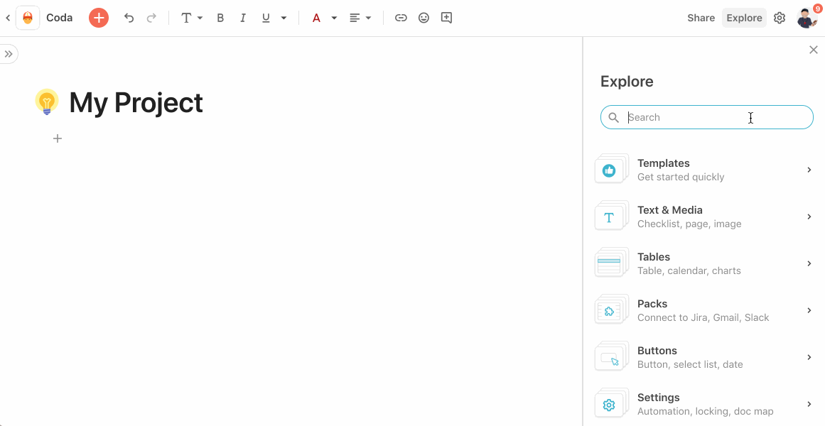
Building a foyer: Explore panel
What we needed was an entrance area, a place to see all the possible rooms. We needed a place where people could begin to explore all the possibilities of Coda.
This week we launched a central place to connect the great work from the last two years: Explore panel.
While building Coda’s features, we had the foresight to use a specific pattern, which allowed us to simply move those features instead of tearing them down. And that pattern—side panels—is now front and center with the launch of the Explorer panel.
One of my personal UX favorites, side panels help cut through noise by getting out of the way and letting you actually see what you’re making. They have endless vertical scale, so we will never run out of space as Coda continues to evolve. And side panels are the same width as a mobile phone, so responsive designs are easily adapted.

We were intentional in the design consistency of each side panel. With drag-and-drop support, users are invited to experiment and “play.” As you’re exploring, you can simply drag what you find onto the canvas. And we added a unified search to quickly find what you need across all panels.
With this new entrance hall, we invite you to explore our entire house.
Once you get the hang of it, we fully expect you gravitate more to the “/” command for a quicker experience. And we hope that the two experiences will complement each other in your journey of building awesome and inspiring things in Coda.
Want to print your doc?
This is not the way.
This is not the way.

Try clicking the ··· in the right corner or using a keyboard shortcut (
CtrlP
) instead.