Skip to content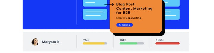
 Welcome Launch
Platform • UX & UI • 2021–2022
The Welcome rebrand was officially launched in March 2021, following the introduction of the freemium program in late 2020. Prior to this, the platform was exclusively invitation-only and relied heavily on human intervention to onboard new users and set up demo environments for prospects. The PLG initiative inspired us to develop a more user-centric product.
In my role as design lead, I worked closely with product managers, designers, and engineers to achieve this transformation, resulting in a significant impact across the platform. We simplified the signup process, introduced interactive onboarding, updated the homepage, and completely revamped the work and planning experience.
Result:
50% / 1,152 WAU YTD growth
Free Signup
Problem: No sign up experience was available. All customer instances (workspaces) were manually created and implemented by the technical service team. It’s time consuming and not scalable.
Solution: Automate the instance creation from the backend, allow users to sign up and explore the tool freely, and guide them through with an interactive onboarding experience.


Sign up — Before vs. After (No sign up available in the old version)
Homepage
There are many iterations for the ‘home’ page — from task-centric of the whole organizations, to a performance-driven dashboard, and then, a simple homepage that focuses on the user themselves.
Problem: The widget-based dashboard on the home page was designed to provide an overview of published content performance, team efficiency across tasks, and progress toward content marketing goals for the entire organization. However, most users were looking for a more personalized home screen that would allow them to quickly identify their own tasks and work needs.
Solution: We designed a more personalized home page that caters to individual users rather than the organization as a whole. The new homepage allows users to easily track their ongoing tasks, quickly identify what they need to work on next, and view their overall progress. This approach better serves our users and enables them to work more efficiently.


Home — Before vs. After
Plan
In 2018, we reintroduced campaigns to our platform with the goal of transforming it into a marketing operating system. To enhance user adoption, we opted for a visually appealing gallery presentation format.
Problem: The gallery presentation for campaigns on our platform was visually appealing but not scalable. The related views, such as the calendar and kanban views, were located in different modules, resulting in a disjointed user experience. Furthermore, these views did not share the same query, resulting in discrepancies in task results and performance issues.
Solutions: We consolidated related views into a single module called Plan. This module offers a unified filter experience and allows users to easily switch between list, calendar, timeline, and kanban views. Users can also save their views and share them with their team members. This approach has greatly improved the user experience and reduced performance issues.

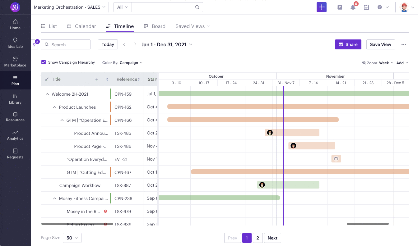
Plan — Before vs. After
Task
The task page is a fundamental component of our platform, accounting for over 70% of its usage. As we ventured into the project management space, the use cases expanded beyond content publishing to include content creation and collaboration.
To improve user experience, we made significant changes, such as moving the workflow steps from the left to the right to free up the main real estate for content. We also reorganized the page into tabs to reduce cognitive load, allowing users to focus on one task at a time. Recently, we completely overhauled the workflow feature to make it more flexible and robust. Users can now take advantage of drag-and-drop functionality, rich-text descriptions, and free-form checklists. These updates have significantly improved the user experience on the task page.


Task — Before vs. After
The Marketing OS
Welcome has been recognized as a leader in the annual Magic Quadrant for Content Marketing Platforms by Gartner in 2022. Maintaining a leadership position in any space, particularly in the SaaS industry, is a challenging feat.
Now part of the Optimizely family, Welcome faces various design challenges as it strives to support a broad range of use cases, from enterprise users to mid-market users, each with different user roles, personas, and goals. The diversity of user journeys introduces new challenges to every detail.
Keep listening, keep ideating, and keep iterating.
Want to print your doc?
This is not the way.
This is not the way.
Try clicking the ··· in the right corner or using a keyboard shortcut (
CtrlP
) instead.