Skip to content
let Claude generate the scriptreview itrun it on a small batchthen scale up


Visual space for control, grounded in product UI and data.Conversational space for intent, grounded in natural language and reasoning.
Pull in product-specific UIs when precision and control are required.Maintain continuity between conversational reasoning and visual execution.Relieve the limitations of the pure chat interface, such as lack of visibility, context, and parallelism, by leveraging structured visual affordances.
Opal uses chat to understand user intent.The canvas adapts to display relevant product UI components.Both evolve dynamically, creating a multi-layered, context-rich experience.
Preserves the nuance and power of specialized product UIs.Bridges natural-language intent with structured execution.Reduces cognitive load and fragmentation inherent in chat-only experiences.
GenAI or no GenAI — Opal doesn’t insert AI for its own sake. Features like content brief generation or transcription are grounded in specific, time-saving tasks.Convert user needs to data needs — In Opal, campaign history, brand guidelines, and channel metadata are used to inform context-aware responses.Augment vs automate — The Meeting Analysis Agent and Video Transcription Agent augment rather than replace; they prep summaries but don’t make decisions.Define level of automation — Opal supports a range—from prompt-based assistance to agents that run predefined workflows.Progressive AI adoption — AI entry points in Opal are unobtrusive (e.g., undockable chat, in-situ buttons) and evolve with user confidence.Leverage mental models — Agents in Opal are framed by familiar roles (e.g., “Industry Marketing Agent”), making their purpose intuitive. When viewing experiment results, Opal offers in-situ summarization—meeting users where they already are.Convey product limits — Users are shown system constraints—for example, when context exceeds token limits or when data sources are missing.Communicate data privacy and controls — Opal adheres to Optimizely’s enterprise-grade data privacy standards, with transparent policies on data handling and usage.Provide contextual input parameters — Prompt templates in Opal help users provide structured input, especially for repetitive tasks.Design for co-pilot / partial automation — Users can edit, regenerate, or collaborate mid-task with AI-generated briefs, headlines, etc.Define user controls for automation — Agents are scoped—users activate specific ones rather than letting AI roam freely.Design for memory and recall — Opal threads retain session memory to support fluid conversations. Expanded long-term memory is on the roadmap.Design for user input error states — Opal catches vague prompts and asks for clarification or suggests better phrasing.Design for AI system error states — Timeouts, incomplete responses, or failures are surfaced clearly with retry options. We’re actively improving error handling to ensure users don’t get stuck.Design to capture user feedback — Users will soon see in-context feedback options like thumbs up/down and “Was this helpful?” prompts.Design for model evaluation — Admin users can compare different models and prompt configurations to determine the most effective setup.Display chain of thought — Agents in Opal display their reasoning or steps, such as “Analyzing tone…” or “Filtering by campaign goal…”. Users will be able to drill down into which tools or agents were used during execution.Leverage multiple outputs — Users often get multiple options, not just one, and can iterate from there.Provide data sources — Outputs reference past campaigns, CMS content, or linked metadata.Convey model confidence — Model confidence indicators are not yet exposed in Opal, but are under active exploration.Design for AI safety guardrails — Opal includes built-in safety settings that block high-risk outputs across key harm categories: dangerous content, hate speech, sexually explicit material, harassment, and unspecified harms. These are configured at a ‘block only high’ threshold, balancing safety with generative flexibility. Brand-specific compliance filters can also be layered on as needed.
Double headers – Our Content Marketing Platform had a stacked nav. It was visually heavy and confusing.Interim navigation constraints – We haven’t rolled out our new unified nav yet. In the meantime, we rely on a dark header with long dropdowns for switching products and instances. That left us limited real estate.
The right pattern in theory still has to earn trust in practice.Design systems aren’t just about components—they’re about context.Listening post-launch is part of building in public. Side Chat Panel (docked and undocked): For accessible, ongoing conversations—resizable and movable to avoid obstructing key UI.Takeover Modal: For deep, focused interaction that benefits from full-screen guidance.In-situ contextual embeds: For lightweight, contextual suggestions directly where the user is working.Expand the chat for longer reasoning or complex queriesMove the panel to avoid key controlsKeep Opal visible while referencing multiple layers of UI
In-situ prompts when editing a headline or configuring a CTAA modal takeover when generating a multi-step brief or proposalA docked or undocked chat during longer planning, exploration, or experimentation sessions

Solve real user problemsSupport the new mental modelProvide appropriate amount of trust and reliancePut humans in charge
“What problem are we trying to solve?”“How will AI enhance the user experience?”“Are there other non-AI solutions that work just as well?”
What is the work about?When is the live date?What’s falling behind?Are we providing enough coverage for certain campaigns?
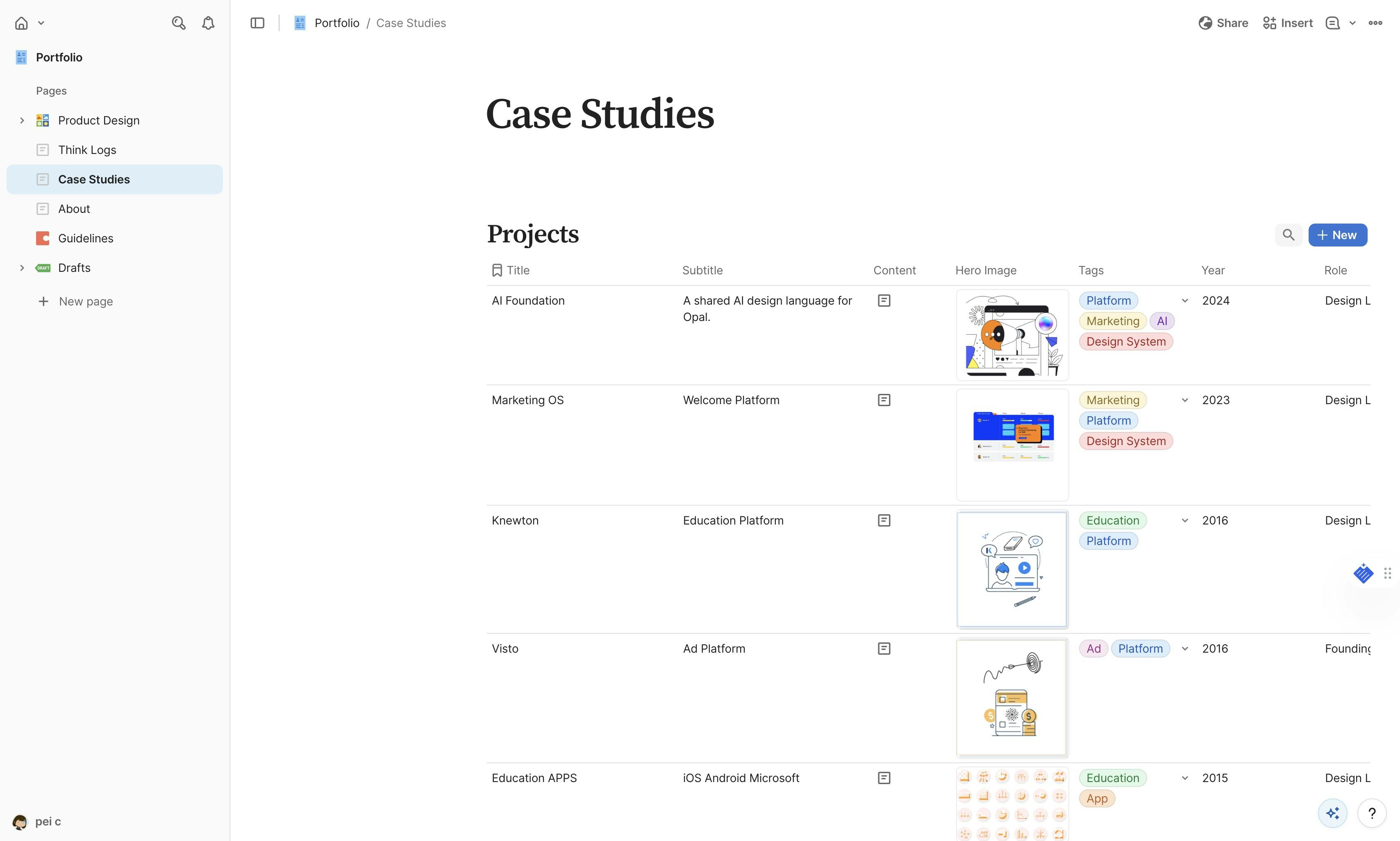
Think Logs
Logs
Title
Date
Category
Description
Embed URL
Feature Image
Status
Image 8
Image Migration
Feb 1, 2026
AI
Howto
// When images in my portfolio started breaking, I knew I needed a real CDN solution. What I didn’t expect was how educational (and occasionally humorous) the migration process would become — or that it would lead me to experiment with automating the entire pipeline with Claude Code.
#### The Problem
I'd started using Coda to manage my portfolio content, with images embedded directly in canvas cells. Most worked fine with Coda's imgix URLs, but I had a few stubborn blob URLs that refused to load. The bigger issue was the amount of time I'd spent in Antigravity debugging image rendering. Complex regex to parse markdown formats, inconsistent URL structures, images that would load sometimes but not others - it was eating up development time.
It worked, but it was annoying and way too easy to mess up. I wanted something simpler where I could just paste a URL and move on.
https://res.cloudinary.com/dv5xz9ng7/image/upload/v1769982562/80c8b58c-34d2-4a7e-a010-489fd9b51969.png?h=24
spacer:24
toolkit: Coda | Cloudinary | Claude Code | Terminal + Node.js | Antigravity (fixing the wrapper)
spacer:24
Why Not Antigravity?
I could’ve done this migration in Antigravity, but I specifically chose to work on this in Claude.ai for two reasons. First, I wanted to keep my API tokens separated (so I have more, ha). Second, the chat interface here is just easier to work with.
spacer:24
The Vercel Blob Saga
Since my portfolio runs on Vercel, trying Vercel Blob seemed logical. I already had the free tier set up. How hard could it be?
Turns out, pretty hard. We spent a solid chunk of time wrestling with authentication tokens. The Blob store existed, the token existed, but they refused to talk to each other. At one point Claude basically said, “Look, you have 90 working images and 1 broken one. Just fix that one image manually and call it a day.”
I appreciate the pragmatism, but I wanted the real solution.
spacer:24
The Cloudinary Switch
After the second time Claude gently suggested taking the easy route (which was genuinely funny), we switched to Cloudinary. Setup took maybe 5 minutes. Three environment variables, one npm install, and we were off.
The migration script Claude helped me write did exactly what I needed. It pulled all images from my Coda tables, uploaded them to Cloudinary, and created a mapping file linking old URLs to new ones. 91 images migrated successfully.
spacer:24
#### Pushing Further: Bulk Automation with Claude
With the initial migration behind me, I got curious — could Claude (I was in chat, not even Claude code) handle bulk asset migration end to end? Not just one-off scripts, but a full pipeline: point it at a source, define the destination, and let it do the heavy lifting.
For straightforward cases — flat directories, consistent file types — it felt almost effortless. Claude could inspect the source structure, figure out naming conventions, and produce working upload scripts with minimal back-and-forth.
The harder part was edge cases. Mixed file formats. Nested folders with inconsistent naming. Assets referenced in multiple places. Those needed more context than a single prompt could realistically carry.
What worked best was breaking the work into smaller, focused steps instead of asking for one giant migration command.
The pattern that kept paying off was:
Trusting, but verifying.
spacer:24
Breaking Things (Briefly... or not)
Did the migration break my site? Yes, for a little while. My image wrapper component expected the old Coda markdown format and didn’t know what to do with plain Cloudinary URLs. It did take a few rounds of back-and-forth to fix it, and now the parsing is actually cleaner. No more complex regex patterns trying to extract URLs from markdown. Just look for Cloudinary URLs and render them.
Later on, I discovered a catch: having Claude automatically replace the URLs wiped out most of my styling. As it turns out, automating code blocks in Coda is pretty inconsistent. Luckily, my projects and log count are still low, but fixing the formatting definitely took longer than expected.
spacer:24
The Gallery Format Cleanup
One unexpected bonus was fixing my gallery formatting. I had galleries scattered across my content in three different formats - some with parentheses, some without, some already in code blocks. We wrote a script that normalized everything into clean markdown code blocks:
https://res.cloudinary.com/dv5xz9ng7/image/upload/v1769982241/cec51dbe-02b4-4c8f-9b78-458781767317.png?h=80
spacer:24
Much better.
spacer:24
#### What I Learned
Running migration scripts from the terminal isn’t something I do every day, but Claude’s guidance made it approachable. Each script had a clear job — check the data, migrate the images, update the URLs, fix the formatting. Breaking things into steps helped me understand what was happening instead of running some mystery command and hoping nothing exploded.
The funniest part was still Claude’s repeated “maybe just fix the one broken image?” suggestion. It was a good reminder that the simplest solution is often good enough. But in this case, pushing through gave me something much cleaner long-term.
Having all my images on Cloudinary means simpler code, better control, and no more weird Coda blob URLs.
Honestly, the biggest takeaway wasn’t speed. It was the moment I realized, “oh… I can actually do this.” Claude didn’t think for me. It just made the annoying parts disappear.
After the first asset migration, I later tried having Claude help me migrate another site with around 9,000 assets. It was surprisingly fast and smooth. I really appreciated how clearly it reported what migrated successfully and what didn’t.
For someone who doesn’t code every day, it was a pretty great experience.
gallery
https://res.cloudinary.com/dv5xz9ng7/image/upload/v1770589366/Screenshot_2026-02-01_at_9.55.09_PM_p05kia.png
https://res.cloudinary.com/dv5xz9ng7/image/upload/v1770589365/Screenshot_2026-02-01_at_9.57.11_PM_opsvta.png
https://res.cloudinary.com/dv5xz9ng7/image/upload/v1770589366/Screenshot_2026-02-01_at_10.29.57_PM_xvjzpw.png
spacer:40
Draft
Connect
Feb 1, 2026
Design
Howto
AI
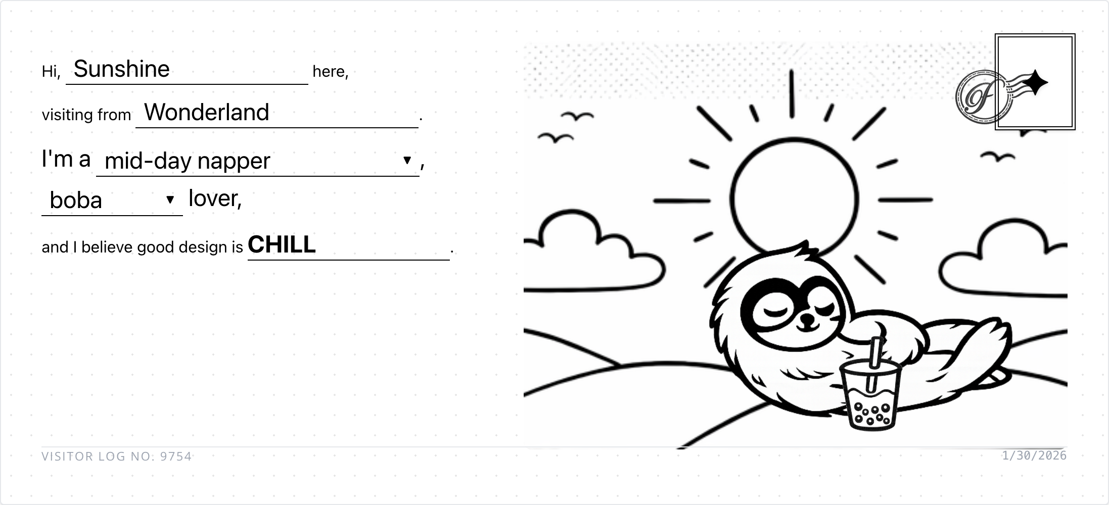
// I wanted my portfolio’s About page to feel less like a resume and more like… well, like getting a postcard from a friend. So I built an interactive postcard that visitors can customize and “send” to me.
#### The idea
My previous portfolio had the same sterile contact setup as everyone else. Fill out this form, hit submit, done. Name, email, message. It worked, but it felt lifeless.
I kept thinking about how I could make mine feel more human, more playful. The postcard concept felt right because it's inherently personal but also a bit whimsical. Plus, it would tell me something about the person beyond just their email address.
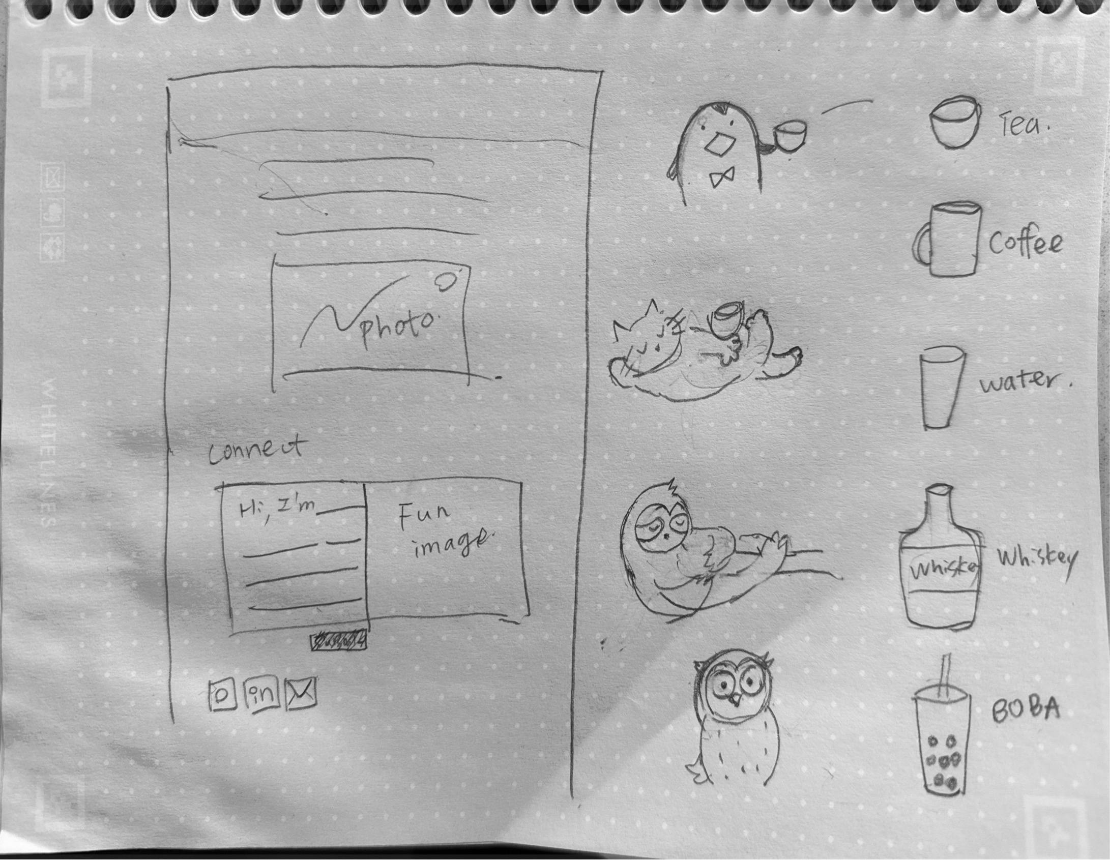
The interaction is simple: visitors fill in mad-lib style fields (your persona, where you're from, your rhythm, your drink preference, your design philosophy). But I wanted the postcard to feel custom, not just a form with a different skin.
I ideated with Gemini about how to make this work with custom assets. After a few explorations, the cleanest approach was to separate the assets based on the mad-lib options and overlay them on top of each other. Each choice would pull a different visual element, and they'd all layer together to create a unique postcard.
I started doing some quick drawings and sent them to ChatGPT to clean them up. Just simple line art, but they had personality. My daughter got excited about the project and contributed a few stamps too. There's something special about having her drawings mixed in with mine.
gallery


#### The secret enhancement
Once the basic postcard was working, I thought: what if instead of the system picking the stamp, visitors could choose their own? A little secret interaction, a hidden delight. Not everyone would discover it, but the ones who did would feel like they found something special.
But those generic icons felt too... generic. So I started doodling and had ChatGPT cleaned up the sketches.
My daughter got excited about the project and contributed a few stamps too. There's something special about having her drawings mixed in with mine. It makes the whole thing feel more personal, more collaborative
I also added a couple of details for personalization. The default background image changes based on the visitor's local time, showing the right scene for their moment of day. And for my own curiosity, I appended the visitor's location after the visitor number so I could see where people were coming from. ;)
gallery ()()()
divider
Building the stamp picker
I started with a grid approach because I wanted to get something working first. Get the basic interaction solid, make sure the data flows correctly, ensure stamps actually show up where they’re supposed to. Once that foundation was working, I could push it further.

But once the grid picker was functional, I couldn’t resist trying something I’d always wanted to build: a wheel picker. You know, that circular interface where options rotate around and you can spin to select. It felt more playful, more tactile, more… fun.
This is where things got interesting.
The first wheel I built was completely unusable, and in the most frustrating way possible. You could never actually click the stamp you were aiming for because the mouse cursor kept pushing it away. Like trying to pick up a piece of paper with a hair dryer.
The stamps were supposed to feel like they're floating around the wheel, not cramped in a rigid grid. But I'd set up the hover states in a way that the stamps would rotate or shift when your cursor got near them. Which meant the exact moment you tried to click, the stamp would move just out of reach. Hilarious in retrospect, maddening in the moment.
Once that’s more stabilized, it went into clipping issue. The stamps didn’t always load in properly.
gallery ()()
spacer: 32
Debugging with AI
I pulled in Gemini to help debug. What I love about using AI for this kind of work is that explaining the problem to the AI forces me to articulate what’s actually broken. Sometimes that’s half the solution right there.
https://youtu.be/OGnXiNpMjow
spacer: 24
#### Postcards in action
The final result feels good. Each visitor gets a unique combination, and the postcards I receive actually tell me something about the person beyond just their email address (Actually, I don’t even ask about that). The ones who discover the stamp picker get to add their own personality to the card.
gallery ()()
divider
#### What I learned
Building this feature reinforced a few things for me:
Small enhancements can create big moments. The stamp picker started as a “nice to have” but it turned into the most delightful part of the whole feature. The people who find it feel like they discovered something just for them.
Start functional, then get fancy. The grid picker gave me confidence that the core interaction worked. Once I had that foundation, I could experiment with the wheel interface without worrying about whether the basic flow was broken.
AI tools work best when you can be specific. Gemini was incredibly helpful once I could point to exact CSS properties and explain what I expected versus what I was getting. Vague “it’s not working” descriptions get vague responses.
Whimsy takes work. The playful, personal feeling I wanted didn’t come from the concept alone. It came from getting the spacing right, making the transitions smooth, ensuring the stamps felt tangible. The details matter.
spacer: 32
toolkit: Antigravity | Gemini (Code) | Claude (Code) | ChatGPT (Image, Audit) | Gimp (Image cleanup)
divider
Behind the making:
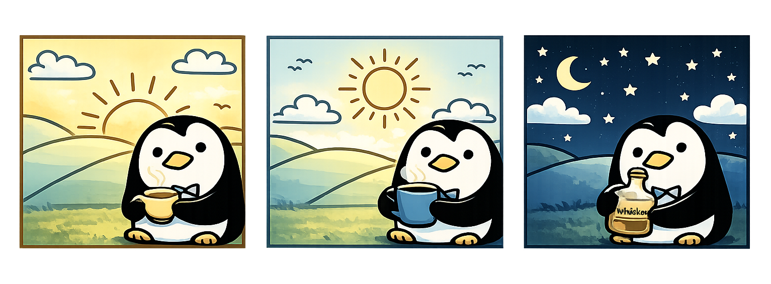
Asset Analysis
| Character Path | Background | Character Asset | Drink Pairing (Example) |
| :--- | :--- | :--- | :--- |
| Early Bird | `Sunrise.png` | Penguin (Bowtie) | Tea |
| Mid-day Napper | `Mid-day.png` | Sloth (Sleeping) | Coffee |
| Night Owl | `Night.png` | Owl Penguin (Electric Eyes) | Boba |
| All Nighter | `Midnight.png` | Cat (Electric Eyes) | Whiskey |
spacer:24
gallery ()()()()
spacer: 48
Published
Fenming 6.0
Jan 30, 2026
AI
Design
Outlet
Howto
//Every year, I feel the same pain when my hosting subscription renews.
Why am I still maintaining my portfolio on WordPress?
I update it maybe once a year, and yet it’s been such a painful experience. Constant security issues. Malware attacks almost every week. Ongoing server costs just to keep the site alive. It felt wildly disproportionate to what I actually needed.
AI is already deeply embedded in my work. It shapes how I think, how I design systems, how I prototype, and how I reason through complexity. But outside of work, I realized I wasn’t really leveraging it in the same way.
So I decided to change that.
spacer:20
toolkit: Antigravity | Gemini (Code) | Claude (Code) | ChatGPT (Image, Audit) | Gimp (Image cleanup) | Coda (Database, Authoring) | Github | Vercel
spacer:20
#### Finding the right platform
I asked Antigravity whether it made sense to move my WordPress site to Notion or Coda. After exploring both, I landed on Coda for one main reason: its APIs and structured data model felt like something I could actually grow with.
At the beginning, my goal was intentionally modest. I didn’t want to do anything fancy. I just wanted a copy of my content somewhere safer, easier, and cheaper to maintain. I used my existing portfolio as a visual reference and started rebuilding it piece by piece. The first draft looked close, but of course, it took a lot of prompting to get it to feel right.
#### Moving the content
For content, I exported my WordPress site to XML and used Gemini to analyze and import everything into Coda. From there, I connected the portfolio pages directly to Coda tables. I still remember how excited I felt when I saw the content load locally for the first time. The styling was completely broken, but it worked. That alone felt like a small win.
This was where something interesting happened. My familiarity with structured content suddenly became a real advantage. I started working with AI to define how different Coda blocks should be used to display content the way I had in mind. It wasn’t just about copying text anymore. It was about shaping structure.
It took a while to get all the tables and blocks properly set up and rendered. At one point, I had Gemini and Claude fighting each other with regex back and forth. That part was an experience. Slightly chaotic, slightly hilarious, but productive.
divider
#### Building interactions
Once the content was in place, I moved on to interaction. I started with the before-and-after slider. My assumption was that anything should be possible, so I just asked. Surprisingly, the slider itself took almost no time compared to everything that came before it. The tricky part was making sure all the images loaded correctly, especially with block translation. This is probably the hardest thing to nail down.
After that, I added galleries, which felt much more straightforward by comparison.
Then came the logs. It’s kind of wild how quickly some older AI-related content starts to feel irrelevant. Rebuilding the case studies gave me a chance to reflect and refine, and once that foundation was there, rebuilding the logs went much faster than I expected.
#### Editing and maintaining
After all of that, I started auditing and updating the content more seriously. This was when tools like Atlas (Coda’s AI assistant) and Dia (an AI editing interface) really clicked for me. Editing content through an AI chatbot, then updating it with a single button, is so much easier. It removes just enough friction that keeping things up to date no longer feels like a chore.
And finally, the About page. The simplest page to recreate.
divider
#### Making it interesting
At that point, I had a working copy of my portfolio. Which raised the next question: now what?
Having a copy is useful, but it’s not very interesting. So I started thinking about what I could do that I couldn’t easily do before.
The first thing I added was an interactive filter for the logs. It was simple, fun, and actually useful. That small interaction immediately made the site feel more alive.
From there, more ideas started to pop up. The About page, in particular, felt like a good playground. I didn’t want to overthink it, so I decided to start with something small.
I replaced the old contact form with an interactive postcard.
Honestly, who uses contact forms anymore? I wanted something more personal, a little unexpected. I tested the idea in Gemini first to sanity-check how complex it might be. Then I sketched out what I wanted and handed it to ChatGPT to clean up.
I wasn’t sure how long image generation would take, but I figured I could start building and testing in parallel. That part took a couple of late nights, but the result was fun. The hardest part turned out to be styling the madlib form, the screenshot flow, and the email step. Seeing AI handle so much of that end-to-end flow left me in quiet awe.
gallery
divider
#### What I learned
It sounds cliché, but I mean it sincerely.
At this point, the limitation isn’t the tools anymore. It’s our imagination.
For me, that means thinking less about maintenance and more about play. More about what feels true to how I actually want to exist in the web. The postcard was just the start. I hope that I’d have time to add more fun explorations.
The question isn’t “can I build this?” anymore. It’s “what do I actually want to make?”
^ While I tested with ChatGPT on generating all scenarios, I got this adorable version, unfortunately not what I’m looking for. Sharing here for fun :)
spacer:40
Published
Claude Cowork - Context
Jan 23, 2026
AI
Everyday UX
// There’s been a lot of hype around Claude Cowork. It took me a moment to fully understand what it actually means—and more importantly, how it helps. There are plenty of learnings to unpack, but I want to start with one thing: context.
Published
💜 The Purple Button for Opal
November 25, 2025
AI
Design
Opal
// One of our most successful UX patterns in Opal is what we nickname "the purple button", but really, the contextual trigger.
Published
Designing for Opal #2 – Is AI Outgrowing the Chat UI?
October 21, 2025
AI
Design
Opal

// Last week’s OpenAI Dev Day, with the release of ChatGPT Apps, once again drew attention to a long-simmering question: Is AI outgrowing the chat UI?
That question isn’t just theoretical for us. At Optimizely, we’ve been exploring ideas through Opal’s design evolution, where AI isn’t a chatbot but an orchestrator that brings the product UIs into the flow when that saves the back-and-forth due to the limitation of the chat.
divider
#### Expanding the Concept: Opal’s Canvas Mode and Its Role in AI UX Evolution
At Opticon last month, we revealed our new vision, which illustrated where we're sprinting toward.
#### 1. Canvas and Chat in Tandem
On the left, the canvas space represents the product interface, here, the CMS layout. (This isn’t the same “canvas” you see in ChatGPT or Claude for displaying interactive artifacts or long-form content.) Each module shown, Hero, Event Details, Sponsor Logos, Countdown Timer, Registration Form, embodies structured complexity.
https://res.cloudinary.com/dv5xz9ng7/image/upload/v1769979132/portfolio/image-92.webp
On the right, Opal Chat acts as an orchestrator that interprets natural language and connects it to specific UI elements or configurations.
Rather than replacing the interface, Opal works with it. This creates a duality:
This approach anticipates the hybrid pattern now emerging across the industry, where conversation coexists with structure, and the AI orchestrates rather than replaces.
divider
#### 2. Opal as the Primary Interface Layer
We’ve been actively exploring the design vision where Opal becomes the primary interface, not by taking over visual UIs, but by bringing them together when needed. When a user’s task spans products (say, moving from CMS to Experimentation), Opal’s chat layer connects those workflows seamlessly.
The canvas space (or space and elements as how our engineers define it) isn’t just a layout. It allows Opal to:
divider
#### 3. Canvas Beyond the Interface
The term canvas here goes beyond literal design space. It means a shared interaction environment, the combination of visual elements, layout, and state that Opal can surface or manipulate. Within this framework:
This makes Opal less of a chat window and more of a collaborative surface, one where intent and interaction coexist.
divider
#### 4. The Broader Implication
Our design philosophy is grounded in the belief that AI should enhance complex interfaces, not flatten them. By using the canvas space, Opal:
In essence, think of AI as an orchestrator, not an interface, where Opal becomes the connective tissue across products, bringing the right surfaces into focus at the right moment.
We’re actively getting feedback, not declaring it the only direction, but recognizing its potential to extend our design coverage and strengthen cross-product orchestration.
The million-dollar question remains: when do we lean on chat, and when do we bring in the product UI? Designing the UX that guides users gracefully through that handoff is still in progress.
We understand the challenges in moving beyond the chat UI, but that’s exactly what makes it exciting.
spacer:32
Published
🔍 Behind the Prompt: Designing for Opal – The UX Pattern Framework
May 13, 2025
AI
Design
Opal
// After reading , I found the breakdown refreshingly practical—something many of us can learn from. To make the ideas easier to apply in context, I restructured the framework around how we think and design for Opal—Optimizely’s AI.
This version pairs each UX principle with real patterns from Opal in production.
divider
#### 1. Use AI Where It Matters
Apply AI only when it meaningfully improves the experience.
Automate time-consuming tasks, not decisions. Avoid novelty. Focus on value, speed, and augmentation over replacement.
Is AI the right solution for the job?
Focus on determining when and how to apply GenAI meaningfully.
divider
#### 2. Make the AI Easy to Grasp
Introduce AI gradually and in context.
Use familiar metaphors like roles or assistants. Show what the AI can and can’t do, and always be upfront about data use and privacy.
Help users understand what the AI is and how to use it.
Focus on setting expectations, shaping mental models, and guiding initial trust.
divider
#### 3. Let the User Stay in Control
Design for collaboration, not delegation.
Give users clear ways to prompt, edit, guide, and undo. Scope what agents can do, and allow users to start, pause, or change direction at any time.
Let users steer, shape, and collaborate with the AI.
Focus on prompting, editing, recall, and how users direct the system.
divider
#### 4. Expect Things to Break — and Design for It
Handle errors gracefully.
Be ready for vague prompts, failed completions, or missing data. Offer recovery paths, retry options, and clear feedback loops that help the system learn and improve.
Prepare for what can go wrong—and learn from it.
Focus on error states, feedback capture, and continuous improvement.
divider
#### 5. Make AI Behavior Transparent
Show your work.
Let users see what steps the AI took, what data it used, and why it made a decision. Provide multiple options where helpful. Reveal limitations and model reasoning whenever possible.
Make the AI’s thinking visible and safe.
Focus on showing how the AI works, why it responded a certain way, and building trust. This is an active area of development. Planned improvements include:
divider
#### 6. Design for Safety and Trust
Safety isn’t optional—it’s built in.
Build in strong guardrails to prevent harmful or off-brand content. Align AI behavior with enterprise data policies, brand standards, and user expectations.
(This principle is deeply integrated into the Transparency & Trust section above.)
divider
To dive deeper, I’ll be sharing bite-sized insights from this framework in upcoming posts—stay tuned for how these principles play out across real product moments in Opal. We’re still learning and iterating every day. Hopefully, this framework offers a useful lens—or a starting point—for other teams designing GenAI experiences in the real world.
divider
Let me know if you’d like this turned into a Figma-ready slide deck or a blog-style format next.
spacer:32
Published
The smart system in the airport
July 8, 2025
Everyday UX
//  Traveling back from my hometown, I came across something quietly impressive at Taoyuan International Airport — a live monitoring system displayed just outside the restrooms.
The screen showed real-time stall availability — not just for that location, but also for nearby gates. It was intuitive, efficient, and genuinely helpful in a busy terminal.
Traveling back from my hometown, I came across something quietly impressive at Taoyuan International Airport — a live monitoring system displayed just outside the restrooms.
The screen showed real-time stall availability — not just for that location, but also for nearby gates. It was intuitive, efficient, and genuinely helpful in a busy terminal.
 (See image) — One small UI suggestion: the women’s availability count was shown in red, which could be misinterpreted as “occupied” or “unavailable.” A simple fix? Just use the same color already applied to availability counters for the other restrooms — consistency improves clarity, especially in fast-paced environments.
Curious, I looked into it more and discovered it’s part of a smart restroom initiative that recently won international recognition from the Japan Toilet Association. Behind the screen is a full ecosystem of:
• People flow sensors
• Humidity and odor detectors (very needed!)
• Toilet paper level monitors
• All powered by 4G NB-IoT for instant alerts and predictive cleaning
It’s a great example of how AI and UX can work together to solve real, human problems — quietly and effectively.
And Taoyuan Airport isn’t alone.
(See image) — One small UI suggestion: the women’s availability count was shown in red, which could be misinterpreted as “occupied” or “unavailable.” A simple fix? Just use the same color already applied to availability counters for the other restrooms — consistency improves clarity, especially in fast-paced environments.
Curious, I looked into it more and discovered it’s part of a smart restroom initiative that recently won international recognition from the Japan Toilet Association. Behind the screen is a full ecosystem of:
• People flow sensors
• Humidity and odor detectors (very needed!)
• Toilet paper level monitors
• All powered by 4G NB-IoT for instant alerts and predictive cleaning
It’s a great example of how AI and UX can work together to solve real, human problems — quietly and effectively.
And Taoyuan Airport isn’t alone.
 More airports around the world are implementing smart restroom systems to improve operational efficiency, passenger comfort, and sustainability:
 1. Improved Efficiency & Maintenance
– Real-time data on usage, cleanliness, and supplies
– Touchless faucets help avoid water waste by running only when needed
– Automated alerts for cleaning and restocking
– Predictive analytics to optimize layouts and schedules
– Touchless fixtures to reduce germs and maintenance
1. Improved Efficiency & Maintenance
– Real-time data on usage, cleanliness, and supplies
– Touchless faucets help avoid water waste by running only when needed
– Automated alerts for cleaning and restocking
– Predictive analytics to optimize layouts and schedules
– Touchless fixtures to reduce germs and maintenance
 2. Enhanced Passenger Experience
– Cleaner, better-stocked restrooms
– Stall sensors reduce wait times and crowding
– Real-time feedback tools to resolve issues faster
– Health-forward design: hands-free, hygienic, and inclusive
2. Enhanced Passenger Experience
– Cleaner, better-stocked restrooms
– Stall sensors reduce wait times and crowding
– Real-time feedback tools to resolve issues faster
– Health-forward design: hands-free, hygienic, and inclusive
 3. Cost Savings & Sustainability
– Smarter scheduling = reduced labor waste
– Data-driven inventory = less product waste
– Sensor-activated systems = lower water and energy use
3. Cost Savings & Sustainability
– Smarter scheduling = reduced labor waste
– Data-driven inventory = less product waste
– Sensor-activated systems = lower water and energy use
 4. Tech in Action
– TRAX Analytics and others offer integrated restroom monitoring solutions
– Autonomous robots handle routine cleaning (See picture 2)
– ToF and PIR sensors for accurate occupancy tracking
– Digital signage to guide, inform, and reassure
—
When we think of innovation, we often picture big, flashy breakthroughs. But sometimes, it’s a restroom that quietly reflects thoughtful design, invisible intelligence, and a commitment to making public space feel more human.
AI and UX are not just about what’s possible — they’re about making the everyday better.
4. Tech in Action
– TRAX Analytics and others offer integrated restroom monitoring solutions
– Autonomous robots handle routine cleaning (See picture 2)
– ToF and PIR sensors for accurate occupancy tracking
– Digital signage to guide, inform, and reassure
—
When we think of innovation, we often picture big, flashy breakthroughs. But sometimes, it’s a restroom that quietly reflects thoughtful design, invisible intelligence, and a commitment to making public space feel more human.
AI and UX are not just about what’s possible — they’re about making the everyday better.
gallery https://codaio.imgix.net/docs/imoIgNesGW/blobs/bl-75hkfX-GWE/ca22c483cc81a022768c9f55c92d8c11935534b8c485fd58d1f17a846c71a53f9ae5f0b1e96471bdec7456bd0edd6a9145b564350a7f2a6a0c68e04ad46bfb782313ad3cdee761c58c8c98a97d88751de3795ba2436a0b5b2b5769f05eafa4b53cc2a65f?fit=max&fm=webp&lossless=true https://codaio.imgix.net/docs/imoIgNesGW/blobs/bl-DhcifIBnmh/726233d97d6be06405a14156f2dca2db71b5eda7a84422762c1cd28797aed9967eaf30c6af9813ed646dfa75c341ddfd737bb61b5ec7bdd9dc2968fc81bdeb23c8b7c6ed98a98d0b18a2344d75b22ba959842e1c735157056d5864327c39a67a1c0c81b0?fit=max&fm=webp&lossless=true
spacer:32
Published
A Humble Learning from Our Recent UI Change
Fri, 30 May 2025 23:25:39 +0000
Product Design & Dev
Design
Outlet
// What we changed, what we heard, and how we adjusted—with empathy.
Recently, we introduced a new search interaction in our platform. It was a small visual change—but one that led to a big user reaction. We thought we were solving for clarity and scalability. Instead, we unintentionally broke a familiar rhythm.
This is a short story about design intention, user trust, and the lessons you learn when you listen after launch.
#### What We Changed
We minimized the search bar in the header, replacing it with a magnifier icon. The search interaction itself—the results, the filters, the modal—remained exactly the same. But the visual cue? It disappeared.
Old design: full-width search input, always visible New design: magnifier icon, tap to expand

Original vs. updated search trigger. Same function, different visibility.
#### Why We Did It
This update was part of a larger effort to align our UI with New Axiom, our new design system—bringing consistency, clarity, and long-term flexibility across products.
But we also had real constraints:
The compact search icon felt like a clean, modern solution—freeing up space and aligning with industry trends.
#### But Then… Feedback Rolled In
We heard from users almost immediately:
“Bring back the search bar. The search icon being minimized and moved is awful. I NEED a clear search function.”
It didn’t matter that the functionality was untouched. Removing the visual presence of search made it feel gone. When a UI pattern interferes with user expectations—especially for a core action like search—it doesn’t matter how “clean” it looks.

The search interaction comparison
#### Would Testing Have Caught This?
This wasn’t something we’d likely catch in usability testing.
The interaction technically worked. From a task-based perspective, nothing broke. But something was off—and that only became clear in the flow of real, habitual use.
This was a “caught in the wild” moment—the kind of insight that doesn’t show up in a usability script, but emerges through everyday behavior.
Sometimes the best signal isn’t how users perform a task—it’s how they react when their routine is disrupted.
#### How We Adjusted
We brought the search input back—smaller, more subtle, but clearly visible. It’s now a bridge between where we were and where we’re going: a gentle nudge toward our future design system, without surprising users too abruptly.

Current implementation: subtle, visible, Axiom-aligned.
#### What We Learned
Rolling out a new design system like Axiom means balancing ambition with transition. Even “small” changes—especially to core functions like search—need to respect user rhythm and familiarity.
This experience reminded us that:
Thanks to every user who spoke up. This is how we make Axiom—and our product—better, together.
#DesignInPublic #UXDesign #AxiomDesignSystem #ProductDesign #OpalAI #SearchUX #DesignRollbacks #DesignReflection/
Published
Designing for Opal #1
May 13, 2025
AI
Design
Opal
// As AI becomes more deeply embedded in SaaS tools, the way users interact with it matters just as much as what it can do. At Optimizely, we built Opal AI not just to deliver intelligent support, but to do so in a way that respects the complexity of our interface and the workflows of our users.
Opal supports multiple interaction patterns, each designed with a specific purpose:
While all three modes matter, this article focuses specifically on why we made Opal’s chat dedockable—and why that flexibility is essential.
divider:line
#### Why Dedockable Chat Matters
In our research across products like ChatGPT, Microsoft Copilot, Edge, Slack, and Salesforce, we noticed a pattern: many tools rely on a single, fixed chat model—usually a persistent sidebar or full-screen takeover. This works in simpler or single-purpose interfaces, but it breaks down in rich, multifunctional UIs like those in Optimizely.
Our users frequently move between dense layouts: campaign workflows, personalization logic, experimentation variants, and performance insights—all within the same environment. In these contexts, a fixed AI panel—no matter how smart—can obscure essential controls or break visual context.
That’s why we built Opal’s side chat to be dockable by default but fully undockable when needed. This way, users can:
divider:line
Use Case: Experimentation Needs Room to Breathe
This flexibility is especially critical in Experimentation, where clarity, precision, and access to multiple data views are key. Users need to compare variants, metrics, targeting, and rollout rules without disruption.
If a fixed AI panel were to block any part of this, it could introduce real risk—misinterpreting test configurations or missing validation steps. But by undocking Opal, marketers can maintain full visibility into their test setup while engaging in rich, AI-assisted conversation.

Fixed side chat panel could obscure some UI

Undocked chat allows users to work in context
divider:line
#### AI That Fits Into the Flow of Work
One of our core design principles is to “meet users where they are.” That means Opal adapts to the user’s task—showing up as:
This pattern matters because Optimizely supports the entire content supply chain—from ideation and orchestration to experimentation and activation. No single interface can meet all those needs. Opal has to be able to shift modes fluidly, always staying helpful—but never in the way.
#### Powered by Semantic Understanding
Our UI flexibility is matched by Opal’s intelligence. Behind the scenes, Opal uses vector-based search—a powerful technique that understands the meaning behind your words, not just the keywords.
So when a user asks:
“Find images from the Opticon 2025 campaign that match a clean, tech-forward feel”
Opal isn’t just looking for metadata. It’s searching across semantic space—retrieving assets that align in tone and visual language, even if those words aren’t explicitly tagged.
That’s why having an undockable, unobtrusive chat matters. When users are previewing search results or referencing Opal’s suggestions against the live interface, they need room to think, evaluate, and act—without toggling away or losing focus.
divider:line
#### What’s Next
As we continue to evolve Opal, we’re exploring adaptive patterns that can respond dynamically to user intent—automatically shifting the chat from docked to undocked, or triggering modal assistance based on task complexity.
Because in the end, our goal isn’t just to build a smart AI. It’s to build an assistant that feels intuitive, contextual, and truly integrated into the way marketers already work.
Published
Riding AI #3 Leverage AI to Generate Relevant Dummy Data
Mar 17, 2025
AI
Howto
// Not long ago, I tried using AI to populate dummy data for my design. It not only helps me focus on the design but also enhances technical discussions with engineers. Real, context-specific content is helpful for collecting user feedback, as it is easier to relate to.
Unlike traditional dummy data, which often lack depth and variability, I’ve found that AI-generated data is much more dynamic and adaptable to different design and testing needs. For instance, It can create user profiles, transaction histories, and behavior patterns for product designers, helping us designers test responsiveness and functionality in a more realistic environment. Additionally, AI-generated data has saved me so much time with best guesses, freeing me up to focus on the creative and strategic parts of my work. Manually creating dummy data can be time-consuming and error-prone, especially when multiple people need to collaborate to ensure the design tells the right story—this is always the most time-consuming part of my design workflow particularly designing for an important event, such as a conference. With AI, accurate datasets can be generated quickly, enabling faster iterations and improvements. This streamlines projects and increases the likelihood that final designs meet goals and user expectations.
For me, choosing the right AI tools has been key to generating realistic and useful dummy data. generates realistic data and integrates with various design software. It is ideal for web development, graphic design, and data visualization, helping to bring projects to life.
If you’re comfortable using tools like Gemini or ChatGPT, a well-crafted prompt can go a long way. Here, I’ll use Gemini to demonstrate how I created a data table for a previous project.
Using Gemini for Dummy Data
Previously, I needed to create a screen for all tools that our AI agents could use. While engineers were working on the backend, I wanted a head start in understanding this, so I turned to Gemini.
Following up on my previous discussion about AI Agents and Tools (), I asked Gemini to generate a list of common tools for AI agents.
The HTML file type is not supported
➔ Can you list the tools in a table?
The HTML file type is not supported
➔ Can you break down the tool examples into their own rows?
The HTML file type is not supported
Now I have a well-structured list of AI tools in a spreadsheet format. I downloaded and shared it with the PM and engineers to ensure it made sense for our purpose. Then, I imported the list via the Figma . Voila!
The HTML file type is not supported
Update on Mar 31, 2025
Got access to Figma AI recently, so I decided to try the same data table with Figma to compare the results. In short, I’d suggest to give Figma more context on what type of data you are looking for to get more relevant output. It’s the most convenient approach if you don’t mind the actual details. See the gif below.
The HTML file type is not supported
/// What I love most about AI-generated data is how it can simulate real-world scenarios. By testing designs with data that mimics actual user behaviors and interactions, we can identify potential usability issues and functional gaps before the project goes live. When dummy data is too “dummy,” users have to “imagine” how it might work for them, making it harder for them to react quickly and accurately. A proactive approach improves user experience and saves time and resources by catching issues early in development.
Whether using AI-generated data or not, user validation is always crucial. The feedback loop is invaluable for refining designs and ensuring they meet user needs and expectations. By combining AI’s precision with human feedback, we can create designs that are both innovative and user-centric.
Finally, keep in mind that it’s best to limit AI-generated data to non-critical areas of my design projects. AI is a great tool, but it’s essential to maintain control over key aspects to protect important company information.
Integrating these practices helps maximize AI dummy data for functional, user-friendly, and innovative designs.
Draft
Riding AI #2: Break the Blank Page Syndrome
Mon, 03 Mar 2025 17:30:21 +0000
<p>As designers, we’ve all faced the dreaded “blank page syndrome”—staring at an empty screen, waiting for inspiration to strike.</p>
<p>Lately, I’ve been using AI to help me overcome this hurdle, and it’s been a game-changer. Instead of starting from scratch, I use AI to generate initial ideas, layouts, or even copy. It’s not about letting AI do the work for me, but rather using it as a springboard to get my creative juices flowing.</p>
<p>For example, when I’m stuck on a layout, I’ll ask an AI tool to suggest a few different structures based on the content I have. Often, the suggestions aren’t perfect, but they give me a starting point—something to react to, refine, and make my own. It’s like having a brainstorming partner who never gets tired.</p>
<p>This approach has not only sped up my workflow but also helped me explore directions I might not have considered on my own. It’s a reminder that AI can be a powerful collaborator in the creative process, helping us move past the initial blocks and get to the fun part of designing.</p>
<p>How are you using AI in your design process? I’d love to hear your tips and experiences!</p>
<p>Posted on <a href="https://www.linkedin.com/pulse/riding-ai-2-break-blank-page-syndrome-pei-chien-qnphe/" target="_blank" rel="noreferrer noopener">LinkedIn</a> on March 3, 2025</p>
Published
Riding AI #1: Coding For Designers
Feb 20, 2025
AI
Howto
<p>// <em>Why every designer should (re)consider learning to code in the age of AI.</em></p>
<hr class="wp-block-separator has-alpha-channel-opacity"/>
<p>I’ve always believed that designers should learn to code. It helps us understand the medium we’re designing for, communicate better with engineers, and ultimately build better products. But I also know the struggle: setting up environments, debugging obscure errors, and the sheer time investment can be daunting.</p>
<p>Enter AI.</p>
<p>With tools like ChatGPT, Copilot, and Cursor, the barrier to entry for coding has never been lower. You don’t need to memorize syntax or spend hours stack-overflowing error messages anymore. You can focus on the <em>logic</em> and the <em>outcome</em>.</p>
<p>I recently used AI to help me build a small prototype. I described what I wanted in plain English, and the AI generated the HTML, CSS, and JS boilerplate. Was it perfect? No. But it got me 80% of the way there in minutes. The rest was just refining and tweaking—the fun part.</p>
<p>If you’ve been putting off learning to code (or refreshing your skills), now is the time. Treat AI as your pair programmer. Ask it to explain concepts, debug your code, or suggest optimizations. It turns coding from a solitary struggle into a collaborative learning experience.</p>
<p>Designers who can speak the language of code—even if just a little—will always have an edge. And with AI, that edge is easier to sharpen than ever.</p>
<p>Posted on <a href="https://www.linkedin.com/pulse/riding-ai-1-coding-designers-pei-chien-u5pie/" target="_blank" rel="noreferrer noopener">LinkedIn</a> on Feb 20, 2025</p>
Draft
Using AI to help with writing
Feb 15, 2025
AI
Howto
<p>I've been experimenting with using AI to assist with my writing process, and I have to say, it's been a surprisingly helpful tool. It's not about letting the AI write <em>for</em> me, but rather using it as a collaborative partner to refine my thoughts and improve clarity.</p>
<p>One of the biggest benefits I've found is in <strong>overcoming writer's block</strong>. Sometimes I have a general idea of what I want to say, but I get stuck on the first sentence or how to structure the argument. Providing a few bullet points to an AI and asking for an outline or an intro paragraph can unblock me instantly.</p>
<p>It's also great for <strong>tone checks</strong>. I can draft a messy email or a slack message and ask the AI, "Does this sound too aggressive?" or "Make this more professional." It acts like a second pair of eyes before I hit send.</p>
<p>Of course, you have to review everything. AI can be generic or overly wordy. But as a starting point or a refinement tool? It's invaluable.</p>
Draft
Design Hackathon
November 1, 2024
Design
Outlet
// I remember the look the design team gave me when I first announced the Design Hackathon last year. Everyone was confused, what is a Design Hackathon?
Indeed, this may be unique to us.
When I was appointed to lead the design team, there were multiple challenges to overcome. Designers from each product were working in silos. Our design system was not well-received, hence low adoption. There was no unity between the products, and the team’s morale was at risk because of all the changes happening within the organization.
What concerned me the most, was the level of creativity shown. As someone new to the team, it wasn’t clear to me whether the outputs were due to the existing design system or the designers. It felt constrained.
I wanted to provide a safe playground for the team to express their ideas and creativity. I needed a platform to tell the team that it’s okay to break the rules. I’d like to see how everyone thinks their ideal state should be if there’s no constraint. Here came the idea of Design Hackathon.
So what is it?
It’s really simple. Inspired by the traditional hackathon that’s driven by the engineering team, a design hackathon is to hack the product via design. The beauty of it is that there’s technically no limit. Of course, it’s also important to set up goals/themes, or it can go too wild and would not deliver any business value.
The very first theme was about the general UI and UX, as the design system was facing criticism and push on its aesthetics. I asked the team if they had all the freedom to reimagine our products, how would they look like. At first, there was a lot of uneasiness for the team to break the rules and not follow the existing design system, but I was really glad to see the outcome. The team was inspired by seeing other designers’ creativity. It also gave me a great chance to understand the team better by seeing their original designs. The ideas later inform our new design system. Even better, in the second hackathon, we focused on AI. It was when we started to have a better gtip of AI’s potential. I encouraged the team to think about how it could integrate with our products and empower our users. This time around, not only was everyone more adapting to the idea of a design hackathon, the ideas that came out of it were really stellar. There were so many great ideas, that we formed a design guild to finalize the interaction . How amazing was that!
And early last month, we just had our third design hackathon. This time, I asked everyone to focus on the idea of “One” — how could we tell the One story from our design when we have many different products with different technologies. Of course, the team once again surprised me with lots of superb ideas. After seeing our hackathon presentations, the product organization was so excited, that some of them are now prioritized on the roadmap. This is exactly how design can truly make an impact. When an idea is translated into something visual, the likelihood of realizing it is exponential.
For those who are looking for avenues to advocate for design, I highly recommend giving this a try, make your own rules and agenda.
Published
Our design principles for AI design
Aug 1, 2024
AI
Design
Opal
// Following the launch of
, our AI technology last year, we finalized and documented our design guiding principles to ensure a consistent and thoughtful experience for our users across our products. As we know, with the rapid growth of AI capabilities, designing for AI-powered experiences has become complex and multifaceted.Following the launch of
, our AI technology last year, we finalized and documented our design guiding principles to ensure a consistent and thoughtful experience for our users across our products. As we know, with the rapid growth of AI capabilities, designing for AI-powered experiences has become complex and multifaceted.#### Principles
The team has aligned on 4 guiding principles to serve as a foundation for designing effective and ethical AI-driven experiences. These principles are intended to help the team understand best practices and apply them, make informed decisions, and foster creativity while maintaining the focus on user-centric design. Just like our design system, this is a living document that we anticipate will be updated and changed to reflect the new AI era.These principles are meant as guidance, not strict rules. The team should always use their best judgment to determine whether a principle applies to their particular use case.
#### Solve real-world problems
With the shiny & fancy AI possibilities, we need to remember the core principle of design thinking: solving real user problems. Ask how the AI will improve the user experience and if there are alternative solutions without AI. Generative AI can be powerful, but it should never overshadow user-centered design.Always:
#### Prioritize user needs and pain points
Consider these questions when evaluating potential AI solutions, especially if you’re concerned about using AI just for the sake of using it:
#### Test and monitor
After adding AI features, track usage data to see if they help users. Use this info to improve the design and make sure the AI helps users.
Design with responsibility
Think about the long-term impact of AI features. Weigh the business value and user needs carefully. Using AI for upsells might seem good for business, but too much can harm trust and won’t likely increase AI adoption.
Show that AI is present
AI should support the user’s workflow, not be the main action. It should be noticeable but not overpower important actions. Opal’s design language subtly highlights AI actions without overpowering the main ones.
#### Support the new mental model
Users can now interact with computers using natural language to describe their desired outcomes. This opens up many opportunities but requires thoughtful designs that guide users to apply this new mental model. This enables the AI to create the most desirable results.
Suggest prompts
For open-ended interactions like chat, consider suggesting FAQs to users as a starting point. To create these suggestions, find the most frequently asked questions on relevant pages through user research. Once the feature is live, analyze data to find common user prompts.
Highlight how AI can help in the current situation
Consider offering contextual prompts with relevant suggestions to users. But, make sure the guidance is helpful and not annoying. Use data analysis to identify sections with low usage and provide additional guidance there. This can improve user experience and increase engagement.
Ask follow-up questions
For chat interactions with unpredictable prompts, the AI should be able to ask clarifying questions to gather more information and provide high-quality results, even with short or limited prompts.

#### Provide trust and reliance
Trust is key when designing experiences with generative AI. Users must feel confident in the AI’s abilities and output. To build trust, create transparent experiences where users can understand and predict the AI’s behavior.Reliance is important because it determines how much users depend on AI. Over-reliance can lead to underutilizing human skills and negative outcomes, while under-reliance means AI’s potential isn’t fully used.There are several reasons why users may under-rely on AI, such as usability issues, not solving the right problem, or not providing enough guidance for optimal usage.To minimize this risk, conduct user research and understand the problem before implementation. If under-reliance persists, investigate further to find the root cause.
Give sources
Including sources boosts trust by making information transparent. Users can evaluate credibility and dive deeper if they want to. This shows the AI’s accountability and helps users understand its reasoning.
Let people know AI can make mistakes, and they should think critically
We can build trust, critical thinking, and reduce over-reliance by admitting AI errors and urging users to verify their work. This openness sets realistic expectations, helps users spot issues, and lets them make informed decisions when using AI.
Be aware of the context
Context is key for building trust in AI. It helps AI understand user intent and provide relevant, accurate, and helpful responses. Without context, AI responses can be generic or misleading, leading to frustration and less reliance.
Alternatively, start Opal with an open-ended question and provide follow-ups if the AI doesn’t understand context.
Show response progress
Show progress when AI responds to user prompts, similar to file upload progress.
When giving text-based responses, consider streaming the text word by word to simulate AI typing.

#### Put Humans In Control
While AI can create drafts or starting points, users should make the final decision. This helps avoid over-reliance and gives users more control. At the end of the day, we want to leverage the power of AI to do the heavy lifting so that humans can focus on what they should be focusing on: their creativity & strategy!
Allow users to improve AI’s response by regeneration/refinement
Users can regenerate or refine AI responses if they’re not satisfied. This lets them explore different ideas or tweak the response until it’s perfect.
Let users give feedback
Providing rating options lets users control the AI’s learning. Their feedback improves future responses.
Offer multiple options
Give users multiple options to choose from. This way, they can pick the direction they want and get the results they need.
Let users set parameters
Help users set parameters like text length, tone, and sentiment. Let users specify these in prompts, but also offer pre-defined options.
Allow editing of generated outputs
Users can edit AI outputs, which lets them think critically about the suggestions and tailor the results to their needs. Iterative editing lets users use the AI’s strengths for inspiration and exploration while ensuring the final product reflects their voice.
divider
As AI keeps evolving at a breakneck pace, our design team needs to stay close and sharp. We should constantly check how our decisions are panning out and make changes when necessary. These principles are our compass, helping us craft AI experiences that are top-notch while keeping users’ needs front and center. By sticking to these guidelines, Opal can set the bar for AI design that’s both ethical and effective. We’re aiming to create meaningful connections with users that’ll stand the test of time.
Published
Welcome Calendar
Dec 1, 2021
Design
#### Background
Marketing teams launch various activities (Requests, Campaigns, Tasks, Events), and as they grow and do more inside the platform, visualization is becoming even more critical. Not only it is important for users involved in these activities to see what work is in progress, late or upcoming, but also for all stakeholders of the company who need to understand what marketing campaigns are running.
My role is to redesign the calendar so that it allows users to easily understand their existing work and plan future projects more efficiently.
divider:line
#### Editorial Calendar
Problems:
The old calendar was built years back with an old technology, which is hard to maintain and scale. Not only the calendar was dated and clunky to use, but it also didn’t provide the information that marketers need.
Marketers are looking for a calendar that is visually answering the following questions:
compare https://codaio.imgix.net/docs/imoIgNesGW/blobs/bl-ah0i-DhLy4/4134415fd517c6610e9b7d9fb3d2f62a6d3f369647875c088db7538f360d0647e68dd8c0cd1103731b53d5469e9b1f319ed9df79a7704b67ba90275df71e2beb8d0c018ab037230ccc9ee12bf208c91ccf8e4cfebbb4e1519784565134d903997296d390?fit=max&fm=webp&lossless=true https://codaio.imgix.net/docs/imoIgNesGW/blobs/bl-pRvP2hD2sj/fa5dd017469b45d9f1ad55b0e63e40ea2ca3841778a5cfc44bb9755102be2fdcbd6e61744e869c8e76b97e9eba6546cda7e7efce6713bfc39e413ae33d137232d44c7a4ba75f19de165203841d2d034bb130306d3e93a2b15e787dd304442b4fae832ed3?fit=max&fm=webp&lossless=true
Before vs. After
#### Outcome:
Users can customize the display to show thumbnails and more metadata that help them understand the work.
This is a true differentiator that sets us apart from other project management tools.
#### Timeline Calendar
compare https://codaio.imgix.net/docs/imoIgNesGW/blobs/bl-WAdihN1tY9/66b66f71320fff5a58b1ed6bc36b24aa0e989904d8ed369f90fc1df2a44fd4eec4bcbbe08ecd3b80158cfb27cc5eafb66f1c50a6651dba88fbb628c40bfe3fc207e7e6d600c64f80395746ab43d23edd3bc3c31215a25d55304f922153f5a088421f49e2?fit=max&fm=webp&lossless=true https://codaio.imgix.net/docs/imoIgNesGW/blobs/bl-MIddkjhjFN/e574619d0adbf4bdf814bfd3f7ef5ac7da5443031bbfda59e8eb879536867360cd03dd7bd614ad420d2ab6f1d4dd4f5144a9a9c36aa59051774a07a463dbb5993ad8a9999690268ef36ed8ece017c8a04b797091fe916208fd97b683e9bc8f45b0822ce4?fit=max&fm=webp&lossless=true
Before vs. After
Problems:
Marketers need a way to easily slice and dice their plans so that they can answer the questions above. The old timeline calendar is static and inflexible.
They need to be able to group their plans by specific metadata, such as campaigns, and a flexible way to color them. They also want to be able to quickly zoom in/zoom out the timeframe to get different granularity.
Outcome:
246% increase of users in 10-week span.
Users can easily slice and dice their work by campaigns or other labels.
They can also color-code their work accordingly
With the interactive calendar, users can easily drag and drop tasks to different campaigns and adjust the length of any work directly.
The feature is now available at Welcome. and give it a try. I’m all ears for your feedback!
Published
Fenming 5.0
March 13, 2023
Design
Outlet
// Can’t believe that it’s another few years since Fenming 4.0. Covid has stolen time from us, for sure.
Last year, I had a hard time maintaining my old WordPress sites. They went broken a few times either due to the security issue or the updates pushed from WordPress. It was exhausting and frustrating for me to recover the site. I ended up backing up all my portfolio work on Med
um and Coda because I couldn’t get my sites to work properly.Finally, I decided to use a different hosting service this year. It’s a great opportunity to revisit my abandoned task. I wanted to create a brand new portfolio site. Funny that it’s not any easier dealing with WordPress this time around. The truth is, it has evolved so much, there’s a steep learning curve for all the new features.
Nonetheless, I’m glad that I went through this – helped me gain more empathy for our users who use WordPress 
My domain has been down for so long, I’m almost in tears seeing it back up online.
If you are interested in how that might work – check out the following articles:
Published
Welcome’s Signup & Quick Onboarding
Jan 31, 2022
Design
// It’s a battlefield! For Welcome’s freemium SaaS signup onboarding process, the following key factors were what we focused on to ensure a successful and effective experience for users:
Simplified Signup Process
It is crucial to keep the signup process simple and user-friendly. Minimize the number of required fields and steps to reduce friction and potential drop-offs. Only ask for essential information during the signup process. This can be tricky as we want to increase the success rate of free signups while the business still obtains valuable information to convert them into leads.
Clear Value Proposition
How does our product stand out from our competitors? We aim to clearly communicate the value of our product to potential users during the signup process. We highlight key features and benefits that address their pain points and explain how our product can solve their problems.
Personalization
We tailored the onboarding experience to the individual user’s needs and preferences. The flow changes based on the data we collected during signup and use it to personalize the onboarding journey. This is to ensure them to find the most relevant features based on the user’s role, goals, or behavior.
Guided Onboarding Flow
An essential concept that may be new to our users is our “campaign”. We’ve developed an interactive walkthrough that simplifies and presents the structure of our platform in an understandable manner. This feature not only highlights the platform’s unique capacities but also places special emphasis on its robust planning tools such as the Kanban board, calendar view, and so on.
Clear Call-to-Action (CTA)
It’s crucial to include a clear and prominent call-to-action button that prompts users to take the next step in the onboarding process. Don’t cramp in unnecessary actions that could confuse users or derail them.
Progress Indicators:
No progress indicator can frustrate users. We implemented clear progress indicators to show users their progress in the onboarding process and how much is left to complete. This visual feedback helps users feel a sense of accomplishment and encourages them to continue with the onboarding journey.
Follow-Up Emails:
We use Intercom to plan and schedule follow-up emails after signup to reinforce the value proposition, provide additional resources, and encourage users to take further action. These emails include tips, tutorials, success stories, and special offers to keep users engaged and motivated.
Analytics and Iteration:
Following the introduction of our sign-up experience, we’ve persistently monitored and assessed our onboarding process’s efficacy using various analytical tools. For instance, we’ve examined elements like the ‘skip’ button’s positioning, the phrasing of our value proposition, and the fields included in our sign-up form, in order to ensure the collection of necessary data without deterring our users.
This post is mainly to capture what we had implemented as they evolved quickly.
divider
References:
The Ultimate Guide to Freemium
Freemium Strategy 101: Ultimate Guide for SaaS Companies [+ Examples]
spacer:32
Published
Fenming 4.0
Apr 14, 2018
Design
Outlet
<p>There is a Chinese idiom called Keep pace with the times (与时俱进), which means you have to constantly improve yourself to catch up with the world. I really believe it.</p>
<p>There was a time when I thought I was really good at Flash and Actionscript 3.0. I was so proud of the interactive websites I made. But looking back now, nobody is using Flash anymore.</p>
<p>The world is changing fast, so is the technology. As a designer who also code, I have to keep learning. It is really easy to fall behind.</p>
<p>So this is the 4th version of my portfolio site. I built it with React.js (create-react-app). It is a single page application (SPA) with a WordPress backend (WP-API). I host the frontend on Netlify and backend on Bluehost.</p>
<p>It is still a work in progress. I will keep adding new projects and features to it. I hope you like it.</p>
Fenming 3.0
Apr 3, 2017
Design
<p>I just launched the 3rd version of my portfolio. This time I used a WordPress theme. I customized it heavily to fit my needs.</p>
<p>The main reason I switched to WordPress is because I want to have a blog. I want to write about my design process and things I learned. I think writing is a good way to organize my thoughts.</p>
<p>I also want to separate my portfolio from my blog. My portfolio is for potential employers or clients. My blog is for myself and people who are interested in my thoughts.</p>
Kicked off the year of the Horse via AI
Feb 17, 2026
AI ExplorationCreative
AI
//Last Friday, I took Cheyenne to work, that means lots of bugging my colleagues and doodling. She drew everyone their favorite animals, and then this horse.

It cracked me up. It's the least horse-like drawing of a horse, but I love it. It's so bare, so elemental. Just the absolute minimum required to communicate "horse" to a 6-year-old brain.
divider:line
#### The Experiment
I had this silly idea: what if I could put some hair, wigs, horns, or outfits on this horse to make it look more like a horse? Or at least, more like *something*.
I asked ChatGPT to help me clean up the image first, then generate some outfit options. In order to made it understandable by AI, I asked ChatGPT to organize it as a storyboard, which looked promising. And then off I went on trying animating it with all possible tools.
gallery


spacer: 40
#### The AI Video Generation Struggle
This is something I haven't tried before, and I didn't anticipate how hard it could be to just animate my daughter's simple stick-horse.
Here's the thing: despite ChatGPT generating very detailed prompts for me to use, every single AI video generation tool tried to "improve" the horse. They wanted to add realistic features, smooth out the lines, make it look more horse-like. They completely missed the point.
The charm IS the simplicity. The awkwardness IS the feature.
After ONLY 90+ tries and errors, I finally got something that worked. But the journey was full of hilarious failures.
spacer: 40
#### The Outtakes
Here are some of the funny NG clips where the AI just couldn't help itself:
gallery
https://res.cloudinary.com/dv5xz9ng7/video/upload/v1771029217/portfolio/AI%20Videos/2026%20year%20of%20the%20horse/Art_Gen_Video.mp4
https://res.cloudinary.com/dv5xz9ng7/video/upload/v1771031001/portfolio/AI%20Videos/2026%20year%20of%20the%20horse/Sora_Video_Feb_13_2026_4.mp4
https://res.cloudinary.com/dv5xz9ng7/video/upload/v1771029519/portfolio/AI%20Videos/2026%20year%20of%20the%20horse/Video_Generation_from_Images_and_Text.mp4
https://res.cloudinary.com/dv5xz9ng7/video/upload/v1771077677/portfolio/AI%20Videos/2026%20year%20of%20the%20horse/Sora_Video_Feb_14_2026_moustache.mp4 vMoustache
https://res.cloudinary.com/dv5xz9ng7/video/upload/v1771077674/portfolio/AI%20Videos/2026%20year%20of%20the%20horse/Sora_Video_Feb_13_2026_jump.mp4?caption="Jumping and walking backward"
https://res.cloudinary.com/dv5xz9ng7/video/upload/v1771096737/portfolio/AI%20Videos/2026%20year%20of%20the%20horse/Sora_Video_Feb_14_2026_ng_missing_head.mp4?caption="missing head"
https://res.cloudinary.com/dv5xz9ng7/video/upload/v1771311503/portfolio/AI%20Videos/2026%20year%20of%20the%20horse/Sora_Video_Feb_17_2026.mp4
https://res.cloudinary.com/dv5xz9ng7/video/upload/v1771311502/portfolio/AI%20Videos/2026%20year%20of%20the%20horse/Sora_Video_Feb_15_2026_97_strange_leg_movement.mp4?caption="strange leg movements"
https://res.cloudinary.com/dv5xz9ng7/video/upload/v1771311503/portfolio/AI%20Videos/2026%20year%20of%20the%20horse/Sora_Video_Feb_16_2026_98_funny_movement.mp4?caption="funny movement"
gallery
https://res.cloudinary.com/dv5xz9ng7/image/upload/v1771312849/portfolio/AI%20Videos/2026%20year%20of%20the%20horse/Screenshot_2026-02-15_at_7.54.47_PM.png
https://res.cloudinary.com/dv5xz9ng7/image/upload/v1771312850/portfolio/AI%20Videos/2026%20year%20of%20the%20horse/Screenshot_2026-02-14_at_11.08.36_AM.png
button: https://collection.cloudinary.com/dv5xz9ng7/6a39331f12817e89ba933a5f99e66df2 | View full collection
spacer: 40
spacer: 24
#### The Final Version
👇👇👇
https://res.cloudinary.com/dv5xz9ng7/video/upload/v1771314740/portfolio/AI%20Videos/2026%20year%20of%20the%20horse/Sora_Video_Feb_17_2026_yes.mp4
spacer: 48
#### Spring Couplets
That’s not it. I used the same art to create square spring couplets for the Year of the Horse.
I asked ChatGPT to add Chinese characters to the designs. It took a few rounds of back and forth to get the characters positioned right, and eventually I just used Gimp to put them exactly where I wanted them.
Why not push it further? I asked ChatGPT to arrange the final designs in a layout with crosshairs so I could easily trim them for printing.
spacer: 24
spacer: 48
gallery
https://res.cloudinary.com/dv5xz9ng7/image/upload/v1771315101/portfolio/AI%20Videos/2026%20year%20of%20the%20horse/IMG_2066.jpg
https://res.cloudinary.com/dv5xz9ng7/image/upload/v1771315103/portfolio/AI%20Videos/2026%20year%20of%20the%20horse/IMG_2070.jpg
https://res.cloudinary.com/dv5xz9ng7/image/upload/v1771315104/portfolio/AI%20Videos/2026%20year%20of%20the%20horse/IMG_2075.jpg
https://res.cloudinary.com/dv5xz9ng7/image/upload/v1771315105/portfolio/AI%20Videos/2026%20year%20of%20the%20horse/IMG_2077.jpg
divider
#### What I Learned
This whole experiment showed me how AI can genuinely empower creativity. From cleaning up Cheyenne's drawing to generating outfit variations to creating print-ready layouts, AI helped me take a simple stick-horse and turn it into videos, storyboards, and spring couplets.
But there's friction. Every AI video tool kept wanting to "improve" the horse, adding realistic features and smooth lines when the charm was in its bare simplicity. I had to fight to keep it minimal.
That tension is interesting. AI is an incredible creative partner, but it's optimized for conventional "better." Sometimes what we want isn't improvement, it's preservation of the original idea, even when it's imperfect. Learning to work with that friction, to push back when needed, that's part of the craft now.
divider
toolkit: ChatGPT (Image cleanup, outfit generation, prompting, layout design) | Artgen | Pika | Flora | Gemini Veo 3 | Sora | Gimp (Character placement)
spacer:40
Published
There are no rows in this table
Want to print your doc?
This is not the way.
This is not the way.

Try clicking the ··· in the right corner or using a keyboard shortcut (
CtrlP
) instead.