Skip to content

Standardization: No need to worry about how people enter their data. Column formats keep you all speaking the same language.Visualization: Any charts you make in Coda automatically update when you enter new data.Interactivity: Lists are valuable, but cumbersome to sort through. Coda docs give you the opportunity to build true interactivity. Based on the questions you have, you can use controls to get quick answers from massive amounts of data.
Share
Explore

One of the most common uses for spreadsheets is a list of data. Think vendors, tasks, restaurants to visit, attendance, and the list (pardon the pun) goes on.
Last year, we saw several articles about salary comparison spreadsheets helping people understand how their pay compares across industries and locations. So Al Chen and I decided to explore the possibility of translating static lists into interactive dashboards with Coda.
I’ll also break down the steps here.
Step 1: Copy, paste, and clean.
First things first, get your list into Coda. This is a super easy process — simply select the data you want to bring in, use Cmd+C or Ctrl+C to copy, and then use Cmd+V or Ctrl +V to paste. If you’re working with a .csv file, you can also use the Import menu under the red plus sign at the top of your Coda doc.
Now, Coda is pretty smart. Your doc looks at the data you paste and automatically adjusts the columns to be an appropriate format. In the example below, Coda created a checkbox for a TRUE/FALSE field in sheets, a dropdown menu when it saw consistent values, and a data picker.
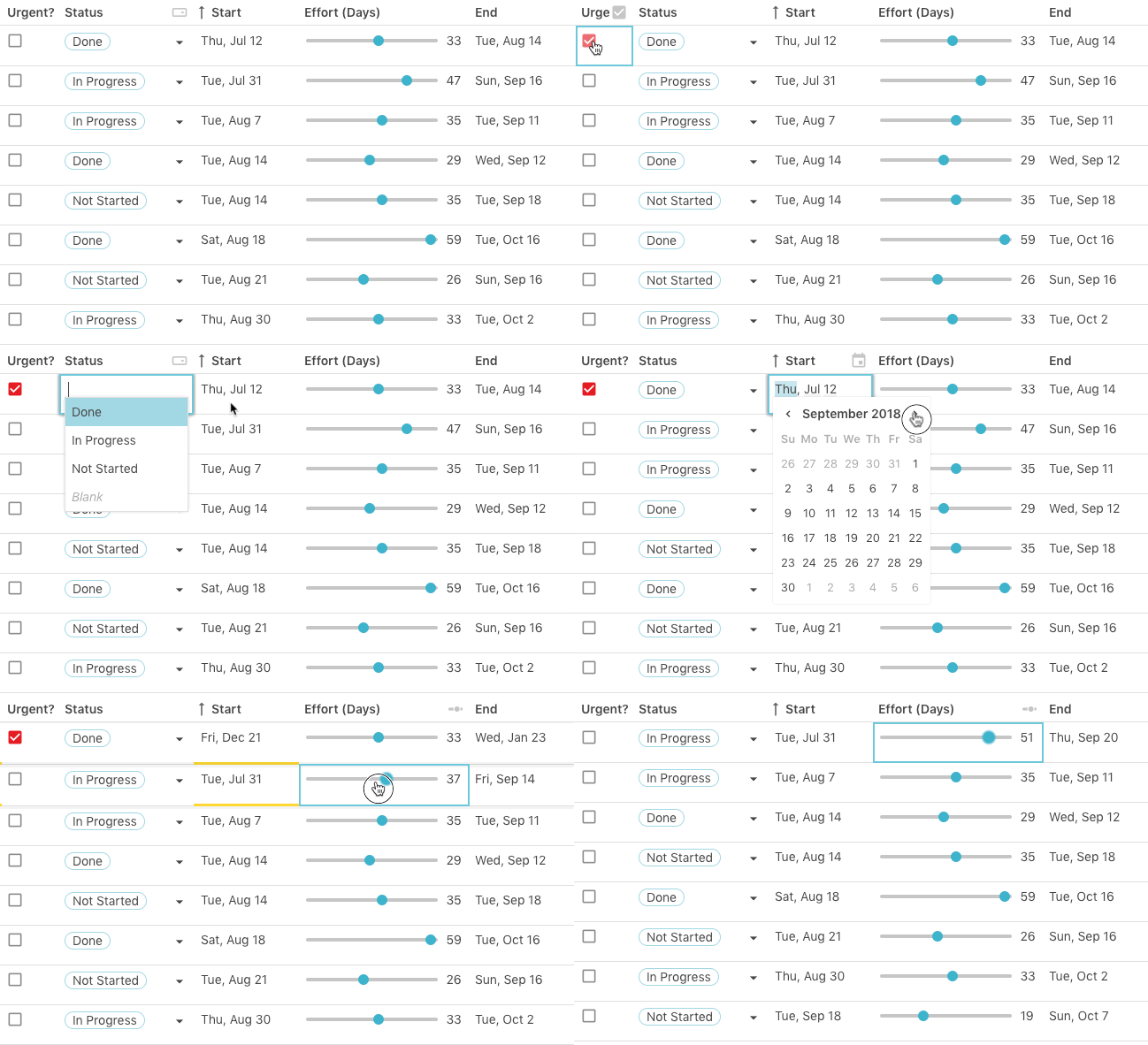

Go through and see if any of the old data needs tidying. For example, someone might have used “twenty thousand” instead of “20,000.” You’ll know if something doesn’t fit if there is a red triangle in the cell:


You can further customize your data by clicking on any column and choosing Format. For example, Al and I didn’t want to see any decimal points on our compensation column to keep the view clean.
Step 2: Build controls for your questions.
Time to turn that squeaky clean dataset into a dashboard! You’ll do this by using controls and filters. Want to see data based on age? Let’s create an interactive filter using a control:
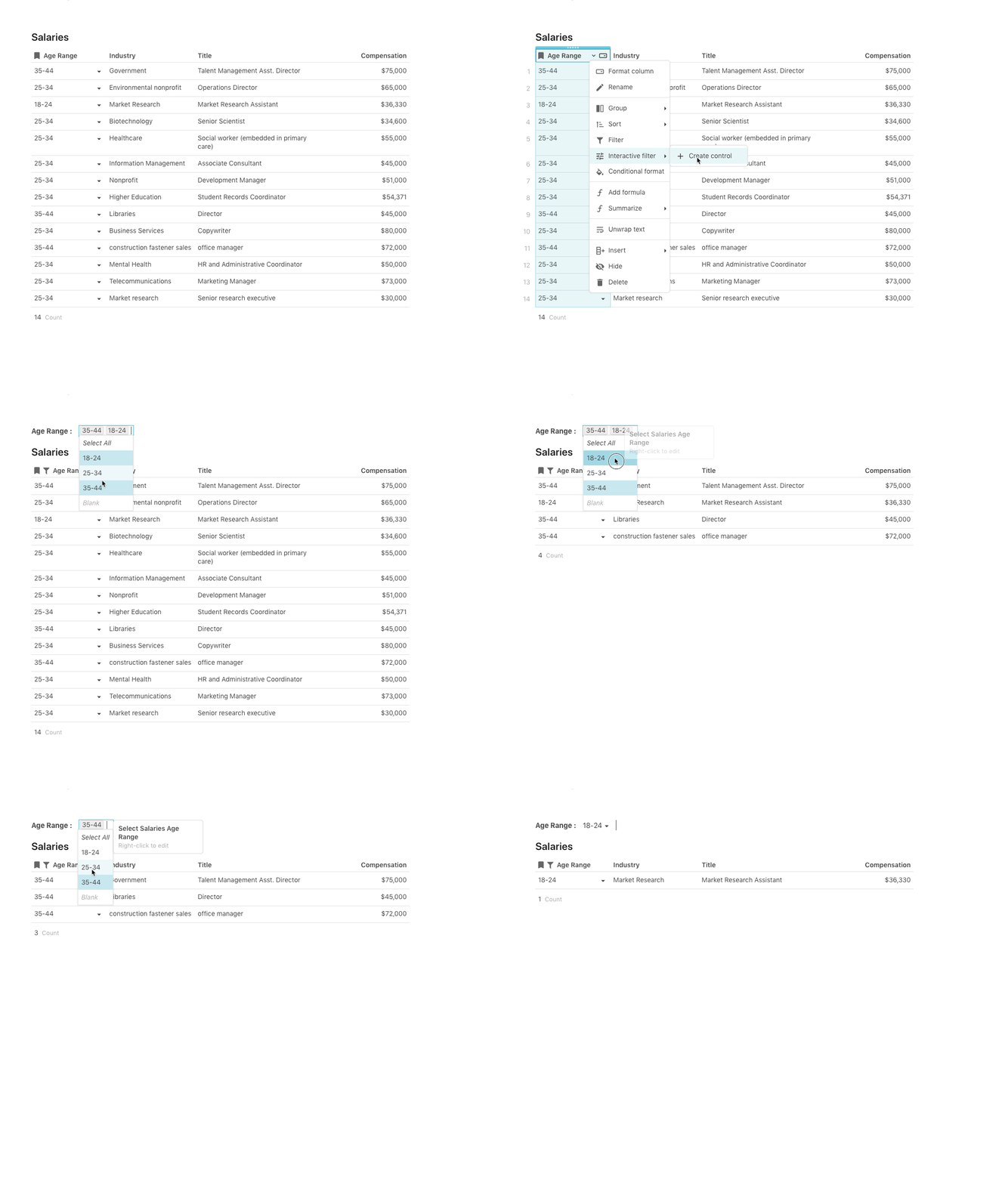

You can add as many of these interactive filters and controls as you like to answer any questions you might have about your data.
Step 3: Add visualizations.
But honestly, who wants to stare at rows all day? Sometimes an image uncovers or highlights trends. Enter: Coda’s chart views.
Instead of being a static copy of your dashboard, Views automatically update whenever you add or remove data. Each View is also linked and have a two way sync, so updating data in one view will update data everywhere else as well.
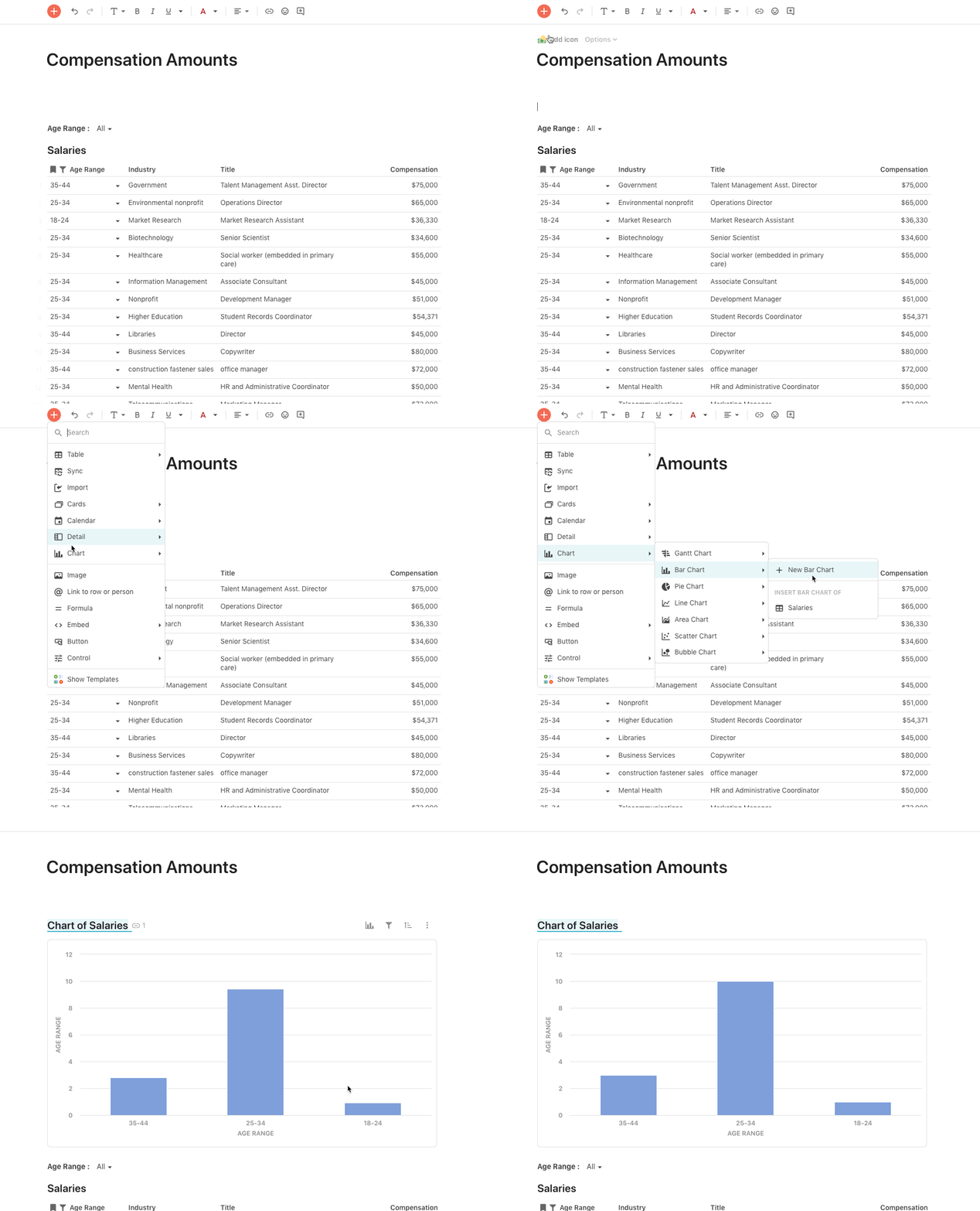

Step 4: Create summaries with grouping and lookups and formulas.
Every spreadsheet-head knows the value of a good pivot table. But, they can be a bit cumbersome. In Coda, there are a few ways to make sense of your data by category.
Option 1 — Grouping
Group columns along the left, top, or any combination of the two.
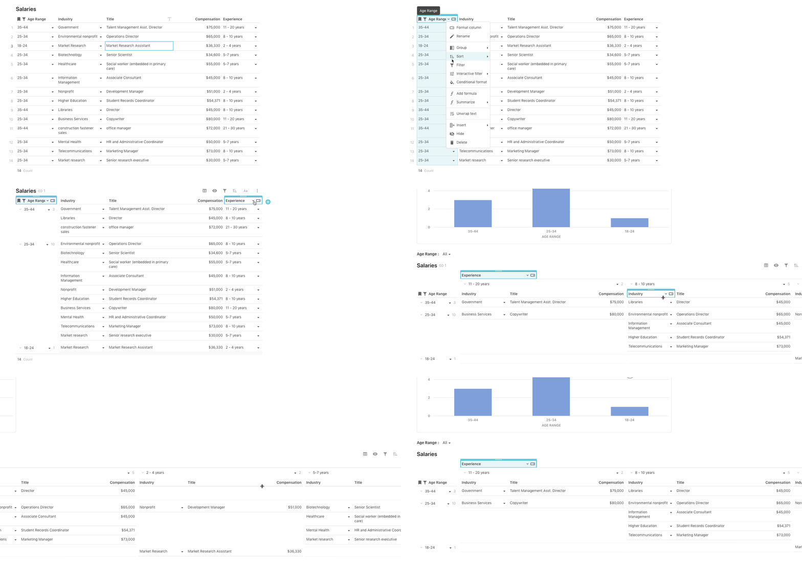

Option 2 — Lookups and Formulas
If you want to see summaries and averages of your data in a table, use lookup columns and formulas. You can take any column and automatically convert it to a table creating a lookup:


Then you can use the filter formula to summarize the data:


Lookups are also a great way to connect information in tables together and see all of the context of a value (and are much faster to build that a VLOOKUP).
Wins
Other than being more fun to look at, translating a list to a dashboard has a few key wins:
Want to nerd out on spreadsheets with us?
Want to print your doc?
This is not the way.
This is not the way.

Try clicking the ··· in the right corner or using a keyboard shortcut (
CtrlP
) instead.