Skip to content
A growing community = number of (recurrent) membersAn active community = number of daily logins/ posts/ replies; time between logins or interactionsA supportive community = Level of warm language in messages (but what is a warm message?); speed at which new members are integratedA safe community = ???
Measuring what and why
"But, what's the problem?" I ask. Not just once, but several times. The other sentence my students often hear me say is "But why?" They look at me puzzled, explaining the link between sharing knowledge and innovation, and how the team needs to interact and feel safe. While they talk I add arrows and boxes to their model. It's more complicated now, but they are getting closer to what they actually want to measure: The ability to feel safe and speak up.
Useless Dashboards
For anyone working with data, it is easy to create a dashboard. Every chart speaks to us. Patterns are fascinating, just for being there. It's like that french scientist who I heard talking on the radio. He wants to dig a hole through the earth's crust. It's gonna cost a ton of money. But why? I was wondering. Of course, as a scientist, the only reason is to see what is there. There needs no further, higher meaning. The same goes for dashboards for people who like data. They just look nice. It's a piece of art.
But decision-makers do not want a piece of art. They want a decision-aid. The dashboard needs to tell stories. It needs to be meaningful. As with other things, making a simple dashboard is really hard.
Charting
When creating a graph the first thing should be the message. The why. What you show depends on who will be looking at it. What is important for them? What are their goals?
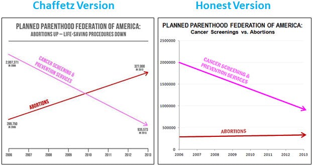
I begin my Excel workshops with a short session on data literacy. I think that's harder to learn and more important than Excel. I use these charts to show students what they need to pay attention to when reading charts and creating them.
. Pay attention to
your message and keep your biases in check.
But why?
Data for the sake of data is useless. Before you start collecting anything, be clear what you want to see.
I’m teaching a course on . We begin at the beginning. What do you want to measure
Want to print your doc?
This is not the way.
This is not the way.
Try clicking the ··· in the right corner or using a keyboard shortcut (
CtrlP
) instead.