Skip to content

Images and objects.colour palettes, textures, shapes: combining these into uniform images. 2D or 3D.Gifs, moving images. logos, icons.
The text and logo express the information that needs to be communicated. The text and logo are composed in a particular manner, which expresses a particular style. fonts, margins, breaks, sizes, positions,
Have a conceptual framework, defined and predetermined, and Create the composites and compositions within the defined framework.
Background images. One main image, with variations of it for different applications. A different colour way or gradient for when the user is logged into the website compared to when they are logged out. Not too hectic for the eyes. Simple is best, but communicative enough for the concept. Like NEAR I guess. Objects. Less urgent for the moment but a nice update for the future. Good to use as icons and emojis for components, as visual aid/cues. Similar to how does it. Could have the following object/shapes to represent activities, components or sections on the site:‘Consulting’ object/shape.‘Hire’ object/shape.‘Earn’ object/shape.‘Community’ object/shape.Contact/communication channels object/shape.
Do something like this for images and stuff on docs/wiki/articles?Can also do this for icons or little images on docs, can remove background too. Can trace icons from this website to make it look proper. Sand and light: the sand more yellow beige and the light more orange purple. Sand grains
Share
Explore

 Conceptual Direction
An ongoing draft of OWS's conceptual direction for aesthetic development.
Two types of design categories.
When developing a brand identity and using that identity to create aesthetic content used for marketing purposes, there are two types of design categories that need to be developed independently but congruently so that a brand identity can be maintained through time, but scalability (and decreased creative expertise) can also be affectively achieved.
i. Creation of Composites (images & objects).
The first is artistic graphic design: the actual backgrounds, images and objects that are used for simple-designs and graphic compositions.
These are difficult to do and make up the foundational part of a brand identity. This is why I recommend outsourcing the task. This can be a one-off job but preferably it would be good to find someone to progress with over longer periods to maintain a stable look.
Examples
Backgrounds:


Objects:


ii. Graphic Composition (assembly of composites).
The first type is like our 'simple-designs' category: a background image with some text and/or a logo.
This can be done on programs like Figma (easiest and most appropriate). This category is done on a regular basis, so it must be somewhat standardised, it must be easy to do, and approachable/understandable by more people internal to the organisation. This is the category that a web developer/designer can do.
Backgrounds and objects and text composed in specific ways:


Finding these categories for OWS:
To develop a brand identity for OWS, both categories must be fulfilled in the following way:
Because OWS is a subsidiary of the NEAR Protocol, it must in some way be recognisable as such. So the OWS brand identity must be within the framework created by NEAR, but be different enough in the composites and their composition that it is recognisable as a different brand. Let’s look at the NEAR brand first and then turn to OWS.
i. NEAR’s composites (images & objects)
NEAR has opted for a fairly open ended aesthetic for composites. The brand has created a NEARverse: a hilly desert with lit up roads and objects. The desert is clean and simplistic (representative of the natural) and the objects are colourful and sharp (representative of the artificially created).
Backgrounds:


Objects:


ii. NEAR’s Graphic Compositions
NEAR has provided a on their website and a on Figma. Both of these documents define in detail the rules and limits of the graphic compositions allowed for the NEAR brand. This is the framework within which NEAR designers must comply to. Within this framework they have creative freedom, but they must adhere to it to maintain the brand identity.
Backgrounds and objects and text composed in adherence to the framework:


Now that we have briefly looked at how NEAR has defined both their categories, let’s develop one for OWS.
i. OWS’s composites (backgrounds + objects)
Considering the role of OWS, as a community based recruitment and consulting service provider within the broader NEAR ecosystem, NEAR’s brand identity framework can be taken advantage of creatively.
Turning nothing (sand) into something (objects).
The NEARverse is a barren land, sandy, full of opportunity and with growing distinct objects. The role of the sandbox within this is to help with consulting, recruiting, and making projects grow and prosper in the NEAR ecosystem. We can see it in the following way: the NEARverse is composed of sand, OWS is a sandbox where things are created, where ‘things’ are projects, organisations, communities, talent and individuals. These things can be represented as objects. The role of OWS is to facilitate the creation of these objects, in the barren sandy land of the NEARverse.


^ NEARverse hills.
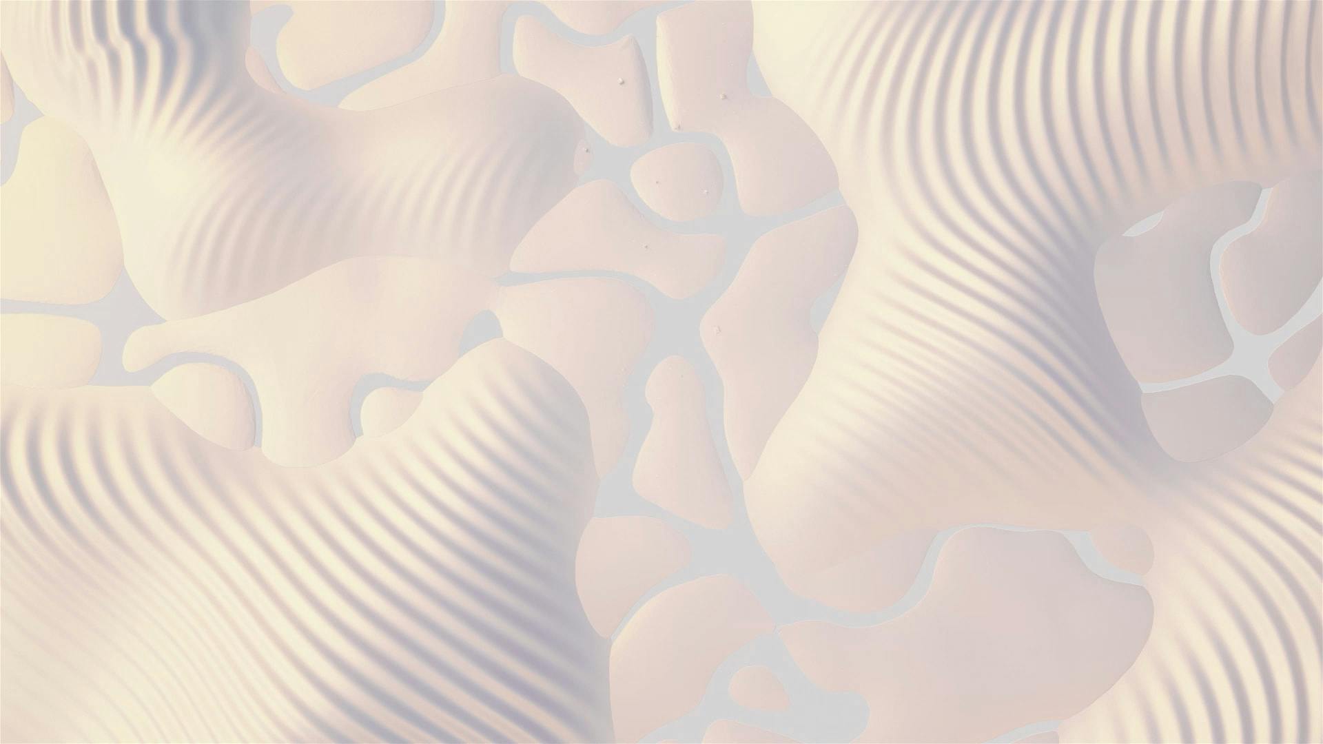

^ This is a birdseye view of the NEARverse hills above.


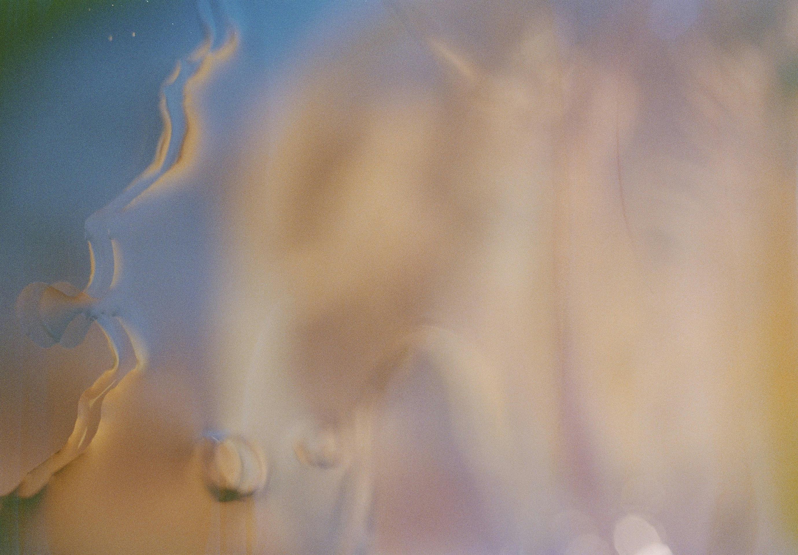


The sandy background turns into an object. Maybe right to left (still image).


For this category the following non-reoccurring composites must be created:
ii. OWS’s graphic composition (assembly of composites).





^ This background, with gradients and textures, is the right direction, but more HD and dynamic, not as uniform. More complexity but still easy for the eye.


End of Draft
Extra


Want to print your doc?
This is not the way.
This is not the way.

Try clicking the ··· in the right corner or using a keyboard shortcut (
CtrlP
) instead.