Skip to content
Share
Explore

Originally published on June 28, 2019— we’ve made even more improvements to our UI, typography, and visuals since then.
Today, we’re launching a refresh of Coda’s interface. All the building blocks you know and love are still here, but we’ve updated our visuals, cleaned up our toolbar, and made more space for your doc.
Why?
People use Coda for everything from writing notes, to running projects, to creating powerful apps. As people surprise us with more and more examples of what a Coda doc can do, we felt that our old design wasn’t showing off your work as well as it could. Our logo, toolbars, and sidebar were taking up a lot of room and visual focus.
So a few weeks ago, the Coda design team got together for a design sprint. We started with a simple core principle:
Emphasize people’s contentー more of your work, less of ours.
In doing so, we also wanted to make sure familiar editing and format tools were close at hand. That led to some structural changes, some visual changes and a lot of detailed cleanup.
. . .
What’s New
There are four main changes to highlight in the new design.
1. A toolbar that doesn’t get in your way
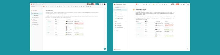
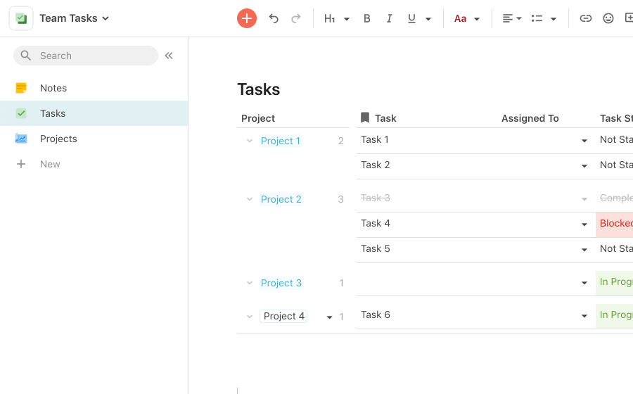
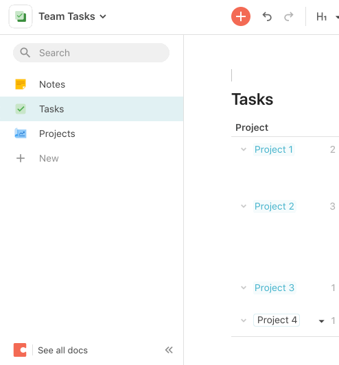
We broke down the toolbar elements and started to organize them. Some items were doc-level: Sharing, presenting, Packs and Automations. We shifted those to the upper right to keep them together. We simplified the text-level controls too — now there’s one place to go for color, and one for lists. And to bring focus back to your individual doc, we moved our logo from the top left to the bottom left, so the icon you selected stands out. You can still always navigate back to all your docs by clicking ‘See all docs’ in the bottom left side of the screen.

Before, the toolbar always used two lines, even though the
top middle area was rarely used.
This allowed us to increase the usable space for your content by a meaningful sliver— 36 more vertical pixels and 18 more horizontal pixels on average laptops.

The dashed line shows the old edge of the doc surface— you can
now fit an extra table row or line of text.
2. A clean section list you can hide completely
The section list is the backbone of a Coda doc. It’s how you organize your content and tell the story of your doc. We’ve refreshed the visuals and made a few changes. The section list can now be fully collapsed, when you are focused on writing or presenting, or working with a particularly wide table. Folders no longer show an icon — instead, we’ve aligned them further to the left, to better visually separate them from sections.
3. A new (but familiar) font
We felt like our doc font, Source Sans, wasn’t holding up well. We tried the product in a variety of other fonts, evaluating with Windows and Mac users. We chose to use the default system font on each platform— San Francisco on macOS and iOS, Segoe UI on Windows, and Roboto on Android. Our coworkers and beta customers on Windows expressed preference for Segoe UI over our consistent options. The system fonts are very well supported and well internationalized. Slightly different rendering across platforms can be a little trickier as designers, but makes Coda feel more familiar to people using each platform.
4. A foundation for the future
One fun aspect of the design sprint was getting to peek further into the future of Coda. The three changes above help lay a stronger foundation for a series of improvements we are very excited to iterate on with you and release in the coming months. More to come!
. . .
Our Process
1. We started with a design sprint
We’ll save you the gratuitous photograph of our post-it notes, but suffice to say getting the whole team together to riff in real time was extremely worth it. As a team with designers in multiple offices, every time we run an in-person sprint, it’s a great reminder of the importance of doing these types of exercises in-person and with our full attention.
During the sprint, we used a typical closed-laptops and at the end of each exercise everyone quickly transcribed their post-its into a Coda doc. Having these bits of feedback in a Coda doc became helpful later, as we were able to further vote, add comments, sort and tag the feedback to help our next iterations in real time.

We created a simple doc for our sprint. Afterwards, it grew into a hub for the refresh project.
We made heavy use of Figma, with each designer working in their own page in a single file and regrouping to critique and discuss. We pulled out patterns into our doc using the Coda — which was a great way to organize and navigate our growing Figma file.
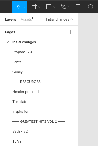
A lot of Figma pages…
A delightful Figma detail was having one laptop presenting all our mocks, then using to make sure critiques ran efficiently. If you haven’t seen the feature, it allows you to click on a person’s avatar and follow their cursor, as they speak to their designers. This enabled us to switch to the next designers seamlessly on the same laptop, and keep the flow of a critique moving smoothly.
We of course admired each other’s work and when someone had a frame they liked, we grabbed and kept riffing. The end proposal cherry picks the best ideas from our entire design team— Elly, Jeremy, Helena, TJ, Seth, Lane, and myself.
2. We iterated with a CSS prototype
Once we had the proposal, we wanted to stress test it with real docs. As the design team, we created a few user stylesheets and scripts that roughly approximated the design we created. We would tweak some values in the Chrome web inspector, then save the adjustments into a growing stylesheet. We used a few extensions to apply those changes straight to real docs in the browser— Stylish to apply CSS changes, and Tampermonkey to apply a script for a few of the trickier structural changes.
We added a tiny javascript snippet with to try different
fonts with live docs, outside of Figma.
Using Stylish ended up being incredibly valuable for prototyping, feeling out a design and eventually deciding on various directions. We were able to make a design change in seconds, and then live with it for days. This made it easy to iterate quickly and get to the third, fourth, or fifth version of an idea. (An engineer could make changes quickly too, but it would’ve taken days for those changes to make it to production docs — and would require more care since those changes could be deployed to all customers). Hacking around with the stylesheet, we were able to achieve faster results at a significantly lower cost to our team.
Prototyping against real docs helped us head off lots of edge cases and frictions. For example, our initial designs moved the section list collapse button to the bottom of the screen. This seemed like a great space saver in mocks. But anyone who tried to live with it in the prototype quickly realized they were moving their mouse up and down the entire screen.
It doesn’t look too bad in the GIF, but moving your mouse up
and down a dozen times, we realized we needed to revise.
3. We listened and learned from customers
We evaluated our prototypes with feedback from coworkers and users, with the help of a Coda doc and the . We started by finding customers who might be interested in helping us test in the and through Intercom. Using the pack, we were able to pull real time customer data into our feedback doc, then reach out to gather feedback through a Coda doc.
We created individual Coda docs for each user, copying a template we made. Each doc contained instructions on how to enable the new design, as well as a table for their feedback. As the feedback rolled in, we could respond to the customer in real time and make tweaks based on their suggestions— another example of using Coda to create the ideal tool for our specific problem.
. . .
Give it a try and let us know what you think. We can’t wait to see what you make with Coda.
Want to print your doc?
This is not the way.
This is not the way.

Try clicking the ··· in the right corner or using a keyboard shortcut (
CtrlP
) instead.