Skip to content

Share
Explore

 Visualize your Spotify Data in RStudio
Let’s go through and outline my project to visualize and project my Spotify data.
The setup:
knitr::opts_chunk$set(warning = FALSE, message = FALSE)
# Import packages
#install.packages('gghighlight')
#install.packages('rjson')
library(purrr)
library(rjson)
library(jsonlite)
library(lubridate)
library(ggplot2)
library(gghighlight)
library(spotifyr)
library(tidyverse)
library(knitr)
library(ggplot2)
#library(plotly)
Importing data into a dataframe && mutate the data
# Export my Spotify data to an R dataframe
streamHistory1 <-
jsonlite::read_json(
"C:/Users/eddie/OneDrive/Desktop/my_spotify_data/MyData/StreamingHistory0.json",
flatten = TRUE
)
streamHistory2 <-
jsonlite::read_json(
"C:/Users/eddie/OneDrive/Desktop/my_spotify_data/MyData/StreamingHistory1.json",
flatten = TRUE
)
streamHistory1 <- do.call(rbind, lapply(streamHistory1, data.frame))
streamHistory2 <- do.call(rbind, lapply(streamHistory2, data.frame))
# str(streamHistory1)
# str(streamHistory2)
streamingData <- rbind(streamHistory1, streamHistory2)
streamingData <- streamingData %>%
as_tibble() %>%
mutate_at("endTime", ymd_hm) %>%
mutate(endTime = endTime - hours(6)) %>%
mutate(date = floor_date(endTime, "day") %>% as_date, minutes = msPlayed / 60000)
Charting the number of songs played per day:
There is the limitation that I often only play a song for a few seconds before skipping to another one, or continually skip through my playlist before finding a song that I like. I addressed this by filtering out songs that I listened to for less than 10 seconds.
It also seems like I do not get close to 100 songs played per day, which to me is a bit of a surprise. Also On April 20th apparently all I did was listen to music because I have over 350 songs played…I wonder what I was doing…
# Number of songs I play per day : bar chart
songsByDay <- streamingData %>%
filter(msPlayed >= 1000) %>%
group_by(date) %>%
group_by(date = floor_date(date, "day")) %>%
summarize(songs = n()) %>%
arrange(date) %>%
ggplot(aes(x = date, y = songs)) +
geom_col(aes(fill = songs)) +
scale_fill_gradient(high = "#132B43", low = "#56B1F7") +
labs(x= "Date", y= "Number of Songs Played") +
ggtitle("Number of songs I play per day", "April 2022 to April 2023")
songsByDay


Now, this chart is a great way to get an overall sense of what my listening was like. However to examine a frequency trend over the past year, I have changed one grouping aspect from day to month in the code above: group_by(date = floor_date(date, "month")) %>%
Hence:
# Number of songs I play per month : bar chart
songsByDay <- streamingData %>%
filter(msPlayed >= 1000) %>%
group_by(date) %>%
group_by(date = floor_date(date, "month")) %>%
summarize(songs = n()) %>%
arrange(date) %>%
ggplot(aes(x = date, y = songs)) +
geom_col(aes(fill = songs)) +
scale_fill_gradient(high = "#132B43", low = "#56B1F7") +
labs(x= "Date", y= "Number of Songs Played") +
ggtitle("Number of songs I play per month", "April 2022 to April 2023")
songsByDay


This was very interesting to me, and reflects my switching from playing songs exclusively on Spotify to going back to my roots and using SoundCloud. You can see that for most of this year, my average monthly listening is not hitting over 750 total songs played.
Although I cannot prove this without testing, my theory is:
When I am in school I play Spotify a lot more to quickly listen to some tunes while studying. My number of songs has a huge drop when summer starts and this might reflect my current listening being more of a 50/50 split with SoundCloud that is currently reflected in the most recent months (end of graph).
Creating my listening activity weekly calendar heatmap
Heatmaps can be a great way to provide a visual overview of how frequently items appear in a dataset over time.
In this analysis, I used the geom_tile() function from the ggplot package to create a heatmap of my listening activity displayed as a weekly calendar. This chart shows me which days of the week I spend the most time listening to music, along with the hours on those days that I listened to the most or least music.
The weekdaysHoursData dataframe contains the weekday of each date and the hour of the day the song was played during. It was made using the wday() function to find the day of the week of each date. [1]
To make the listening heatmap, I used the group_by() and summarise() functions to create the total minutes value each tile is filled with and then used the geom_tile() function to create the heatmap. The specifications after define the gradient used, which is the reverse of the default gradient the function uses because I wanted the higher values to be darker, and make the y — axis reversed to look more like a calendar.
# Listening Weekly Calendar Heatmap
weekdaysHoursData <- streamingData %>%
group_by(date, hour = hour(endTime), weekday = wday(date, label = TRUE))%>%
summarize(minutesListened = sum(minutes))
listeningHeatMap <-
weekdaysHoursData %>%
group_by(hour, weekday) %>%
summarize(totalMinutes = sum(minutesListened)) %>%
ggplot(aes(weekday, hour, fill = totalMinutes)) +
geom_tile(color = "white", size = 0.1) +
scale_fill_gradient(high = "#132B43", low = "#56B1F7") +
scale_y_continuous(trans = "reverse") +
labs(x= "Weekday", y= "Hour of the day") +
ggtitle(
"My Listening Activity Weekly Calendar Heatmap",
"Total minutes are the summed minutes by day and hour"
)
listeningHeatMap


For me, the results have a trend that I listen to music a lot mroe later in the day and a lot at night, compared to almost none in the mornings. # Visualizing listening activity by artist in a line chart The personal streaming history data from Spotify also includes the track name and artist name of each song you listened to. This information can be used to create a "listening history" line chart of the minutes listened to each artist over time.
To do this, I used the group_by() and summarise() functions in a similar way to previous plots to isolate the streaming data by artist and create data points by week. Then I plotted the data over a line chart using geom_line(). Finally, gghighlight() was used to color artists of interest on the graph which were hard-coded into the plot.
# My listening activity by artist in a line chart
artistLineChart <- streamingData %>%
group_by(artistName, date = floor_date(date, "week")) %>%
summarize(hours = sum(minutes) / 60) %>%
ggplot(aes(x = date, y = hours, group = artistName, color = artistName)) +
geom_line() +
gghighlight(artistName == "Nipsey Hussle" ||
artistName == "Collie Buddz" || artistName == "Mac Miller") +
labs(x= "Date", y= "Hours") +
ggtitle("My listening activity by artist in a line chart")
artistLineChart


The chart shows how sporadic my listening tastes could be, as I jumped from artist to artist pretty quickly over a number of only a few weeks. The red spike representing Iration was very low all year. Another interested takeaway is that many artists have more than one spike in activity, meaning that I was really interested in them, forgot about them, and then got really into them again. You can clearly see this pattern with Mac Miller, there seems to be a lot of spikes and then huge absences.
I converted the line chart above to a geom_smooth() chart by replacing geom_line() with geom_smooth()
# My listening activity by artist in a geom_smooth chart
artistLineChart2 <- streamingData %>%
group_by(artistName, date = floor_date(date, "week")) %>%
summarize(hours = sum(minutes) / 60) %>%
ggplot(aes(x = date, y = hours, group = artistName, color = artistName)) +
geom_smooth(method = "gam", formula = y ~ s(x, bs = "cs")) +
gghighlight(artistName == "Nipsey Hussle" ||
artistName == "Collie Buddz" || artistName == "Mac Miller") +
labs(x= "Date", y= "Hours") +
ggtitle("My listening activity by artist in a geom_smooth chart")
artistLineChart2


Spotify API
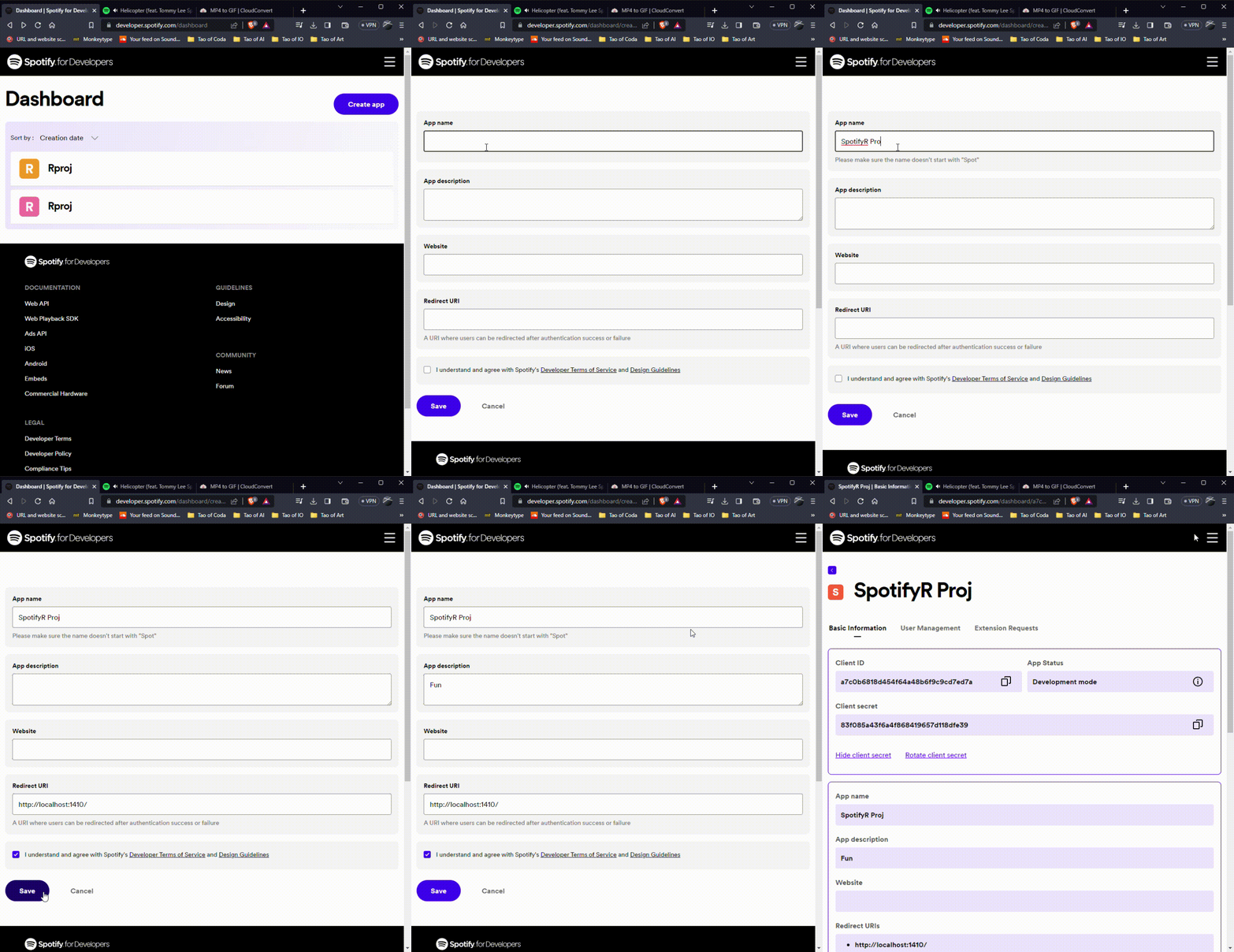
Let’s go to: Log in with your Spotify account. Create a new app. The app name and App description are up to you to fill in, they are arbitray to our implementation in RStudio. The “Redirect URI” is very important, we want to fill this line with allowing your R application to access the Spotify API and “login.”


```{r spotifyr}
# Setup spotifyr
#install.packages("httpuv")
Sys.setenv(SPOTIFY_CLIENT_ID = 'PASTE YOUR CLIENT ID HERE')
Sys.setenv(SPOTIFY_CLIENT_SECRET = 'PASTE YOUR CLIENT SECRET HERE')
get_spotify_authorization_code()
access_token <- get_spotify_access_token()
```
Want to print your doc?
This is not the way.
This is not the way.

Try clicking the ··· in the right corner or using a keyboard shortcut (
CtrlP
) instead.