Skip to content
Share
Explore
Charts in Cells
A template with time series charts in a table that update when you move a slider.

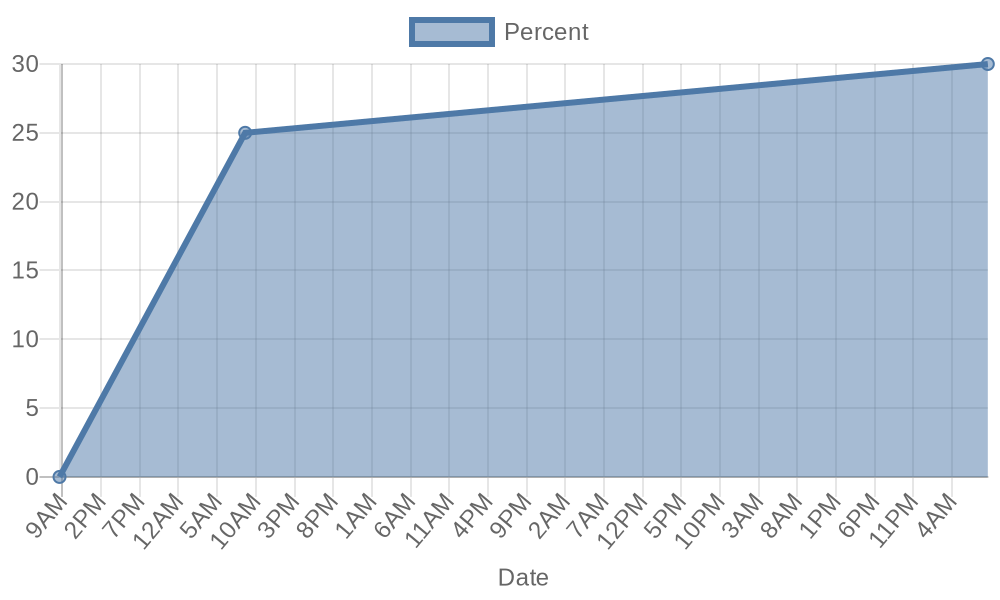
I’ve long wanted simple Sparkline charts in Coda to see how things change over time. I figured out how to do it using , by making a simple URL request to generate a chart. Note there’s also an automation on the below table so every time you adjust the Percent slider, it updates the Updates column with the information and regenerates the chart. You can use this technique for all sorts of live-updating charts that or similar URL-based chart generators offer! (, all of which could be integrated in Coda with a similar technique.)
to make it your own.
Copy this doc
Slider with History
Percent
графік
Оновлення
URL
000
21
{"x": "1/13/2021 8:37:17 AM", "y": 0}, {"x": "1/14/2021 8:37:17 AM", "y": 25}, {"x": "1/18/2021 8:37:24 AM", "y": 30}
https://quickchart.io/chart?c={
type: 'line',
data: {
datasets: [{
label: 'Percent',
data: [
{"x": "1/13/2021 8:37:17 AM", "y": 0}, {"x": "1/14/2021 8:37:17 AM", "y": 25}, {"x": "1/18/2021 8:37:24 AM", "y": 30}
]
}]
},
options: {
scales: {
xAxes: [{
type: 'time',
time: {parser: 'M/D/YYYY HH:mm:ss LT'},
scaleLabel: {display: true, labelString: 'Date'}
}]
}
}
}
There are no rows in this table
Want to print your doc?
This is not the way.
This is not the way.

Try clicking the ··· in the right corner or using a keyboard shortcut (
CtrlP
) instead.