Skip to content

Share
Explore

Originally published 5/2/2019
Three months ago, with a long-awaited mobile experience that made the doc-to-app journey finally feel real to us. As part of the launch, we released an iOS iPhone and iPad app, but no Android app. Better late than never: Here’s the .
Now all makers can watch their unique docs transform into apps on their phones. Whether your doc is a , , or — when you pull it up on your phone, you’ll feel like you built an app.
How we built it (aka the beauty of building blocks)
When we started to design Coda’s mobile experience, we set an ambitious goal: what would it look like if someone turned your doc into a native app? And could Coda make that happen automatically, without you having to think about how?
Thanks to the true modularity of our product, the building blocks in your doc are able to magically reconfigure for mobile.
We know a lot of people talk about building blocks and modular design these days, but our engineers and product designers have been living and breathing it since day one. Thanks to the true modularity of our product, the building blocks in your doc are able to magically reconfigure for mobile. Sections become tabs. Tables become cards. Buttons become swipe actions. And doc notifications become push notifications (but only if you want them to).
Or read on if you want to learn more about how we designed it.
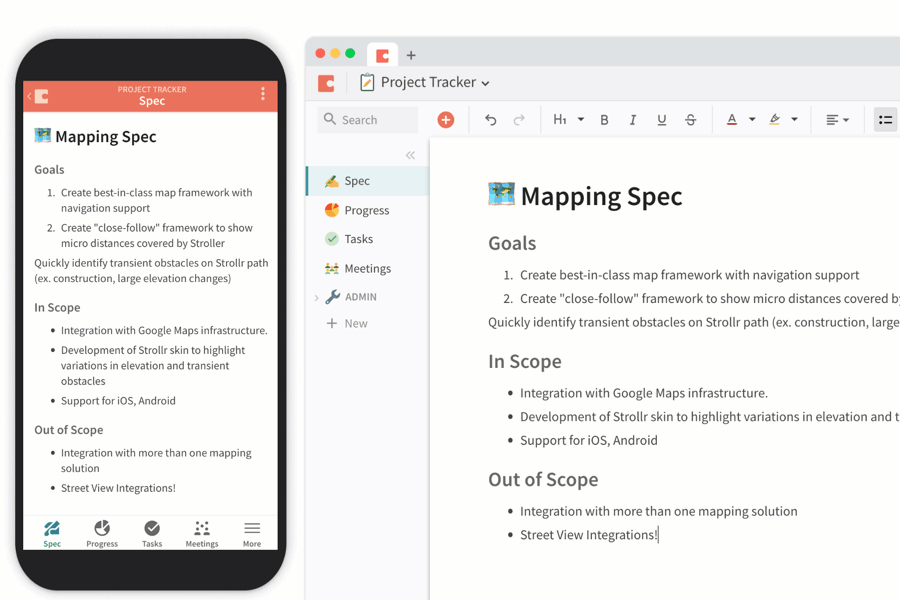
1. Sections to tabs
One of the most quintessential and familiar patterns of mobile design is the bottom tab bar. It’s how you find your way around, and it’s an important signal for what your app is supposed to do.
We found that sections in Coda naturally translated into the tab bar, except Coda docs tend to have a lot more sections that can fit on your phone. Our initial thought was to take the first four sections and make those your nav bar, keeping the rest behind a “More” button.
It didn’t take many user interviews before we realized that the most important sections differed across collaborators. So we created a way to choose which sections they want to sit on their bottom nav bar, without affecting the other users in the doc. This felt really good to us: We want every user to have the power to adapt the doc to their specific needs.
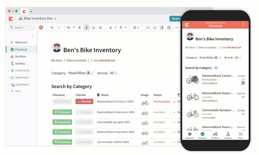
2. Tables to cards
Look at the apps on your phone and you’ll find plenty of structured data, but rarely shown as a table. That’s because tables on mobile are too tiny and hard to wrangle. Instead, the structured data is often presented as responsive cards you can scroll up and down.
Luckily, tables transform into cards all the time in Coda (check out our concept of ), which is all to say that this wasn’t our first rodeo. The hardest part of designing cardsーdesktop and mobile alikeーis deciding the content hierarchy. What table information do you surface in the card, and in what order and format?
To keep tackling that question, we interviewed makers with lots of different types of docs. We looked at their tables and asked what they would want in a mobile card. Eventually we came up with a logic based on the order of columns, the length of content in each column, the number of empty values, and whether the table had images.
We won’t delve into specifics here, but we will call out one fun thing: Button columns.
3. Buttons to Swipe Actions
In Coda, come in many forms beyond text and integers. One of them is button columns. We transformed them into swipe gestures for mobile. We loved that it was a familiar pattern and an efficient way to effect change on a row. And it turns out that the only thing more satisfying than pushing a button is swiping a button.
4. Doc notifications to push notifications
Right now, we notify you when someone shares a doc or mentions you in a commentーboth in email and in Coda. While developing the iOS and Android apps, we had an opportunity to re-imagine notifications on a more granular level. Want to know every time someone’s added to a people column? When a button is clicked? You can even create your own logic with Automations, to send notifications on any rule.
You can also decide to whom you want to send notifications. So when something actually interesting happens, they’ll get a push notification through the Coda app. Or if they don’t have the app, they’ll see it in their email inbox.
The maker generation is afoot.
Since launching Coda mobile, we’ve seen embrace lots of exciting, unexpected scenarios for Coda.
For example, Cassey Ho, who hosts popular YouTube channel , created a Coda doc for her , so friends can compete and motivate each other, without being in the same gym. You can also find her , , and
workouts on Coda.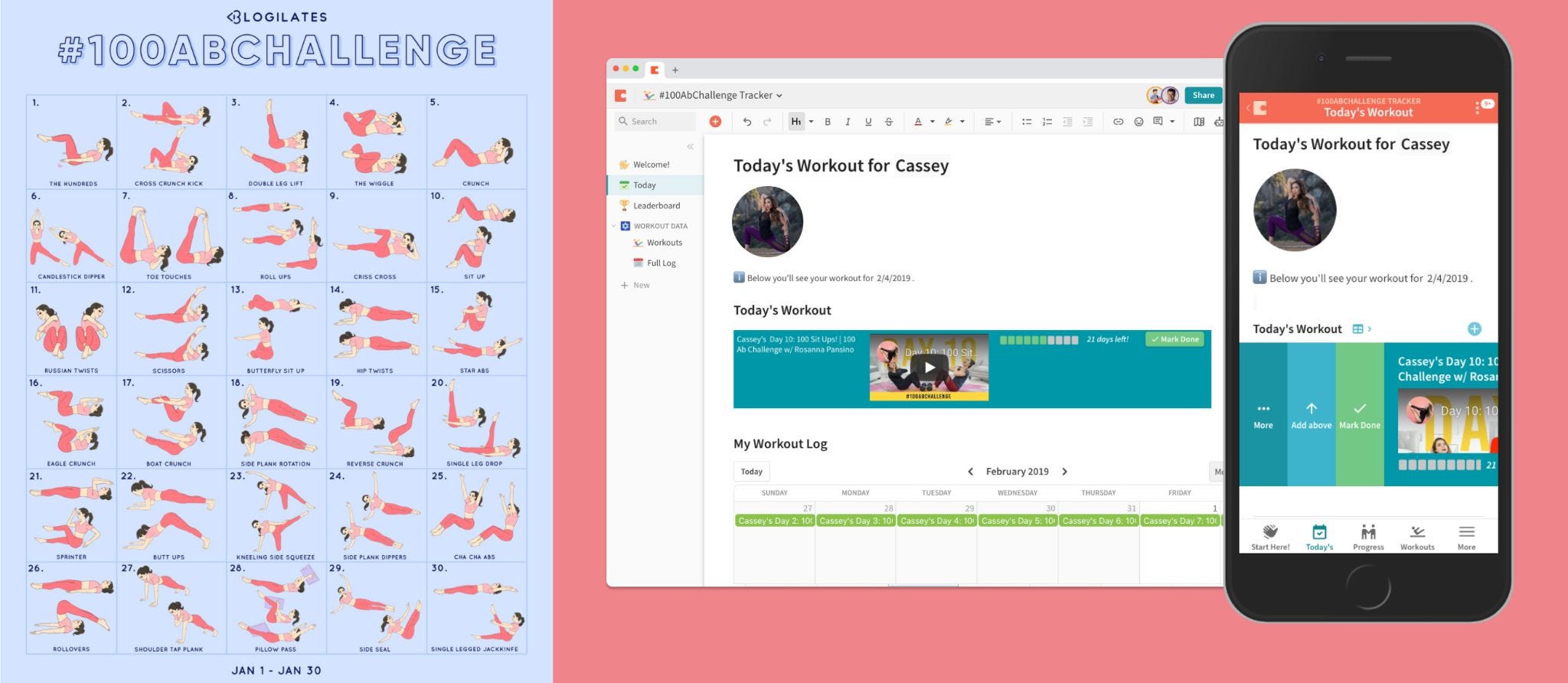
The Blogilates #100AbChallenge doc
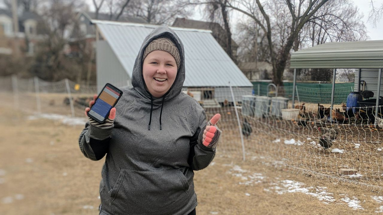
A soil farmer and small business owner named , recently built doc (in one night, no less!). The doc helps coordinate all the compost pickups, sending automated text messages to drivers on the go.
Our workplace continues to become more varied and distributed. Maker platforms like YouTube and Etsy are creating new careers. Communication tools like Zoom and Slack are making virtual offices more advanced. And co-working spaces like WeWork and The Wing are further challenging our notions of the traditional office. And it’s critical that our tools can flex with us. It’s why we’re so passionate about enabling the creation of those tools, and reimagining how they can support our changing teams.
We can’t wait to see what you’ll make with Coda mobile.
Want to print your doc?
This is not the way.
This is not the way.

Try clicking the ··· in the right corner or using a keyboard shortcut (
CtrlP
) instead.