Skip to content

Share
Explore
New building block: Layouts
One of our most important building blocks — Views — just got much more powerful. Now you can customize your data down to the very row, zooming in what’s important and hiding the rest.

Originally published 11/9/2018 by Jaime Hwacinski
One of our most important building blocks — Views — just got much more powerful. Now you can customize your data down to the very row, zooming in what’s important and hiding the rest.
Before now, Views could be visualized as cards, calendars, or Gantt charts. However it was displayed, though, you could never get the perfect View of a single row. Starting today, you can do just that. We call it Layouts.
Want to play with Layouts? Check out our new ,
, , and templates in the Gallery!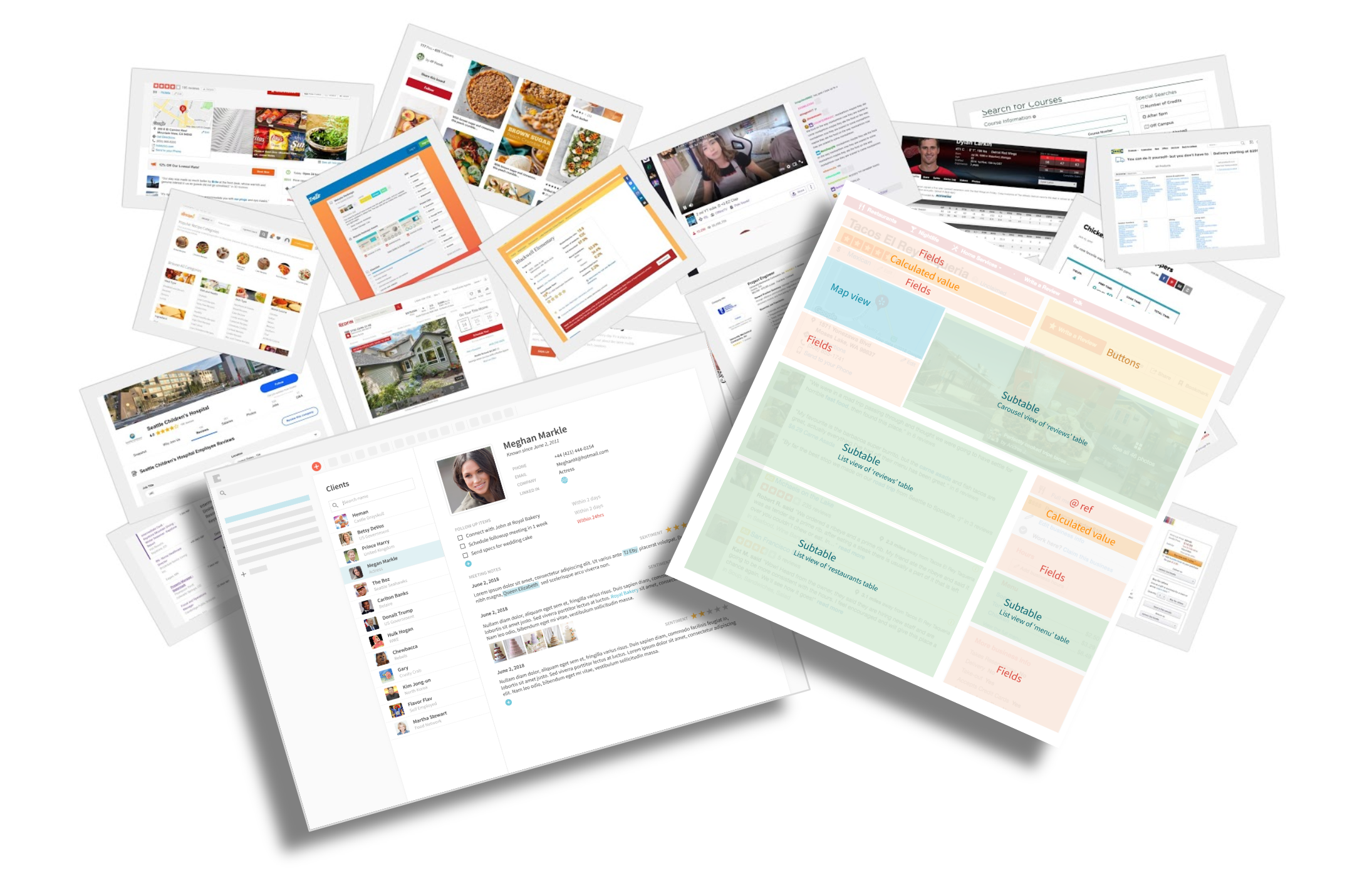
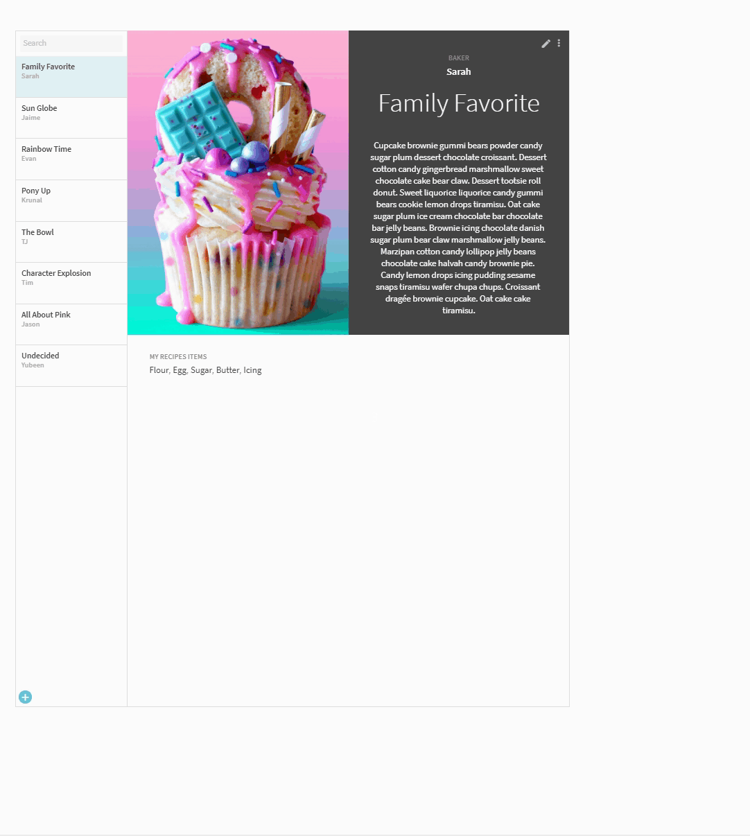
This new Layout building block focuses on how to better visualize what’s inside of each row. To get started, open a row and click the new “edit” icon.
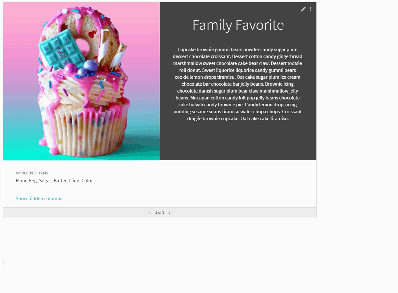
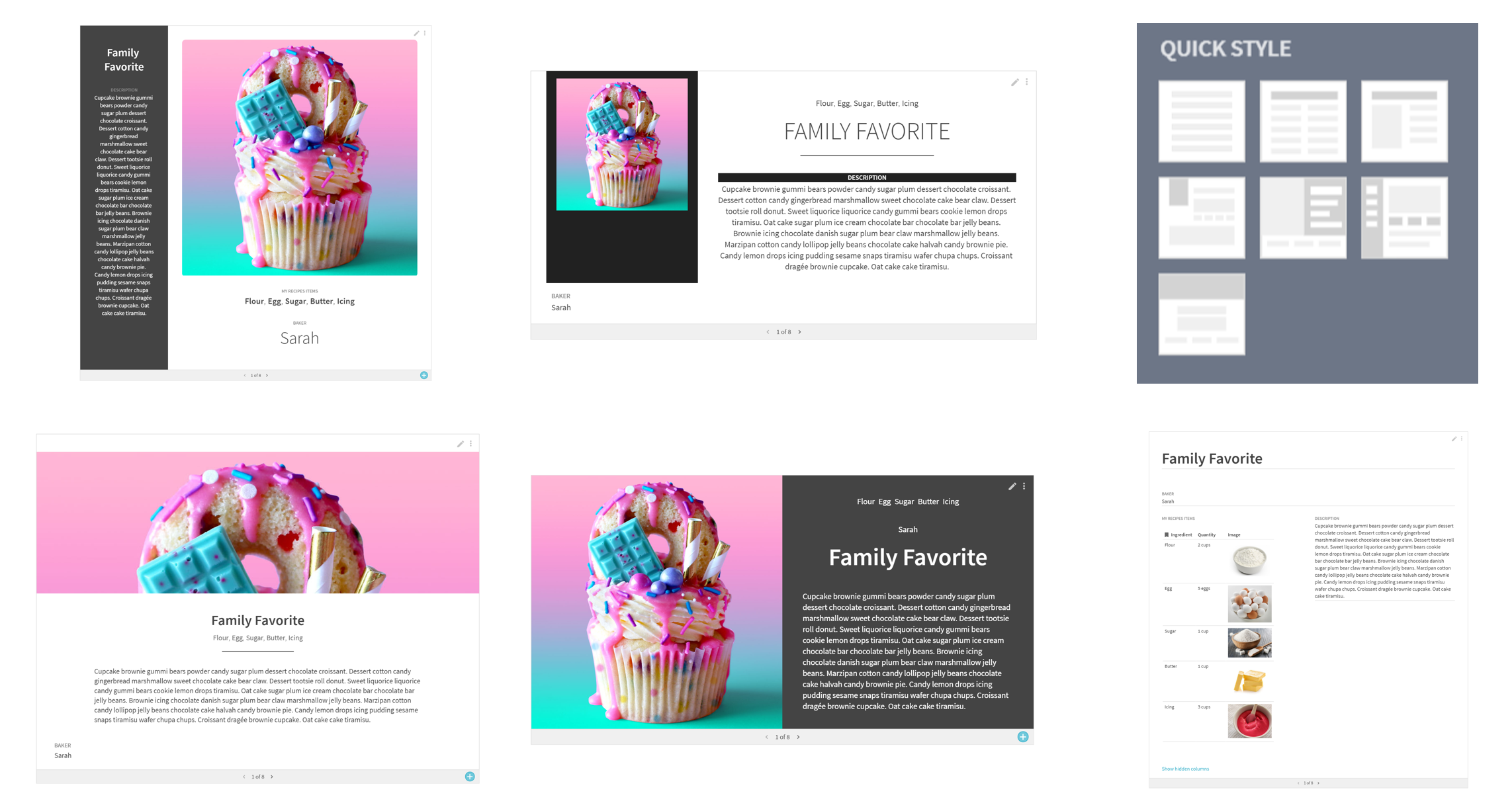
When creating a new layout there are a few styles to choose from as a starting point. Once you select an option, drag and drop fields around until you’re happy with the design. You can even name and save it to re-purpose later.
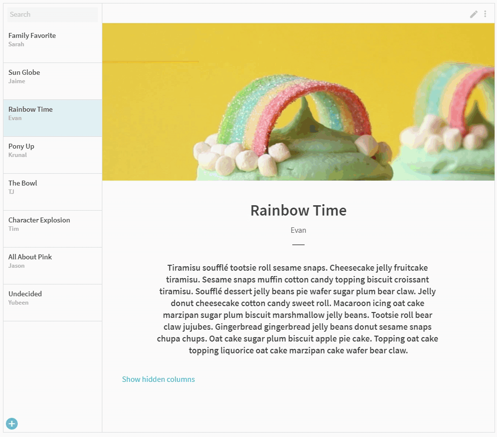
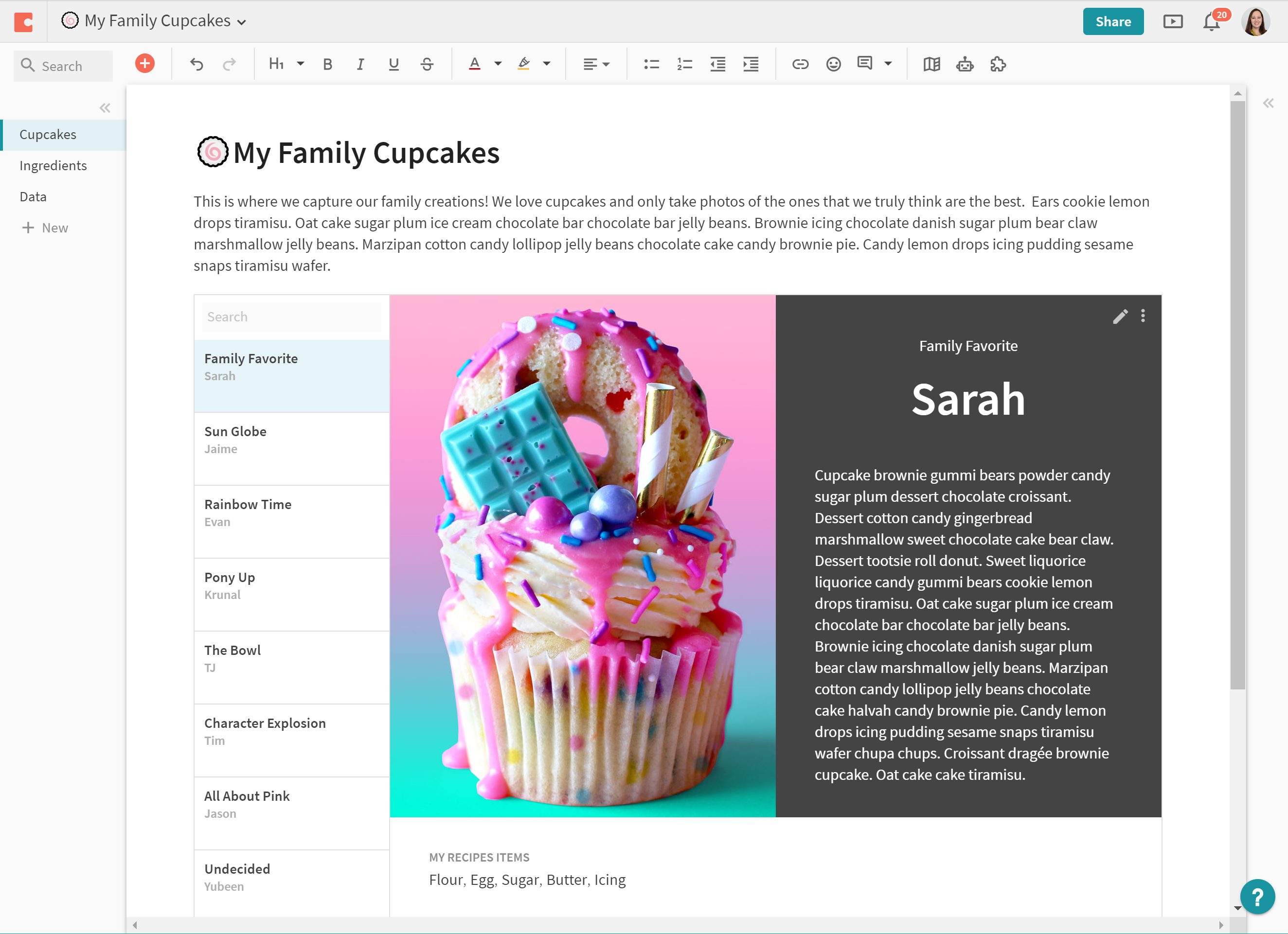
We’re also introducing a new Detail view which puts your newly customized row front and center in your doc.
Building the building block.
At Coda, we believe docs can be as powerful as apps. And often, there are three parts to apps: data, interaction and presentation. Today’s launch combines the last two: How do you enable makers to present and interact directly with their data in a functional and beautiful way? How can a table tell a story?
To answer these questions, our designers and engineers referenced countless websites, apps, and print media to survey how they tell stories with data. Eventually common patterns emerged. And we began to recite a mantra: Everything’s a table.
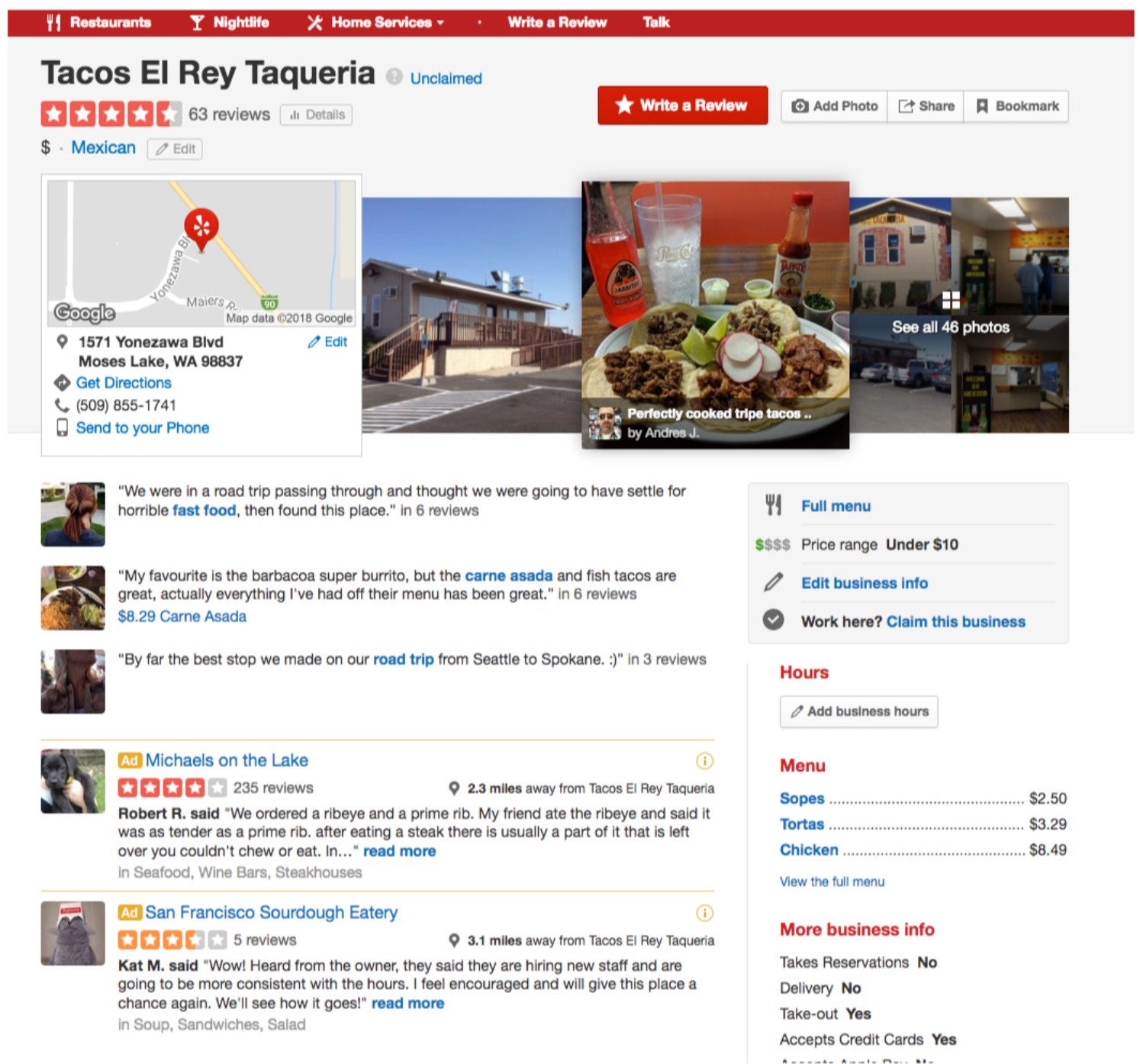
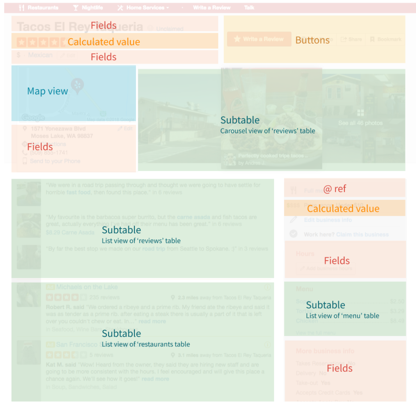
To show you what I mean, let’s take a familiar example. Yelp. Imagine Yelp as one giant table, where each restaurant makes up a row. And within that, you have attributes: the reviews, the location, the menu. Those are the columns. Looking at the Yelp page below, you can see that every part maps to a building block in Coda. The carousel of imagesーcards. Each individual reviewー a sub-table. The average score? A formula. Now I’m not saying you should build Yelp on Coda tomorrow — just want to drive home the idea that tables and rows are everywhere if you look closely.
You can have however as many components as you want, but if you want users, you need to tell a story with them. Each restaurant may be a row, but nobody wants to read through a long row with a vertical list of attributes to decide where to eat. You want a way to shine a light on a detail. You want a way to zoom in on what’s important and do what you need to do. Look at the pictures. Read the menu. Make a reservation. Done.
In that spirit, our team decided on three guiding principles to help us bring Layouts to life.
Principle 1: Keep it row-level.
The first principle was to focus on viewing and interacting at the row level. When we started to experiment with real makers’ scenarios, like building an invoice or a recruitment system, we stumbled across a big usability gap. Looking at a row, you lost track of all the lookups and references to the rest of the doc. Like when you want to see a set of sub-tasks for a big project, invoice items for a purchase order, or a set of references for a recruiting candidate. So we expanded those references in-place so the user could meaningfully interact with them from deep within a row. If one of your columns is looking up information from another table, you’ll be able to expand those references to see and edit them just like you would in their original location.
Principle 2: Give makers something to start with.
The second was giving people inspiration to get started. This led us to providing a bunch of layouts to choose from in order to get started, called quick styles. We’ll be adding lots more over time. This first set optimizes for common shapes of data. For example, visually heavy vs text heavy vs calculation heavy.
Principle 3: Put details center stage.
The third guiding principle was to bring the freshly customized row to the center stage of the doc where it made sense. This effectively led us to our new Detail view where you could take today’s pop-out of a row and anchor it to the body of your doc. This is great when working with scenarios that have a more singular focus on each item in a table.
I think this new building block will really change the face of your docs. We can’t wait to see how you Coda with Layouts.
Thanks to Lane Shackleton.
Want to print your doc?
This is not the way.
This is not the way.

Try clicking the ··· in the right corner or using a keyboard shortcut (
CtrlP
) instead.