Skip to content
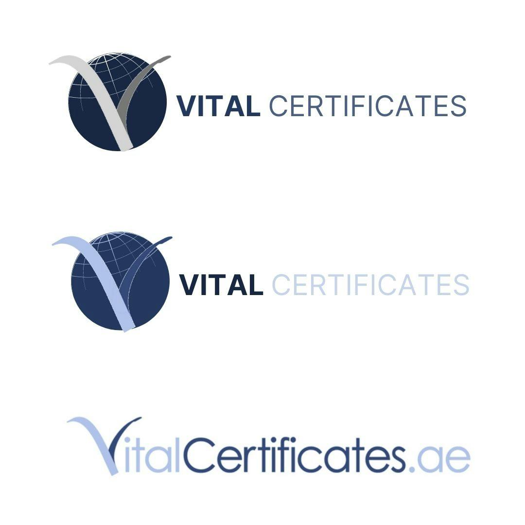
They all look the same! They aren’t representative of each brand on social media, on the site etc, and how each one differsThe font (Century Gothic) isn’t used anywhere else anymoreThe colours used aren’t standardised across the boardThe “V” is used to represent a text character, when it’s actually an icon or image. This is problematic when it comes to alignmentIt’s boring!
 Logos
Logos
We have a few issues with our logos that could do with resolving for better brand balance and uniformity. This doc aims to be an open discussion around those issues, and suggest possible solutions.
Problems with our logos:
Some (very rough) ideas for change are below. I like the idea of a logo which can have something small added or changed to represent the different strands of the business - Legalisation, Certificates, Visas, the UAE site etc. The globe might be a good one for Consular/Certificates UAE. Would other icons work for different businesses?
Would someone more talented at logo design like to take up the mantle and make a better version? 😁 perhaps? Open to any and all suggestions!
@Melanie Clarke


Some more ideas:

Want to print your doc?
This is not the way.
This is not the way.

Try clicking the ··· in the right corner or using a keyboard shortcut (
CtrlP
) instead.