Skip to content
 Logo Lockups
Lockups are different configurations of the icon and logotype. Select the appropriate lockup based on layout and orientation considerations.
Primary Lockup
Overview

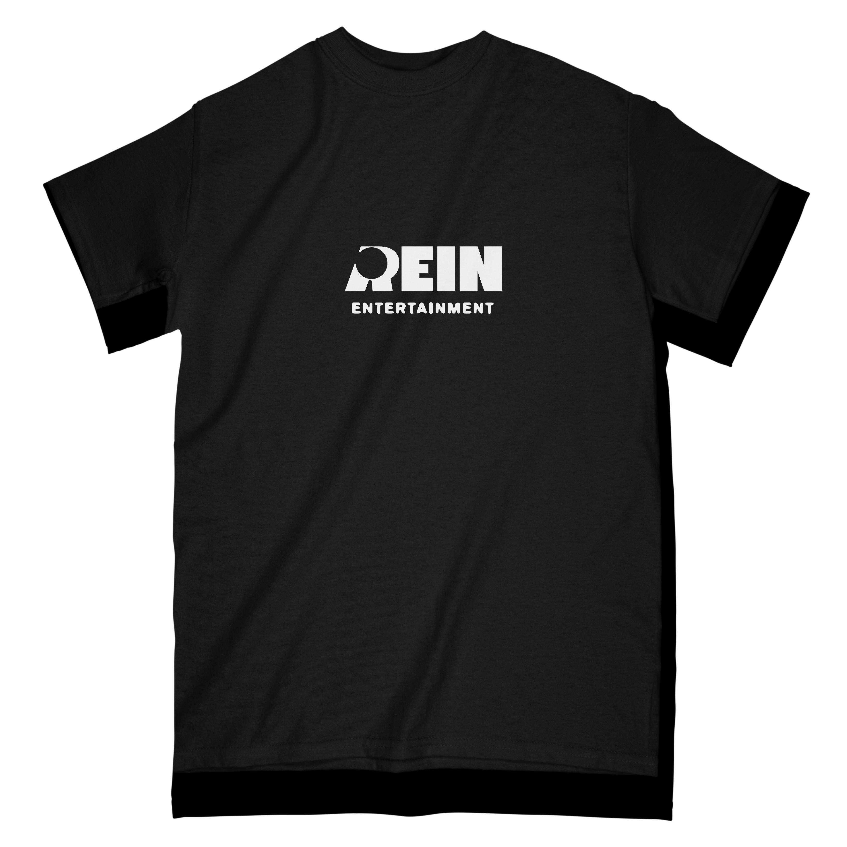
The primary logo is the main signature of the brand. It should be prioritized when applying the logo to different brand applications. Use this logo for primary brand communications, especially internal communications and brand promotional materials, e.g. company profile, official documents, uniforms, signage, website etc.
Composition
The primary logo is composed of the wordmark stacked on top of the descriptor. The wordmark is made of custom letters with a unique letter R design. This letter R functions like an icon that can stand alone and represent the brand as its key visual.
The descriptor “Entertainment” is set in Blur Medium.

Use in vertically-oriented layouts.
Horizontal Lockup
Composition

With similar components as the primary logo, this lockup should be used on horizontally-oriented layouts.
Usage
Color Use
The logo lockups in this section use the following colors: Red Rein, Black Void and White. These colors are used on internal applications and brand promotions. Do not use Neon Purple on the logos.


However, it is important to note that the logo lockups can adopt the colors of specific projects. The brand colors should only feature on brand promotions and internal materials. They should not take away from the individual visual identities of each film or project. Their identities should always take precedence over the mother brand.

For applications with limited color use, use the black and white versions of the logo lockups.


Clear Space
Clear space is a space surrounding the logo set to ensure elements surrounding the logo will not overlap or obscure it. The clear space of both the primary logo and horizontal lockup is equal to half the height (1/2) of the wordmark.


Minimum Size

The minimum size of the stacked primary logo is at a width of 1.5”. This is the smallest possible size that you can use this mark.

The minimum size of the horizontal primary logo is at a width of 2.5”. This is the smallest possible size that you can use this mark.
Misuse
Avoid the following misuse cases for all lockups.

Do not stretch the logo when scaling.

Do not shear the logo.

Do not alter the typography of the logo.

Do not add any gradients to the logo. Even if the colors are on brand.

Do not use patterns on the logo lockups.

Do not alter the composition of the logo.

Do not rotate the logo.

Do not use Neon Purple or other colors not on the palette when placed on internal materials.

Do not add any embellishments to the logo such as drop shadows, bevels, glows, etc.
Want to print your doc?
This is not the way.
This is not the way.
Try clicking the ··· in the right corner or using a keyboard shortcut (
CtrlP
) instead.