Skip to content


 Color Palette
Red Rein is the main color of the brand, followed by Black Void and Neon Violet as part of the primary palette. However, their usage is not required on individual projects and films by Rein Entertainment as each project must maintain its own identity and art direction separate from the mother brand.
Primary Palette
Red Rein
Pantone
Bright Red C
Hex Code
#fb2a02
RGB
R 251
G 42
B 2
CMYK
C 0
M 94
Y 100
K 0
Black Void
Pantone
Black 6 C
Hex Code
#000000
RGB
R 0
G 0
B 0
CMYK
C 75
M 68
Y 67
K 90
Neon Purple
Pantone
Violet C
Hex Code
#6608f7
RGB
R 102
G 8
B 247
CMYK
C 75
M 79
Y 0
K 0
The secondary colors below are meant to be used as backgrounds and/or accents. These neutral colors provide a balance for the brightness and boldness of the primary palette.
Secondary Palette
Light Gray
Pantone
Cool Gray 1 C (50%)
Hex Code
#eeeeee
RGB
R 238
G 238
B 238
CMYK
C 5
M 4
Y 4
K 0
Gray
Pantone
Cool Gray 1 C
Hex Code
#d9d8d6
RGB
R 217
G 216
B 214
CMYK
C 14
M 11
Y 12
K 0
White
Pantone
—
Hex Code
#ffffff
RGB
R 255 G 255 B 255
CMYK
C 0 M 0 Y 0 K 0
IMPORTANT NOTE
White should only used on the logo lockups. It is not to be used in other applications.
Color Distribution & Combination
When selecting colors, follow this loose guide. Ensure that there is always enough contrast among the colors. The designer is free to play around with the proportion of color usage, meaning any color in the recommended combinations can be dominant or used as an accent.
2-color Combinations
When using only 2 colors from the palettes, it is suggested to use the following combinations.


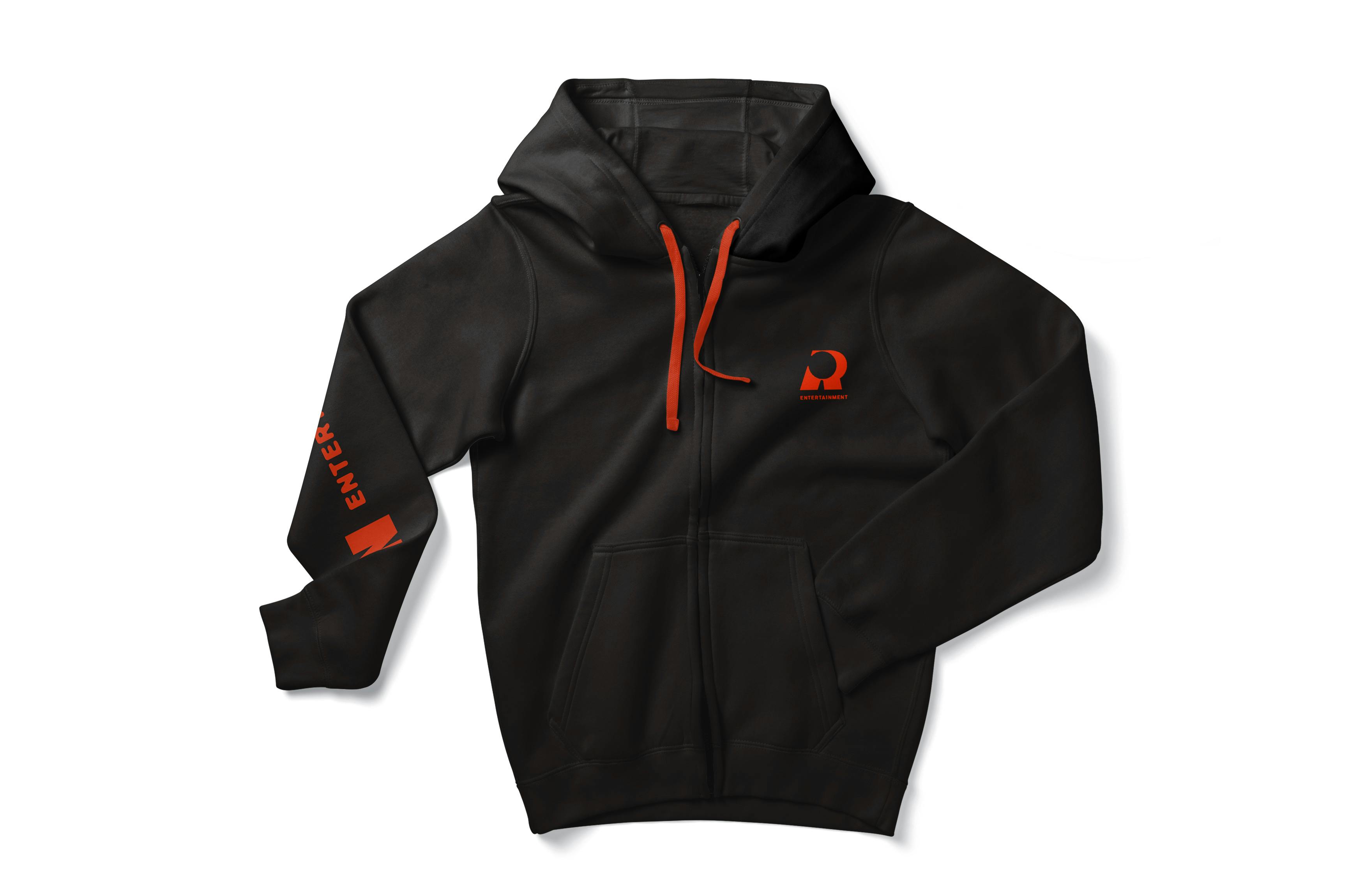
A sample application of Red Rein printed on a black hoodie.
3-color Combinations
When using only 3 colors from the palettes, it is suggested to use the following combinations.


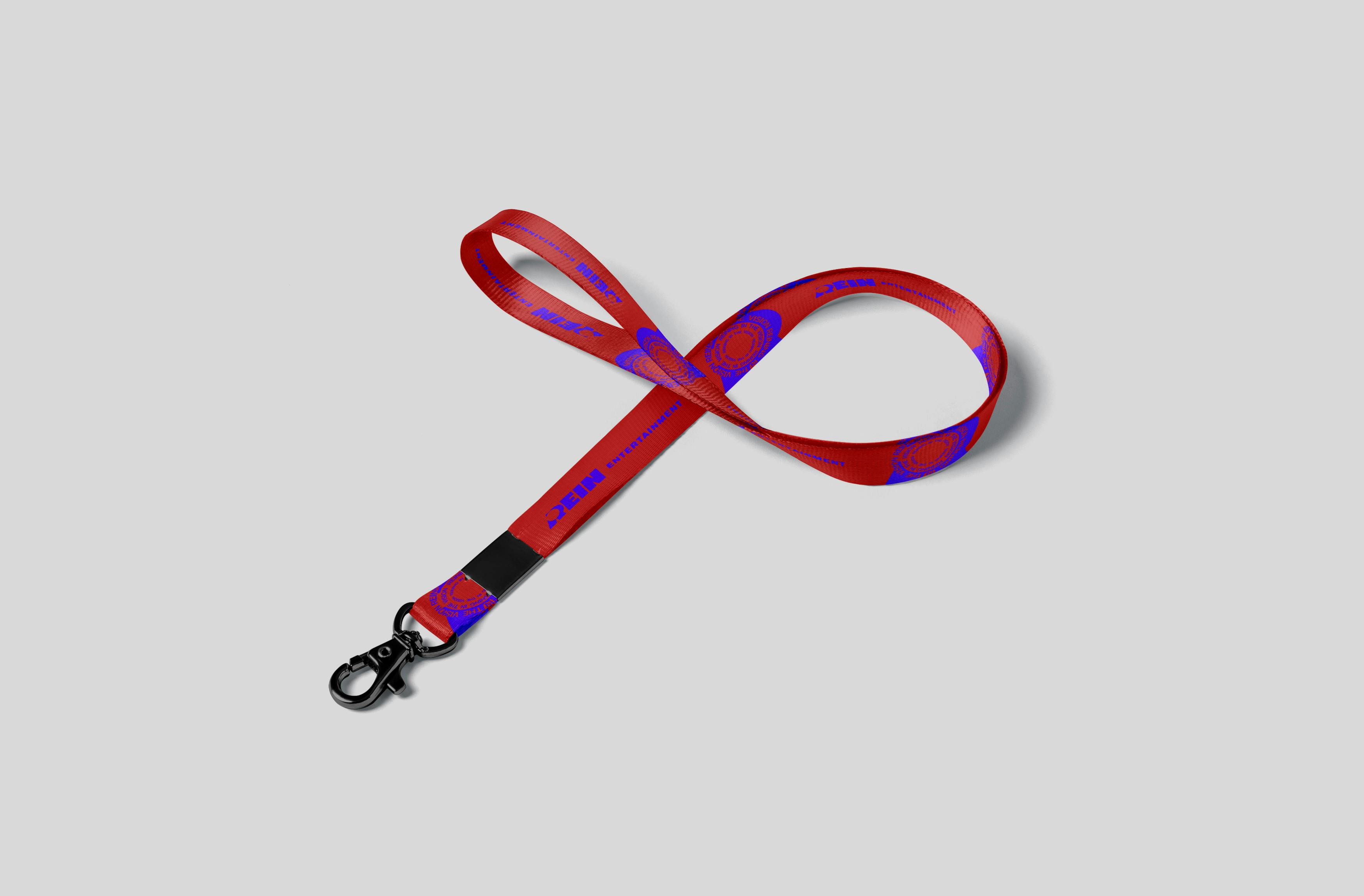
A sample application of Red Rein and Neon Violet printed on a lanyard, accented by Black Void for the metal components.
4-color Combinations
When using 4 colors from the palettes, it is suggested to use the following combinations.


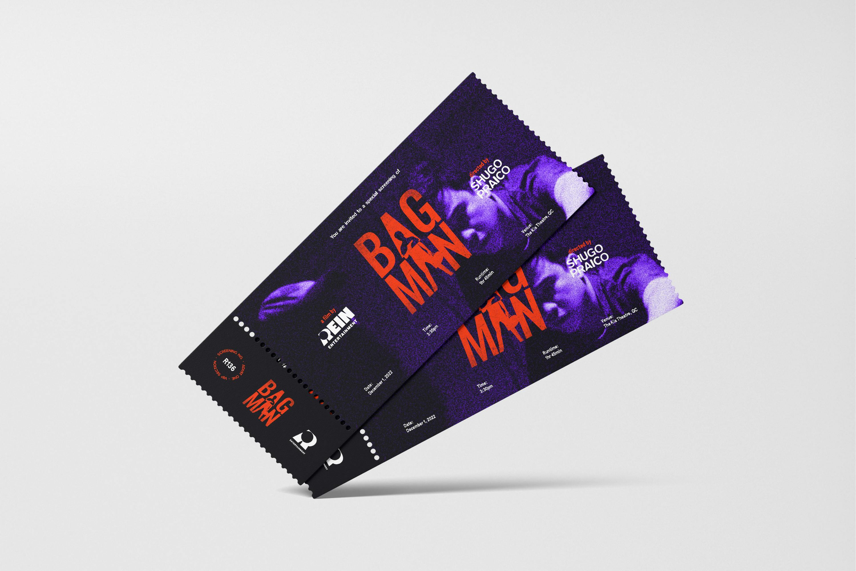
A sample application of 4 colors on a ticket graphic.
Want to print your doc?
This is not the way.
This is not the way.

Try clicking the ··· in the right corner or using a keyboard shortcut (
CtrlP
) instead.