Skip to content


Flutter Class
How to Get Started
Basics Of Flutter 💻
import “package:flutter/material.dart”;
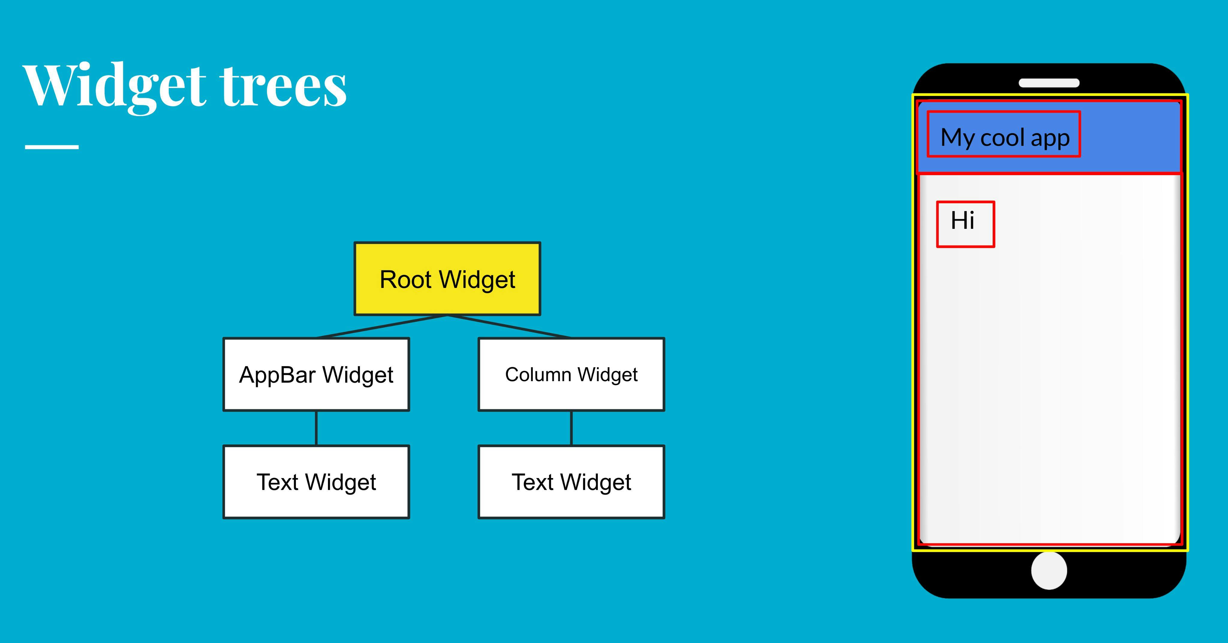
Widget Tree’s
Stateless and Stateful Widgets
Scaffolds
Properties
Columns, Rows, Stacks and ListViews
Container
Widgets 📱
What are Buttons
Different Kinds of Buttons
Divider
persistentFooterButton
Navigator
MainAxisAlignment
Formatting widgets
Circle Avatar
Drawers
Icons

ThemeData
ListTile

TextFormFields
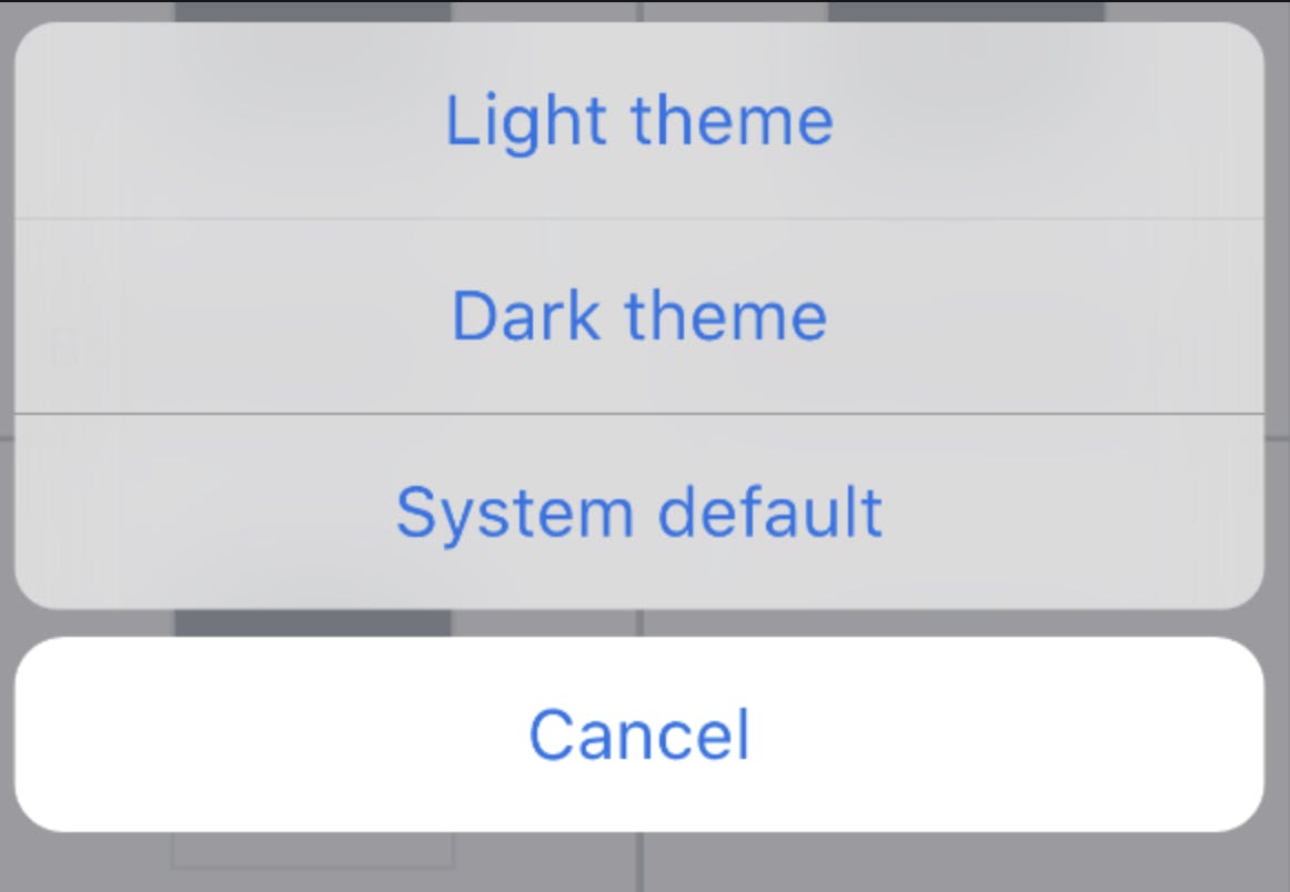
CupertinoActionSheet
CupertinoActivityIndicator
CupertinoAlertDialog
MediaQuery
GestureDetector
LayoutBuilder
Extensions ➕
Pubspec.yaml and Images
YouTube Videos
GetWidget
Functions ⌨️
Making Your Own Widgets
DebugShowCheckedModeBanner

Run on the Web
Variables
If and Else Statements
Maps
Custom Widgets
Void
kIsWeb
Lessons 📖
Basic Database
Sign Up
What are _ used for?
Want to print your doc?
This is not the way.
This is not the way.

Try clicking the ⋯ next to your doc name or using a keyboard shortcut (
CtrlP
) instead.