Skip to content

 Accessibility Guidelines
Accessibility Guidelines

Accessibility for Web Development
Intro
Perceivable
Alternate descriptions

Captions
Present content using semantic HTML
Adaptable design
Visual cues
Avoid auto-starting video or audio
Responsive body copy
Operable
Keyboard Navigation
Allow enough time
Disable distracting content
Flashing animations
Helpful navigation
General helpful information
Understandable
Readable
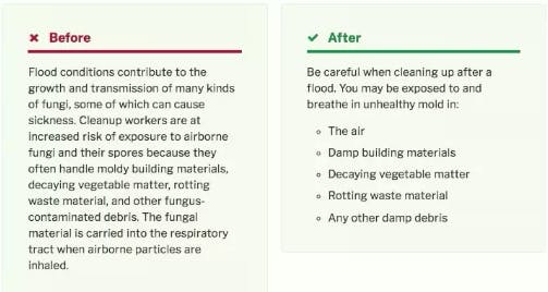
Plain Language
Create predictable navigation
No unexpected changes in context
Input assistance
Robust
Working accessibility into practice
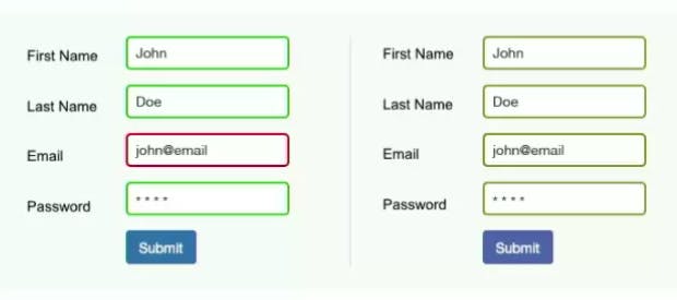
Form usability
Want to print your doc?
This is not the way.
This is not the way.

Try clicking the ⋯ next to your doc name or using a keyboard shortcut (
CtrlP
) instead.