Skip to content
Design a delightful doc
Share
Explore

icon picker
A delightful doc

How you can design your own internal business app for your team.
When software first came out, you had to build work tools for yourselves from scratch. Then out-of-the-box solutions came to market which were already mostly built: business users just had to customize them and train the team. Recently, a new wave of tools have come into the hands of makers, and these tools have building blocks so that makers can design their unique ways of doing things.
When I first learned about these types of tools like Coda, I got excited about the possibilities of what I could do with them, but quickly realized that I needed more skills and experience in building solutions to compete with the apps we were already using. So after seven years of working at software / service product companies and using out-of-the-box tools to run the company, implementing and customizing 50+ internal business apps, and building / launching over a 100 Coda docs across various use cases and client industries, I've begun to document what works and doesn't with internal apps.

Work, your way

It’s funny. You can work for a product company with talented product managers, designers, engineers, customer experience champions, marketers, and sales folks, and, unless you’re working at Salesforce or Atlassian, you're rarely building a product that you get to use daily. Instead, you use some other company's idea of what should be a CRM, project tool, or meeting app, all while having product rockstars on your team secretly (or not so quietly) thinking about ways to improve or change it. Their dissatisfaction results in wonderfully built docs and sheets, as those programs provide surfaces flexible enough for the people who are actually doing the work to build their own, unique way of doing things. And, with product skills, these docs and sheets feel so close to apps.
Unfortunately, these tools aren’t designed to scale or be connected in any meaningful way ー they come with the same building blocks and concepts from desktop word processors and spreadsheets 40 years ago.
Coda is unique in that you can take some of the simple affordances of docs and sheets, but you can build tools that work for your team: meeting systems, 1:1 trackers, OKRs connected to your product roadmap. See what the current community of makers are building in the , and if you have a keen product eye, you can start figuring out the patterns that work when teams design and build their own tools.
This guide is my attempt to elucidate the best business app patterns (and things I've seen in other's docs) and share how to incorporate those into your (soon-to-be awesome) Coda doc — a doc users love working in and stakeholders appreciate insight from.
But first, the patterns of out-of-the-box business apps.

Adaptable patterns of out-of-the-box business apps

What’s cool about most business apps is that they follow the same pattern for a successful user experience and system design that scales. Strip away the branding, any strong points of views that the software product company has infused, and the UI, and you're left with a core set of principles. Fortunately, when you’re designing your homegrown doc /tool / app, you can apply these principles into the unique way you do things:
A warm welcoming to and within the app with clear direction on the steps a user should take to interact and be successful with the app.
Core of a business app is a set of tables, the discrete things you’re tracking and there's an order of the columns.
Different users get different views. End users focus on taking action on their work and stakeholders see the big picture.
Information hierarchy follows a front stage for the workflow and a back stage for the setup.

We also did a webinar about this here:
This link can't be embedded.

1. Warm welcoming

Successful out-of-the-box business apps welcome new users across various channels with specific instructions and call to actions (CTAs) for how to be successful using the app.
Learn how to do it in a Coda doc
EXAMPLES 👇

Salesforce


Salesforce Homepage.png
Salesforce has a starter home module that all new users drop in to on their first ーand until they change the settingー Nth time logging in to the app. This homepage includes help links, calls the user to Create (a client, sale, case). On the left, navigation guides them from the classic UI of Salesforce to the Lighting UI.

Asana


Asana Welcome Email.png
Asana sends a welcome email to all new users highlighting why you would want to use asana (it's a better way to work of course!) and then including three call to actions (CTAs) for how to get started with the tool starting with Create your first project which is what's going to begin the user on a successful journey. Onboarding emails with CTAs that link into the app are a common way to remind and support coming back to the same place to get the job done.

2. Everything's a table

Under the hood, business apps are basically just a collection of tables, the things you’re tracking. If you're coming from the land of databases, one could argue (I do) that business apps are just pretty and easier-to-use relational databases that are branded and connected.
There are a for that are pretty detailed and slightly dry, so let's go with 2 principles for now:
There are no duplicate tables in the app (on the backend). If you see the table twice in any app, one of them is a view of the base table.
In a table, you order the core, unique, more important items on the left, the less accessed items to the right, and the actions on the far right.

Learn how to do it in a Coda doc
EXAMPLES 👇

Quickbooks


Quickbooks table.png
In Quickbooks, when an invoice comes in, that date is the most important item in the sales module of accounting software.
Check box on the left is a common pattern for tables where the rows (invoices here) need to be "bulk actioned" like sending overdue notices to your clients.
Invoice # which is the only unique column in this table, so it's the first column relating to the invoice itself.
All details like the customer, and the amount follow.
Status on the right is common as users take actions using buttons and drop downs after they have complete context (invoice date, customer, amount, overdue) of the situation.

Jira


Jira Table.png
Jira is funny because it hasn't changed much since its initial release in 2002 and is heavily used by engineers, so we get to see almost what a database looks like in this issue list.
First column is an icon to tell us what issue type it is ー these icons haven't changed for a long time and Jira users often know what they are associated with, so Atlassian took the approach of using iconography over text to outline the type to increase information density.
column is directly from relational database language and is the unique value in a row that can be used to reference it. While their actual database key is likely a Row ID in the Jira database backend, this key is the human-readable version which combines the issue number with the project name to create a unique reference (a trick of ).
Summary, which is the core piece of information (though I've aways thought this is more like the ticket name) is taking up the main visual space on the left.
Assignee so we can easily see who's working on the issue.
Status on the far right, similar to Quickbooks, so that we can take action once we have established context for the issue.

3. Different users get different views

Everyday users get a homepage to launch from with the ability to quickly add data.

This view gives end users immediate context for how to interact with the doc by creating a space designed specifically for them where they focus on their own work. Most end users will be adding data (usually related to themselves) and updating their own info, so creating a page for them will allow them to get in, do their work, and get out in the easiest and fastest way.
Learn how to do it in a Coda doc

EXAMPLES 👇

Asana


Asana homepage.png
This section, My Tasks, is a filtered view of the team's task table. Each user of Asana gets their own My Tasks list / board with a big button to add their own tasks. They don't have to worry about others and can focus on what they need to do.

Greenhouse

Greenhouse homepage.png
Greenhouse's user homepage, My Dashboard, is a customizable space with the core focus on filtered tables of the rest of the app down to what's assigned to the user: My Interviews and My Applications that I need to review. The right hand space includes Tasks, which are sub tracked items under Candidates and a secondary workflow. Greenhouse uses this homepage as an educational welcome space to with help resources similar to .

Salesforce

Salesforce Homepage.png
For this user, a salesperson, the core focus is a roll-up of their team's performance against their sales goals. The main value-prop for Salesforce is for a team to move from multiple lists of clients and opportunities to one place for the team to update pipeline in the cloud (no on-premise software), so this dashboard makes sense to communicate that value.
In the core area are events and tasks that are assigned to the user that they need to focus on today - using both time based and user assignment to make these tables more focused. Recent records goes to search history given users often come back to the same clients and deals within a week. In the right space is Salesforce encouraging the use of Einstein, their AI bot, increasingly a value-prop for them.

Stakeholders (often managers) see reports with aggregate and highlighted info.
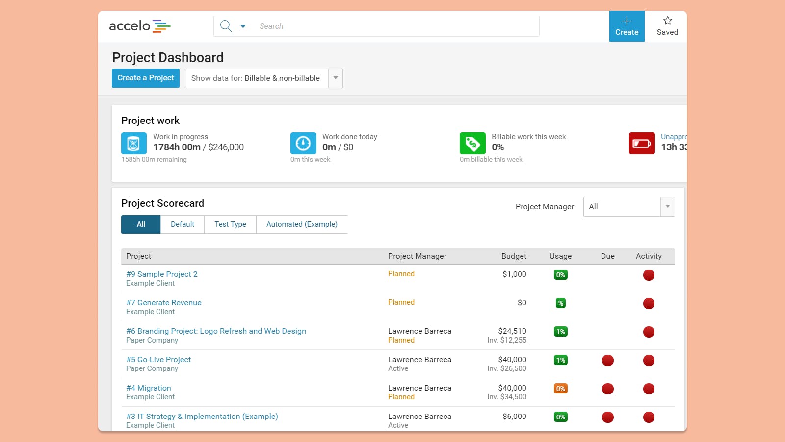
Folks who aren’t part of the core operation but essential to the success ー the Head of Delivery for client projects, hiring managers for applicants, VP of Product for the Product team, Head of Sales for Growth ー will want insight into how the team / process is performing. They want aggregates, summaries, and gists of what’s going on so that they can guide the team, ask the right questions, and make strategic adjustments where needed.
Learn how to do it in a Coda doc
EXAMPLES 👇

Accelo

Accelo Report.png
Accelo starts with aggregate single numbers, often called Key Performance Indicators (KPIs) which sit on their own. The number alone can start conversation where it's high / low, trending up / down. For managing directors of digital agencies and partners of consultancies (the key users of this dashboard in Accelo), work in progress measured in hours and dollars is vital to being able to bill and recoup effort as well as the billable % (often called utilization) for their team. KPIs are often put front and center in manager dashboards as they kickoff a meeting or report.
A project scorecard table allows partners to skim each project at the highest level (if there are less than 50 projects) with their project managers and drill down in if needed.

Greenhouse

Greenhouse Report.png
Hiring mangers and the head of HR / People get to step through weekly / monthly an entire pipeline (Pipeline Stage chart) and then can see how the pipeline looks for each of the roles. Pipeline and workflow tools like ATS, CRMs, and manufacturing often have this design with a bar chart on top, with summary details below.

4. Information hierarchy: front stage vs back stage

Apps traditionally have a flow from top → bottom or left → right (as with most other things like how you read a document or navigate a website).
Generally, the pattern is as follows:
Home page and personal space where every user starts off
Reports for managers and stakeholders
Team views for folks to collaborate and work together
Admin and setup also known as the "back end" or "back stage"

Learn how to do it in a Coda doc
EXAMPLES 👇

Asana

Asana Folder.png
Home, My Tasks, and Inbox are all personal user sections. Reports for management. Team space with projects and tasks related to each functional area. Not on this navigation, but still calling out, that personal and admin settings are under the user profile areas.

Salesforce and Greenhouse

Salesforce Folder.png
Both start with a personal workspace/ home, then move into All [insert unique object to that app] such as Jobs or Clients. Reports and dashboards for management. Then a back end admin and configuration area.

You can do it

So we've gone across the universe of business apps and their design patterns that make them stand out amongst their fierce competition. Now it's time to roll this new insight and understanding of the world (at least the business app world) into your own Coda doc.
Apply the four principles of best of breed business apps and make docs that users love, that scale as the operation and team growths, and that leadership sees as a key part of any organization.

Want to print your doc?
This is not the way.
Try clicking the ⋯ next to your doc name or using a keyboard shortcut (
CtrlP
) instead.