Skip to content

icon picker
Intro

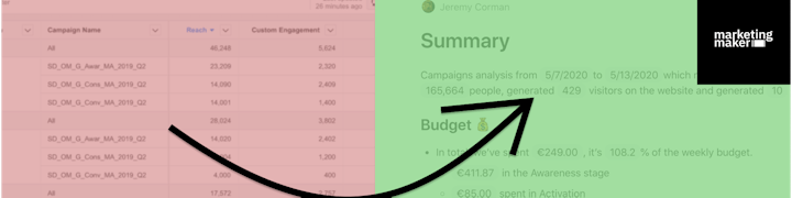
I use this to help my clients understand reports and focus on what matters the most
Making an ads report is good.
But making an ads report meaningful is great.
What sounds obvious to you doesn't sound obvious to everyone, especially when it comes to reading tables of statistics. What we want is how you interpret things as an expert in your own field. I’ve noticed that we have this tendency to throw statistics around in the hope our audience will see what we wee. Hey it’s obvious, right? Nope sorry. It’s not.
It took me some time to realize this simple fact over the years.
Today I wanted to come up with an example of a textual report that encourages you to write down your own interpretations. But that’s not the whole point about this report. In fact, I’ve automated this textual report and, I show you how you can do it yourself (for free, without writing code) in this video.
Tech stack and data architecture look like this:
Facebook Ads → Adveronix → Google Sheets ←→ Zapier ←→ Coda → Gmail
Zaps used:
Account (A):
Account (B):
Campaigns (A):
Campaigns (B):
Date range picker:

Check the final result here:
Want to print your doc?
This is not the way.
Try clicking the ⋯ next to your doc name or using a keyboard shortcut (
CtrlP
) instead.