Skip to content
CSS
 css flexbox layout
css flexbox layout
適用flexContainer
flex-wrap(wrap-reverse)
align-content
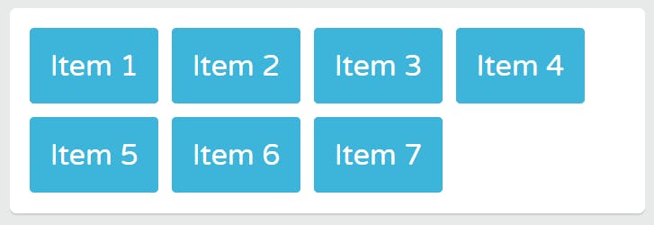
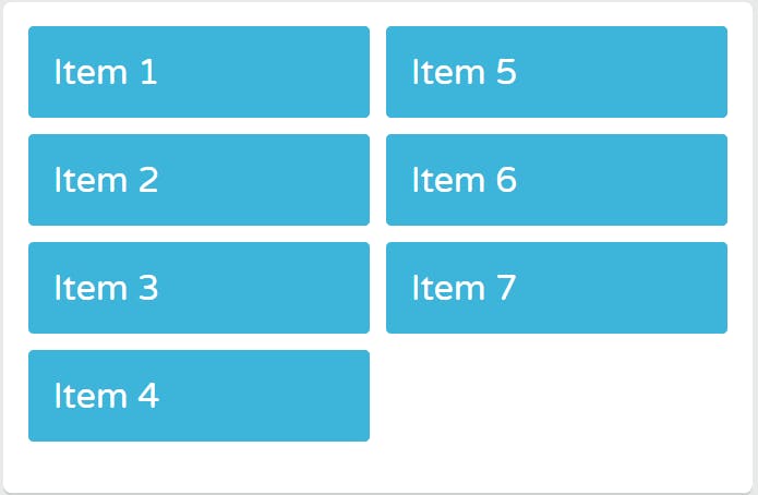
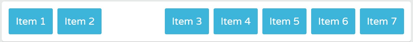
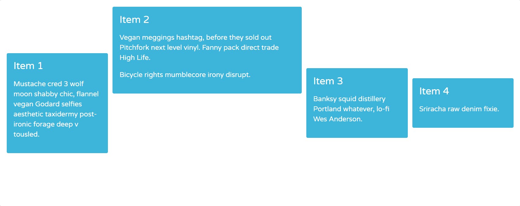
justify-content(center, flex-start, flex-end, space-between, space-around)
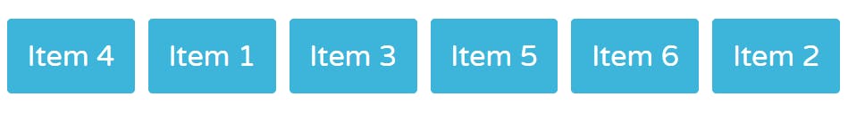
order
align-items(stretch(default), flex-start, flex-end, center )
適用flexItem
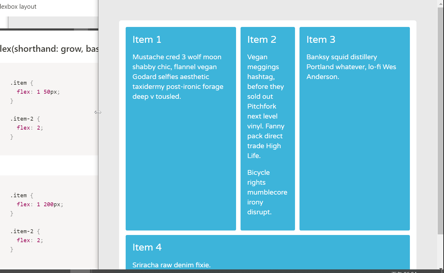
flex-grow(增), flex-shrink(減)

flex-basis
flex(shorthand: grow, basis, shrink)
align-self
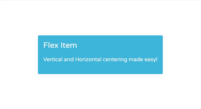
單一item置中 (3ways)
rwd application
nav
main-content
content-including button
sticky-footer
Want to print your doc?
This is not the way.
This is not the way.

Try clicking the ⋯ next to your doc name or using a keyboard shortcut (
CtrlP
) instead.