Skip to content
More
Share
Explore
Acquisition landing page(s)
Overview
About us
This project
Objectives
Brand guidelines
User journey
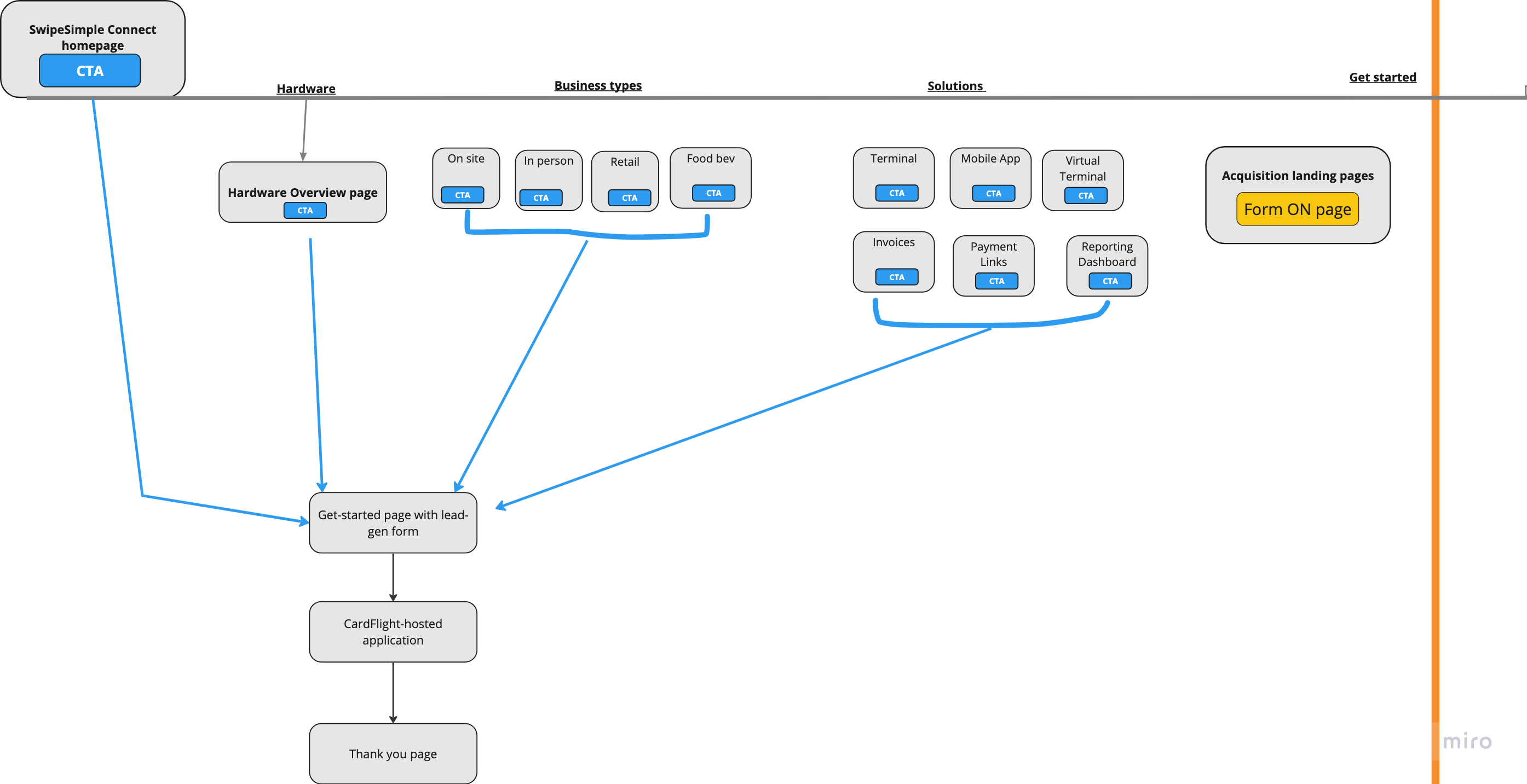
Sitemap
Assets
Figma files
Copy
Section 1 - intro
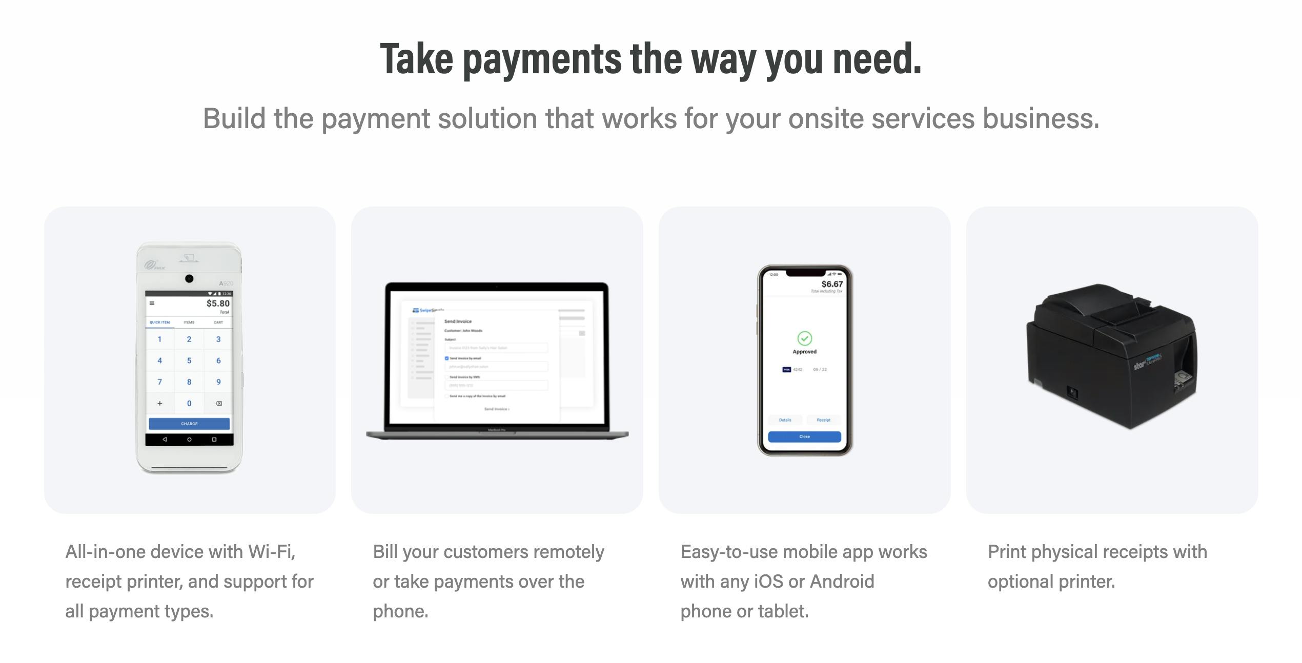
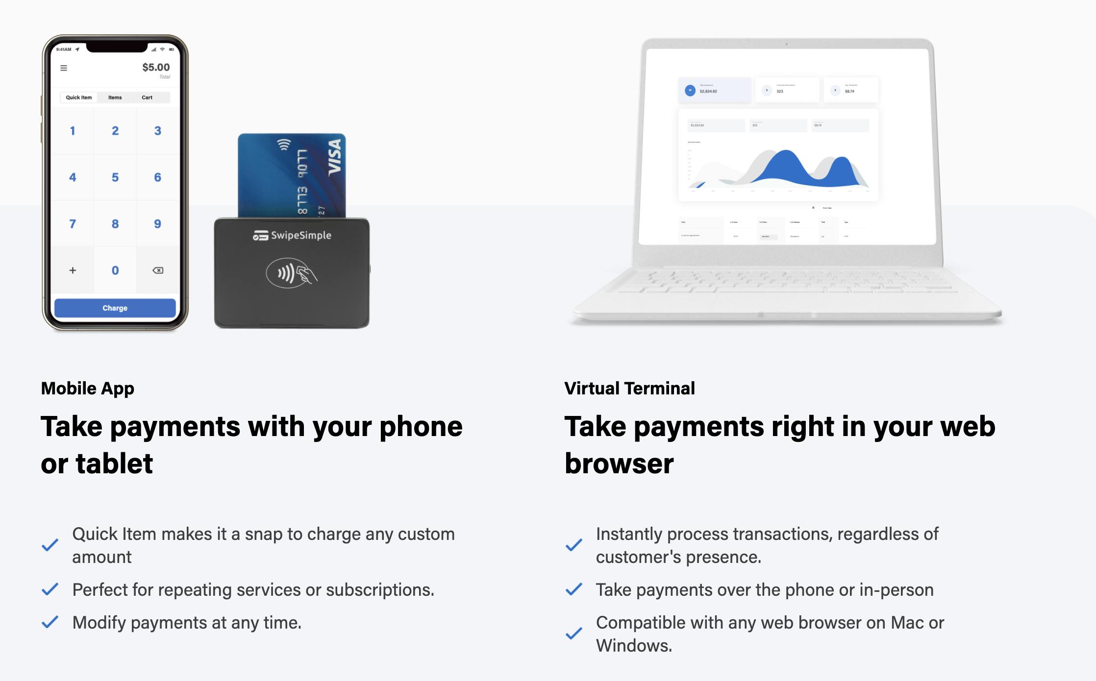
Section 2 - the product
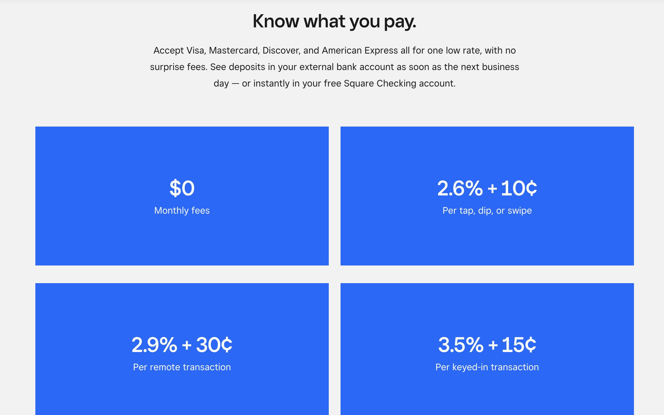
Section 3 - pricing
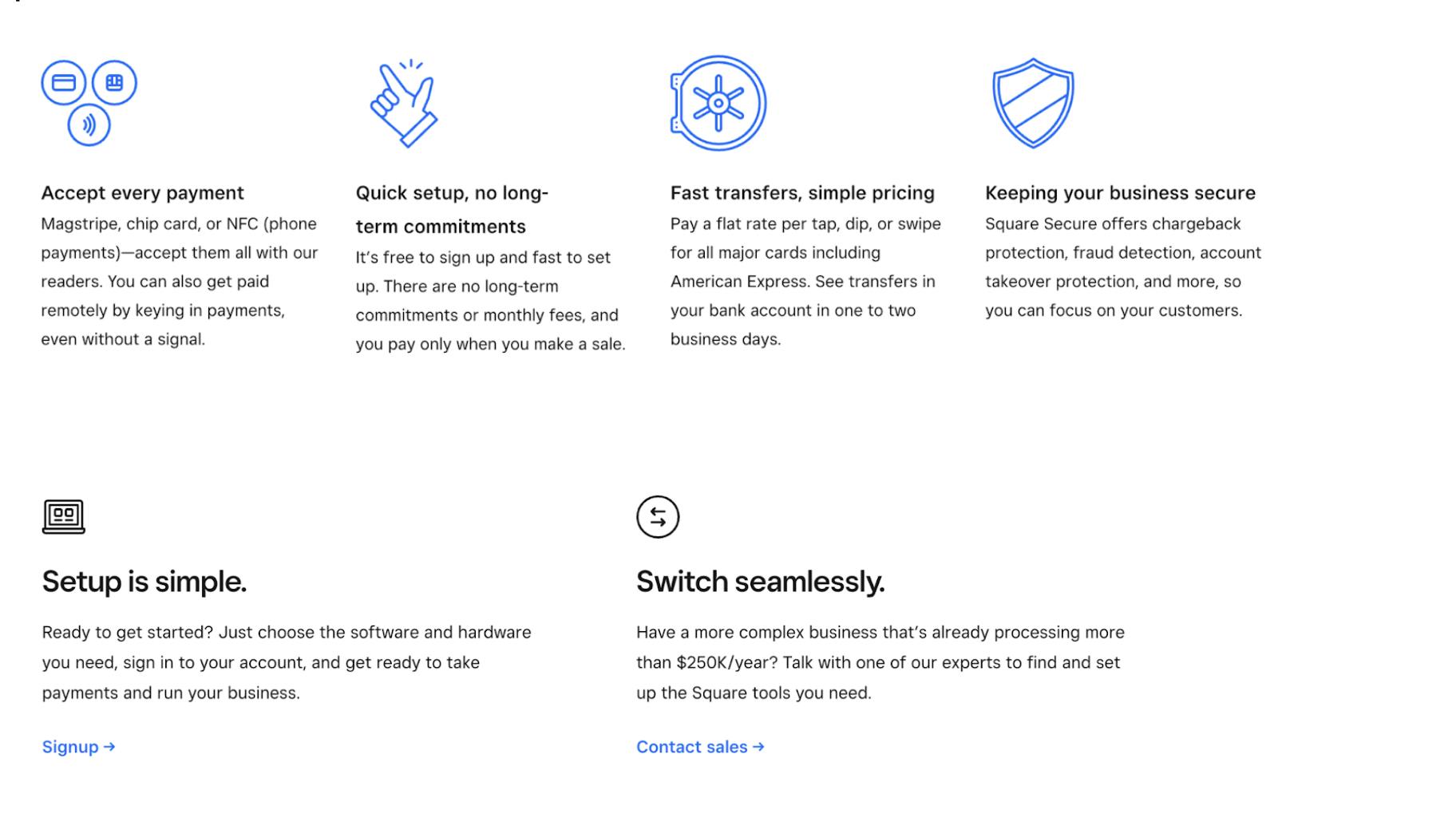
Section 4- bullets
FINAL: How we talk about core SwipeSimple Connect features and capabilities [fka SwipeSimple basics]
But wait there’s more copy
Error
Note: this was an import from a Notion doc. So if it looks weird, here’s a PDF (landing page content starts on p. 8):Bell Curve landing page copy.pdf824 kB
Photography
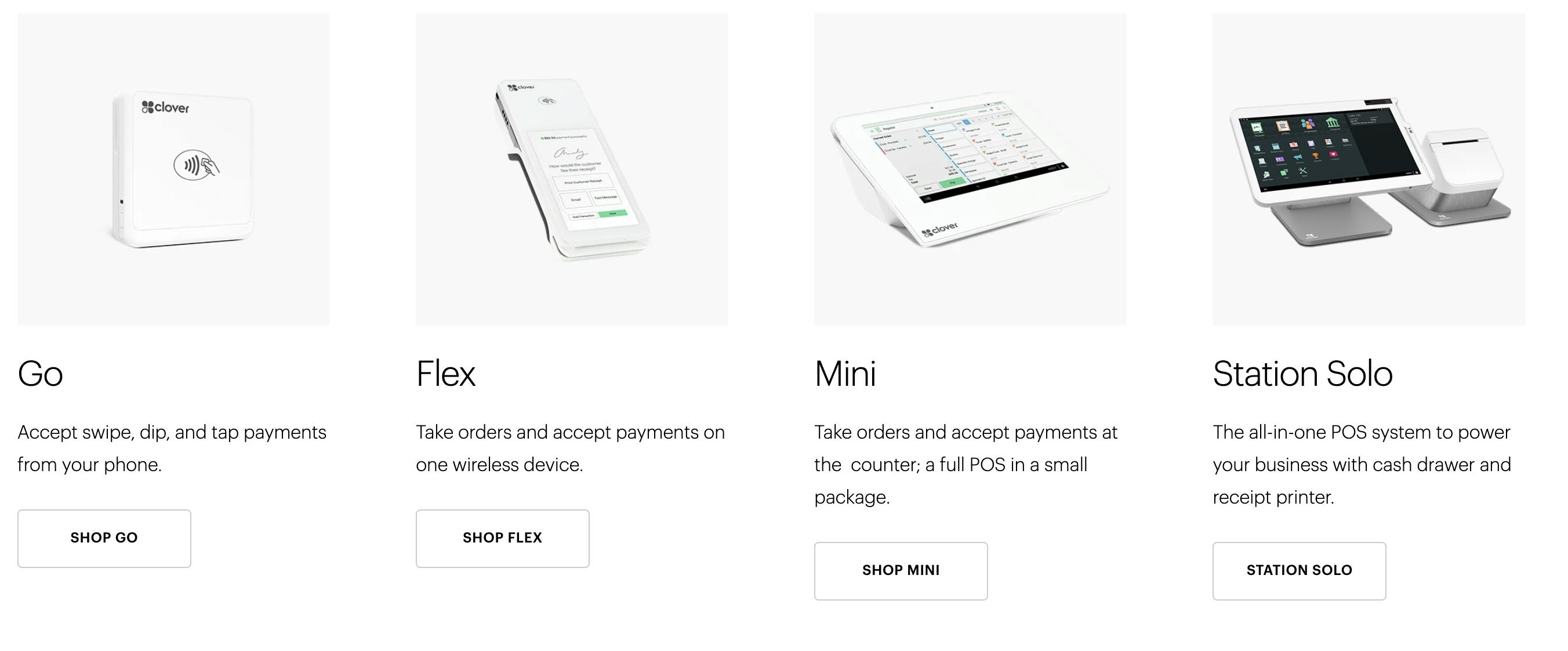
Competitor landing pages
Want to print your doc?
This is not the way.
This is not the way.

Try clicking the ⋯ next to your doc name or using a keyboard shortcut (
CtrlP
) instead.